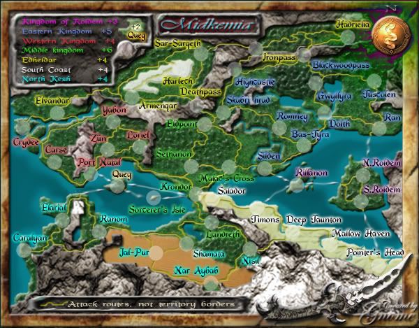
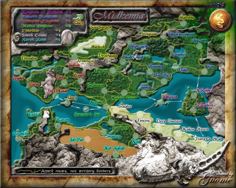
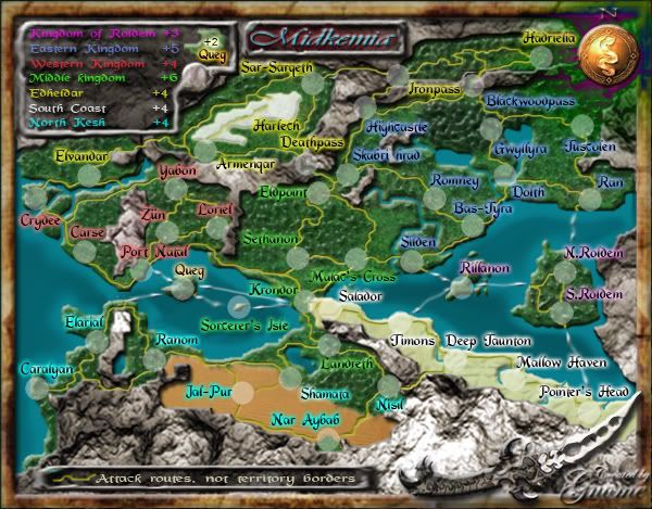
ya, that's a secret way through the mountains, that's how the spartans were killed in "300"Coleman wrote:He probably didn't see the Deep Jaunton - Nisil connection.DiM wrote:reasons?unriggable wrote:South Coast should be 3.
Midkemdil [Quenched]
Moderator: Cartographers
Forum rules
Please read the Community Guidelines before posting.
- unriggable
- Posts: 8036
- Joined: Thu Feb 08, 2007 9:49 pm
maybe it's not that clear...I'll try to make it a bit more clearunriggable wrote:Five countries, three attack routes into it. How should it not be three? Think of Africa.DiM wrote:reasons?unriggable wrote:South Coast should be 3.
I think everyone has to do a little effort to be able to understand the map...I can make the attack routes big black lines so you would know what place can attack the other...but than you don't need the background of the map...
I think everyone should be able to see that attack way in the mountain...I don't think it's that difficult to find...
- tallfella27
- Posts: 8
- Joined: Wed Dec 06, 2006 1:44 pm
I have to admit, while I didn't like this map to begin with it is growing on me. The individual graphic elements have come a long way. The desert, however, still looks wrong to me - it may be the bevelled edge along the top, which makes it look as though it pops up slightly from the bordering lands, which desert doesn't do.
this doesn't matter at all, but there are redundant attack routes between blackwoodpass and hadriella... seems like the roads in there could be easier to follow.

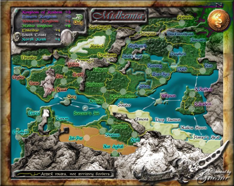
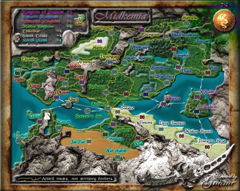
ok new update had arrived
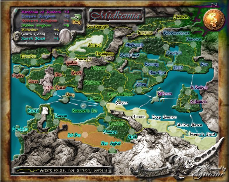
Large map Version 18.0

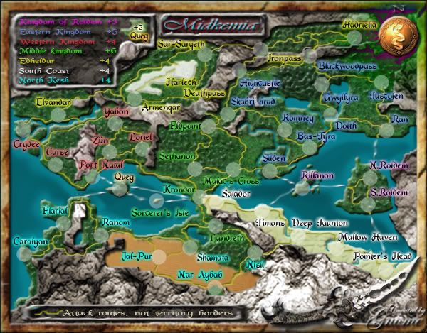
Small map Version 14.0

I changed the desert, I hope you like it more in this state...The desert, however, still looks wrong to me - it may be the bevelled edge along the top, which makes it look as though it pops up slightly from the bordering lands, which desert doesn't do.
fixedThe attack route from Ranom to Shamara is bit difficult to see in the small version of the map. Just needs bumped a couple pixels to the north.
I made the connection more clear by making the road a bit thickerHe probably didn't see the Deep Jaunton - Nisil connection.Five countries 4 attack routes into it.South Coast should be 3
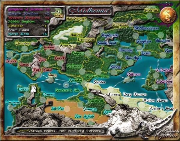
I changed the font of the +, I made it Arial Narrowany chance the you can make each "+" a bit less crunched vertically? I know that players will automatically assume that they are plus signs, but they look like bullets especially in the small map.
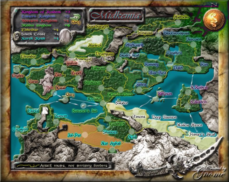
Large map Version 18.0

Small map Version 14.0

- tallfella27
- Posts: 8
- Joined: Wed Dec 06, 2006 1:44 pm
Midkemia
Gnome...hi....just a couple of small things....
* in the bottom of the large map legend left corner you have what looks like a notch with a cross in it....it is missing from the small map....is this deliberate?
* good work on the text size on the small map.
* is it possible to do anything to line up the bonus digits evenly in the legends.
* and again, i want to express my congrats on the artwork of this map...it is very different and i think fantastic artwork.
* in the bottom of the large map legend left corner you have what looks like a notch with a cross in it....it is missing from the small map....is this deliberate?
* good work on the text size on the small map.
* is it possible to do anything to line up the bonus digits evenly in the legends.
* and again, i want to express my congrats on the artwork of this map...it is very different and i think fantastic artwork.

* Pearl Harbour * Waterloo * Forbidden City * Jamaica * Pot Mosbi
Re: Midkemia
*1) It was in the small map until I changed it because I could increase the font that way...I choosed to have the small map and the large map not entirely the same but if you want I can change it...cairnswk wrote:Gnome...hi....just a couple of small things....
* in the bottom of the large map legend left corner you have what looks like a notch with a cross in it....it is missing from the small map....is this deliberate?
* good work on the text size on the small map.![]()
* is it possible to do anything to line up the bonus digits evenly in the legends.
* and again, i want to express my congrats on the artwork of this map...it is very different and i think fantastic artwork.
*2) Thx
*3) I tried (but the font won't let me do that)...But I'll try harder
*4)Thx again cairnswk I'm glad you like it:)
Re: Midkemia
No please don't change it if you don't want to...i was just wondering why it was different.Gnome wrote:
*1) It was in the small map until I changed it because I could increase the font that way...I choosed to have the small map and the large map not entirely the same but if you want I can change it...
Perhaps the challenge is that it might pay to have the digits separate from the text.

* Pearl Harbour * Waterloo * Forbidden City * Jamaica * Pot Mosbi
- DiM
- Posts: 10415
- Joined: Wed Feb 14, 2007 6:20 pm
- Gender: Male
- Location: making maps for scooby snacks
the small looks good.
the large has 2 sides thiner than the other but that's not a problem since it's symmetrical.
so everything looks good to me.
the large has 2 sides thiner than the other but that's not a problem since it's symmetrical.
so everything looks good to me.
“In the beginning God said, the four-dimensional divergence of an antisymmetric, second rank tensor equals zero, and there was light, and it was good. And on the seventh day he rested.”- Michio Kaku
- Optimus Prime
- Posts: 9665
- Joined: Mon Mar 12, 2007 9:33 pm
- Gender: Male
since others have brought up the frame, I'll echo some of that concern. I don't mind that the sides aren't the same width (though you certainly could crop some pixels off the left and right of the large map without effecting the playing area); I'm troubled more by the lack of effect on the inner edge of the right border. The other edges have contour and light, the right side doesn't.
DiM wrote:the small looks good.
the large has 2 sides thiner than the other but that's not a problem since it's symmetrical.
so everything looks good to me.
tenio wrote: think it really looks good, nice job , i see no major problems
Thx Guys!Optimus Prime wrote:How on earth did I miss this map along the way? I absolutely love it. I have a feeling it will be one of my favorites whenever it gets quenched. Great work!
Lol weird...I never noticed it...I'll change that, It's no big dealoaktown wrote:since others have brought up the frame, I'll echo some of that concern. I don't mind that the sides aren't the same width (though you certainly could crop some pixels off the left and right of the large map without effecting the playing area); I'm troubled more by the lack of effect on the inner edge of the right border. The other edges have contour and light, the right side doesn't.
Ok...no further comments on this map...
I'll post everything here
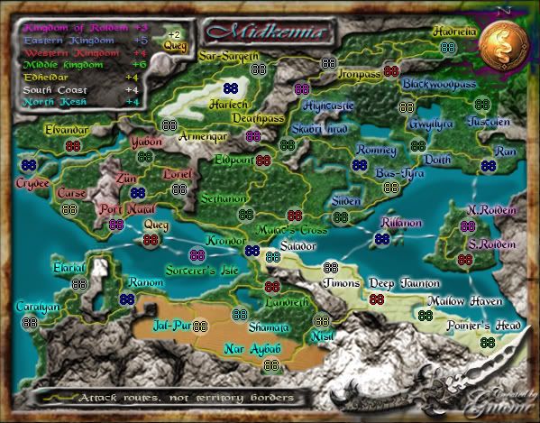
Small map test

Large map test

Small map:
http://i219.photobucket.com/albums/cc31 ... 0small.jpg
Large map:
http://i219.photobucket.com/albums/cc31 ... 210Big.jpg
Xml file:
http://h1.ripway.com/Gnomepy/midkemiaV8.0.xml
I'll post everything here
Small map test

Large map test

Small map:
http://i219.photobucket.com/albums/cc31 ... 0small.jpg
Large map:
http://i219.photobucket.com/albums/cc31 ... 210Big.jpg
Xml file:
http://h1.ripway.com/Gnomepy/midkemiaV8.0.xml
- unriggable
- Posts: 8036
- Joined: Thu Feb 08, 2007 9:49 pm