
Battle For Australia [Quenched]
Moderator: Cartographers
Forum rules
Please read the Community Guidelines before posting.
Please read the Community Guidelines before posting.
-
DiM

- Posts: 10415
- Joined: Wed Feb 14, 2007 6:20 pm
- Gender: Male
- Location: making maps for scooby snacks
there's nothing wrong with the map. and i'm totally against the outline stroke. it would clutter the map even more.KEYOGI wrote:I wonder if perhaps an outline/stroke to the land and possibly ships would help at all? There's just something that doesn't seem quite right about the map but I can't put my finger on it. The outline/stroke may be it, it may not.
i say you should work on the large version and the xml and you're ready for forging.
“In the beginning God said, the four-dimensional divergence of an antisymmetric, second rank tensor equals zero, and there was light, and it was good. And on the seventh day he rested.”- Michio Kaku

How does this sit...below...KeyogiKEYOGI wrote:I wonder if perhaps an outline/stroke to the land and possibly ships would help at all? There's just something that doesn't seem quite right about the map but I can't put my finger on it. The outline/stroke may be it, it may not.
I have place a black border on the ships, and applied a bevel to the land/islands...it does kind of lift the land out of the water, but some of it is very hard to see because of the islandic nature of this map.


* Pearl Harbour * Waterloo * Forbidden City * Jamaica * Pot Mosbi

Nah, the emboss looks bad... it's that whole problem of the water looking higher than the land again. I just thought some more definition between the land and the water would have been better.
And DiM, I know you're feeling hard done by and you have every right to counter any of my suggestions, but on this occassion you are wrong.
Also, last I checked you weren't responsible for Final Forge or Quenching.
And DiM, I know you're feeling hard done by and you have every right to counter any of my suggestions, but on this occassion you are wrong.
Also, last I checked you weren't responsible for Final Forge or Quenching.
-
DiM
- Posts: 10415
- Joined: Wed Feb 14, 2007 6:20 pm
- Gender: Male
- Location: making maps for scooby snacks
i only said there's no need for outlines as that would only clutter the map. am i not allowed to post my opinion if it contradicts yours? and neither me nor you can say that i'm wrong. in this field of map making many things are artistic. some i like some i don't. i feel an outline would do this map harm by cluttering it. you probably feel an outline would help it become clearer. we are both right because we view the map from different points. maybe somebody will come and say the map needs to be pink. he is right too. but in the end the most popular choice will be chosen. that won't make it right for everybody it will just make it right for the majority. so don't tell me i'm wrong as long as i don't tell you.KEYOGI wrote:And DiM, I know you're feeling hard done by and you have every right to counter any of my suggestions, but on this occassion you are wrong.
Also, last I checked you weren't responsible for Final Forge or Quenching.
and no i'm not responsible for forging but neither are the dozens of people that yell quench quench on various threads. it's our right to express our opinions on the development stage the maps are in. i feel this map could be ready for final forge after cairns provides the large version and the xml. what's wrong with that?

“In the beginning God said, the four-dimensional divergence of an antisymmetric, second rank tensor equals zero, and there was light, and it was good. And on the seventh day he rested.”- Michio Kaku
kewl now i can try something else....maybe just a thicker outline on the islands/land. i'll see what i can do later....KEYOGI wrote:Nah, the emboss looks bad... it's that whole problem of the water looking higher than the land again. I just thought some more definition between the land and the water would have been better.
And DiM, I know you're feeling hard done by and you have every right to counter any of my suggestions, but on this occassion you are wrong.
Also, last I checked you weren't responsible for Final Forge or Quenching.
* Pearl Harbour * Waterloo * Forbidden City * Jamaica * Pot Mosbi
Gilligan...thanks for the suggestion...I have no idea how to make them clearer...to me they are as clear as glass. I can't make them bigger because that would distort the whole area, and i consider they are very adequately marked. Sorry.Gilligan wrote:I think Tiwi Is. should be a little clearer.

* Pearl Harbour * Waterloo * Forbidden City * Jamaica * Pot Mosbi
I was just thinking for it to be to the left of the circle, since the color of the names correspond to the continent it belongs to.If it is on the left, it won't get mixed up with Mullingimbi. Am I making any sense?cairnswk wrote:Gilligan...thanks for the suggestion...I have no idea how to make them clearer...to me they are as clear as glass. I can't make them bigger because that would distort the whole area, and i consider they are very adequately marked. Sorry.Gilligan wrote:I think Tiwi Is. should be a little clearer.

oh that...i'll c what i can do.Gilligan wrote:I was just thinking for it to be to the left of the circle, since the color of the names correspond to the continent it belongs to.If it is on the left, it won't get mixed up with Mullingimbi. Am I making any sense?cairnswk wrote:Gilligan...thanks for the suggestion...I have no idea how to make them clearer...to me they are as clear as glass. I can't make them bigger because that would distort the whole area, and i consider they are very adequately marked. Sorry.Gilligan wrote:I think Tiwi Is. should be a little clearer.
* Pearl Harbour * Waterloo * Forbidden City * Jamaica * Pot Mosbi
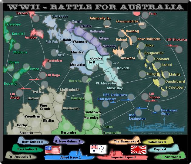
Keyogi...take a look at Australia, East Indies and western japanese islands...i have applied a simple 4 pixel edge in the same colour as the army shadow edge...does this work for you? if it does, i'll do the rest of the map.KEYOGI wrote:Nah, the emboss looks bad... it's that whole problem of the water looking higher than the land again. I just thought some more definition between the land and the water would have been better.
* Pearl Harbour * Waterloo * Forbidden City * Jamaica * Pot Mosbi
Gilligan wrote: I was just thinking for it to be to the left of the circle, since the color of the names correspond to the continent it belongs to.If it is on the left, it won't get mixed up with Mullingimbi. Am I making any sense?
Gilligan...is this any clearer in the image above?cairnswk wrote:oh that...i'll c what i can do.
* Pearl Harbour * Waterloo * Forbidden City * Jamaica * Pot Mosbi
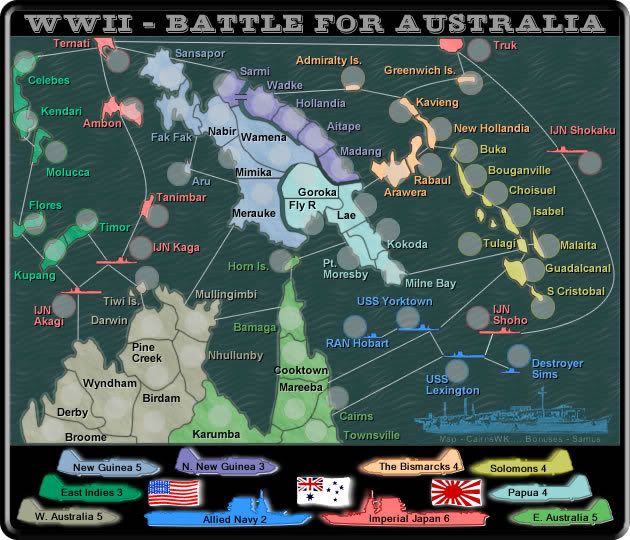
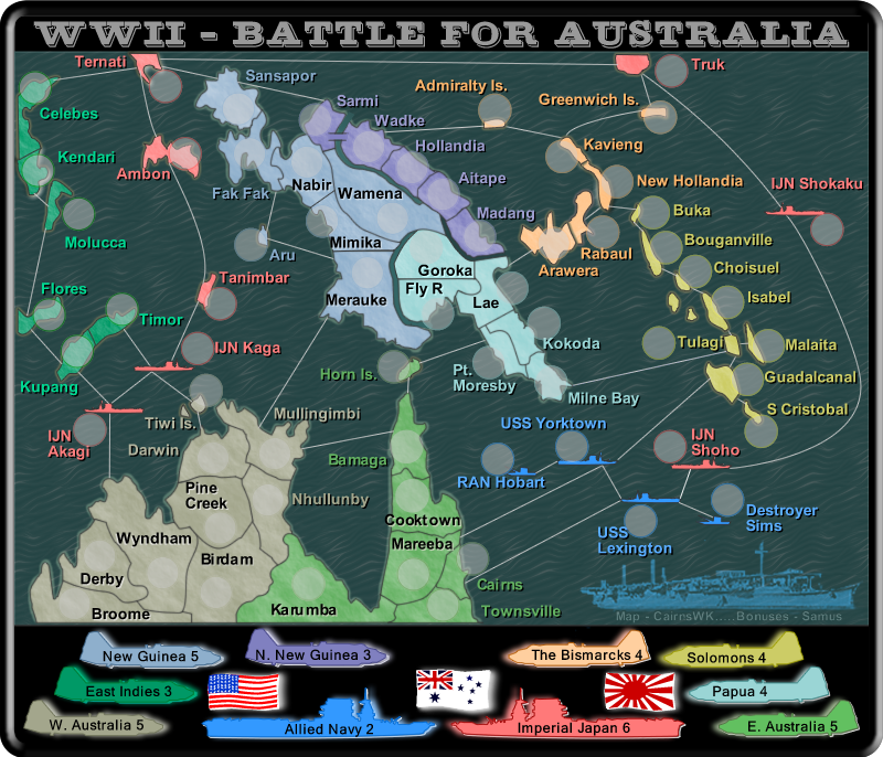
V28 Updates 26May 2007
V28 Update:
* 4 pixel outlines placed under all land
* font smoothed as non anti-aliased version does not translate up at all
* small changes to overall framework
Small
Large
* 4 pixel outlines placed under all land
* font smoothed as non anti-aliased version does not translate up at all
* small changes to overall framework
Small
Large
* Pearl Harbour * Waterloo * Forbidden City * Jamaica * Pot Mosbi
Nice update cairns, those outlines look superb! 
Hmm... I am quite happy with the texture you have for the sea, I am just wondering if it may look better a little less obvious. I know I'm nit-picking, but remember that's a good thing.
I know we've discussed the title and legend before, but there's still something that's slightly bugging me about it. Perhaps black is too strong a contrast colour from the map and the coloured images in the legend. Maybe a faint texture or shade of grey might look better?
Another little thing is the double outline in the title, it's doing weird things to my eyes. Maybe play around with some settings and effects and see what you can come up with. I'm not sure how to specifically resolve the issue, but I have faith in your abilities.
Last little thing... I promise. The Australian Navy flag in the legend would maybe look better if it was centred between the two ships. At the moment it's leaning towards the Imperial Japan side. If it was to lean in any direction, it would lean in the other way.
Hmm... I am quite happy with the texture you have for the sea, I am just wondering if it may look better a little less obvious. I know I'm nit-picking, but remember that's a good thing.
I know we've discussed the title and legend before, but there's still something that's slightly bugging me about it. Perhaps black is too strong a contrast colour from the map and the coloured images in the legend. Maybe a faint texture or shade of grey might look better?
Another little thing is the double outline in the title, it's doing weird things to my eyes. Maybe play around with some settings and effects and see what you can come up with. I'm not sure how to specifically resolve the issue, but I have faith in your abilities.
Last little thing... I promise. The Australian Navy flag in the legend would maybe look better if it was centred between the two ships. At the moment it's leaning towards the Imperial Japan side. If it was to lean in any direction, it would lean in the other way.
v29 Update
Thanks KeyogiKEYOGI wrote:Nice update cairns, those outlines look superb!
Hmm... I am quite happy with the texture you have for the sea, I am just wondering if it may look better a little less obvious. I know I'm nit-picking, but remember that's a good thing.
No....its alright....you're not nitt-picking...I'm pleased though that it is happening now before we go further with englargement etc...I reduced it to 50% in the v29 map below....i think you'll be happier with that
Yes we have...and it's not that i don't want to change it...but believe me black is the best colour here in concept with all the other colours...i have been through the entire colour spectrum for this and they all look attrocious....in earlier post I even had textrues there...but the black so far has been the best for this design....which i hope is nearing an end.I know we've discussed the title and legend before, but there's still something that's slightly bugging me about it. Perhaps black is too strong a contrast colour from the map and the coloured images in the legend. Maybe a faint texture or shade of grey might look better?
Another little thing is the double outline in the title, it's doing weird things to my eyes. Maybe play around with some settings and effects and see what you can come up with. I'm not sure how to specifically resolve the issue, but I have faith in your abilities.
This is called Goldmine font. I like it...it fits the overall gameboard concept that we discussed earlier and I believe other forum members are also happy with it...otherwise they would have called for change previously. It's meant to stand out like that...and i don't think there is any other space to bevel/emboss whatever there.
Promise!!!Last little thing... I promise.

Yes I re-aligned/centred that area down there...it should look much better now....in v29 below.The Australian Navy flag in the legend would maybe look better if it was centred between the two ships. At the moment it's leaning towards the Imperial Japan side. If it was to lean in any direction, it would lean in the other way.

* Pearl Harbour * Waterloo * Forbidden City * Jamaica * Pot Mosbi
I think it is clearer, but I was thinking above the island.cairnswk wrote:Gilligan wrote: I was just thinking for it to be to the left of the circle, since the color of the names correspond to the continent it belongs to.If it is on the left, it won't get mixed up with Mullingimbi. Am I making any sense?Gilligan...is this any clearer in the image above?cairnswk wrote:oh that...i'll c what i can do.
-
AndyDufresne

- Posts: 24919
- Joined: Fri Mar 03, 2006 8:22 pm
- Location: A Banana Palm in Zihuatanejo
- Contact:
Hm, alright. I'm liking the way things are shaping up. I've got a few things that are itchin' my skin. I'm not sure if these are just image quality problems, or if they are something else, so forgive me.
Is it just me, or does the interior of the army shadows look a little fuzzy at times? Maybe it's the waves of the ocean coming through that look odd? I'm not sure.
On the map, especially around names and sea routes, there is some weird pixely fuzziness. Near USS Yorktown, for example. And Greewich Is. And Molucca. And Birdam. And the route from Yorktown to Guadal. And other places. But again, I'm not sure if it's lower image quality, or what exactly.
One thing you might want to consider, is upping the font size for the numbers in the bonus legend, but that just might make them look out of place then.
Also, I feel your sig is a little cramped underneath the boat. Have you considered maybe repositioning it somewhere else? You have some empty space in the top right corner, but then it might distract from the map a little, but you could make it blend and flow with the background nicely. Or you could maybe manage putting it below the ships or the planes in the bonus legend, but that might be too much of a squeez also.
Also, could you show me the other (Large/Small) version of the map?
--Andy
Is it just me, or does the interior of the army shadows look a little fuzzy at times? Maybe it's the waves of the ocean coming through that look odd? I'm not sure.
On the map, especially around names and sea routes, there is some weird pixely fuzziness. Near USS Yorktown, for example. And Greewich Is. And Molucca. And Birdam. And the route from Yorktown to Guadal. And other places. But again, I'm not sure if it's lower image quality, or what exactly.
One thing you might want to consider, is upping the font size for the numbers in the bonus legend, but that just might make them look out of place then.
Also, I feel your sig is a little cramped underneath the boat. Have you considered maybe repositioning it somewhere else? You have some empty space in the top right corner, but then it might distract from the map a little, but you could make it blend and flow with the background nicely. Or you could maybe manage putting it below the ships or the planes in the bonus legend, but that might be too much of a squeez also.
Also, could you show me the other (Large/Small) version of the map?
--Andy
Andy...while i'm adjusting these items....last post you made you said you were going to comment on gameplay...anything there?AndyDufresne wrote:Hm, alright. I'm liking the way things are shaping up. I've got a few things that are itchin' my skin. I'm not sure if these are just image quality problems, or if they are something else, so forgive me.
Is it just me, or does the interior of the army shadows look a little fuzzy at times? Maybe it's the waves of the ocean coming through that look odd? I'm not sure.
On the map, especially around names and sea routes, there is some weird pixely fuzziness. Near USS Yorktown, for example. And Greewich Is. And Molucca. And Birdam. And the route from Yorktown to Guadal. And other places. But again, I'm not sure if it's lower image quality, or what exactly.
One thing you might want to consider, is upping the font size for the numbers in the bonus legend, but that just might make them look out of place then.
Also, I feel your sig is a little cramped underneath the boat. Have you considered maybe repositioning it somewhere else? You have some empty space in the top right corner, but then it might distract from the map a little, but you could make it blend and flow with the background nicely. Or you could maybe manage putting it below the ships or the planes in the bonus legend, but that might be too much of a squeez also.
Also, could you show me the other (Large/Small) version of the map?
--Andy
* Pearl Harbour * Waterloo * Forbidden City * Jamaica * Pot Mosbi
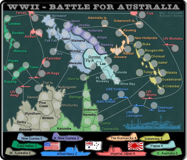
v30 Updates
there was fuzziness coming through the army shadow from the waves...i've fixed that and changed the transparency to 60%...i don't think it needs to be any higher than that otherwise the arny circles start looking out of place and too bright.AndyDufresne wrote:Is it just me, or does the interior of the army shadows look a little fuzzy at times? Maybe it's the waves of the ocean coming through that look odd? I'm not sure.
yes that has been fixed...it was an issue created from underlaying all the land with a thick outline.On the map, especially around names and sea routes, there is some weird pixely fuzziness. Near USS Yorktown, for example. And Greewich Is. And Molucca. And Birdam. And the route from Yorktown to Guadal. And other places. But again, I'm not sure if it's lower image quality, or what exactly.
font uped to 11....can't go any higher than that otherwise N New Guinea disappears oof the legend plane.One thing you might want to consider, is upping the font size for the numbers in the bonus legend, but that just might make them look out of place then.
moved to top right corner.Also, I feel your sig is a little cramped underneath the boat. Have you considered maybe repositioning it somewhere else? You have some empty space in the top right corner, but then it might distract from the map a little, but you could make it blend and flow with the background nicely. Or you could maybe manage putting it below the ships or the planes in the bonus legend, but that might be too much of a squeez also.
as below Andy.Also, could you show me the other (Large/Small) version of the map?
Small
Large
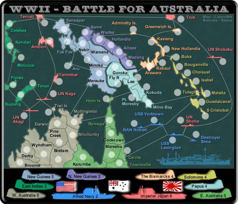
Last edited by cairnswk on Sat May 26, 2007 4:02 pm, edited 1 time in total.
* Pearl Harbour * Waterloo * Forbidden City * Jamaica * Pot Mosbi
Gilligan...moved it to above the island...and also deleted one of those Tiwi islands as it was in the road and redundant...Gilligan wrote:I think it is clearer, but I was thinking above the island.cairnswk wrote:Gilligan wrote: I was just thinking for it to be to the left of the circle, since the color of the names correspond to the continent it belongs to.If it is on the left, it won't get mixed up with Mullingimbi. Am I making any sense?Gilligan...is this any clearer in the image above?cairnswk wrote:oh that...i'll c what i can do.
* Pearl Harbour * Waterloo * Forbidden City * Jamaica * Pot Mosbi
Try it northwest of the island.cairnswk wrote:Gilligan...moved it to above the island...and also deleted one of those Tiwi islands as it was in the road and redundant...Gilligan wrote:I think it is clearer, but I was thinking above the island.cairnswk wrote:Gilligan wrote: I was just thinking for it to be to the left of the circle, since the color of the names correspond to the continent it belongs to.If it is on the left, it won't get mixed up with Mullingimbi. Am I making any sense?Gilligan...is this any clearer in the image above?cairnswk wrote:oh that...i'll c what i can do.
Boy, am I being a bitch.