Conquer Club

WWII Pearl Harbor - [Quenched]

Care to peruse completed maps? Take a stroll through the Atlas.

Moderator: Cartographers

Forum rules
Please read the Community Guidelines before posting.

WWII Pearl Harbor - [Quenched]

Postby cairnswk on Mon May 14, 2007 4:01 pm

In memory of over 2000 servicemen and women - presenting:
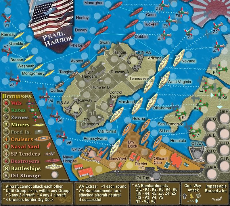
PEARL HARBOR


Current Version.
Click image to enlarge.
image


Please note: play this map at your own chance.
The initial bonuses are high due to this map attempting to emulate the surprise component of the Japanese attack.


This is the small map @ 630 x 566
Massive play:
* 11 continents
* 72 territories
Consisting of:
5 Miners (Minesweepers)
12 Zeroes (Japanese Attack Aircraft)
6 Kates (Torpedoe and Bomb Carriers)
9 Ford Island (Hangers and Runway)
4 Cruisers (heavy and light)
4 Seaplanes
10 Oil Tanks
8 Destroyers
8 Battleships
6 Naval Yard Utilities

The design features the flag in the title area from the USS Shaw.
The runway on Ford Island displays stars on its background representing the planes that never got off the ground and were destroyed in a matter of minutes.

Please, everyone, enjoy! :D :D

************************************************

Pearl Harbour - this initial draft below has been replaced by Versions above.
Image
Last edited by cairnswk on Sun Oct 10, 2010 5:29 pm, edited 68 times in total.
User avatar
Private cairnswk
 
Posts: 11510
Joined: Sat Feb 03, 2007 8:32 pm
Location: Australia

Postby gimil on Mon May 14, 2007 4:42 pm

im definetly intrested in this map. but right now its a bit small and to crampped together. try and sapce it out a bit more even if the maps jsut a little longer vertically. but its definetly a good start.
User avatar
Corporal 1st Class gimil
 
Posts: 8599
Joined: Sat Mar 03, 2007 12:42 pm
Location: United Kingdom (Scotland)

Postby RobinJ on Mon May 14, 2007 4:54 pm

Yep, definitely a good idea. I think gimil has already stated the obvious about what needs to be done in the immediate future
nmhunate wrote:Speak English... It is the language that God wrote the bible in.


Highest Score: 2437
Highest Place: 84
User avatar
Sergeant 1st Class RobinJ
 
Posts: 1901
Joined: Mon Aug 21, 2006 1:56 pm
Location: Northern Ireland

Postby hulmey on Mon May 14, 2007 5:05 pm

yeah excellent idea...I was thinking of starting it myself yesterday...I think you really need to make the graphics alot better than they to justify such a important place in history
[img]http://img801.imageshack.us/img801/9761/41922610151374166770386.jpg[/mg]
User avatar
Lieutenant hulmey
 
Posts: 3742
Joined: Fri Nov 03, 2006 7:33 am
Location: Las Vegas

Postby Gilligan on Mon May 14, 2007 5:11 pm

I'm behind you 100%, carins.

I just think you should finish your other maps first :D :wink:
Image
User avatar
Captain Gilligan
 
Posts: 12478
Joined: Thu May 11, 2006 4:59 pm
Location: Providence, RI

Postby jennifermarie on Mon May 14, 2007 5:18 pm

I like this map a lot, it seems like it will be very fun when it is finished. My concerns so far is that it is rather difficult to read whatever the yellow text is in the legend. Also, the Japanese Planes A and B colors are almost exactly alike. I do enjoy the theme of this map very much though.
User avatar
Private 1st Class jennifermarie
 
Posts: 1316
Joined: Wed Mar 07, 2007 8:07 pm
Location: Indiana, USA

Postby mibi on Mon May 14, 2007 6:18 pm

good start, but i think this map should be as big as the cairns coast... no point it making it gameboy size.
User avatar
Captain mibi
 
Posts: 3350
Joined: Thu Mar 01, 2007 8:19 pm
Location: The Great State of Vermont

Postby edbeard on Mon May 14, 2007 6:23 pm

I'm interested in seeing what you have in store for the next version.

One small thing I'd change. Even though I spell it with a U as well, I'd spell it Harbor because it's American.

Also, I'm hoping this is the small version?
User avatar
Lieutenant edbeard
 
Posts: 2501
Joined: Thu Mar 29, 2007 12:41 am

Postby plysprtz on Mon May 14, 2007 6:47 pm

yea looks great but the names are kinda goofy
1546 - top score
User avatar
Cook plysprtz
 
Posts: 471
Joined: Fri Mar 02, 2007 2:43 pm
Location: chicago

Postby DiM on Mon May 14, 2007 7:05 pm

the map is extremely cramped. either make it bigger or remove some territories.

i take it this is just a draft so i'm not going to comment on graphics.

the names are probably temporary also.

the bonuses are strange.
combatants 57!!!! probably a typo.

airplanes A 6?? with only 3 borders?


i like the map. it needs work but it's looking good and i'm sure it will be great.
“In the beginning God said, the four-dimensional divergence of an antisymmetric, second rank tensor equals zero, and there was light, and it was good. And on the seventh day he rested.”- Michio Kaku
User avatar
Major DiM
 
Posts: 10415
Joined: Wed Feb 14, 2007 6:20 pm
Location: making maps for scooby snacks

Postby cairnswk on Tue May 15, 2007 3:49 am

Gilligan wrote:I'm behind you 100%, carins.

I just think you should finish your other maps first :D :wink:


Thanks Gilligan.
I wish I could get the others finished also, however here's the word on the street....

Cairns Coral Coast: I am hoping it will be quenched very soon....indications are good, I believe.

WWII - Battle For Australia: I am waiting on gameplay review from Andy, and of course very people have commented, and if I see no comments then I suspect people are happy with the current result. I certainly am as it has the style that I wanted from this map.

Egypt - Valley of the Kings: this has just undergone a major re-design after what was disappointing initial voting results...it is at hand and I would once again appreciate some comments. :wink:

So I am in between maps, and don't worry...there are several more on my design board.

So watch this space and don't forget to get everyone to comment....the more feedback the more interesting the map might be.

Thanks for your comments.
Image
* Pearl Harbour * Waterloo * Forbidden City * Jamaica * Pot Mosbi
User avatar
Private cairnswk
 
Posts: 11510
Joined: Sat Feb 03, 2007 8:32 pm
Location: Australia

Postby cairnswk on Tue May 15, 2007 3:58 am

edbeard wrote:I'm interested in seeing what you have in store for the next version.

One small thing I'd change. Even though I spell it with a U as well, I'd spell it Harbor because it's American.

Also, I'm hoping this is the small version?


Sure edbeard....slicing the U out now...I'd forgotten about the americanisation of the english language. Sorry. :wink:
Image
* Pearl Harbour * Waterloo * Forbidden City * Jamaica * Pot Mosbi
User avatar
Private cairnswk
 
Posts: 11510
Joined: Sat Feb 03, 2007 8:32 pm
Location: Australia

Postby cairnswk on Tue May 15, 2007 4:00 am

mibi wrote:good start, but i think this map should be as big as the cairns coast... no point it making it gameboy size.

Yeh good point mibi...i'll see what happens! Thanks
Image
* Pearl Harbour * Waterloo * Forbidden City * Jamaica * Pot Mosbi
User avatar
Private cairnswk
 
Posts: 11510
Joined: Sat Feb 03, 2007 8:32 pm
Location: Australia

Postby cairnswk on Tue May 15, 2007 4:02 am

plysprtz wrote:yea looks great but the names are kinda goofy

i take it yor referring the three letter call signs for the aircraft...well I am hoping to change these to the actual plane names that attacked the vessels.....when i can find them...if there are any links out there....please advise.
Image
* Pearl Harbour * Waterloo * Forbidden City * Jamaica * Pot Mosbi
User avatar
Private cairnswk
 
Posts: 11510
Joined: Sat Feb 03, 2007 8:32 pm
Location: Australia

Postby cairnswk on Tue May 15, 2007 4:05 am

DiM wrote:the map is extremely cramped. either make it bigger or remove some territories.
i take it this is just a draft so i'm not going to comment on graphics.
the names are probably temporary also.
the bonuses are strange.
combatants 57!!!! probably a typo.
airplanes A 6?? with only 3 borders?
i like the map. it needs work but it's looking good and i'm sure it will be great.

DiM, hold your horses...this is only a draft to get an idea of interest.
i have some ideas for the actual map. and will post this in the next version I post. Of course it needs work, & yes I hope it will be spectacular as required history.
Image
* Pearl Harbour * Waterloo * Forbidden City * Jamaica * Pot Mosbi
User avatar
Private cairnswk
 
Posts: 11510
Joined: Sat Feb 03, 2007 8:32 pm
Location: Australia

Postby gimil on Tue May 15, 2007 4:53 am

DiM wrote:combatants 57!!!! probably a typo.


if u had read the 1st post you would know he means theres 57 terr lol
User avatar
Corporal 1st Class gimil
 
Posts: 8599
Joined: Sat Mar 03, 2007 12:42 pm
Location: United Kingdom (Scotland)

Postby DiM on Tue May 15, 2007 7:29 am

if you do pearl harbour you must certainly do kamikaze airplanes.

one very good way to do this is by having true teleportation attacks.

Description:
A territory marked as a "TRUE" Teleport territory in the XML would provide actual troop movement how a teleport works.
Why It Should Be Considered:
Currently the closest thing we have to teleports is the 1-way border. The issue with this is that if you attack from a 1-way with 18 on 7 and you win, you only need to put 1 army in the conquered territory. This is not how it should be. How did the 18 guys you attacked with get back to the attacking territory if it is a 1-way?

A "TRUE" Teleport territory would allow an attacker to attack but all of the troops sent through would be stuck. So if the attacker had 20 vs 6 and chose to attack with 12. Those 12 would be sent through and there would be a 12 vs 6 auto attack on the other side of the teleport. If the attacker wins the remainder of the troops are now stuck on the other side.


unfortunately this idea was voted no, but hopefully it will be done in the next batch of updates.
“In the beginning God said, the four-dimensional divergence of an antisymmetric, second rank tensor equals zero, and there was light, and it was good. And on the seventh day he rested.”- Michio Kaku
User avatar
Major DiM
 
Posts: 10415
Joined: Wed Feb 14, 2007 6:20 pm
Location: making maps for scooby snacks

Postby Epideme on Thu May 17, 2007 7:16 am

now this idea i like. could you make the sea a little more like a realistic water colour
Remember next time you're buying rat poison, spare a thought for a cheerleader...Buy an extra bottle!
Corporal Epideme
 
Posts: 29
Joined: Fri Mar 09, 2007 8:34 am
Location: Warrington, NW England

Postby cairnswk on Thu May 17, 2007 7:31 am

Epideme wrote:now this idea i like. could you make the sea a little more like a realistic water colour

Epideme...this is only a basic start...there is a complete design in the making which I'm hoping to have up by weekend's end...watch this space.
Image
* Pearl Harbour * Waterloo * Forbidden City * Jamaica * Pot Mosbi
User avatar
Private cairnswk
 
Posts: 11510
Joined: Sat Feb 03, 2007 8:32 pm
Location: Australia

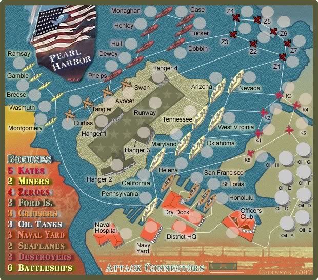
19 May V2 Design.

Postby cairnswk on Sat May 19, 2007 12:52 am

V2 - please refer to P1 for the lowdown on what's what.

Image
Image
* Pearl Harbour * Waterloo * Forbidden City * Jamaica * Pot Mosbi
User avatar
Private cairnswk
 
Posts: 11510
Joined: Sat Feb 03, 2007 8:32 pm
Location: Australia

Postby dominationnation on Sat May 19, 2007 12:53 am

looking good
Cook dominationnation
 
Posts: 4234
Joined: Sat Jan 13, 2007 10:20 am

Postby cairnswk on Sat May 19, 2007 12:56 am

dominationnation wrote:looking good
Thanks Dominationnation...that's encouraging after a weeks work! :)
Image
* Pearl Harbour * Waterloo * Forbidden City * Jamaica * Pot Mosbi
User avatar
Private cairnswk
 
Posts: 11510
Joined: Sat Feb 03, 2007 8:32 pm
Location: Australia

Postby frood on Sat May 19, 2007 2:53 am

The oil tanks are 6 with only two borders? Or am I missing something?
I have an IQ of 195. Of course my answers are different!
User avatar
Lieutenant frood
 
Posts: 133
Joined: Tue Mar 06, 2007 6:49 pm
Location: Now What.

Postby cairnswk on Sat May 19, 2007 3:15 am

frood wrote:The oil tanks are 6 with only two borders? Or am I missing something?

Thanks frood...i'll fix that in the bove image now...sorry, its been a long day to get this up. :)
Image
* Pearl Harbour * Waterloo * Forbidden City * Jamaica * Pot Mosbi
User avatar
Private cairnswk
 
Posts: 11510
Joined: Sat Feb 03, 2007 8:32 pm
Location: Australia

Re: 19 May V2 Design.

Postby onbekende on Sat May 19, 2007 5:43 am

cairnswk wrote:V2 - please refer to P1 for the lowdown on what's what.

Image

Again an excellent map, grats


Overall:
Give cruisers and Destroyers a more different color, they look a bit alike
Order of bonuses: (Kates - Miners - Zeroes - Ford Is. - Cruisers - Oil Tankers - Naval Yard - Seaplanes - Battleships - Destroyers) lenght of names
OR order them like this: (Minders - Seaplanes - Destroyers (as that are destroers at the top?) - Zeroes - Kates - Oil Tanks - Naval Yard - Cruisers - Battleships - Ford Is.)
look what makes it look the best :D
perhaps a sort of "pipeline" from a oil tank to the airfield? justifying the 3 bonus (possible 1 way)

Miners:
All good

Zeroes:
Switch the Z4 and army shade of it

Kates:
All good

Ford Is.:
Possible a pipeline going to the Runway, see if it fits in

Cruisers (the ones below I still presume):
All good

Seaplanes:
All good

Oil Tanks:
the pipeline idea to justify the +3 bonus

Destroyers:
All good

Battleships:
All good

Naval Yard:
perhaps +4? seeing it is close by to those good continents


Again, very good
Emperor of the Benelux
Founder of the Commonwealth of Planets
Founder and CEO of JF
User avatar
Captain onbekende
 
Posts: 1530
Joined: Fri Apr 14, 2006 10:19 am
Location: Belgium

Next

Return to The Atlas

Who is online

Users browsing this forum: No registered users