[Abandoned] Alamo
Moderator: Cartographers
Forum rules
Please read the Community Guidelines before posting.
Please read the Community Guidelines before posting.
-
generalhead
- Posts: 806
- Joined: Mon Apr 26, 2010 10:09 pm
Re: Alamo map 29/9
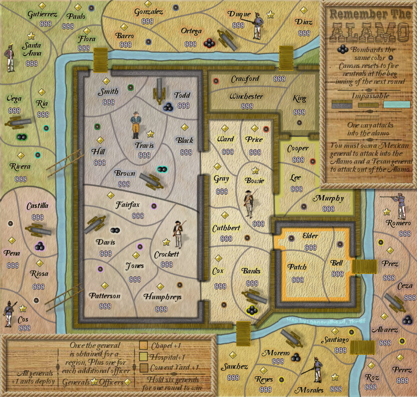
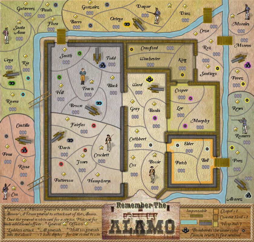
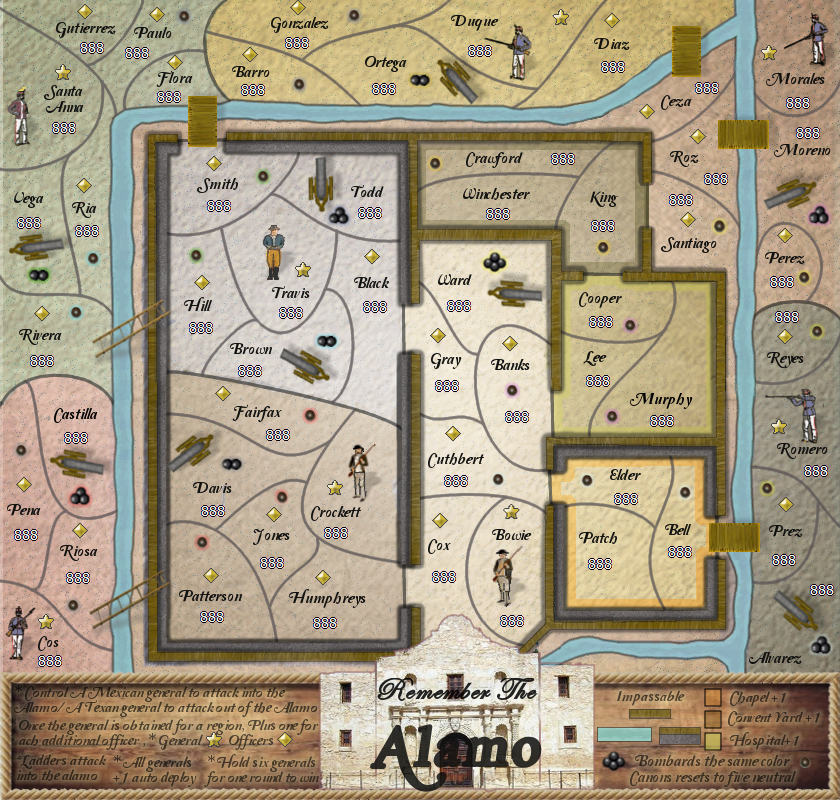
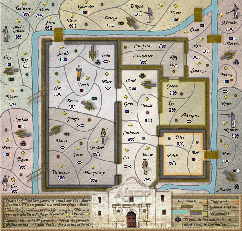
Seeking to see which version is liked better.
Plus how the new figures look?
Original map Combined legend map
The reason for this request is because this layout opens the board up and only gives you one place to look for the instructions
I know the glows need worked on and the items in the legend need aligned, but I wanted to see if
this version is liked better before I go too far with it. Test Test test
Last edited by generalhead on Sun Oct 27, 2013 12:32 am, edited 7 times in total.
- koontz1973
- Posts: 6960
- Joined: Thu Jan 01, 2009 10:57 am
Re: Alamo map 10/17 (pg 22) board layout change vote
GH, this will take a bit longer than a little bit of time to really look at. You have changed the dynamics of the game play a bit. Let mew look into it tomorrow with a fresh head, speak to ian about it and see if we can OK the new layout without too much fuss.
From my opinion, it has not been too dramatic though and the ability to include the façade of the Alamo will negate any problems.
From my opinion, it has not been too dramatic though and the ability to include the façade of the Alamo will negate any problems.

-
generalhead
- Posts: 806
- Joined: Mon Apr 26, 2010 10:09 pm
Re: Alamo map 10/17 (pg 22) board layout change vote
Thanks koontz. I can wait on the approval, I was just wondering if you liked it better?koontz1973 wrote:GH, this will take a bit longer than a little bit of time to really look at. You have changed the dynamics of the game play a bit. Let mew look into it tomorrow with a fresh head, speak to ian about it and see if we can OK the new layout without too much fuss.
From my opinion, it has not been too dramatic though and the ability to include the façade of the Alamo will negate any problems.
Re: Alamo map 10/17 (pg 22) board layout change vote
I love the new layout!
- koontz1973
- Posts: 6960
- Joined: Thu Jan 01, 2009 10:57 am
Re: Alamo map 10/17 (pg 22) board layout change vote
It is better and would be worth keeping.generalhead wrote:Thanks koontz. I can wait on the approval, I was just wondering if you liked it better?

-
generalhead
- Posts: 806
- Joined: Mon Apr 26, 2010 10:09 pm
Re: Alamo map 10/17 (pg 22) board layout change vote
DearCyrus wrote:I love the new layout!
Awesome, thank you.koontz1973 wrote:It is better and would be worth keeping.
Re: Alamo map 10/17 (pg 22) board layout change vote
+1DearCyrus wrote:I love the new layout!
+1koontz1973 wrote:It is better and would be worth keeping.
-
generalhead
- Posts: 806
- Joined: Mon Apr 26, 2010 10:09 pm
Re: Alamo map 10/17 (pg 22) board layout change vote
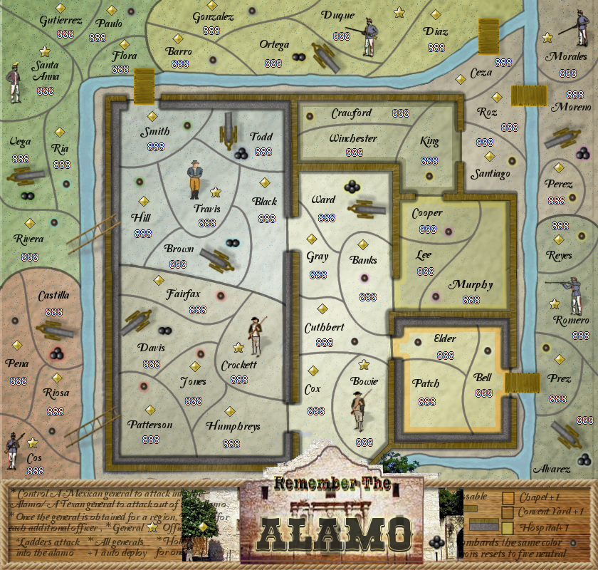
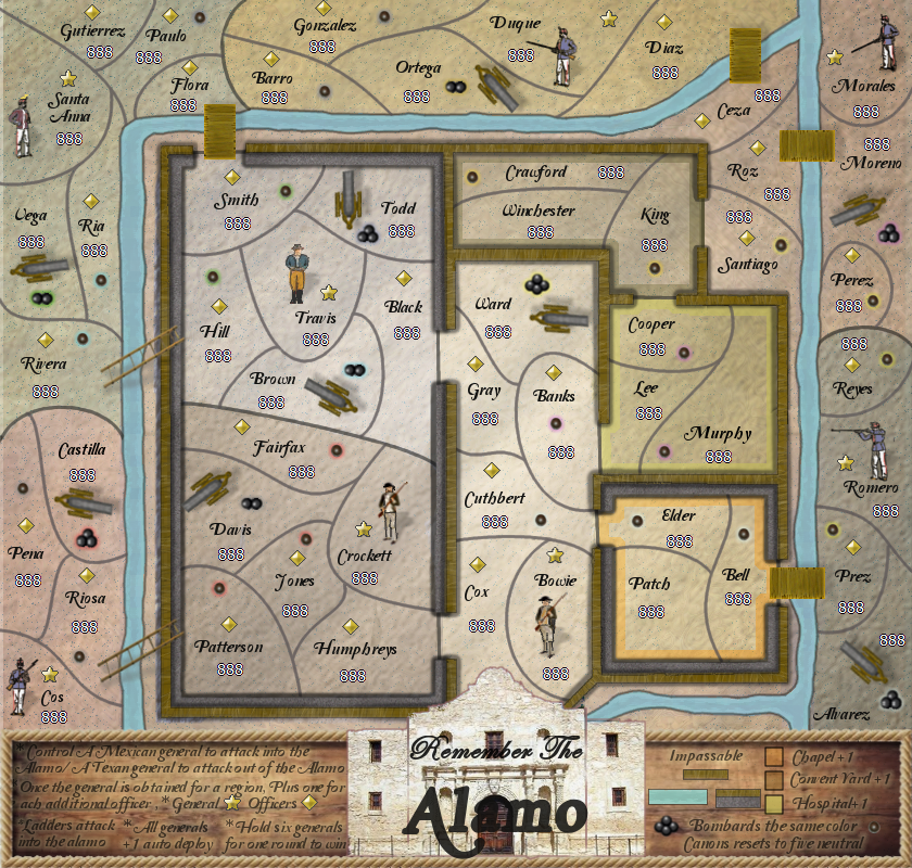
Changed the Alamo facade, Alamo text, Legend background, Bump.
- koontz1973
- Posts: 6960
- Joined: Thu Jan 01, 2009 10:57 am
Re: Alamo map 10/27 (pg 23)
That is a lot better. Also not going to remove the stamp so all is good to carry on with graphics. Makethe title part of the facing. Remove remember and go with alamo only for the map.

Re: Alamo map 10/27 (pg 23)
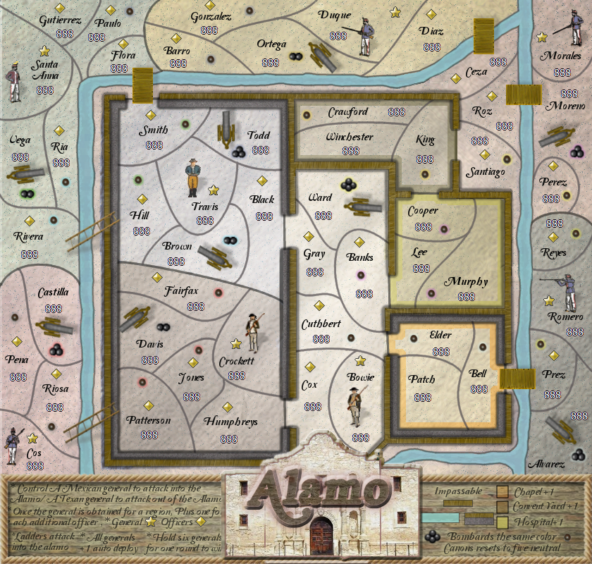
A couple of things that jump out right now:
1. This is more game-play, but Ceza looks like it can also attack Smith. Draw in a border so that it doesn't look like it does.
2. Along the left side, it looks like you don't have a layer positioned correctly, if so it needs to be moved to the left a few pixels.
That's it for now!
1. This is more game-play, but Ceza looks like it can also attack Smith. Draw in a border so that it doesn't look like it does.
2. Along the left side, it looks like you don't have a layer positioned correctly, if so it needs to be moved to the left a few pixels.
That's it for now!
-
generalhead
- Posts: 806
- Joined: Mon Apr 26, 2010 10:09 pm
Re: Alamo map 10/27 (pg 23)
I removed the remember the part but I don't understand what you mean by making the title part of the facing. If you could elaborate that wouldkoontz1973 wrote:That is a lot better. Also not going to remove the stamp so all is good to carry on with graphics. Makethe title part of the facing. Remove remember and go with alamo only for the map.
be awesome. I tried a few other textures in this version for the legend.
The bevel on the facade covered up some of the letters in the legend. The bottom of the bevel needs to be fixed also. I will fix that next version
if it stays.
Last edited by generalhead on Sun Oct 27, 2013 11:47 am, edited 1 time in total.
- koontz1973
- Posts: 6960
- Joined: Thu Jan 01, 2009 10:57 am
Re: Alamo map 10/27 (pg 23)
Use the wood effect you have now but make it a lot smaller so it looks like the name above the door.

-
generalhead
- Posts: 806
- Joined: Mon Apr 26, 2010 10:09 pm
Re: Alamo map 10/27 (pg 23)
10-4 buddy, thanks.koontz1973 wrote:Use the wood effect you have now but make it a lot smaller so it looks like the name above the door.
- koontz1973
- Posts: 6960
- Joined: Thu Jan 01, 2009 10:57 am
- Swimmerdude99
- Posts: 2588
- Joined: Mon Aug 09, 2010 6:07 pm
- Gender: Male
- Location: North Carolina
- Armandolas
- Posts: 1761
- Joined: Fri Jun 06, 2008 6:32 am
- Gender: Male
- Location: Lisbon
Re: Alamo map 10/27 (pg 23)
im finding the legend a bit hard to read, can u darken it a bit please?
-
generalhead
- Posts: 806
- Joined: Mon Apr 26, 2010 10:09 pm
Re: Alamo map 10/27 (pg 23)
koontz1973 wrote:What happened here then? Have you been smoking too much wacko tobacco?
and above the door.
Thanks swimmerdude
On the next draft I will see what I can do buddy.Armandolas wrote:im finding the legend a bit hard to read, can u darken it a bit please?
- koontz1973
- Posts: 6960
- Joined: Thu Jan 01, 2009 10:57 am
Re: Alamo map 10/27 (pg 23)
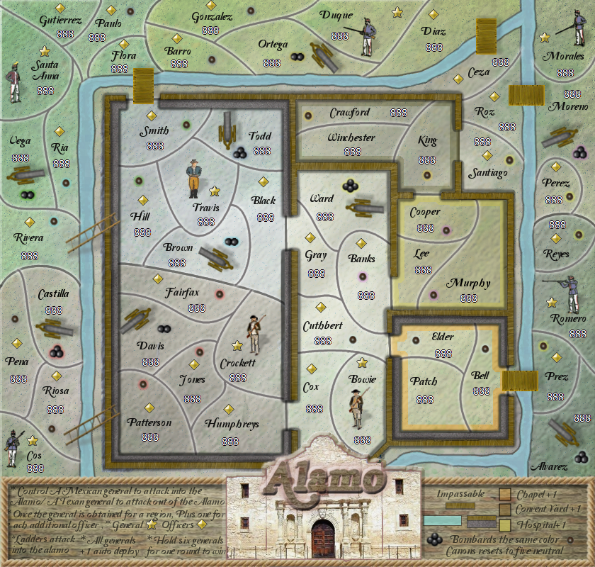
Smaller yes, above the door yes. Make the Alamo name part of the wall as if it is hanging above the door. It should look part of the façade, not on top and blocking it.generalhead wrote:What do you mean. Did you mean to make (Alamo) as the same font as the (remember the) was and use the same effect. I thought you meant just have it smaller
and above the door.
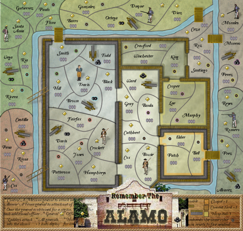
But why has everything gone green and grey?

-
generalhead
- Posts: 806
- Joined: Mon Apr 26, 2010 10:09 pm
Re: Alamo map 10/27 (pg 23)
10-4 on the Alamo name. It is a layer I was trying to make the ground look more natural. I agree it blends everything too much and it will not be in the next draft.koontz1973 wrote:Smaller yes, above the door yes. Make the Alamo name part of the wall as if it is hanging above the door. It should look part of the façade, not on top and blocking it.generalhead wrote:What do you mean. Did you mean to make (Alamo) as the same font as the (remember the) was and use the same effect. I thought you meant just have it smaller
and above the door.
But why has everything gone green and grey?
- RedBaron0
- Posts: 2657
- Joined: Sun Aug 19, 2007 12:59 pm
- Gender: Male
- Location: Pennsylvania
- Contact:
Re: Alamo map 10/30 (pg 24)
I see that couple of pixels on the left side of the map too, the whole left side is either out or alignment, is just missing pixels(wrong size) or you have some sort of bevel added that you didn't think was supposed to be there.
The other thing that pops out at me is what looks to me like a blue snow across the map. It looks kinda like a dissolve effect, and it just doesn't look right to me.
The other thing that pops out at me is what looks to me like a blue snow across the map. It looks kinda like a dissolve effect, and it just doesn't look right to me.


-
generalhead
- Posts: 806
- Joined: Mon Apr 26, 2010 10:09 pm
Re: Alamo map 10/30 (pg 24)
Thanks RB0 for the eyes, I will fix in the next draft.RedBaron0 wrote:I see that couple of pixels on the left side of the map too, the whole left side is either out or alignment, is just missing pixels(wrong size) or you have some sort of bevel added that you didn't think was supposed to be there.
The other thing that pops out at me is what looks to me like a blue snow across the map. It looks kinda like a dissolve effect, and it just doesn't look right to me.
- Wingnut 16ga
- Posts: 139
- Joined: Fri Jan 08, 2010 8:49 am
- Gender: Male
- Location: 1st floor of a 2 story out house
Re: Alamo map 10/30 (pg 24)
Generalhead...this map has come along way from it's humble beginnings. Looking good...can't wait to have a play on it
-
generalhead
- Posts: 806
- Joined: Mon Apr 26, 2010 10:09 pm
Re: Alamo map 10/30 (pg 24)
Thank you my friend.Wingnut 16ga wrote:Generalhead...this map has come along way from it's humble beginnings. Looking good...can't wait to have a play on it

