Conquer Club

Vertex/Austrum [Quenched]

Care to peruse completed maps? Take a stroll through the Atlas.

Moderator: Cartographers

Forum rules
Please read the Community Guidelines before posting.

Vertex/Austrum [Quenched]

Postby koontz1973 on Mon Oct 22, 2012 1:24 am

Image :D Image :D Image :D Image Image Image

Map Name:Coelus: Vertex
Mapmaker(s):koontz1973
Number of Territories:50+
Special Features:TBD
What Makes This Map Worthy of Being Made:Nothing what so ever, but the community decides these things.

Map Image:
http://imageshack.us/a/img594/5528/vertex.png
http://imageshack.us/a/img824/8883/vertexsmall.png
V3.xml
(22.93 KiB) Downloaded 1955 times

show: small 888 map

show: gameplay

show: drafts


----------------------------------------------------------------------------------------------------------------

----------------------------------------------------------------------------------------------------------------

----------------------------------------------------------------------------------------------------------------
Map Name:Coelus: Austrum
Mapmaker(s):koontz1973
Number of Territories:48
Special Features:TBD
What Makes This Map Worthy of Being Made:Nothing what so ever, but the community decides these things.

Click image to enlarge.
image

Image
AU3.xml
(22.63 KiB) Downloaded 1843 times

show: small 888 map


show: gameplay

show: drafts

show: 888 map

[spoiler=CB tests]Deuteranope

Protanope

Tritanope
Last edited by thenobodies80 on Mon Oct 14, 2013 5:32 pm, edited 2 times in total.
Reason: edited your image links or i wasn't able to update your OP. feel free to replace images if you want ;)
Image
User avatar
Lieutenant koontz1973
 
Posts: 6960
Joined: Thu Jan 01, 2009 10:57 am

Re: Vertex [22/10]

Postby generalhead on Mon Oct 22, 2012 6:56 am

Cool looking map!
Sergeant generalhead
 
Posts: 806
Joined: Mon Apr 26, 2010 10:09 pm

Re: Vertex [22/10]

Postby nolefan5311 on Mon Oct 22, 2012 7:35 am

I agree. This looks good.
User avatar
Captain nolefan5311
 
Posts: 1768
Joined: Mon Nov 22, 2010 11:51 am
Location: Florida

Re: Vertex [22/10]

Postby Seamus76 on Mon Oct 22, 2012 8:51 am

Looking good Koontz. Nice and simple with great color combinations. I'll look more into it for some gameplay comments, but I really like where your skills are going. This one has a little Natty feel to it. G-d rest his CC soul.
ImageImageImage
User avatar
Sergeant 1st Class Seamus76
 
Posts: 1574
Joined: Fri Feb 25, 2011 5:41 pm
Location: Atlanta, GA

Re: Vertex [22/10]

Postby koontz1973 on Mon Oct 22, 2012 10:44 am

generalhead wrote:Cool looking map!

nolefan5311 wrote:I agree. This looks good.

Seamus76 wrote:Looking good Koontz. Nice and simple with great color combinations. I'll look more into it for some gameplay comments, but I really like where your skills are going. This one has a little Natty feel to it. G-d rest his CC soul.

Thanks guys, but I think it has more of a Tisha feel to it than natty although it has some of the same design eliments about it that natty had on Eurasia.
Image
User avatar
Lieutenant koontz1973
 
Posts: 6960
Joined: Thu Jan 01, 2009 10:57 am

Re: Vertex [22/10]

Postby AndyDufresne on Mon Oct 22, 2012 1:15 pm

I like this map more so than some of the other ideas you've been kicking around, so hopefully you'll keep on the development path. :D


--Andy
User avatar
Corporal 1st Class AndyDufresne
 
Posts: 24935
Joined: Fri Mar 03, 2006 8:22 pm
Location: A Banana Palm in Zihuatanejo

Re: Vertex [22/10]

Postby sannemanrobinson on Mon Oct 22, 2012 1:38 pm

Looks promising. There will be a lot of starting neutrals to prevent the winning condition to apply in round 2?

I would not mention the minimum amount of troups (3). Instead it is important to mention if the normal territory bonus (4 for 12, 5 for 15, etc) does not count.
Major sannemanrobinson
 
Posts: 255
Joined: Mon Dec 20, 2010 6:35 am

Re: Vertex [22/10]

Postby tkr4lf on Mon Oct 22, 2012 8:08 pm

Very nice, Koontz. I like the look and feel of this one.

And before I get told of by TK for not carrying on with Escape, I am but behind closed doors.

Hahaha, I'll shut up about it. Just knowing you're working on it is good enough for me.
User avatar
Major tkr4lf
 
Posts: 1976
Joined: Thu Nov 06, 2008 11:35 am
Location: St. Louis

Re: Vertex [22/10]

Postby koontz1973 on Mon Oct 22, 2012 10:56 pm

AndyDufresne wrote:I like this map more so than some of the other ideas you've been kicking around, so hopefully you'll keep on the development path. :D


--Andy

That's the thing, I throw a lot of ideas and some stick, some do not.
sannemanrobinson wrote:Looks promising. There will be a lot of starting neutrals to prevent the winning condition to apply in round 2?

I would not mention the minimum amount of troups (3). Instead it is important to mention if the normal territory bonus (4 for 12, 5 for 15, etc) does not count.

Neutrals in the first post now. Forgot to post the neutrals map. There will be no territ bonus. You get you 3 and any land bonus you can and that is it.
Image
User avatar
Lieutenant koontz1973
 
Posts: 6960
Joined: Thu Jan 01, 2009 10:57 am

Re: Vertex [22/10] V2

Postby koontz1973 on Tue Oct 23, 2012 1:03 am

Here is the next version. Not much done to it.

Brought out the glows some more to make it easier to see the different bonus regions.
Added the ships to the sea.
Sorted out placement of names and 888s.
Bridges sorted out.
Spacing of text in the gold circles.
Click image to enlarge.
image


Come on guys, need 3 pages of comments before I can get this moved over for game play. :lol:
Image
User avatar
Lieutenant koontz1973
 
Posts: 6960
Joined: Thu Jan 01, 2009 10:57 am

Re: Vertex [23/10] V2 Page 1

Postby Teflon Kris on Tue Oct 23, 2012 2:04 am

Nice style ;)
User avatar
Sergeant 1st Class Teflon Kris
 
Posts: 4236
Joined: Sun Jul 13, 2008 4:39 pm
Location: Lancashire, United Kingdom

Re: Vertex [23/10] V2 Page 1

Postby AndyDufresne on Tue Oct 23, 2012 1:06 pm

DJ Teflon wrote:Nice style ;)

Mmmhm, I like it because it looks like you, Koontz, have pushed yourself to take on a whole new style, and I like that idea.

For random items:

So you just need to hold any 15 territories plus Arctous?

Those are assault routes that cross the ocean, yes? They almost look like you are dividing up the ocean a la Land and Sea or High Seas. But I like 'em.

The text of the legends, it'd be nice if you could add like a gold outline around the dark text, so if you wanted you could keep the dark and on dark, but add some sort of contrast to help readability, since the text itself is also a bit cryptic for reading already.

Best,


--Andy
User avatar
Corporal 1st Class AndyDufresne
 
Posts: 24935
Joined: Fri Mar 03, 2006 8:22 pm
Location: A Banana Palm in Zihuatanejo

Re: Vertex [23/10] V2 Page 1

Postby koontz1973 on Tue Oct 23, 2012 9:52 pm

DJ Teflon wrote:Nice style ;)

Thanks DJ. I try.
AndyDufresne wrote:Mmmhm, I like it because it looks like you, Koontz, have pushed yourself to take on a whole new style, and I like that idea.

For random items:

So you just need to hold any 15 territories plus Arctous?

Those are assault routes that cross the ocean, yes? They almost look like you are dividing up the ocean a la Land and Sea or High Seas. But I like 'em.

The text of the legends, it'd be nice if you could add like a gold outline around the dark text, so if you wanted you could keep the dark and on dark, but add some sort of contrast to help readability, since the text itself is also a bit cryptic for reading already.

Best,


--Andy

Never realised I had a style, what is it?
So you just need to hold any 15 territories plus Arctous?

Correct, Arctous is the key and has the 10 neutrals on it. It might seem small and easy, but bonuses should be small all through the game. Hold the entire red zone only gives 4. But you need to go through another 3 neutrals to get to the win.
Those are assault routes that cross the ocean, yes? They almost look like you are dividing up the ocean a la Land and Sea or High Seas. But I like 'em.
The text of the legends, it'd be nice if you could add like a gold outline around the dark text, so if you wanted you could keep the dark and on dark, but add some sort of contrast to help readability, since the text itself is also a bit cryptic for reading already.

I do like the sea routes, like most things on the map, subtle. As for the writing, already got a highlight on the text but I like the idea of gold better than mine. Will add today for you.


Thanks again guys. Need more from you lot, but if you like this one wait till the next one.
EDIT: Added the map.
Click image to enlarge.
image
Image
User avatar
Lieutenant koontz1973
 
Posts: 6960
Joined: Thu Jan 01, 2009 10:57 am

Re: Vertex/Austrum [25/10] V2.2 Page 1

Postby koontz1973 on Thu Oct 25, 2012 11:44 am

Vertex.
Made to match Austrum.
Click image to enlarge.
image


Austrum.
Added sea monsters.
Put exploratorum ships into legend so players know them.
Match to Vertex.
Added dragons.
Click image to enlarge.
image
Image
User avatar
Lieutenant koontz1973
 
Posts: 6960
Joined: Thu Jan 01, 2009 10:57 am

Re: Vertex/Austrum [25/10] V2.2 Page 1

Postby sannemanrobinson on Thu Oct 25, 2012 12:17 pm

Austrum is looking at least as good as Vertex I think. If this becomes a series of pole maps then the theme is still a bit weak. Why is the pole so important that it is part of the winning condition? Is there oil/the holy grail?

Also the whale in Austrum is seen from the middle while the mountains and trees are all pointing to the top of the map. Maybe letting the mountains point from the middle to the outside of the circle works.
Major sannemanrobinson
 
Posts: 255
Joined: Mon Dec 20, 2010 6:35 am

Re: Vertex/Austrum [25/10] V2.2 Page 1

Postby koontz1973 on Thu Oct 25, 2012 12:26 pm

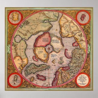
Nice idea about the mountains and trees. Never thought of that. Will add to my list of things to do. The idea has not been one of Poles but one of old maps. Like this

Image

I was starting work on the Umbilicus map (equator) but need to slow down some. When these two are nearly finished I will get that one done but only after these are late in graphics.
Image
User avatar
Lieutenant koontz1973
 
Posts: 6960
Joined: Thu Jan 01, 2009 10:57 am

Re: Vertex/Austrum [25/10] V2.2 Page 1

Postby generalhead on Sat Oct 27, 2012 11:50 pm

Usually on old maps they drew the monsters on the edge of the map in the unexplored territory. I like where you have them though, they look good.
The mountains on Vertex/ It4, It5 look a little strange to me. I don't know why. They are smaller than the rest of the mountains correct. They are non-functional mountains that cross horizontal between the two regions. I don't know. Looking good "boss man".
Sergeant generalhead
 
Posts: 806
Joined: Mon Apr 26, 2010 10:09 pm

Re: Vertex/Austrum [25/10] V2.2 Page 1

Postby koontz1973 on Sun Oct 28, 2012 5:07 am

generalhead wrote:Usually on old maps they drew the monsters on the edge of the map in the unexplored territory. I like where you have them though, they look good.

The monsters are on the map (Austrum) to give it some life and to fill in some of the blanks. They need to be moved into better positions though.
generalhead wrote:The mountains on Vertex/ It4, It5 look a little strange to me. I don't know why. They are smaller than the rest of the mountains correct. They are non-functional mountains that cross horizontal between the two regions. I don't know. Looking good "boss man".

Mountains are being redrawn. Just in the process of doing Madrid today and looking for a mountain I like. I like these ones but feel they are not the best I can do so they will change.
sannemanrobinson wrote:Also the whale in Austrum is seen from the middle while the mountains and trees are all pointing to the top of the map. Maybe letting the mountains point from the middle to the outside of the circle works.

Been fiddling with this idea as I liked it. But when the mountains all pointed out, it looked weird. Changing the mountains today.
Image
User avatar
Lieutenant koontz1973
 
Posts: 6960
Joined: Thu Jan 01, 2009 10:57 am

Re: Vertex/Austrum [25/10] V2.2 Page 1

Postby koontz1973 on Mon Oct 29, 2012 5:50 am

Vertex
New mountains.
Played with territ lines.
Click image to enlarge.
image

--------------------------------------------------------------------------------------------------------------------

--------------------------------------------------------------------------------------------------------------------

--------------------------------------------------------------------------------------------------------------------
Austrum
New mountains.
Played with territ lines.
Click image to enlarge.
image
Image
User avatar
Lieutenant koontz1973
 
Posts: 6960
Joined: Thu Jan 01, 2009 10:57 am

Re: Vertex/Austrum [29/10] V2.3 Page 2

Postby generalhead on Mon Oct 29, 2012 6:21 am

The mountains look way better. The clumps of trees on Vertex/ OrT5, Mt2 might need to be a little thicker. If they looked like the ones on Austrum that would look good. Your heading for the Austrum map says vertex. You the man koontz, looking good.
Sergeant generalhead
 
Posts: 806
Joined: Mon Apr 26, 2010 10:09 pm

Re: Vertex/Austrum [29/10] V2.3 Page 2

Postby nolefan5311 on Mon Oct 29, 2012 8:07 am

I think these are about ready to be moved to the Main Foundry Workshop. What do you think koontz?
User avatar
Captain nolefan5311
 
Posts: 1768
Joined: Mon Nov 22, 2010 11:51 am
Location: Florida

Re: Vertex/Austrum [29/10] V2.3 Page 2

Postby koontz1973 on Mon Oct 29, 2012 8:16 am

generalhead wrote:The mountains look way better. The clumps of trees on Vertex/ OrT5, Mt2 might need to be a little thicker. If they looked like the ones on Austrum that would look good. Your heading for the Austrum map says vertex. You the man koontz, looking good.

Thanks GH, always nice to hear kind words. Will look at the woods later today.
nolefan5311 wrote:I think these are about ready to be moved to the Main Foundry Workshop. What do you think koontz?

Yes, but not yet please. Give it a few more posts (9 to be exact) to see if the community want these ones. ;) But if you want to comment on the game play now, go ahead. :D
Image
User avatar
Lieutenant koontz1973
 
Posts: 6960
Joined: Thu Jan 01, 2009 10:57 am

Re: Vertex/Austrum [29/10] V2.3 Page 2

Postby generalhead on Sat Nov 03, 2012 9:33 am

On Austrum, For Asser Hastile and Sublica, it is hard to tell where one region starts and one ends. Could you highlight the inside of the also. It might not be neccesary because you have the territories labeled, I didn't know if it would help though. in the legend +1 for every three territories, the min 3 means minimum 3 correct. The h in hold for the win condition is a little funky, but it is legible. I wouldn't have know what an exploratorum was if you didn't have the picture there. I am glad it is there. All looks good buddy, the more I look at these maps, the more I want to play!
Image
Sergeant generalhead
 
Posts: 806
Joined: Mon Apr 26, 2010 10:09 pm

Re: Vertex/Austrum [29/10] V2.3 Page 2

Postby sannemanrobinson on Sat Nov 03, 2012 10:17 am

I'm still missing something in both maps, call it a theme or something to relate to. Are there inhabitants on these islands? Some villages and roads like on the Oasis map could show this.
Major sannemanrobinson
 
Posts: 255
Joined: Mon Dec 20, 2010 6:35 am

Re: Vertex/Austrum [29/10] V2.3 Page 2

Postby koontz1973 on Sat Nov 03, 2012 12:50 pm

generalhead wrote:On Austrum, For Asser Hastile and Sublica, it is hard to tell where one region starts and one ends. Could you highlight the inside of the also. It might not be neccesary because you have the territories labeled, I didn't know if it would help though. in the legend +1 for every three territories, the min 3 means minimum 3 correct. The h in hold for the win condition is a little funky, but it is legible. I wouldn't have know what an exploratorum was if you didn't have the picture there. I am glad it is there. All looks good buddy, the more I look at these maps, the more I want to play!
Image


Thanks GH, will look at all points you mentioned tomorrow morning and see what I can do to improve things. The h, inner glows and wording. As you can see, I want the very minimum in the way of wording. The normal territory bonus was not part of the plan. What I wanted to do was to have just a bonus which increased slowly. Again, will have a think.
sannemanrobinson wrote:I'm still missing something in both maps, call it a theme or something to relate to. Are there inhabitants on these islands? Some villages and roads like on the Oasis map could show this.

I will look at putting in some settlements like the mountains and forests, but will not make them part of the game play. That will bring the life you are looking for.
Image
User avatar
Lieutenant koontz1973
 
Posts: 6960
Joined: Thu Jan 01, 2009 10:57 am

Next

Return to The Atlas

Who is online

Users browsing this forum: No registered users