[Vacation until Dec] Clash of Kings - [14.03.14] - V18.1
Moderator: Cartographers
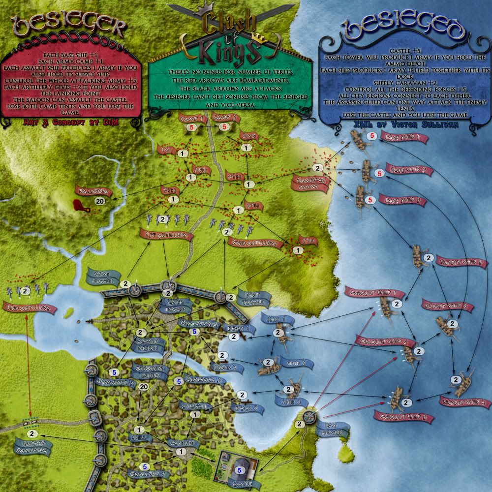
Re: Clash of Kings [09.Jan.12] - 1v1 map - V7 - p1&7
It looks like everything is clear on both maps, so here is your whatcha-ma-call-it!!


-
 isaiah40
- Posts: 3990
- Joined: Mon Aug 27, 2007 7:14 pm


Re: Clash of Kings [09.Jan.12] - 1v1 map - V7 - p1&7
bryguy wrote:Looks great, only one small thing I can think of at this time: The docks seem to "float" above everything. They don't seem to blend in with the ground or the water at all
i'll see what i can do about it. i think it's just a matter of adjusting the drop shadow.
“In the beginning God said, the four-dimensional divergence of an antisymmetric, second rank tensor equals zero, and there was light, and it was good. And on the seventh day he rested.”- Michio Kaku
-

 DiM
DiM
- Posts: 10415
- Joined: Wed Feb 14, 2007 6:20 pm
- Location: making maps for scooby snacks


Re: Clash of Kings [09.Jan.12] - 1v1 map - V7 - p1&7
isaiah40 wrote:It looks like everything is clear on both maps, so here is your whatcha-ma-call-it!!
woohoo
now i just need to get myself one of those nifty draft stamps
“In the beginning God said, the four-dimensional divergence of an antisymmetric, second rank tensor equals zero, and there was light, and it was good. And on the seventh day he rested.”- Michio Kaku
-

 DiM
DiM
- Posts: 10415
- Joined: Wed Feb 14, 2007 6:20 pm
- Location: making maps for scooby snacks


Re: Clash of Kings [09.Jan.12] - 1v1 map - V7 - p1&7
DiM wrote:isaiah40 wrote:It looks like everything is clear on both maps, so here is your whatcha-ma-call-it!!
woohoo
now i just need to get myself one of those nifty draft stamps
Talk to the Bison or Helix!
-
 isaiah40
- Posts: 3990
- Joined: Mon Aug 27, 2007 7:14 pm


Re: Clash of Kings [09.Jan.12] - 1v1 map - V7 - p1&7
cca 2/3 of my comments got lost with some network difficulties (and a restart of my computer). Didn't realise.
Basically, I was outlining how you could make the map more compact while taking the proportions slightly down. Which I generally think is desirable for its convenience.. I'll try to repeat some of those I remember:
-> you could save vertically on putting two siege armies between the attacker cannons and the city walls. Artillery would, gameplay wise, have connections of current 5th and 6th armies. One line of attacking armies saved & more drama under the walls. (you could then choose to slightly alter the gameplay to make more logical sense, but it's not necessary)
-> you could save horizonal space by making the ships attack line thinner and rather more vertically spread. Eg. current assault ship 3 could almost be on the level of the castle. Then you coudl change bay tower to bay artillery battery alongside the coastline, so it would still make graphically some sort of sense.
-> what I meant by suggesting to move some armies to the lake was not adding more armies (wonder how much they'd be used? - I'm now thinking about All Your Base when in 1vs1 the majority of territories in the majority of games are simply irrelevant), but rather using the current ones slightly differently to save up the space.
I had some other suggestions and will bring them here when I remember.
-
 J_Indr
- Posts: 177
- Joined: Mon Aug 30, 2010 5:24 am


Re: Clash of Kings [09.Jan.12] - 1v1 map - V7 - p1&7
Let's give this one some ink:


Sketchblog [Update 07/25/11]: http://indyhelixsketch.blogspot.com/
Living in Japan [Update 07/17/11]: http://mirrorcountryih.blogspot.com/
Russian Revolution map for ConquerClub [07/20/11]: viewtopic.php?f=241&t=116575
Living in Japan [Update 07/17/11]: http://mirrorcountryih.blogspot.com/
Russian Revolution map for ConquerClub [07/20/11]: viewtopic.php?f=241&t=116575
-

 Industrial Helix
- Posts: 3462
- Joined: Mon Jul 14, 2008 6:49 pm
- Location: Ohio


Re: Clash of Kings [09.Jan.12] - 1v1 map - V7 - p1&7
cool, thanks.
“In the beginning God said, the four-dimensional divergence of an antisymmetric, second rank tensor equals zero, and there was light, and it was good. And on the seventh day he rested.”- Michio Kaku
-

 DiM
DiM
- Posts: 10415
- Joined: Wed Feb 14, 2007 6:20 pm
- Location: making maps for scooby snacks


Re: Clash of Kings [09.Jan.12] - 1v1 map - V7 - p1&7
so, gameplay-wise, what are the issues?
are the routes ok? the bonuses? is it fairly balanced?
are the routes ok? the bonuses? is it fairly balanced?
“In the beginning God said, the four-dimensional divergence of an antisymmetric, second rank tensor equals zero, and there was light, and it was good. And on the seventh day he rested.”- Michio Kaku
-

 DiM
DiM
- Posts: 10415
- Joined: Wed Feb 14, 2007 6:20 pm
- Location: making maps for scooby snacks


Re: Clash of Kings [09.Jan.12] - 1v1 map - V7 - p1&7
I think things look good, but I don't play that much 1v1 so I'm not the best to make the assessment...

-

 natty dread
- Posts: 12877
- Joined: Fri Feb 08, 2008 8:58 pm
- Location: just plain fucked


Re: Clash of Kings [09.Jan.12] - 1v1 map - V7 - p1&7
Hi DiM!
First of all - this looks really amazing! The graphic-style is definitely something special/unique and, from what I have seen through browsing the site so far, will make this map stand out for sure.
The arrow-system is very easy to understand and negotiate.
The detail on the map is outstanding!
The ships look amazing.
The textures on the map work so well and compliment the theme, and the overall feel is fantastic because of this!
The "Besiege" and "Besieger" title fonts are good - apart form the initial "b"s - would you be interested in shaping them up a little? I think if just the left-side of the character was made into more of a straight line, it would be clearer. However, I can see that the graphic style of the title/title holders are quite curvature and flowing, therefore straightening out one side may contradict this... maybe if it was straightened to an extent (so it was less symmetrical), and the ascender was taken a tad higher, while retaining the curve? What do you think?
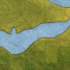
The blue labels on the map are a little hard to read too - partly because of the busy background, and partly because they're of the same brightness and value to the background. You can see what I mean more here when the colour of that portion of the map is withdrawn:

I know that you requested in the post above to have some gameplay discussion, but I don't feel that so far I know enough about gameplay in general to comment! I hope you don't mind this post - I suppose you could interlink some small graphical issues such as legibility to gameplay!?
Nesoi
First of all - this looks really amazing! The graphic-style is definitely something special/unique and, from what I have seen through browsing the site so far, will make this map stand out for sure.
The arrow-system is very easy to understand and negotiate.
The detail on the map is outstanding!
The ships look amazing.
The textures on the map work so well and compliment the theme, and the overall feel is fantastic because of this!
The "Besiege" and "Besieger" title fonts are good - apart form the initial "b"s - would you be interested in shaping them up a little? I think if just the left-side of the character was made into more of a straight line, it would be clearer. However, I can see that the graphic style of the title/title holders are quite curvature and flowing, therefore straightening out one side may contradict this... maybe if it was straightened to an extent (so it was less symmetrical), and the ascender was taken a tad higher, while retaining the curve? What do you think?
The blue labels on the map are a little hard to read too - partly because of the busy background, and partly because they're of the same brightness and value to the background. You can see what I mean more here when the colour of that portion of the map is withdrawn:

I know that you requested in the post above to have some gameplay discussion, but I don't feel that so far I know enough about gameplay in general to comment! I hope you don't mind this post - I suppose you could interlink some small graphical issues such as legibility to gameplay!?
Nesoi
-
 Nesoi
Nesoi
- Posts: 13
- Joined: Thu Dec 08, 2011 9:25 am
Re: Clash of Kings [09.Jan.12] - 1v1 map - V7 - p1&7
hi nesoi and welcome to the foundry. a very good post to start your foundry adventure indeed.
thanks for the appreciation and all the comments.
as for your concerns, i will try to tweak the Bs in the titles and make them clearer.
also, i know the terit names are kinda difficult to read and i will try to come up with a solution in the next few days
thanks for the appreciation and all the comments.
as for your concerns, i will try to tweak the Bs in the titles and make them clearer.
also, i know the terit names are kinda difficult to read and i will try to come up with a solution in the next few days
“In the beginning God said, the four-dimensional divergence of an antisymmetric, second rank tensor equals zero, and there was light, and it was good. And on the seventh day he rested.”- Michio Kaku
-

 DiM
DiM
- Posts: 10415
- Joined: Wed Feb 14, 2007 6:20 pm
- Location: making maps for scooby snacks


Re: Clash of Kings [09.Jan.12] - 1v1 map - V7 - p1&7
I think you could change blue to something close to cyan, or between cyan and green. It would complement the red well, cyan & red being complementary colours.

-

 natty dread
- Posts: 12877
- Joined: Fri Feb 08, 2008 8:58 pm
- Location: just plain fucked


Re: Clash of Kings [09.Jan.12] - 1v1 map - V7 - p1&7
the labels should be perfectly legible now.
V8:
*made besieger and besieged taller
*added banner as terit labels.
V8:
*made besieger and besieged taller
*added banner as terit labels.
“In the beginning God said, the four-dimensional divergence of an antisymmetric, second rank tensor equals zero, and there was light, and it was good. And on the seventh day he rested.”- Michio Kaku
-

 DiM
DiM
- Posts: 10415
- Joined: Wed Feb 14, 2007 6:20 pm
- Location: making maps for scooby snacks


Re: Clash of Kings [16.Jan.12] - 1v1 map - V8 - p1&8
Those changes are fantastic. Everything is perfectly legible now!
Nesoi
Nesoi
-

 Nesoi
Nesoi
- Posts: 13
- Joined: Thu Dec 08, 2011 9:25 am
Re: Clash of Kings [16.Jan.12] - 1v1 map - V8 - p1&8
I think those two-line names should be on a single thick flag. The doubling of flags doesn't look nice.
-
 J_Indr
- Posts: 177
- Joined: Mon Aug 30, 2010 5:24 am


Re: Clash of Kings [16.Jan.12] - 1v1 map - V8 - p1&8
DiM, great looking as always. Just want to double J_Indrs request to having a larger banner for the double line names. Just wondering, will you be curving the text with the banner? Can we get some red and blue dots (sorry, men) in and around the artillery guns. They look a little lonely without anyone firing them. Mainly the 3rd artillery.
Game play. I really have nothing to add apart from why is the balloon at 20 neutrals. I see it attacks the castle but to me it would make more sense to be able to attack any territ apart from the castle. It is the furthest territ away from the balloon and I am sure the blues will see this large bloody balloon floating and try to shot it down. It would always make more sense to use the ships to attack the castle as there are less neutrals to go through. Just a thought I had when looking.
Game play. I really have nothing to add apart from why is the balloon at 20 neutrals. I see it attacks the castle but to me it would make more sense to be able to attack any territ apart from the castle. It is the furthest territ away from the balloon and I am sure the blues will see this large bloody balloon floating and try to shot it down. It would always make more sense to use the ships to attack the castle as there are less neutrals to go through. Just a thought I had when looking.

-

 koontz1973
- Posts: 6960
- Joined: Thu Jan 01, 2009 10:57 am


Re: Clash of Kings [16.Jan.12] - 1v1 map - V8 - p1&8
koontz1973 wrote:DiM, great looking as always. Just want to double J_Indrs request to having a larger banner for the double line names. Just wondering, will you be curving the text with the banner?
yes i will curve the text to fit the banners. i didn't do it because i wanted to get a general feel about the banners before. it seems they are liked so they'll stay so i'll curve the text.
koontz1973 wrote:Can we get some red and blue dots (sorry, men) in and around the artillery guns. They look a little lonely without anyone firing them. Mainly the 3rd artillery.
yep sure.
koontz1973 wrote:Game play. I really have nothing to add apart from why is the balloon at 20 neutrals. I see it attacks the castle but to me it would make more sense to be able to attack any territ apart from the castle. It is the furthest territ away from the balloon and I am sure the blues will see this large bloody balloon floating and try to shot it down. It would always make more sense to use the ships to attack the castle as there are less neutrals to go through. Just a thought I had when looking.
the balloon has 20 neutrals cause it can attack the castle. if you lose the castle you lose the game so it is important to have 20 neutrals there to avoid round 1 eliminations. same as the assassin guild
“In the beginning God said, the four-dimensional divergence of an antisymmetric, second rank tensor equals zero, and there was light, and it was good. And on the seventh day he rested.”- Michio Kaku
-

 DiM
DiM
- Posts: 10415
- Joined: Wed Feb 14, 2007 6:20 pm
- Location: making maps for scooby snacks


Re: Clash of Kings [16.Jan.12] - 1v1 map - V8 - p1&8
DiM wrote:the balloon has 20 neutrals cause it can attack the castle. if you lose the castle you lose the game so it is important to have 20 neutrals there to avoid round 1 eliminations. same as the assassin guild
Thanks for that clarification. Not your fault, mine for not reading all of the legend. Blue starts with 2 lots of 5 troops next to the assassins guild, and the 5 from the castle, with a 5 drop coming, that is 22 neutrals against 20 troops. You are good at the math of lucky dice.

-

 koontz1973
- Posts: 6960
- Joined: Thu Jan 01, 2009 10:57 am


Re: Clash of Kings [16.Jan.12] - 1v1 map - V8 - p1&8
koontz1973 wrote:DiM wrote:the balloon has 20 neutrals cause it can attack the castle. if you lose the castle you lose the game so it is important to have 20 neutrals there to avoid round 1 eliminations. same as the assassin guild
Thanks for that clarification. Not your fault, mine for not reading all of the legend. Blue starts with 2 lots of 5 troops next to the assassins guild, and the 5 from the castle, with a 5 drop coming, that is 22 neutrals against 20 troops. You are good at the math of lucky dice.Red has to get through 2 singles and can only attack with one lot of troops. This seems to advantage blue. If you move assassins guild, maybe south of the caravan then you solve this and give some similarity to both sides.
the solution is simpler than moving the assassin outside. i'll just cut the connections from assassin to to quarter 3 and quarter 2 and leave it only connecting to the mill. then the situation will be the same as in the red camp.
however i will up the neutrals from 20 to 25 or maybe 30. i'll crunch some numbers to see if there;s room for exploit in manual deployment.
koontz1973 wrote:Also, why would a city want assassins inside its walls?
any good king has his own band of assassins and he keeps them close not outside the city walls.
“In the beginning God said, the four-dimensional divergence of an antisymmetric, second rank tensor equals zero, and there was light, and it was good. And on the seventh day he rested.”- Michio Kaku
-

 DiM
DiM
- Posts: 10415
- Joined: Wed Feb 14, 2007 6:20 pm
- Location: making maps for scooby snacks


Re: Clash of Kings [16.Jan.12] - 1v1 map - V8 - p1&8
DiM wrote:koontz1973 wrote:Also, why would a city want assassins inside its walls?
any good king has his own band of assassins and he keeps them close not outside the city walls.
Lets hope your king is no relation to Caesar.
Infamy, infamy, they have all got it in for me. Love that from the carry on films.
Great work DiM.

-

 koontz1973
- Posts: 6960
- Joined: Thu Jan 01, 2009 10:57 am


Re: Clash of Kings [16.Jan.12] - 1v1 map - V8 - p1&8
The banners look great. You might want to tweak some arrows once you've settled on the banners, as some overlap awkwardly (particularly Supply Caravan and various ships)
-

 lostatlimbo
- Posts: 1386
- Joined: Wed Mar 28, 2007 3:56 pm
- Location: Portland, OR


Re: Clash of Kings [16.Jan.12] - 1v1 map - V8 - p1&8
lostatlimbo wrote:The banners look great. You might want to tweak some arrows once you've settled on the banners, as some overlap awkwardly (particularly Supply Caravan and various ships)
yep, i know. i'll also have to bend the text to follow the curve of the banners.
“In the beginning God said, the four-dimensional divergence of an antisymmetric, second rank tensor equals zero, and there was light, and it was good. And on the seventh day he rested.”- Michio Kaku
-

 DiM
DiM
- Posts: 10415
- Joined: Wed Feb 14, 2007 6:20 pm
- Location: making maps for scooby snacks


Re: Clash of Kings [16.Jan.12] - 1v1 map - V8 - p1&8
V9:
*added men near the 3rd artillery
*curved the terit names
*moved and adjusted arrows
*removed connections from assassin to quarter 3 and quarter 2
*changed the text colour to grey to be easier on the eyes.
*added men near the 3rd artillery
*curved the terit names
*moved and adjusted arrows
*removed connections from assassin to quarter 3 and quarter 2
*changed the text colour to grey to be easier on the eyes.
Last edited by DiM on Mon Jan 30, 2012 6:21 am, edited 1 time in total.
“In the beginning God said, the four-dimensional divergence of an antisymmetric, second rank tensor equals zero, and there was light, and it was good. And on the seventh day he rested.”- Michio Kaku
-

 DiM
DiM
- Posts: 10415
- Joined: Wed Feb 14, 2007 6:20 pm
- Location: making maps for scooby snacks


Re: Clash of Kings [25.Jan.12] - 1v1 map - V9 - p1&9
changed the text colour to grey to be easier on the eyes
Opposite effect for me. Less clear now.
-

 BadgerJelly
- Posts: 180
- Joined: Wed Dec 08, 2010 2:51 pm
Re: Clash of Kings [25.Jan.12] - 1v1 map - V9 - p1&9
BadgerJelly wrote:changed the text colour to grey to be easier on the eyes
Opposite effect for me. Less clear now.
Maybe a touch more white than gray, but I think overall this is the right idea.
--Andy
-

 AndyDufresne
- Posts: 24935
- Joined: Fri Mar 03, 2006 8:22 pm
- Location: A Banana Palm in Zihuatanejo


Who is online
Users browsing this forum: No registered users


