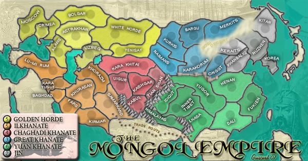
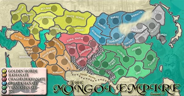
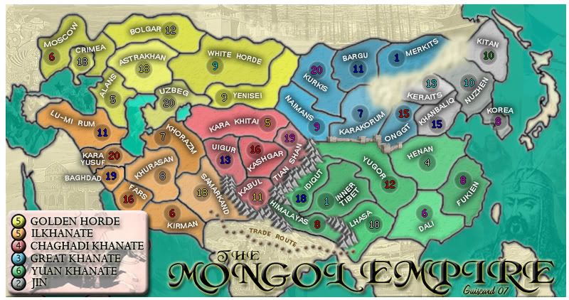
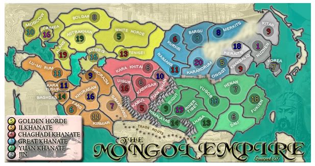
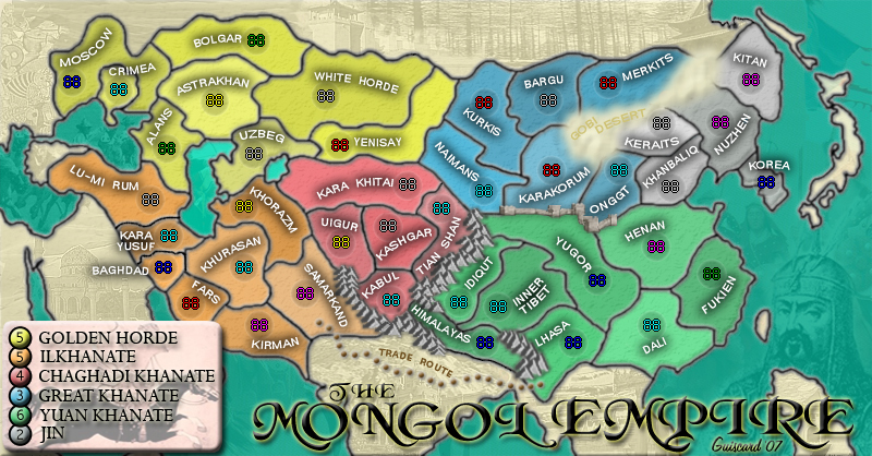
Legend. Whenever you can really. Don't feel pressured to get it sorted.johloh wrote:guiscard, all i need is what youve posted...
I'll have the xml done sometime tonight when I get back home...
Mongol Empire Map [Quenched]
Moderator: Cartographers
Forum rules
Please read the Community Guidelines before posting.
- Guiscard
- Posts: 4103
- Joined: Fri Dec 08, 2006 7:27 pm
- Location: In the bar... With my head on the bar
qwert wrote:Can i ask you something?What is porpose for you to open these Political topic in ConquerClub? Why you mix politic with Risk? Why you not open topic like HOT AND SEXY,or something like that.
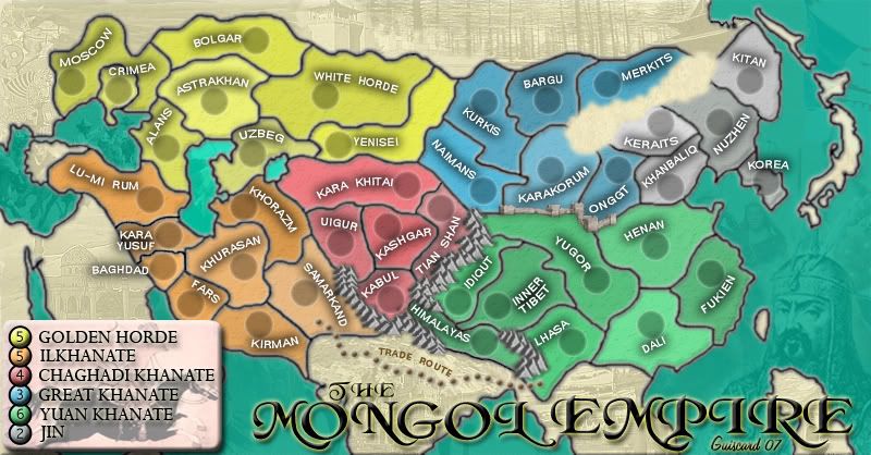
I really do like this map, still one of my favourites in development. It's been a while since I took a really good look at it though.
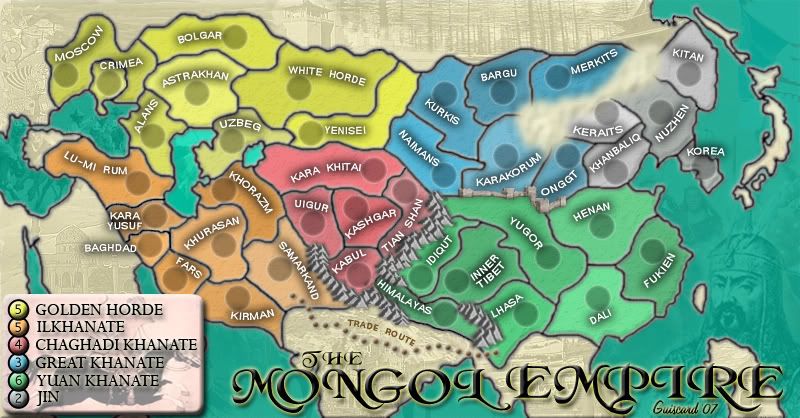
I think I prefered the old Gobi Desert with the border around it. Maybe try a combination of the two? I'm not sure, but the new desert isn't sitting well with me.
Could you perhaps make Baghdad, Crimea, Fars and Idiqut territories a little bit bigger and give your army shadows some more room? Also, maybe rework the Southern Kara Khitai border a little so Tian Shan has more room also.
There's a few odd pixels on your Onggt/Henan border next to the wall.
There's something weird going on with your mountains in the corner of Samarkand.
Perhaps move the legend into the corner a bit more or chop off a few pixels from that edge of your map. I don't really see a need for the space that's there.
I think I prefered the old Gobi Desert with the border around it. Maybe try a combination of the two? I'm not sure, but the new desert isn't sitting well with me.
Could you perhaps make Baghdad, Crimea, Fars and Idiqut territories a little bit bigger and give your army shadows some more room? Also, maybe rework the Southern Kara Khitai border a little so Tian Shan has more room also.
There's a few odd pixels on your Onggt/Henan border next to the wall.
There's something weird going on with your mountains in the corner of Samarkand.
Perhaps move the legend into the corner a bit more or chop off a few pixels from that edge of your map. I don't really see a need for the space that's there.
- Guiscard
- Posts: 4103
- Joined: Fri Dec 08, 2006 7:27 pm
- Location: In the bar... With my head on the bar
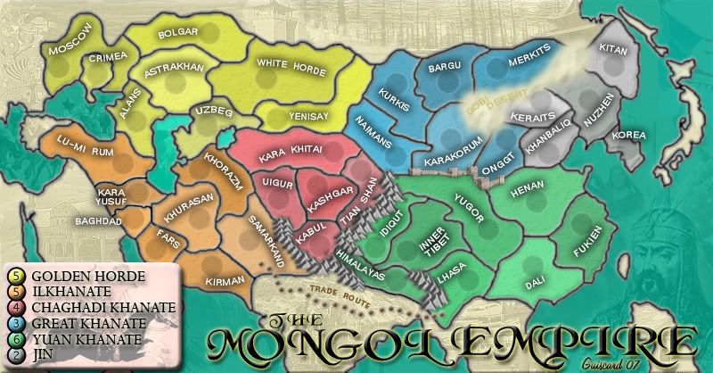
Ok update time:
*Shifted around the borders to give the army circles room.
*Got rid of strap pixels.
*Sorted out the mountains.
*Darkened the desert slightly - Keyogi I do think this is a major improvement from the old version, and it seems to have satisfied most people... I did try adding a yellow border and the black but it really didn't work at all because of the fade.
Sorry Johloh, the army circles Keyogi mentioned have been moved slightly. I also changed the Himalayas slightly too.


*Shifted around the borders to give the army circles room.
*Got rid of strap pixels.
*Sorted out the mountains.
*Darkened the desert slightly - Keyogi I do think this is a major improvement from the old version, and it seems to have satisfied most people... I did try adding a yellow border and the black but it really didn't work at all because of the fade.
Sorry Johloh, the army circles Keyogi mentioned have been moved slightly. I also changed the Himalayas slightly too.


qwert wrote:Can i ask you something?What is porpose for you to open these Political topic in ConquerClub? Why you mix politic with Risk? Why you not open topic like HOT AND SEXY,or something like that.
my new site - http://www.spritestitch.com/ - A video game craft weblog...
- Ruben Cassar
- Posts: 2160
- Joined: Thu Nov 16, 2006 6:04 am
- Gender: Male
- Location: Civitas Invicta, Melita, Evropa
- AndyDufresne
- Posts: 24919
- Joined: Fri Mar 03, 2006 8:22 pm
- Location: A Banana Palm in Zihuatanejo
- Contact:
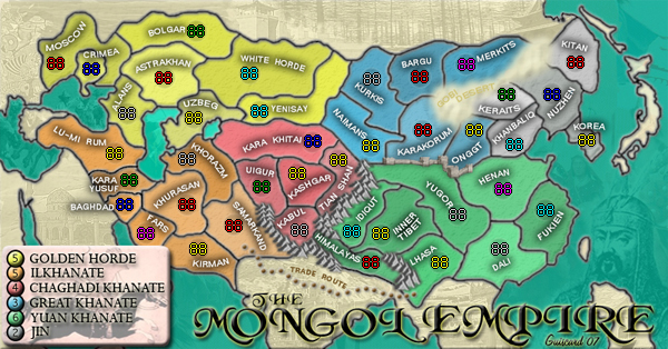
In the San Fran. map thread I spoke of increasing the army shadow size in the small map, and I think you should do the same. Right now they barely hold the coordinates, but the large is fine.
I'd also suggest upping the font size, but unfortunately there doesn't seem to be a lot of room to do this on the small map. But I'd surely try and experiment with any sort size increase you can muster. Perhaps even look into making the names a little less 'dull', so they will be easier to read on the small map.
--Andy
I'd also suggest upping the font size, but unfortunately there doesn't seem to be a lot of room to do this on the small map. But I'd surely try and experiment with any sort size increase you can muster. Perhaps even look into making the names a little less 'dull', so they will be easier to read on the small map.
--Andy
- Ruben Cassar
- Posts: 2160
- Joined: Thu Nov 16, 2006 6:04 am
- Gender: Male
- Location: Civitas Invicta, Melita, Evropa
I believe, looking at it one map has been shrunk or inlarged from the other, this is fine for everything apart from the circles as the numbers stay the same size so the circles have to be done seperately for each map.AndyDufresne wrote:In the San Fran. map thread I spoke of increasing the army shadow size in the small map, and I think you should do the same. Right now they barely hold the coordinates, but the large is fine.
--Andy
The desert stays in my opinion
- Guiscard
- Posts: 4103
- Joined: Fri Dec 08, 2006 7:27 pm
- Location: In the bar... With my head on the bar
The desert is an impassable, and to be honest I think we've got the optimum style for it now. I've tried everything I can think of to make it more like the mountains, but I can't make any improvement. If anyone's got any specific ideas I'd be happy to have a go but for now there's no improvement I can make on such general terms.hulmey wrote:can u et rid of the desert???
lets see what it looks like without the desert pls?
Cheers for the code, Johloh. I'll give you a little credit somewhere.
Updates to come:
*Yenisei (sorry ruben I did forget
*Small army circles enlarged.
*Circles darkened slightly on both.
*I'm gonna get rid of the desert text as its unreadable on the small map and it wouldn't fit at any bigger font size.
*I'll have a go at brightening the text but its pure white as it is, maybe a larger font will help on the small map at least.
qwert wrote:Can i ask you something?What is porpose for you to open these Political topic in ConquerClub? Why you mix politic with Risk? Why you not open topic like HOT AND SEXY,or something like that.
- Guiscard
- Posts: 4103
- Joined: Fri Dec 08, 2006 7:27 pm
- Location: In the bar... With my head on the bar
Actually I do have a question about photoshop that hopefully someone could answer... So far the small maps have simply been a direct scale down of the jpeg.
Now I want to scale the whole image down with layers and allto edit the army circles and text, and have tried, but it doesn't scale down the effects, which leaves large borders around things (as they stay at 3px). How can I scale down the whole map, including the effects such as strokes, whilst maintaining layers and being able to edit them?
qwert wrote:Can i ask you something?What is porpose for you to open these Political topic in ConquerClub? Why you mix politic with Risk? Why you not open topic like HOT AND SEXY,or something like that.
- steve monkey
- Posts: 490
- Joined: Sat May 13, 2006 5:25 pm
- Location: London
great work with the map guiscard
i have not checked it out in a long time, but i was here in the beginning and i like the way it has developed. great to see that you finally got the wall right
i can agree that the desert is the only thing that doesn't really fit in to the 3d kind of look you've got there, but i can see that it would be hard to change - you can't really make a desert 3d, can you?
keep up the good work, sorry i can't help you with photoshop issues
i have not checked it out in a long time, but i was here in the beginning and i like the way it has developed. great to see that you finally got the wall right
i can agree that the desert is the only thing that doesn't really fit in to the 3d kind of look you've got there, but i can see that it would be hard to change - you can't really make a desert 3d, can you?
keep up the good work, sorry i can't help you with photoshop issues
- Guiscard
- Posts: 4103
- Joined: Fri Dec 08, 2006 7:27 pm
- Location: In the bar... With my head on the bar
Wow nearly dropped off the first page...
OK Update time:
*YeniSEI
*Small army circles enlarged.
*Circles darkened slightly on both.
*Got rid of the desert text
*Brightened the small map text


I honestly don't think the desert can be improved at this stage. Lowering the blur at all makes it look like a marshmallow plonked on the map. it either has to be pretty blurred, like present (the effect is more sandy) or like a solid block as it was before, which met with much more disapproval.
OK Update time:
*YeniSEI
*Small army circles enlarged.
*Circles darkened slightly on both.
*Got rid of the desert text
*Brightened the small map text


I honestly don't think the desert can be improved at this stage. Lowering the blur at all makes it look like a marshmallow plonked on the map. it either has to be pretty blurred, like present (the effect is more sandy) or like a solid block as it was before, which met with much more disapproval.
qwert wrote:Can i ask you something?What is porpose for you to open these Political topic in ConquerClub? Why you mix politic with Risk? Why you not open topic like HOT AND SEXY,or something like that.
Hate to say it, but the desert still looks absolutely terrible. (Boy, that sounds harsh...
) Did you try the thing wisse worked out back on page... 25, was it? That looked decent, if you made it a bit more two dimensional. I'm going to have to read the thread thoroughly, but it almost seems to me like the desert needs to be sharp, not blurred, to go with the rest of the effects, and it needs to be two-dimensional - part of the problem is that nothing so far has looked flat enough for a desert. Maybe use a picture of actual sand?
I'll read the rest of the thread and add comments later.
- Ruben Cassar
- Posts: 2160
- Joined: Thu Nov 16, 2006 6:04 am
- Gender: Male
- Location: Civitas Invicta, Melita, Evropa
- Guiscard
- Posts: 4103
- Joined: Fri Dec 08, 2006 7:27 pm
- Location: In the bar... With my head on the bar
I did as well, but I feel I ought to have a go, at least to give some comparison. If a fair few like this version I might consider going all Qwert-like and putting up a poll with the two options. Does seem to be a reasonably even split in opinion. I'll give it a few days though.Ruben Cassar wrote:Guiscard I much prefer the previous version of the desert. It had a real desert look and I don't know why people were complaining. I vote you use the older version.
qwert wrote:Can i ask you something?What is porpose for you to open these Political topic in ConquerClub? Why you mix politic with Risk? Why you not open topic like HOT AND SEXY,or something like that.