johloh wrote:guiscard, all i need is what youve posted...
I'll have the xml done sometime tonight when I get back home...
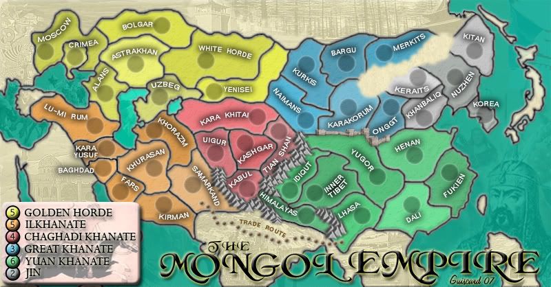
Legend. Whenever you can really. Don't feel pressured to get it sorted.
Moderator: Cartographers
![]() by Guiscard on Sun Apr 08, 2007 6:03 pm
by Guiscard on Sun Apr 08, 2007 6:03 pm
johloh wrote:guiscard, all i need is what youve posted...
I'll have the xml done sometime tonight when I get back home...
qwert wrote:Can i ask you something?What is porpose for you to open these Political topic in ConquerClub? Why you mix politic with Risk? Why you not open topic like HOT AND SEXY,or something like that.


![]() by KEYOGI on Sun Apr 08, 2007 9:10 pm
by KEYOGI on Sun Apr 08, 2007 9:10 pm


![]() by Guiscard on Mon Apr 09, 2007 9:14 am
by Guiscard on Mon Apr 09, 2007 9:14 am
qwert wrote:Can i ask you something?What is porpose for you to open these Political topic in ConquerClub? Why you mix politic with Risk? Why you not open topic like HOT AND SEXY,or something like that.
![]() by Guiscard on Mon Apr 09, 2007 9:15 am
by Guiscard on Mon Apr 09, 2007 9:15 am
qwert wrote:Can i ask you something?What is porpose for you to open these Political topic in ConquerClub? Why you mix politic with Risk? Why you not open topic like HOT AND SEXY,or something like that.
![]() by johloh on Mon Apr 09, 2007 11:37 am
by johloh on Mon Apr 09, 2007 11:37 am


![]() by DiM on Mon Apr 09, 2007 5:34 pm
by DiM on Mon Apr 09, 2007 5:34 pm


![]() by AndyDufresne on Mon Apr 09, 2007 6:22 pm
by AndyDufresne on Mon Apr 09, 2007 6:22 pm


![]() by Ruben Cassar on Tue Apr 10, 2007 3:44 am
by Ruben Cassar on Tue Apr 10, 2007 3:44 am
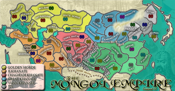
hulmey wrote:can u et rid of the desert???
lets see what it looks like without the desert pls?


![]() by boberz on Tue Apr 10, 2007 4:59 am
by boberz on Tue Apr 10, 2007 4:59 am
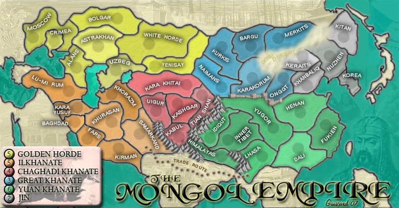
AndyDufresne wrote:In the San Fran. map thread I spoke of increasing the army shadow size in the small map, and I think you should do the same. Right now they barely hold the coordinates, but the large is fine.
--Andy


![]() by Guiscard on Tue Apr 10, 2007 8:10 am
by Guiscard on Tue Apr 10, 2007 8:10 am
hulmey wrote:can u et rid of the desert???
lets see what it looks like without the desert pls?
qwert wrote:Can i ask you something?What is porpose for you to open these Political topic in ConquerClub? Why you mix politic with Risk? Why you not open topic like HOT AND SEXY,or something like that.
![]() by Guiscard on Tue Apr 10, 2007 8:16 am
by Guiscard on Tue Apr 10, 2007 8:16 am
qwert wrote:Can i ask you something?What is porpose for you to open these Political topic in ConquerClub? Why you mix politic with Risk? Why you not open topic like HOT AND SEXY,or something like that.
![]() by steve monkey on Tue Apr 10, 2007 9:01 am
by steve monkey on Tue Apr 10, 2007 9:01 am


![]() by glee on Tue Apr 10, 2007 9:43 am
by glee on Tue Apr 10, 2007 9:43 am
![]() by Guiscard on Thu Apr 12, 2007 7:53 am
by Guiscard on Thu Apr 12, 2007 7:53 am
qwert wrote:Can i ask you something?What is porpose for you to open these Political topic in ConquerClub? Why you mix politic with Risk? Why you not open topic like HOT AND SEXY,or something like that.
![]() by Nikolai on Thu Apr 12, 2007 8:30 am
by Nikolai on Thu Apr 12, 2007 8:30 am

![]() by Guiscard on Thu Apr 12, 2007 8:59 am
by Guiscard on Thu Apr 12, 2007 8:59 am
qwert wrote:Can i ask you something?What is porpose for you to open these Political topic in ConquerClub? Why you mix politic with Risk? Why you not open topic like HOT AND SEXY,or something like that.
![]() by Ruben Cassar on Thu Apr 12, 2007 9:02 am
by Ruben Cassar on Thu Apr 12, 2007 9:02 am
![]() by Guiscard on Thu Apr 12, 2007 9:07 am
by Guiscard on Thu Apr 12, 2007 9:07 am
Ruben Cassar wrote:Guiscard I much prefer the previous version of the desert. It had a real desert look and I don't know why people were complaining. I vote you use the older version.
qwert wrote:Can i ask you something?What is porpose for you to open these Political topic in ConquerClub? Why you mix politic with Risk? Why you not open topic like HOT AND SEXY,or something like that.
Users browsing this forum: No registered users
|
|||||||
| Conquer Club is not associated with RISK online in any way. Copyright © 2006-2025 by Big Wham LLC | |||||||