Conquer Club

Portland [Quenched]

Care to peruse completed maps? Take a stroll through the Atlas.

Moderator: Cartographers

Forum rules
Please read the Community Guidelines before posting.

Re: Rose City: Portland (D, GP) v.31 - Troop #s, new MAX sto

Postby natty dread on Sat Apr 23, 2011 2:31 pm

Victor Sullivan wrote:
isaiah40 wrote:Okay here are a couple of concerns I have:
1) I think the previous icons for the stations will work better with the numbers,
2) The Portland sign is taking some of the focal off the playing area, can you please increase the opacity say be about 15%,
3) The background is also taking some of the focal off the playing area, increase the opacity by about 25% should do the trick.

After you do these three things I'll take another look and then maybe we can get this bumped along! ;)

Try that ;)


No guessing, victor. Speak up only if you know the answer.

I think what Isaiah was trying to say was to make the portland sign slightly darker, or reduce the contrast of it slightly. However, I think the problem is mainly with the "Portland" text itself, which does look kinda bright as pure white. I suggest, instead of making it darker, try giving it a slight coloured inner glow, making it look more neon-ish. This would keep it's style but make it a bit "softer".
Image
User avatar
Sergeant 1st Class natty dread
 
Posts: 12877
Joined: Fri Feb 08, 2008 8:58 pm
Location: just plain fucked

Re: Rose City: Portland (D, GP) v.31 - Troop #s, new MAX sto

Postby isaiah40 on Fri May 13, 2011 10:25 am

It has been 3 weeks since the last update. If the mapmaker wishes to proceed and can post an update within the next 2 weeks, this will remain here, If not it will be moved back into the Recycling Bin. ;)
Lieutenant isaiah40
 
Posts: 3990
Joined: Mon Aug 27, 2007 7:14 pm

Re: Rose City: Portland (D, GP) v.31 - Troop #s, new MAX sto

Postby flexmaster33 on Fri May 13, 2011 8:22 pm

can't wait to get a chance to play this one...thanks for all the work lost...awesome!!!
Current tourneys -- Promontory Summit Best of 5, USA 2.1 Poly Best of 5, 2024 NCAA basketball season, 2024 Major League Soccer, NCAA football playoffs, 2024 NFL season.

High rank: Major. Place: 1,056. Points: 2,093
User avatar
Lieutenant flexmaster33
 
Posts: 5463
Joined: Wed Aug 01, 2007 12:24 pm
Location: Portland, OR

Re: Rose City: Portland (D, GP) v.31 - Troop #s, new MAX sto

Postby TotoroHat on Fri May 13, 2011 11:33 pm

I am Still glad to see this map is still in the works. I have a few suggestions which I will post below. But first the Geography on the map is not accurate... Change Clinton to Wood Stock and Change Wood Stock to either Lents or Mount Scott and remove Clinton all together! The Clinton Neighborhood is between Gladstone and Hawthorne. (Gladstone being north of Reed) and Wood Stock is east of Reed. There is no room for Clinton... (REED takes up at least 7 neighborhoods on this map lol when it itself is very Small) I would say Name it Sellwood but I think the Map needs the Reed Name so keep it.

Anywhoo thats not a big concern but here are some suggestions,

1. The Max line goes to Clackamas Town Center (Wood Stock on this map) maybe you can include it!

2. It is hard to tell certain regions apart.... suggest make them a different color (not just the names a different color) This goes for the Max Lines as well.

3. make the bikes killer neutrals (say +2 and reset to +2 or +6 with no Reset.... something like that (we may love our bikes but even with the east Bank Esplinade ... Reed to Forest park is still an hour away).


Do you cross the Max lines at the Max Cars or how does that work... might confuse some people


Awesome Map.... Keep up the good work!
User avatar
Private TotoroHat
 
Posts: 74
Joined: Wed Apr 11, 2007 5:31 pm
Location: shawash-ili?i

Re: Rose City: Portland (D, GP) v.32 - Final Graphic

Postby lostatlimbo on Thu May 26, 2011 11:37 am

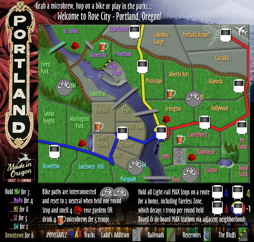
I darkened the background a bit. Other than that, I'm happy with this map. Been working on it for a long time and have had a lot of great feedback and I think its ready for XML or its dead for good.

32nd Draft
Take it or leave it
Image
Click image to enlarge.
image
User avatar
Sergeant 1st Class lostatlimbo
 
Posts: 1386
Joined: Wed Mar 28, 2007 3:56 pm
Location: Portland, OR

Re: Rose City: Portland (D, GP) v.31 - Troop #s, new MAX sto

Postby lostatlimbo on Thu May 26, 2011 12:03 pm

TotoroHat wrote:I am Still glad to see this map is still in the works. I have a few suggestions which I will post below. But first the Geography on the map is not accurate... Change Clinton to Wood Stock and Change Wood Stock to either Lents or Mount Scott and remove Clinton all together! The Clinton Neighborhood is between Gladstone and Hawthorne. (Gladstone being north of Reed) and Wood Stock is east of Reed. There is no room for Clinton... (REED takes up at least 7 neighborhoods on this map lol when it itself is very Small) I would say Name it Sellwood but I think the Map needs the Reed Name so keep it.

Anywhoo thats not a big concern but here are some suggestions,

1. The Max line goes to Clackamas Town Center (Wood Stock on this map) maybe you can include it!

2. It is hard to tell certain regions apart.... suggest make them a different color (not just the names a different color) This goes for the Max Lines as well.

3. make the bikes killer neutrals (say +2 and reset to +2 or +6 with no Reset.... something like that (we may love our bikes but even with the east Bank Esplinade ... Reed to Forest park is still an hour away).


Do you cross the Max lines at the Max Cars or how does that work... might confuse some people


Awesome Map.... Keep up the good work!


Hi Totoro - thanks for you input & feedback

Much of the map is not geographically accurate. The entire eastside was squished down (red MAX should be another 3 inches off the map) and Downtown was magnified more than double its true size. That said, you make some valid, but debatable points.

My benchmark for naming each territory was not official neighborhood names, but general areas that people refer to. Like the Alberta area, Clinton is often referred to beyond its official boundaries because it is a 'place to go'. The official Clinton neighborhood may be smaller than shown, but it is indeed just south of Mt. Tabor & Hawthorne, as the map shows.

Woodstock is a similar case. I never hear anyone talk about Lents in Portland. Colloquially, Woodstock has come to encompass a larger area. More accurately, it would be Foster-Powell, but that doesn't quite roll off the tongue. Early on in the map, I was referring to it as Mt. Scott, but that seemed redundant with Mt. Tabor, so I opted for Woodstock instead. I still prefer that, and I'll note that Woodstock Blvd crosses through that area all the way to I-205.

Reed v Sellwood is a toss up. Both have their merits, but Reed wins based on size - Sellwood just isn't going to fit in that space! :)

As for the Clackamas Town Center - I've avoided including structures here. You'll notice the Llyod Center is also absent. There is a vague reference to the Rose Garden arena, but only as it fits in with the rest of the map. My goal with this map was to highlight the things I appreciate or find unique about Portland (copious public parks, robust transit & bike network, bridges, beer, etc). An enormous shopping mall doesn't really fit in with all that. I also started this map before the Green line was in use. I thought about adding it, but there's just not enough space.

Also, FYI, the bike lanes are indeed 2 killer neutral each. (So 4 neutral to get anywhere). Biking does take work (though less so than a place like San Francisco!) but these are bike paths.

At any rate, I appreciate your attention to detail and that you took the time to make these suggestions.
User avatar
Sergeant 1st Class lostatlimbo
 
Posts: 1386
Joined: Wed Mar 28, 2007 3:56 pm
Location: Portland, OR

Re: Rose City: Portland (D, GP) v.32 - Final Graphic

Postby isaiah40 on Mon May 30, 2011 2:22 pm

FYI, I am looking at this and as soon as a couple of the other CA's get back from vacation I'll get them to look at this as well.
Lieutenant isaiah40
 
Posts: 3990
Joined: Mon Aug 27, 2007 7:14 pm

Re: Rose City: Portland (D, GP) v.32 - Final Graphic

Postby isaiah40 on Sat Jun 11, 2011 2:59 pm

Well since no one has any objections right now, let's get this at least stickied!
Lieutenant isaiah40
 
Posts: 3990
Joined: Mon Aug 27, 2007 7:14 pm

Re: Rose City: Portland (D, GP) v.32 - Final Graphic

Postby flexmaster33 on Sat Jun 11, 2011 5:18 pm

Stickied on Rose Parade Saturday...woot, woot!!!
Current tourneys -- Promontory Summit Best of 5, USA 2.1 Poly Best of 5, 2024 NCAA basketball season, 2024 Major League Soccer, NCAA football playoffs, 2024 NFL season.

High rank: Major. Place: 1,056. Points: 2,093
User avatar
Lieutenant flexmaster33
 
Posts: 5463
Joined: Wed Aug 01, 2007 12:24 pm
Location: Portland, OR

Re: Rose City: Portland (D, GP) v.32 - Final Graphic

Postby RjBeals on Mon Jun 13, 2011 6:47 pm

this map looks good. Very clean with unique grahpics.

Only thing that strikes me is that vertical "Portland" title. It looks blurry compared to the tight vectorish images in the rest of the map. I know you'll hate this suggestion, but if you really want to improve the overall map, trace that in your vector program. It might take some time, but I think it would greatly improve this map.

all else looks fine to me.
Image
User avatar
Private RjBeals
 
Posts: 2506
Joined: Mon Nov 20, 2006 5:17 pm
Location: South Carolina, USA

Re: Rose City: Portland (D, GP) v.32 - Final Graphic

Postby natty dread on Tue Jun 14, 2011 12:05 am

I don't think that's a good idea... rather I would just run the title through a sharpening filter, or try to find a sharper image of that sign.
Image
User avatar
Sergeant 1st Class natty dread
 
Posts: 12877
Joined: Fri Feb 08, 2008 8:58 pm
Location: just plain fucked

Re: Rose City: Portland (D, GP) v.32 - Final Graphic

Postby DiM on Sat Jun 18, 2011 7:37 pm

1. the ladd's addition layer masks the grey borders on 3 of its sides but not on the top one. i think it should
2. the train/plane/bike/trees are all cartoons/cliparts while the beer mugs and the roses look realistic and this makes them stand out too much. why not try and do a clipart style beer and rose?
3. the top and left borders of nobhill look different than all the rest because they have a lighter line going through them.
4. the industrial territory has a weird green spot in the top left corner right between the tracks and the border.
5. the top left bridge is green. all the others are grey.
6. the impassable border between swan island and university oversteps a bit and actually goes a few pixels between swan and overlook
7. the gray border of the map goes 1-2 pixels too far in the lower right corner of the map (above the yellow 4 in the legend)
8. i don't know if mount tabor actually looks like that but on your map it's more of a hill than a mountain. perhaps adding some stone on top and some snow. (unless in reality it's a small mountain completely covered in trees)
9. expo center, lower left corner has a green smudge between the tracks and the border. same as point 4.
10. the map has a grey border on the top and right side but not on the left and bottom.

all remarks are based on the large map. haven't looked at the small one.
“In the beginning God said, the four-dimensional divergence of an antisymmetric, second rank tensor equals zero, and there was light, and it was good. And on the seventh day he rested.”- Michio Kaku
User avatar
Major DiM
 
Posts: 10415
Joined: Wed Feb 14, 2007 6:20 pm
Location: making maps for scooby snacks

Re: Rose City: Portland (D, GP) v.32 - Final Graphic

Postby lostatlimbo on Tue Jun 21, 2011 4:55 pm

Good eye!

DiM wrote:1. the ladd's addition layer masks the grey borders on 3 of its sides but not on the top one. i think it should
will fix
2. the train/plane/bike/trees are all cartoons/cliparts while the beer mugs and the roses look realistic and this makes them stand out too much. why not try and do a clipart style beer and rose?
I actually think they look a little cartoon-y because of their size. I don't know. The minor difference doesn't bother me. I don't think making them more cartoony would really benefit the map. The bikes, FYI, represent the graphics seen in bike lanes, so in a way they are realistic. I wish I could make the trains more realistic, but they have to have troop #s overlayed.
3. the top and left borders of nobhill look different than all the rest because they have a lighter line going through them.
Will fix
4. the industrial territory has a weird green spot in the top left corner right between the tracks and the border.
Will fix
5. the top left bridge is green. all the others are grey.
This is intentional. St John's bridge is notoriously green. The others are more or less gray and less notable. Maybe I'll make the Steel bridge black though - so there is more variety.
6. the impassable border between swan island and university oversteps a bit and actually goes a few pixels between swan and overlook
This is intentional so there is no confusion between what connects. I believe this was requested during gameplay.
7. the gray border of the map goes 1-2 pixels too far in the lower right corner of the map (above the yellow 4 in the legend)
Will fix
8. i don't know if mount tabor actually looks like that but on your map it's more of a hill than a mountain. perhaps adding some stone on top and some snow. (unless in reality it's a small mountain completely covered in trees)
Mount Tabor (notice the Mt., not Mtn.) is actually a dormant volcano. At the top there is a city park - not much in the way of snow or rock.
9. expo center, lower left corner has a green smudge between the tracks and the border. same as point 4.
Will fix
10. the map has a grey border on the top and right side but not on the left and bottom.
Will fix
all remarks are based on the large map. haven't looked at the small one.
User avatar
Sergeant 1st Class lostatlimbo
 
Posts: 1386
Joined: Wed Mar 28, 2007 3:56 pm
Location: Portland, OR

Re: Rose City: Portland (D, GP) v.32 - Final Graphic

Postby danfrank on Thu Jun 23, 2011 10:48 pm

I absolutely love how they have knitpicked this map for YEARS yes YEARS :roll:


Why ? Land and Sea map which graphically is terrible didnt receive a tenth of this . Along with dozens of others..
Corporal 1st Class danfrank
 
Posts: 611
Joined: Mon Dec 24, 2007 1:19 am

Re: Rose City: Portland (D, GP) v.32 - Final Graphic

Postby cairnswk on Fri Jul 01, 2011 1:38 pm

lostatlimbo...just a couple of comments if i may...
my concern was for the green bridge and ladd's addition border, but i see you're addressing that.
- i think "Impassable" needs to change to "impassables" - reason being i looked at all the icons down there and didn't immediately recognise that they were all impassables.
- the trains - perhaps try to make the wheels a fraction wider
- the territory names for me get lost on that green background - have you tried a small offset or drop shadow layer that would lift them a fraction so that they are slightly more legible
hope this helps toward getting stamped :)
Image
* Pearl Harbour * Waterloo * Forbidden City * Jamaica * Pot Mosbi
User avatar
Private cairnswk
 
Posts: 11510
Joined: Sat Feb 03, 2007 8:32 pm
Location: Australia

Re: Rose City: Portland [26 May 2011] v.32 - Final Graphic

Postby isaiah40 on Wed Jul 06, 2011 3:31 pm

[Moved]

It would appear that development of this map has stalled. If the mapmaker wants to continue with the map, then one of the Foundry Moderators will be able to help put the thread back into the Foundry system, after an update has been made. ;-)
Lieutenant isaiah40
 
Posts: 3990
Joined: Mon Aug 27, 2007 7:14 pm

Re: Rose City: Portland [26 May 2011] v.32 - Final Graphic

Postby lostatlimbo on Thu Jul 07, 2011 9:10 pm

I request that you place this back into the Main Foundry Workshop.

The official post on when maps are moved states:
"The topic had advanced beyond the Draft stage, but went more than two months without an update from the mapmaker."
viewtopic.php?f=242&t=56656

I posted an update on May 26th and aside from the fact that no one gave me any real feedback until mid-June AND I've commented on the thread in response to coming changes, it is currently only July 7th.

So this completely unnecessary move is 19 days early.

Please move it back so it will continue to receive feedback while I work on the next update.

Thank you
Last edited by lostatlimbo on Thu Jul 07, 2011 9:24 pm, edited 1 time in total.
User avatar
Sergeant 1st Class lostatlimbo
 
Posts: 1386
Joined: Wed Mar 28, 2007 3:56 pm
Location: Portland, OR

Re: Rose City: Portland [26 May 2011] v.32 - Final Graphic

Postby Victor Sullivan on Thu Jul 07, 2011 9:20 pm

lostatlimbo, once you post an update it will be moved back and you can start again as if you had never left! :) It's merely a temporary change of location.

-Sully
User avatar
Corporal Victor Sullivan
 
Posts: 6010
Joined: Mon Feb 08, 2010 8:17 pm
Location: Columbus, OH

Re: Rose City: Portland [26 May 2011] v.32 - Final Graphic

Postby lostatlimbo on Thu Jul 07, 2011 9:26 pm

Sully - see above - this was premature.

I understand it is temporary, but here it doesn't receive feedback. I was hoping to address DIM's changes next week, but I'd like it to continue in the Workshop as stated in this forum's guidelines.

Thanks
User avatar
Sergeant 1st Class lostatlimbo
 
Posts: 1386
Joined: Wed Mar 28, 2007 3:56 pm
Location: Portland, OR

Re: Rose City: Portland [26 May 2011] v.32 - Final Graphic

Postby DiM on Thu Jul 07, 2011 9:30 pm

i partially understand lostatlimbo's frustration over this movement.

normally i'd recycle any map that goes with no post/update/feedback for more than 2 weeks not 2 months but the rules are rules so his map shouldn't have been moved.
furthermore i can see at leas 1 map that has had more than 2 months since it's last update and almost a month since anybody posted there and yet the map is not recycled. (check out vietnam or research & conquer or death race or ant hill )
“In the beginning God said, the four-dimensional divergence of an antisymmetric, second rank tensor equals zero, and there was light, and it was good. And on the seventh day he rested.”- Michio Kaku
User avatar
Major DiM
 
Posts: 10415
Joined: Wed Feb 14, 2007 6:20 pm
Location: making maps for scooby snacks

Re: Rose City: Portland [26 May 2011] v.32 - Final Graphic

Postby lostatlimbo on Thu Jul 07, 2011 9:33 pm

Furthermore, there are other maps (like Vietnam) currently in the workshop which have not been updated since well before this map. Why was mine moved EARLY when others are well beyond their move date?

viewtopic.php?f=241&t=126809&start=195#p3107192

Vietnam map was last updated on April 8th. That mapmaker has not even commented since May 6th.

My map was updated on May 26th. I commented on June 21st that I would start working on the new edits soon. (All of which are rather minor, but I've been busy!)

Yet mine gets moved and his remains. Why?
User avatar
Sergeant 1st Class lostatlimbo
 
Posts: 1386
Joined: Wed Mar 28, 2007 3:56 pm
Location: Portland, OR

Re: Rose City: Portland [26 May 2011] v.32 - Final Graphic

Postby TaCktiX on Fri Jul 08, 2011 3:46 am

Whether it was in error or not, all you have to do is update and any of the CA's will move it post-haste. I apologize for any error, but I'm certain isaiah did it for good reason. Get those rather minor edits done and we're good to go.
User avatar
Corporal 1st Class TaCktiX
 
Posts: 2392
Joined: Mon Dec 17, 2007 8:24 pm
Location: Rapid City, SD

Re: Rose City: Portland [26 May 2011] v.32 - Final Graphic

Postby natty dread on Fri Jul 08, 2011 8:59 am

I also think this shouldn't have been moved. I understand the cartos wanting to clean up the place, but if the mapmaker is obviously taking feedback and working on the map, then there's no reason to move it.
Image
User avatar
Sergeant 1st Class natty dread
 
Posts: 12877
Joined: Fri Feb 08, 2008 8:58 pm
Location: just plain fucked

Re: Rose City: Portland [26 May 2011] v.32 - Final Graphic

Postby isaiah40 on Fri Jul 08, 2011 10:14 am

Hmmm .. yeppers, I totally goofed on this one!. My apologies lostatlimbo! I looked at the date you last posted wrong, I read it as June 2 not June 21! So I'll get this moved back ASAP, since it seems you are working on an update right?
Lieutenant isaiah40
 
Posts: 3990
Joined: Mon Aug 27, 2007 7:14 pm

Re: Rose City: Portland [26 May 2011] v.32 - Final Graphic

Postby lostatlimbo on Fri Jul 08, 2011 12:36 pm

I'm camping this weekend, but do hope to get a fresh update done next week.

Thanks
User avatar
Sergeant 1st Class lostatlimbo
 
Posts: 1386
Joined: Wed Mar 28, 2007 3:56 pm
Location: Portland, OR

PreviousNext

Return to The Atlas

Who is online

Users browsing this forum: No registered users