Conquer Club

SIEGE! - PSD available - [Quenched]

Care to peruse completed maps? Take a stroll through the Atlas.

Moderator: Cartographers

Forum rules
Please read the Community Guidelines before posting.

Postby DiM on Thu Mar 22, 2007 9:25 am

my suggestions:

*split forrest 2 in 2 territories. and add another river between midlands 4&5 and forest 1&2. this way midlands and forrest will share a border between midlands 6 and forrest 2&5
*do something with the colours in forrest swamp and camp, they are too alike. imagine a colour blinded person will have no idea which is which
*as keyogi said i don't quite like the change from perspective to top view. and the problem is the sudden change in the River Camp. the perspective tent and the top view bridges are so close and the change is too brutal. maybe try making the bridges with a hint of perspective. then the castle being top view will not be such a problem because it is further away.
*remove the 4way borders in the west-east ward and the one in front of the forrest camp.
*add another torch in tunnel 7 it is so dark you can't even tell it continues to the swamp.
*do something about the colours in the legend. the tunnel is very unclear and forest and woods camp

on a more personal note i would have really loved the whole map to be in perspective, to see the walls the stairs the towers, etc. but since you started like this i guess there's no turning back :(
“In the beginning God said, the four-dimensional divergence of an antisymmetric, second rank tensor equals zero, and there was light, and it was good. And on the seventh day he rested.”- Michio Kaku
User avatar
Major DiM
 
Posts: 10415
Joined: Wed Feb 14, 2007 6:20 pm
Location: making maps for scooby snacks

Postby mibi on Thu Mar 22, 2007 10:40 am

changes:
bonuses changed, great hall now 1, wards, now 3, swamp and plains, now 4, tunnel, now 2. soem graphic changes, colors a bit different on the swamp forest and forest camp, and the key to match. river camp bridge have a little depth, and a light in tunnel 7.

can someone please explain to be by 4 ways are so shunned?

Image
Last edited by mibi on Thu Mar 22, 2007 10:56 am, edited 1 time in total.
User avatar
Captain mibi
 
Posts: 3350
Joined: Thu Mar 01, 2007 8:19 pm
Location: The Great State of Vermont

Postby Gozar on Thu Mar 22, 2007 10:43 am

As the diagonals at a four way border cannot attack each other, they create unnecessary confusion.
User avatar
Lieutenant Gozar
 
Posts: 2534
Joined: Wed Jan 31, 2007 3:15 pm
Location: Nova Scotia (G1)

Postby mibi on Thu Mar 22, 2007 10:51 am

Gozar wrote:As the diagonals at a four way border cannot attack each other, they create unnecessary confusion.


heh, i have never been confused by them... i think would be confusing if i refiggered the wards 4 way so that a sliver of one territory were able to touch the other 3 just to get rid of a 4 way would ultimately be more confusing
User avatar
Captain mibi
 
Posts: 3350
Joined: Thu Mar 01, 2007 8:19 pm
Location: The Great State of Vermont

Postby DiM on Thu Mar 22, 2007 11:02 am

mibi wrote:can someone please explain to be by 4 ways are so shunned?


i've never had any problem with 4 way borders. but many people will complain tha the diagonals don't attack. and the confusion will be very annoying. it's a common agreement that 4 way borders will not be used. :wink:
“In the beginning God said, the four-dimensional divergence of an antisymmetric, second rank tensor equals zero, and there was light, and it was good. And on the seventh day he rested.”- Michio Kaku
User avatar
Major DiM
 
Posts: 10415
Joined: Wed Feb 14, 2007 6:20 pm
Location: making maps for scooby snacks

Postby mibi on Thu Mar 22, 2007 11:51 am

ok so now there are now the 4ways in the wards and the woods camp on gone... it certainly throws the symmetry off, but those dreaded four ways are gone! :?

personally i liked it better with the 4 ways in there.

Image
User avatar
Captain mibi
 
Posts: 3350
Joined: Thu Mar 01, 2007 8:19 pm
Location: The Great State of Vermont

Postby DiM on Thu Mar 22, 2007 11:55 am

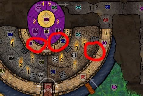
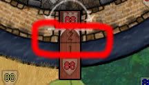
i just found out there are 3 more 4 way borders :lol:
here

Image

edit//
and here:

Image
“In the beginning God said, the four-dimensional divergence of an antisymmetric, second rank tensor equals zero, and there was light, and it was good. And on the seventh day he rested.”- Michio Kaku
User avatar
Major DiM
 
Posts: 10415
Joined: Wed Feb 14, 2007 6:20 pm
Location: making maps for scooby snacks

Postby mibi on Thu Mar 22, 2007 12:23 pm

DiM wrote:i just found out there are 3 more 4 way borders :lol:
here

Image

edit//
and here:

Image


negative...the walls can only be breached via the stairs, so while the borders look 4 way, they dont operate as such.

and the gate has arrows that make it a non- 4way.

its too bad people get all heated about 4 ways, they really arnt complicated and can add to the gameplay.
User avatar
Captain mibi
 
Posts: 3350
Joined: Thu Mar 01, 2007 8:19 pm
Location: The Great State of Vermont

Postby DiM on Thu Mar 22, 2007 12:44 pm

mibi wrote:negative...the walls can only be breached via the stairs, so while the borders look 4 way, they dont operate as such.

and the gate has arrows that make it a non- 4way.

its too bad people get all heated about 4 ways, they really arnt complicated and can add to the gameplay.


i know about the stairs and the arrows but i'm willing to bet that when this map will become playable we'll have threads like:

"BUG in SIEGE MAP" i tried attacking outer wall 2 from west ward 4 and it is impossible. this made me lose, bla bla bla.
“In the beginning God said, the four-dimensional divergence of an antisymmetric, second rank tensor equals zero, and there was light, and it was good. And on the seventh day he rested.”- Michio Kaku
User avatar
Major DiM
 
Posts: 10415
Joined: Wed Feb 14, 2007 6:20 pm
Location: making maps for scooby snacks

Postby Lone.prophet on Thu Mar 22, 2007 1:59 pm

maybe redused the number of bonusses?
Image
Captain Lone.prophet
 
Posts: 1467
Joined: Thu Oct 12, 2006 4:37 pm
Location: Your basement Muahaha

Postby mibi on Thu Mar 22, 2007 2:31 pm

DiM wrote:
mibi wrote:negative...the walls can only be breached via the stairs, so while the borders look 4 way, they dont operate as such.

and the gate has arrows that make it a non- 4way.

its too bad people get all heated about 4 ways, they really arnt complicated and can add to the gameplay.


i know about the stairs and the arrows but i'm willing to bet that when this map will become playable we'll have threads like:

"BUG in SIEGE MAP" i tried attacking outer wall 2 from west ward 4 and it is impossible. this made me lose, bla bla bla.


this is ridiculous, when has there ever been diagonal attacks, why would someone assume they can attack in a diagonal when they never have before.

if a person claims that 'bug' caused them to lose you can bet that wasn't the only reason they lose.
User avatar
Captain mibi
 
Posts: 3350
Joined: Thu Mar 01, 2007 8:19 pm
Location: The Great State of Vermont

Postby KEYOGI on Thu Mar 22, 2007 3:42 pm

mibi wrote:people like seem to like them, as do i. it goes from a 75 degree veiw to a 90 degree view which gives the impression of forward motion.

Sorry, but I disagree. I understand you've put a lot of work into this map and thus are probably more reluctant to change but this really bugs me now that I've figured it out. It is just my opinion, but I'd prefer to see the tent, trees and fence done in a top-down perspective as well.

mibi wrote:i dont think the 'clashing' is bad at all. I'm currently the blue player on a classic map and im not even sure if Im still in the game or now, i mean, im not eliminated but i can't find my armies. But i may darken some shields.

Well it is bad. The problem with a lot of old maps is that they were made before the current foundry process was put in place. That's why there's a lot maps on the site that aren't up to current standards. BeNeLux is currently in hot debate over this very issue.

mibi wrote:maybe your monitor needs adjustment, or maybe mine does.

My monitor is fine, but could you make the numbers just a touch darker. I think contrast is an important part of a map. While it may not always look good, it needs be pratical more than anything else.
Sergeant 1st Class KEYOGI
 
Posts: 1632
Joined: Tue Oct 10, 2006 6:09 am

Postby Lone.prophet on Thu Mar 22, 2007 4:18 pm

Lone.prophet wrote:maybe redused the number of bonusses?
Image
Captain Lone.prophet
 
Posts: 1467
Joined: Thu Oct 12, 2006 4:37 pm
Location: Your basement Muahaha

Postby mibi on Thu Mar 22, 2007 5:31 pm

Lone.prophet wrote:
Lone.prophet wrote:maybe redused the number of bonusses?


is there a reason?
User avatar
Captain mibi
 
Posts: 3350
Joined: Thu Mar 01, 2007 8:19 pm
Location: The Great State of Vermont

Postby Nerrimus on Thu Mar 22, 2007 5:37 pm

:/ A +3 for a one border continent feels... wrong. Any comment? (Great hall + throne = one border).

I think the rest of the map is fine though. :)
Private 1st Class Nerrimus
 
Posts: 23
Joined: Mon Nov 06, 2006 8:52 am

Postby mibi on Thu Mar 22, 2007 5:43 pm

Ok well I, and this map, are currently on vacation for a week. I will be out of the country and unable to do any updates until I get back. I will check this thread though so keep the suggestions coming.

As it stands, the bonuses look good, as does the game play for the most part. Keyogi and one other have issue with 3D forest, fence, and tent, but others like them so I dont plan on changing them. I think it gives a little depth to an otherwise flat map.

I've darkened the numbers and the shields in areas so there is less clashing.

Below are two version. One with 4 way borders in the wards and woods camp, one without. As you can see the loss of the tidy 4 way can create some off angles. I prefer the 4 ways but if its really going to be a game play fiasco then I'll due with out.

Cya in a week! \:D/

without:
Image
with:
Image
User avatar
Captain mibi
 
Posts: 3350
Joined: Thu Mar 01, 2007 8:19 pm
Location: The Great State of Vermont

Postby Teya on Thu Mar 22, 2007 5:56 pm

mibi wrote: Keyogi and one other have issue with 3D forest, fence, and tent, but others like them so I dont plan on changing them. I think it gives a little depth to an otherwise flat map.


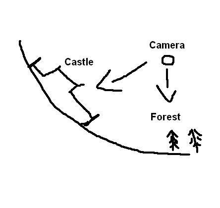
I respect what you are trying to do, but the perspective really is out. The castle looks like it is a birds eye view, the trees and fence should be leaning in the opposite direction as you are above the castle and you are looking back at the trees. They really should just go the other way.
User avatar
Sergeant 1st Class Teya
 
Posts: 411
Joined: Tue Oct 17, 2006 5:25 am

Postby hulmey on Thu Mar 22, 2007 8:56 pm

Maybe the wind is blowing them in that direction Teya :lol:
[img]http://img801.imageshack.us/img801/9761/41922610151374166770386.jpg[/mg]
User avatar
Lieutenant hulmey
 
Posts: 3742
Joined: Fri Nov 03, 2006 7:33 am
Location: Las Vegas

Postby Teya on Thu Mar 22, 2007 9:07 pm

yeah, But im being serious. Its just basic perspective that a graphic designer should know.
User avatar
Sergeant 1st Class Teya
 
Posts: 411
Joined: Tue Oct 17, 2006 5:25 am

Postby unriggable on Thu Mar 22, 2007 9:20 pm

Teya wrote:
mibi wrote: Keyogi and one other have issue with 3D forest, fence, and tent, but others like them so I dont plan on changing them. I think it gives a little depth to an otherwise flat map.


I respect what you are trying to do, but the perspective really is out. The castle looks like it is a birds eye view, the trees and fence should be leaning in the opposite direction as you are above the castle and you are looking back at the trees. They really should just go the other way.


Yeah it does kind of look like this:

Image
User avatar
Cook unriggable
 
Posts: 8037
Joined: Thu Feb 08, 2007 9:49 pm

Postby KEYOGI on Thu Mar 22, 2007 10:02 pm

unriggable wrote:Yeah it does kind of look like this:

Image

I'm not sure if you're trying to prove Teya right or wrong there. :wink:

But yes, the land should be flat and the current map suggest the camera is hovering over the castle, not over the trees. This completely throws the 3D objects out.

If there's to be any sort of perspective like mibi's trying to create, the trees need to be seen from above and the castle have a more 3D look to it. If mibi wants to keep the castle 2D then I'd suggest flipping the map so the castle is at the bottom.
Sergeant 1st Class KEYOGI
 
Posts: 1632
Joined: Tue Oct 10, 2006 6:09 am

Postby hulmey on Thu Mar 22, 2007 11:33 pm

i dont see any problem with it the trees myself!!! Im not to keen on the wooden fence i must admit...Im sure mibi could do a better job on them....

But think the trees look ok and would not suggest fliiping the castle or making the castle look 3d....
[img]http://img801.imageshack.us/img801/9761/41922610151374166770386.jpg[/mg]
User avatar
Lieutenant hulmey
 
Posts: 3742
Joined: Fri Nov 03, 2006 7:33 am
Location: Las Vegas

Postby Teya on Thu Mar 22, 2007 11:56 pm

the perspective is wrong. Since Mibi is a graphic designer he should know that.
User avatar
Sergeant 1st Class Teya
 
Posts: 411
Joined: Tue Oct 17, 2006 5:25 am

Postby Qwert on Fri Mar 23, 2007 4:25 am

Yes mibi, you have 2 diferent perspective, 3D(down half of map) and bird perspective(up half of map) but i dont mine for these.
Well you can try to put all map in 3D to see how will these look.
Image
NEW REVOLUTION-NEW RANKS PRESS THESE LINK viewtopic.php?f=471&t=47578&start=0
User avatar
Major Qwert
SoC Training Adviser
 
Posts: 9262
Joined: Tue Nov 07, 2006 5:07 pm
Location: VOJVODINA

Postby DiM on Fri Mar 23, 2007 10:25 am

mibi wrote:Keyogi and one other have issue with 3D forest, fence, and tent, but others like them so I dont plan on changing them. I think it gives a little depth to an otherwise flat map.


i was the other one :wink:
but since you implemented the perspective bridges near the tent camp i does not bother me that much.


mibi wrote:this is ridiculous, when has there ever been diagonal attacks, why would someone assume they can attack in a diagonal when they never have before.

if a person claims that 'bug' caused them to lose you can bet that wasn't the only reason they lose.


i people see even a 1 pixel connection between 2 teritories they'll asume they border and try to attack. they wo'n be able and they'll come to the forum to complain. just look at the other maps. you'll see no 4 way connections. just my thought. as i said i don't have a problem with this.
“In the beginning God said, the four-dimensional divergence of an antisymmetric, second rank tensor equals zero, and there was light, and it was good. And on the seventh day he rested.”- Michio Kaku
User avatar
Major DiM
 
Posts: 10415
Joined: Wed Feb 14, 2007 6:20 pm
Location: making maps for scooby snacks

PreviousNext

Return to The Atlas

Who is online

Users browsing this forum: No registered users