Lunar War [GP, G, X] files on p.1
Moderator: Cartographers
Re: Lunar War <v19> p1, 22 - major visual update!
Actually, now that I look at it again, swapping CH1 with US1 wouldn't be good since China wouldn't have access to missile base then.
Instead of that... Here's the best solution for all problems that I can see:
1) Swap IN1 with CH2. -> India would still have access to a base and a mine via IN2. China would gain access to franklin mine.
2) Swap US2 with SA2. -> US would have less access to bases as it's currently too strong in that aspect. SA would gain some strength, as it's a bit weak currently...
This is a very tricky map to balance, but I think it can be managed.
If anyone has any better suggestions, I'm all ears...

-

 natty dread
- Posts: 12877
- Joined: Fri Feb 08, 2008 8:58 pm
- Location: just plain fucked


Re: Lunar War <v6> p1, 7 *POLL*
natty_dread wrote:yeti_c wrote:You know - I look at the map and I can't see what borders what... There are craters with connections - then seas and flags that have no connections... Is that because you have only drawn on a few of the connections?
If craters are inside a sea or on the shore of one, they are connected to that sea territory. Otherwise they are connected by connecting lines.
I'm gonna repost this... because it is still true - 15 pages later...
You have a mishmash of connection styles that really doesn't help you see what attacks what - as it stands - this is a "BOB only" map... (i.e. playable only with BOB)
C.

Highest score : 2297
-

 yeti_c
- Posts: 9624
- Joined: Thu Jan 04, 2007 9:02 am


Re: Lunar War <v6> p1, 7 *POLL*
yeti_c wrote:I'm gonna repost this... because it is still true - 15 pages later...
You have a mishmash of connection styles that really doesn't help you see what attacks what - as it stands - this is a "BOB only" map... (i.e. playable only with BOB)
C.
How are the craters here any different than for example the train lines in vancouver or chicago? Only difference is that this map has a different ratio of territories with line connections and territories with borders.
Players seem to have no problems with such arrangement on those maps. Furthermore, there are more complicated maps than this out there, and people still play them.

-

 natty dread
- Posts: 12877
- Joined: Fri Feb 08, 2008 8:58 pm
- Location: just plain fucked


Re: Lunar War <v19> p1, 22 - POLL - vote please!
Anyway, to make it certain, I have added a poll to the thread. If the map is deemed too hard to understand we will reconsider the design of this map.

-

 natty dread
- Posts: 12877
- Joined: Fri Feb 08, 2008 8:58 pm
- Location: just plain fucked


Re: Lunar War <v6> p1, 7 *POLL*
natty_dread wrote:yeti_c wrote:I'm gonna repost this... because it is still true - 15 pages later...
You have a mishmash of connection styles that really doesn't help you see what attacks what - as it stands - this is a "BOB only" map... (i.e. playable only with BOB)
C.
How are the craters here any different than for example the train lines in vancouver or chicago? Only difference is that this map has a different ratio of territories with line connections and territories with borders.
Players seem to have no problems with such arrangement on those maps. Furthermore, there are more complicated maps than this out there, and people still play them.
On city maps that use a train-line of some description, it makes sense because people know how trains work.
I don;t see any logical reason to have linear connections on the moon craters; yes the lines are clear, but it has the visual effect of creating more "territories" that are empty... Things have come a long way since I last checked up on progress, but clarity and consistency are key

PB: 2661 | He's blue... If he were green he would die | No mod would be stupid enough to do that
-

 MrBenn
- Posts: 6880
- Joined: Wed Nov 21, 2007 9:32 am
- Location: Off Duty


Re: Lunar War <v19> p1, 22 - POLL - vote please!
I don;t see any logical reason to have linear connections on the moon craters;
how about the fact that craters are... well, craters. They are round holes in the ground, not land areas with borders. Representing them with some abstract borders drawn around them would seem more illogical to me.

-

 natty dread
- Posts: 12877
- Joined: Fri Feb 08, 2008 8:58 pm
- Location: just plain fucked


Re: Lunar War <v19> p1, 22 - POLL - vote please!
Natty,
Why don't you just swap out the lines with dotted lines. Then this map will conform to what everyone is used to.
Why don't you just swap out the lines with dotted lines. Then this map will conform to what everyone is used to.

-

 porkenbeans
- Posts: 2546
- Joined: Mon Sep 10, 2007 4:06 pm


Re: Lunar War <v19> p1, 22 - POLL - vote please!
Could be done... also, Isaiah, please see the gameplay ideas on the previous page and tell me what you think about that.
I refer to this post viewtopic.php?f=241&t=100634&start=315#p2560155
I refer to this post viewtopic.php?f=241&t=100634&start=315#p2560155

-

 natty dread
- Posts: 12877
- Joined: Fri Feb 08, 2008 8:58 pm
- Location: just plain fucked


Re: Lunar War <v19> p1, 22 - POLL - vote please!
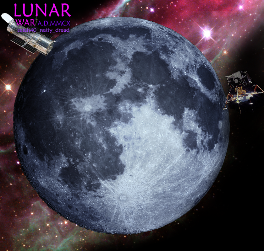
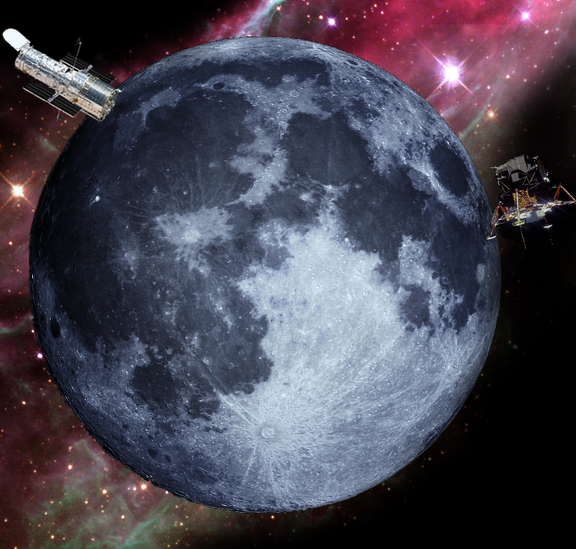
I made this for you natty. You are welcomed to use it if you like. I did not have that Star Wars font, so I just used something similar to show how the title would fit.

-

 porkenbeans
- Posts: 2546
- Joined: Mon Sep 10, 2007 4:06 pm


Re: Lunar War <v19> p1, 22 - POLL - vote please!
Well thanks porkenbeans, I appreciate it, but frankly I don't see how I can use that...
You know, I'll probably have to tell you the same I've told a few people... a large part of the fun in mapmaking for me is that I get to figure out how to do all the graphics work myself and learn in the process. Thus I'm very often extremely reluctant to let anyone do any of the graphics work for me, when I'm working on a map... even if someone could do it better (which I'm sure there's plenty of people who could). I do appreciate all the efforts to help, but really, the process of perfecting the graphics myself and pushing myself to improve is the main enjoyment I get from mapmaking, so... I hope you understand
You know, I'll probably have to tell you the same I've told a few people... a large part of the fun in mapmaking for me is that I get to figure out how to do all the graphics work myself and learn in the process. Thus I'm very often extremely reluctant to let anyone do any of the graphics work for me, when I'm working on a map... even if someone could do it better (which I'm sure there's plenty of people who could). I do appreciate all the efforts to help, but really, the process of perfecting the graphics myself and pushing myself to improve is the main enjoyment I get from mapmaking, so... I hope you understand

-

 natty dread
- Posts: 12877
- Joined: Fri Feb 08, 2008 8:58 pm
- Location: just plain fucked


Re: Lunar War <v19> p1, 22 - POLL - vote please!
You told me this at the start of this project, or have you forgotten ?natty_dread wrote:Well thanks porkenbeans, I appreciate it, but frankly I don't see how I can use that...
You know, I'll probably have to tell you the same I've told a few people... a large part of the fun in mapmaking for me is that I get to figure out how to do all the graphics work myself and learn in the process. Thus I'm very often extremely reluctant to let anyone do any of the graphics work for me, when I'm working on a map... even if someone could do it better (which I'm sure there's plenty of people who could). I do appreciate all the efforts to help, but really, the process of perfecting the graphics myself and pushing myself to improve is the main enjoyment I get from mapmaking, so... I hope you understand
You'd be welcome to work with me on this one...
Sorry it took me so long to get to it, but I figured that you should get your GP worked out first.
BTW, I do not understand why you would have any trouble using the image. You just lay your text right over it.

-

 porkenbeans
- Posts: 2546
- Joined: Mon Sep 10, 2007 4:06 pm


Re: Lunar War <v19> p1, 22 - POLL - vote please!
Ok, I think there's been kinda a misunderstanding... It seems you offered to help with the map at the very first page, and I told I would welcome the help... However we never (if I recall right) discussed this again afterwards, so I thought you had kinda forgotten or given up on it or something... sorry for that. I really do have a lousy memory you know...
Anyways... my graphical skills have really evolved since the start of this thread... at the time when I started this thread I wasn't too confident in my graphics skills, as I lacked experience. Now, having worked one map through to beta, though...
I'm sorry for the misunderstanding, but I thought (especially since we never discussed it afterwards) that you were on the same page, as I had started to work on the graphics myself. I kinda feel bad now, for you doing all that work...

-

 natty dread
- Posts: 12877
- Joined: Fri Feb 08, 2008 8:58 pm
- Location: just plain fucked


Re: Lunar War <v19> p1, 22 - POLL - vote please!
I was waiting for you to get to GFX Workshop. I saw that you have pretty much worked out all of the GP, so I thought I would whip something up for you. I see that you are working with Isaiah now, so, I'M NOT SEEKING ANY CREDITS ON THIS MAP. But, I wish that you would consider using what I made for you. I honestly believe that it is an improvement over what you have now.
I have got to be honest with you natty, so please don't take it the wrong way. OK ?
First off, I think that you pretty much got the GP nailed. And, I have noticed that your photoshop skills are improving, but, I have got to tell you that I agree with MN. about the graphics on this map. The moon does not look spherical. It looks flat, like a cookie. I am not trying to make fun here, just describing it, with the shape that comes to mind. The biggest thing however is how the craters look. They do not look concave, but puffed up from the rest, Like islands. The color and texture is not quite right either, It does not really look like the moon, if you know what I mean.
These critiques are not by any means, meant as a dig. Just trying to be as honest and fair as I can. I really do want to see CC expand into maps that are in this jonra. Space art is very popular these days. And more so with the advent of computer graphics. Go check out some of the really cool chit people are doing. You will be amazed at just what can be achieved. I made this illustration in just a few hours, it is not all that difficult. Get some ideas, and then come back and dazzle us with something better than a flat, drab, cookie.
I took the photo of the moon that you started out with, and created a few layers so as to punch up some color and detail. That, along with a colorful Hubble photo for the background, and the lunar lander, and Hubble telescope, I was able to give the map some depth and interest.
Anyways, It is yours to use, or not use. I hope you do use it, ...but I am OK if you do not.

-

 porkenbeans
- Posts: 2546
- Joined: Mon Sep 10, 2007 4:06 pm


Re: Lunar War <v19> p1, 22 - POLL - vote please!
Well, I have to thank you for your efforts but your visual representation is just not what we're looking for at the moment. Sorry for that.

-

 natty dread
- Posts: 12877
- Joined: Fri Feb 08, 2008 8:58 pm
- Location: just plain fucked


Re: Lunar War <v19> p1, 22 - POLL - vote please!
Pork's point about the craters is certainly worth considering.
MrBenn and Yogi are commenting with fresh eyes - how the layout/connections may be confusing to players coming t the map first time. I had a similar reaction and obviously since then I am more familiar with the connections. But your updates have improved the connection-clarity issue so you aren't far away from satisfying everyone perhaps (especially when there are maps like Forbidden City out there).
Making the craters more obvious would help, and maybe dotted lines. Perhaps the borders between seas worth visiting again? Probably worth focussing on things like the Plato-N.Mare Imbrium connection (and other similar connections such as Cassini & the two lakes)? Fiddling with the craters may help make these connections clear.
The main issue above is probably making it clear which regions border each other where there aren't connecting lines.
Hope that helps.
-

 Teflon Kris
- Posts: 4236
- Joined: Sun Jul 13, 2008 4:39 pm
- Location: Lancashire, United Kingdom


Re: Lunar War <v19> p1, 22 - POLL - vote please!
I'm going to wait to see what the poll results say before I do anything to the map. If the majority of people can't understand the map, I will make it more clear. But I sure as hell will not be implementing a purple bakcground with a blue moon on top of it...
Either way, may I remind all of you that we are still in gameplay workshop and I'd love to get some feedback on the gameplay!
Either way, may I remind all of you that we are still in gameplay workshop and I'd love to get some feedback on the gameplay!

-

 natty dread
- Posts: 12877
- Joined: Fri Feb 08, 2008 8:58 pm
- Location: just plain fucked


Re: Lunar War <v19> p1, 22 - POLL - vote please!
natty_dread wrote:Could be done... also, Isaiah, please see the gameplay ideas on the previous page and tell me what you think about that.
1) Swap IN1 with CH2. -> India would still have access to a base and a mine via IN2. China would gain access to franklin mine.
2) Swap US2 with SA2. -> US would have less access to bases as it's currently too strong in that aspect. SA would gain some strength, as it's a bit weak currently...
#1 would not be a problem, as for #2 we wouldn't be doing anything here except swapping places. Right now all countries have equal access to all missile bases and mines.
If everyone is happy with the game play, can we please


 get this moved into the Graphics Workshop?
-
 isaiah40
- Posts: 3990
- Joined: Mon Aug 27, 2007 7:14 pm


Re: Lunar War <v19> p1, 22 - POLL - vote please!
Ok that sounds reasonable, I'll do #1 and post the update.

-

 natty dread
- Posts: 12877
- Joined: Fri Feb 08, 2008 8:58 pm
- Location: just plain fucked


Re: Lunar War <v19> p1, 22 - POLL - vote please!
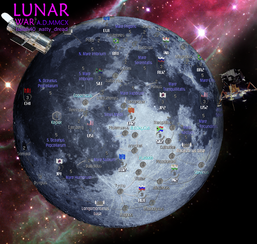
Here's with the changed landing sites, also trying out alternate craters (they came out a bit too large maybe) and dotted connecting lines...
Craters may have to be reduced in size... the dotted connectors, I'm not sure of them either, they look better in some places and worse in others... Perhaps they should be done with smaller dots too.
Craters may have to be reduced in size... the dotted connectors, I'm not sure of them either, they look better in some places and worse in others... Perhaps they should be done with smaller dots too.

-

 natty dread
- Posts: 12877
- Joined: Fri Feb 08, 2008 8:58 pm
- Location: just plain fucked


Re: Lunar War <v19> p1, 22 - POLL - vote please!
The dots are perfect, try to reduce the opacity on them. Take it all the way down until they are just legible enough to see. They do not need to be such an overwhelming focus of the map.
The craters have way too much bevel. Take a look at your photo. Your creators are a hundred miles deep, and they do not appear to be recessed, but rather in relief from the surface.
I am sorry if I hurt your feelings by my critiques before. I had a feeling that you would not take it well. You have been up front and honest with me about my maps. I just hope that you understand that, that is all that I am doing here.
Also, since when have you ever seen me commenting on GP matters. I was waiting for you to get that stuff finalized, before I did my part with the graphics. IMO your graphics are fine to use for the GP development, but once this map hits the Graphics Workshop, it will need a major overhaul.

-

 porkenbeans
- Posts: 2546
- Joined: Mon Sep 10, 2007 4:06 pm


Re: Lunar War <v19> p1, 22 - POLL - vote please!
Pork, you didn't hurt my feelings. I totally get your critique and agree with some of it.
However, if you wanted to do the graphics for this map, we should have discussed it more in detail in the beginning. All you did was post that one post on the first page of the thread... I assumed you had lost interested since there was never any follow-up discussion.
Also, the graphics you now made... well, I'm sorry but they would not be an improvement. If you had been following this thread, you would know your graphics have several problems I have already dealt with in my own graphics. It was decided way back in the first pages that it would be better not to go with an accurate photograph of the moon as background, but rather trace the features of the moon and do a more "stylistic" representation, like I myself have done. This helps hugely with legibility. Secondly your colour scheme is... well, let's just say it doesn't tickle my fashion sense. Thirdly, the space background you chose does not look like a star field. It looks like some sort of nebula as seen through the hubble telescope. Having such an image as a background for the moon is really inconsistent and weird. All these are issues I also had with my own graphics and have by now overcome, so you can see why I would feel that using your graphics would be taking a step back, in a sense. I do appreciate the effort though.
Anyway... as for the crater bevels, this is an optical illusion. No matter what bevel you look at, if you look at only the beveled area without any point of reference, you can always see it two ways, rising from the image or sinking into the image. It's really just an illusion though, and the same problem is with any bevel.
So, as I have gotten really attached to this project, I will be doing the graphics myself. But again I thank you for your efforts and apologize for any misuderstanding we may have had.
However, if you wanted to do the graphics for this map, we should have discussed it more in detail in the beginning. All you did was post that one post on the first page of the thread... I assumed you had lost interested since there was never any follow-up discussion.
Also, the graphics you now made... well, I'm sorry but they would not be an improvement. If you had been following this thread, you would know your graphics have several problems I have already dealt with in my own graphics. It was decided way back in the first pages that it would be better not to go with an accurate photograph of the moon as background, but rather trace the features of the moon and do a more "stylistic" representation, like I myself have done. This helps hugely with legibility. Secondly your colour scheme is... well, let's just say it doesn't tickle my fashion sense.
Anyway... as for the crater bevels, this is an optical illusion. No matter what bevel you look at, if you look at only the beveled area without any point of reference, you can always see it two ways, rising from the image or sinking into the image. It's really just an illusion though, and the same problem is with any bevel.
So, as I have gotten really attached to this project, I will be doing the graphics myself. But again I thank you for your efforts and apologize for any misuderstanding we may have had.

-

 natty dread
- Posts: 12877
- Joined: Fri Feb 08, 2008 8:58 pm
- Location: just plain fucked


Re: Lunar War <v19> p1, 22 - POLL - vote please!
natty_dread wrote:I'm going to wait to see what the poll results say before I do anything to the map. If the majority of people can't understand the map, I will make it more clear. But I sure as hell will not be implementing a purple bakcground with a blue moon on top of it...
Either way, may I remind all of you that we are still in gameplay workshop and I'd love to get some feedback on the gameplay!
Clarity of connections is gameplay.
Plus, what will be close to, or the final, analysis of gameplay balance will be along once the landing site adjustments you're discussing have been implemented.
-

 Teflon Kris
- Posts: 4236
- Joined: Sun Jul 13, 2008 4:39 pm
- Location: Lancashire, United Kingdom


Re: Lunar War <v19> p1, 22 - POLL - vote please!
DJ Teflon wrote:Plus, what will be close to, or the final, analysis of gameplay balance will be along once the landing site adjustments you're discussing have been implemented.
They have already been implemented. I guess I could post it again to get it on this page:

-

 natty dread
- Posts: 12877
- Joined: Fri Feb 08, 2008 8:58 pm
- Location: just plain fucked


Re: Lunar War <v19> p1, 22 - POLL - vote please!
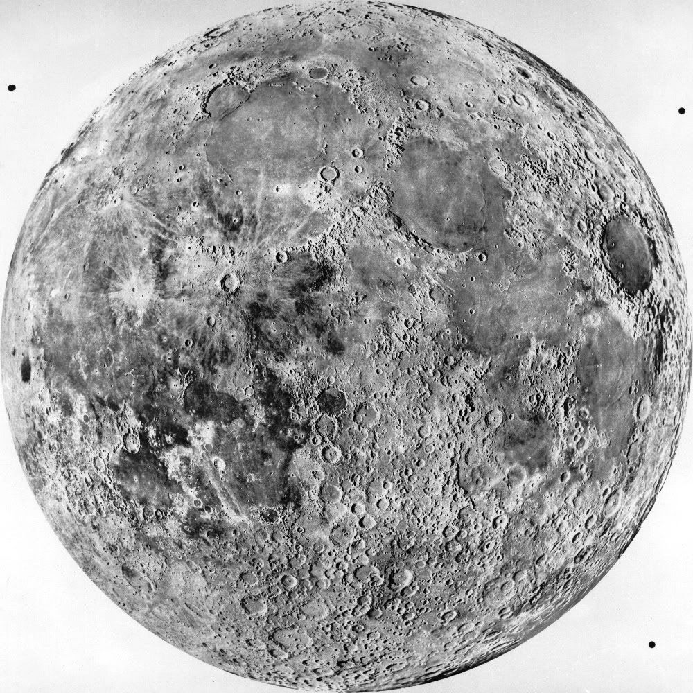
Here is a shot of the moon that I found. It has great detail of the craters.
Natty, If you are indeed trying to make a "stylized" version of the moon, You are not limited to 4 shades of gray.
Natty, If you are indeed trying to make a "stylized" version of the moon, You are not limited to 4 shades of gray.
Last edited by porkenbeans on Mon Apr 26, 2010 10:58 am, edited 1 time in total.

-

 porkenbeans
- Posts: 2546
- Joined: Mon Sep 10, 2007 4:06 pm


Who is online
Users browsing this forum: No registered users

