Conquer Club

First Nations of North America [Quenched]

Care to peruse completed maps? Take a stroll through the Atlas.

Moderator: Cartographers

Forum rules
Please read the Community Guidelines before posting.

Re: Native America.. UPDATE page 3

Postby thenobodies80 on Wed Apr 08, 2009 3:10 pm

Good map! An interesting project.
Mountains are beautiful.
And the possibilities of developing a great map are very high! :)

I think you have to work a lot on colors, i'm not colorblind but there're some zones that are very difficult to distinguish. :?
For exemple Meso America color is "invisible" in the legend.
Plateau is difficult to find on map.
You have to make more clear some regions....
Where is Eyak and where is tlingit?
What regions Beothuk can attack?
I suggest you to "remove" the northern zone of copper region, make only confusion

Personally i think the legend is very big

You need to balance the game, a good start in the south could be an easy +2 bonus (for meso america) withonly 1 border to defend (coahuiltee)
Rivers make the east zone impenetrable, Mountains do the same in the west part, and there's a big vertical central zone in which seems more difficult to find a quick way to take the dominance during the game.

Any suggestions for bonuses now...

Anyway, your map is one of the best i've seen in the last period.
C'mon! Make really great this map
=D>

TNBDS
User avatar
Sergeant 1st Class thenobodies80
 
Posts: 5400
Joined: Wed Sep 05, 2007 4:30 am
Location: Milan

Re: Native America.. UPDATE page 3

Postby Lobster Crush on Wed Apr 08, 2009 3:24 pm

Tisha wrote:
sailorseal wrote:Just three quick things because I love this map
1. Get rid of the compass it does not fit with the map
2. Either capitalize the names or don't but don't have it random
3. Add more canoes because that river really divides the map and only one looks odd


i like the compass.... why doesn't it fit?
all the names are capitalized, it's the font i'm using. (that i love)


That's actually a good point about the compass...I'm pretty sure it was a European invention, and that there wouldn't have been a compass (at least in that style) in pre-European N.A.

However, there definitely was an understanding of the cardinal points of the compass in Native North American culture, with the points of the compass figuring prominently in culture & mythology. Perhaps incorporating a less European-looking compass would work?

Cheers,
LC
User avatar
Sergeant 1st Class Lobster Crush
 
Posts: 93
Joined: Sun Mar 18, 2007 12:18 am
Location: Winneapolis, Minnetoba

Re: Native America.. UPDATE page 3

Postby Bones2484 on Wed Apr 08, 2009 3:38 pm

Tisha wrote:
sailorseal wrote:2. Either capitalize the names or don't but don't have it random

all the names are capitalized, it's the font i'm using. (that i love)


I think sailor is referring to "Hopi". The uppercase "H" just looks like a lower case one, but if you take a look at real lower case "h"s on the map, you can see they are different.
User avatar
Major Bones2484
 
Posts: 2307
Joined: Mon Sep 17, 2007 11:24 am
Location: Los Angeles, CA (G1)

Re: Native America.. UPDATE page 3

Postby Bones2484 on Wed Apr 08, 2009 4:11 pm

Ruben Cassar wrote:
I have a problem with more than one region actually. Aren't Pomo and Paiute part of the same region?


Actually no, those are different regions. I can see the problem though as the background on the mountain range kind of fades down into the California territories. The same mountain background color matches the Paiute region perfectly.
User avatar
Major Bones2484
 
Posts: 2307
Joined: Mon Sep 17, 2007 11:24 am
Location: Los Angeles, CA (G1)

Re: Native America.. UPDATE page 3

Postby ben79 on Wed Apr 08, 2009 4:21 pm

Ruben Cassar wrote:Very nice map indeed Tisha. Well done!

However I must say that I have a big problem with the colours used. It is very hard for me to differentiate between a region and another.

Also would it be possible to have a mini map instead of just listing the various regions?


i have to agrre for the colours ( i'm colorblind ) and it's really hard to make a difference between the regions ! a mini-map would help !
User avatar
Lieutenant ben79
 
Posts: 472
Joined: Tue Dec 04, 2007 4:29 pm

Re: Native America.. UPDATE page 3

Postby ppgangster on Thu Apr 09, 2009 11:46 am

I was about to suggest something about the color... but as everyone already did!

Looks great for a third version though!
User avatar
Sergeant 1st Class ppgangster
 
Posts: 557
Joined: Thu Jan 15, 2009 12:17 am

Re: Native America

Postby MrBenn on Thu Apr 16, 2009 8:26 am

The tweaks to the rivers makes it clearer that you intend them to be impassable; although the tributary in Iowa still looks a little out of place (my eye wants it to follow the territory border :lol: )

The canoe is a nice touch - perhaps you could consider adding one or two more somewhere??

MrBenn wrote:Some of your colours are very similar (the red/orange and blue/purple), and I think there needs to be a bit more clarity between the regions - which don't all have tentative bonus values yet :lol:

The colour scheme fits the style of the map brilliantly, but is likely to cause real headaches for those with or without imparied colour-vision. A quick way of testing region visibility is to look at the different colour channels and see how easy it is to differentiate the regions. I'm not sure if you wanted to experiment with different sort of hatched markings (like in Berlin 1961) - but this would likely change the feel of the map.

The arctic region still feels disjointed, and I still get a feeling of North-South imbalance from a gameplay perspective :?

Keep up the good work ;-)
Image
PB: 2661 | He's blue... If he were green he would die | No mod would be stupid enough to do that
User avatar
Lieutenant MrBenn
 
Posts: 6880
Joined: Wed Nov 21, 2007 9:32 am
Location: Off Duty

Re: Native America.. UPDATE 04/23

Postby Tisha on Thu Apr 23, 2009 9:03 pm

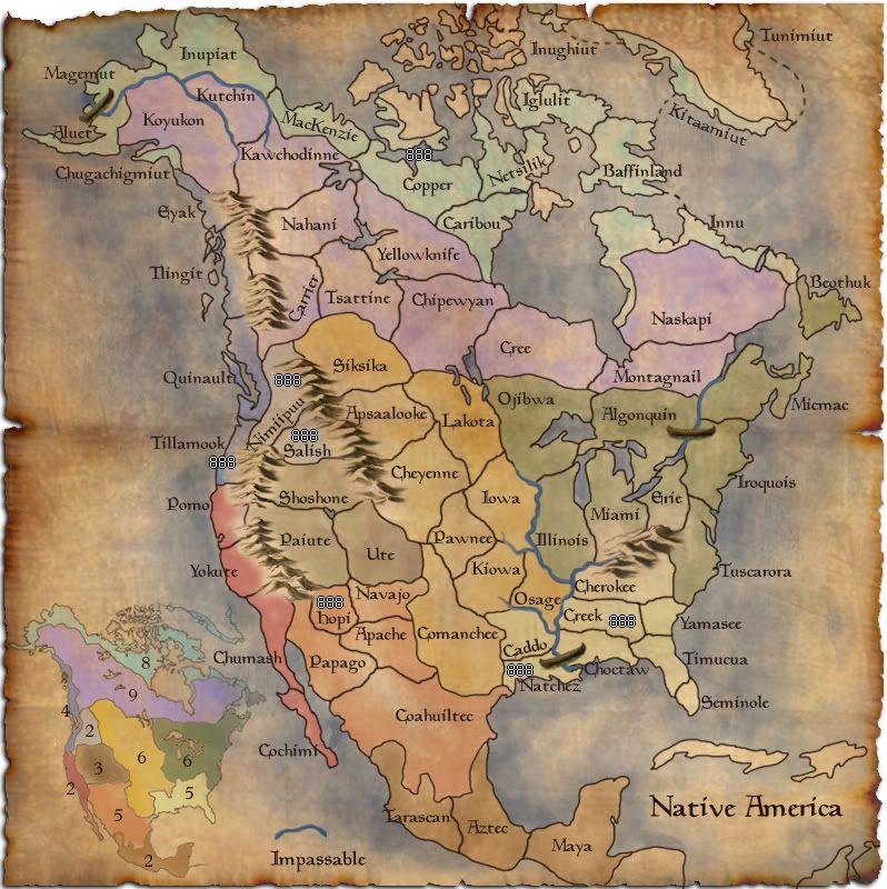
Native America

72 territories
11 bonus regions

-the mini map added.. but something doesn't seem right with it.. :?
-I'm still working on names of territories, and probably will be for quite a while.. any information there helps..
-less red in background
-more canoes
-changed the border of the river by Iowa

draft four
Click image to enlarge.
image
User avatar
Major Tisha
 
Posts: 1065
Joined: Sat Dec 23, 2006 12:41 am

Re: Native America.. UPDATE 04/23

Postby TaCktiX on Thu Apr 23, 2009 9:31 pm

It's a neat concept with some good potential graphics behind it, but my main concern right now is the size of the bonus regions. No one will hold a +5 or +6 without nearly having the game in hand already, much less +8 and +9. Three regions are of decent enough size to be holdable, but they're all in the west side of the map. Mix the +8 with the +9, then split across the center in some fashion, perhaps. The +6's can easily be split down the middle, and even if that means you're naming it "North [indian tribe]" and "South [indian tribe]", it'll make the map playable.
User avatar
Corporal 1st Class TaCktiX
 
Posts: 2392
Joined: Mon Dec 17, 2007 8:24 pm
Location: Rapid City, SD

Re: Native America.. UPDATE 04/23

Postby Tisha on Fri Apr 24, 2009 8:57 am

why aren't the n. e. and s. e. holdable? they only have four borders..
i don't see what mixing subartic and artic, then splitting them down the center would do :?
the artic and subartic.. i could cut down on the number of territories and and trees for another impassable.. would that fix that?
User avatar
Major Tisha
 
Posts: 1065
Joined: Sat Dec 23, 2006 12:41 am

Re: Native America.. UPDATE 04/23

Postby Bruceswar on Mon Apr 27, 2009 7:44 am

I think what he is like Asia was in classic, it is rarely held.
Highest Rank: 26 Highest Score: 3480
Image
User avatar
Corporal Bruceswar
 
Posts: 9713
Joined: Sun Dec 23, 2007 12:36 am
Location: Cow Pastures

Re: Native America.. UPDATE 04/23

Postby ghirrindin on Mon Apr 27, 2009 1:52 pm

Given that the tribes in each of your territories represent a striking array of cultural diversity, perhaps geographic names would be best for the territories? Arctic, Sub-Arctic, Plains, Pacific Northwest, Central Pacific, Great Basin, Southwest, Mesoamerica, Southeast, and Eastern Woodlands? I'm at a loss of what to call that two region territory in the mountains. Columbia River Plateau?

Hope this helps!
User avatar
Sergeant ghirrindin
 
Posts: 129
Joined: Sat Jan 12, 2008 9:34 pm
Location: Urbana, IL

Re: Native America.. UPDATE 04/23

Postby Tisha on Mon Apr 27, 2009 2:37 pm

ghirrindin wrote:Given that the tribes in each of your territories represent a striking array of cultural diversity, perhaps geographic names would be best for the territories? Arctic, Sub-Arctic, Plains, Pacific Northwest, Central Pacific, Great Basin, Southwest, Mesoamerica, Southeast, and Eastern Woodlands? I'm at a loss of what to call that two region territory in the mountains. Columbia River Plateau?

Hope this helps!

i had/have names for all the regions (in the previous drafts)... but the territories were hard to tell apart with the colors i have chosen to use, so a mini map was requested
User avatar
Major Tisha
 
Posts: 1065
Joined: Sat Dec 23, 2006 12:41 am

Re: Native America.. UPDATE 04/23

Postby thenobodies80 on Mon Apr 27, 2009 5:30 pm

Yes, there were some problem with colors on names, but the names fit better than this minimap...a turn back and trying with a different use of colors?
I'm with Tack (about northern/Eastern regions), a split could be a good choice.
The gameplay is unbalanced now, the south and the west zones are still good places in which a player could start, the north and the east zones aren't holdable.


TNBDS
User avatar
Sergeant 1st Class thenobodies80
 
Posts: 5400
Joined: Wed Sep 05, 2007 4:30 am
Location: Milan

Re: Native America.. UPDATE 04/23

Postby Danyael on Mon Apr 27, 2009 7:07 pm

vey nice looking map
I'm a big fan of your burnt edges really suits the map
it looks kinda pretty sharp at the top left corner maybe blur it but not a big deal

I think that Ojibwa needs to go further west with its border
they where nomadic for buffalo hunts threw out the canadian prairies
maybe have it at least more west of lake manitoba due dakota ojibawa resevr is around there as well as sacred ojibawa grounds near portage la praire
as well on a side note lake manitoba is bigger then winnipeg

where is a link to a site on ojibwa in case you want to read alittle about them
http://www.native-art-in-canada.com/ojibwaindians.html

and here's a bad pic where ojibwa are still present an have reserve and scared lands in these location and a purpose border for them
Image

not a must but some to keep in mind

once again very nice looking map and the mini map make so there is no confusion with my colourblindness
User avatar
Corporal 1st Class Danyael
 
Posts: 352
Joined: Fri Jul 04, 2008 4:26 pm
Location: Winnipeg, Manitoba

Re: Native America.. UPDATE 04/23

Postby oaktown on Tue Apr 28, 2009 1:11 am

For starters, this map is all kinds of nice. It's my favorite looking map in the Drafting Room right now. =D>

That said, it turns out I have a lot of little critiques. For starters, the glow around the mountains flows nicely with some region colors (the south east), and creates a bit too much contrast with others (especially California). And while the mini-map helps immensely in terms of picking out where the regions are, the colors on the map are close enough to confuse color-blind players (like me). The colors of northern and southern mexico are especially close.

Has there been any thought of making Coahuiltec a part of the Mesoamerica bonus? +2 for three territories that are only accessible from one region/territory seems quite generous - adding Coahuiltec and leaving it a +2 makes it an Australia and makes it more in line with the Califoria +2.

And now that I look at the regions more closely, it's too bad all of the good starts/small bonuses are clustered. Two-thirds of the map will be completely ignored for the decisive first few rounds of most games. I'd say that the first player to hold a bonus - which will probably be the little guy - will be able to harass the other players trying to hold their first bonuses and/or expand to hold more. And I haven't crunched any numbers, but the pacific northwest/inside passage region seems generous, considering the South East gets only one extra army and it has eight territories and four borders, compared to four territories with four borders. And when you start coupling the small regions you get all kinds of generous bonuses: +5 for five territories with three borders, for example.

Forgive me if this has been brought up, but I'm wondering how people feel about the map title? The term "Native American" is most commonly used to describe people who are native to the United States, and this map goes beyond US borders. And you can most certainly use the term to describe anyone native to the Americas, but that would also include South America. Plus, any name using the word America suggests European presence, since America is itself a name given to the land by Europeans.

The ideal title for this map would be something not derivative of a European name. Our Canadian friends use the terms "First Nations" to refer to native peoples, which is far more empowering.
User avatar
Captain oaktown
 
Posts: 4451
Joined: Sun Dec 03, 2006 9:24 pm
Location: majorcommand

Re: Native America.. UPDATE 04/23

Postby Tisha on Tue Apr 28, 2009 10:45 am

thenobodies80 wrote:Yes, there were some problem with colors on names, but the names fit better than this minimap...a turn back and trying with a different use of colors?
I'm with Tack (about northern/Eastern regions), a split could be a good choice.
The gameplay is unbalanced now, the south and the west zones are still good places in which a player could start, the north and the east zones aren't holdable.


TNBDS


i'm going to have to mess with the colors..:( i don't like the minimap either..

why isn't the east holdable? 8 territories 4 borders, 9 territories 4 borders

as for the north.. i mentioned less territories, maybe trees as an impassable?

Danyael wrote:vey nice looking map
I'm a big fan of your burnt edges really suits the map
it looks kinda pretty sharp at the top left corner maybe blur it but not a big deal

I think that Ojibwa needs to go further west with its border
they where nomadic for buffalo hunts threw out the canadian prairies
maybe have it at least more west of lake manitoba due dakota ojibawa resevr is around there as well as sacred ojibawa grounds near portage la praire
as well on a side note lake manitoba is bigger then winnipeg

where is a link to a site on ojibwa in case you want to read alittle about them
http://www.native-art-in-canada.com/ojibwaindians.html

and here's a bad pic where ojibwa are still present an have reserve and scared lands in these location and a purpose border for them
Image


not a must but some to keep in mind

once again very nice looking map and the mini map make so there is no confusion with my colourblindness


i'll see what i can do about moving ojibwa over a little, but my lakes aren't that far off.. http://geology.com/canada/manitoba.shtml

oaktown wrote:For starters, this map is all kinds of nice. It's my favorite looking map in the Drafting Room right now. =D>

That said, it turns out I have a lot of little critiques. For starters, the glow around the mountains flows nicely with some region colors (the south east), and creates a bit too much contrast with others (especially California). And while the mini-map helps immensely in terms of picking out where the regions are, the colors on the map are close enough to confuse color-blind players (like me). The colors of northern and southern mexico are especially close.

i'll have to change all the colors.. i'll figure it out

Has there been any thought of making Coahuiltec a part of the Mesoamerica bonus? +2 for three territories that are only accessible from one region/territory seems quite generous - adding Coahuiltec and leaving it a +2 makes it an Australia and makes it more in line with the Califoria +2.

What if i split Coahuiltec into two? then i could take a territory out somewhere else.. that will only make the s. w. harder to hold then though.

And now that I look at the regions more closely, it's too bad all of the good starts/small bonuses are clustered. Two-thirds of the map will be completely ignored for the decisive first few rounds of most games. I'd say that the first player to hold a bonus - which will probably be the little guy - will be able to harass the other players trying to hold their first bonuses and/or expand to hold more. And I haven't crunched any numbers, but the pacific northwest/inside passage region seems generous, considering the South East gets only one extra army and it has eight territories and four borders, compared to four territories with four borders. And when you start coupling the small regions you get all kinds of generous bonuses: +5 for five territories with three borders, for example.

Forgive me if this has been brought up, but I'm wondering how people feel about the map title? The term "Native American" is most commonly used to describe people who are native to the United States, and this map goes beyond US borders. And you can most certainly use the term to describe anyone native to the Americas, but that would also include South America. Plus, any name using the word America suggests European presence, since America is itself a name given to the land by Europeans.


The ideal title for this map would be something not derivative of a European name. Our Canadian friends use the terms "First Nations" to refer to native peoples, which is far more empowering.

First Nations i kinda like
User avatar
Major Tisha
 
Posts: 1065
Joined: Sat Dec 23, 2006 12:41 am

Re: Native America.. UPDATE 04/23

Postby Merker on Wed Apr 29, 2009 4:58 am

Just one thing about the name...It's just that I have this feeling that if map was Native America, it'd include South America.
Last edited by Merker on Wed Apr 29, 2009 5:34 pm, edited 1 time in total.
MrBenn wrote:On an a side-note, as a child I used to have a recurring nightmare about being chased round a supermarket by a crocodile pushing a shopping trolley and wearing an "I ♥ Shopping" t-shirt...

-----Spanish Civil War: Vacationed
User avatar
Cook Merker
 
Posts: 124
Joined: Tue May 13, 2008 4:26 am
Location: Manjimup, Australia

Re: Native America.. UPDATE 04/23

Postby lt_oddball on Wed Apr 29, 2009 9:27 am

couldnt you change the very very english name "yellowknife" into "Athabascans" ?
Technically, the yellowknife for todays reference is correct, but it looks bad on this map amongst all original indian names.
I googled, and found Athabascans as (larger group)alternative.

The same goes for "Copper".
Look for something more appropriate.
Barbarus hic ego sum, quia non intellegor ulli.
User avatar
Major lt_oddball
 
Posts: 364
Joined: Mon Mar 05, 2007 11:17 am
Location: Fortress Europe

Re: Native America.. UPDATE 04/23

Postby Tisha on Wed Apr 29, 2009 1:38 pm

Merker wrote:Just one thing about the name...It's just that I have this feeling that if map was Native America, it'd include South America, so please, just for me, change the name of the map to Native North America / North Native America, thanks, ;).


if you read a couple posts above, the name is being talked about..

lt_oddball wrote:couldnt you change the very very english name "yellowknife" into "Athabascans" ?
Technically, the yellowknife for todays reference is correct, but it looks bad on this map amongst all original indian names.
I googled, and found Athabascans as (larger group)alternative.

The same goes for "Copper".
Look for something more appropriate.

Athabascans is pretty much a linguistic stock of some native americans... i'll change yellowknife to Tatsanottine

i know alot of the names need changed still.. i'm working on them.
User avatar
Major Tisha
 
Posts: 1065
Joined: Sat Dec 23, 2006 12:41 am

Re: Native America.. UPDATE 04/23

Postby thenobodies80 on Wed Apr 29, 2009 2:12 pm

Tisha wrote:
thenobodies80 wrote:Yes, there were some problem with colors on names, but the names fit better than this minimap...a turn back and trying with a different use of colors?
I'm with Tack (about northern/Eastern regions), a split could be a good choice.
The gameplay is unbalanced now, the south and the west zones are still good places in which a player could start, the north and the east zones aren't holdable.


TNBDS


i'm going to have to mess with the colors..:( i don't like the minimap either..

why isn't the east holdable? 8 territories 4 borders, 9 territories 4 borders

as for the north.. i mentioned less territories, maybe trees as an impassable?


I try to be more specific:
  • Northeast woodlands - 9 regions/4 borders - actually this zone has a separated region (beothuk), so the player that control the artic zone probably has to move from innu to south. But in this way he has to take the beothuk region to secure the arctic zone and to have only one border to defend (naskapi). In my opinion you have to add a connection from micmac to beothuk to have an easier troops movement.
  • Arctic - chugachigmiut linked with aluet, for the same reason.
  • Subarctic - 11 regions/9 borders ....i think that this zone has to be splitted.It's very large and it has an horizontal placement (southern regions have a vertical one), probably players will try to take the dominance in the southern/western zones, smaller and easier to hold, so the "unlucky" player has to focus himself in the northern part of your map. In few turns this unlucky player has to take (quickly :!: ) the artic or the subarctic zone to contrast the easy small bonuses.

Finally ( you can postpone this thing) the white you used as background doesn't fit very well.

Good work! =D>
TNBDS
User avatar
Sergeant 1st Class thenobodies80
 
Posts: 5400
Joined: Wed Sep 05, 2007 4:30 am
Location: Milan

Re: Native America.. UPDATE 04/23

Postby Merker on Wed Apr 29, 2009 5:31 pm

oaktown wrote:
Forgive me if this has been brought up, but I'm wondering how people feel about the map title? The term "Native American" is most commonly used to describe people who are native to the United States, and this map goes beyond US borders. And you can most certainly use the term to describe anyone native to the Americas, but that would also include South America. Plus, any name using the word America suggests European presence, since America is itself a name given to the land by Europeans.

The ideal title for this map would be something not derivative of a European name. Our Canadian friends use the terms "First Nations" to refer to native peoples, which is far more empowering.


Or you could call it Amerigine. Though it would probably mistaken some sort of precious metal map.
MrBenn wrote:On an a side-note, as a child I used to have a recurring nightmare about being chased round a supermarket by a crocodile pushing a shopping trolley and wearing an "I ♥ Shopping" t-shirt...

-----Spanish Civil War: Vacationed
User avatar
Cook Merker
 
Posts: 124
Joined: Tue May 13, 2008 4:26 am
Location: Manjimup, Australia

Re: Native America.. UPDATE 04/23

Postby lt_oddball on Wed Apr 29, 2009 6:04 pm

Merker wrote:
oaktown wrote:
Forgive me if this has been brought up, but I'm wondering how people feel about the map title? The term "Native American" is most commonly used to describe people who are native to the United States, and this map goes beyond US borders. And you can most certainly use the term to describe anyone native to the Americas, but that would also include South America. Plus, any name using the word America suggests European presence, since America is itself a name given to the land by Europeans.

The ideal title for this map would be something not derivative of a European name. Our Canadian friends use the terms "First Nations" to refer to native peoples, which is far more empowering.


Or you could call it Amerigine. Though it would probably mistaken some sort of precious metal map.


Why not "Tribal Americas" or "Western Natives" (so far serious) or
:mrgreen: (this is a joke) "Original Savages of America" ..but that could be confused with today's down-town Bronx inhabitants :roll:
Barbarus hic ego sum, quia non intellegor ulli.
User avatar
Major lt_oddball
 
Posts: 364
Joined: Mon Mar 05, 2007 11:17 am
Location: Fortress Europe

Re: Native America.. UPDATE 04/23

Postby Teflon Kris on Wed Apr 29, 2009 6:26 pm

Well, the savages could also refer to a lot of other people of the modern world,indigenous is probably the most accurate word although it sounds a bit academic maybe?

How about North America 999AD? Or something like that?
User avatar
Sergeant 1st Class Teflon Kris
 
Posts: 4236
Joined: Sun Jul 13, 2008 4:39 pm
Location: Lancashire, United Kingdom

Re: Native America.. UPDATE 04/23

Postby tlane on Wed Apr 29, 2009 7:33 pm

Tisha wrote:as for the north.. i mentioned less territories, maybe trees as an impassable?

trees sound like a good idea for the north. It should help with the gameplay a good amount.

Also, when you change the colors you should run them through
http://www.vischeck.com/vischeck/vischeckImage.php
this will show you what the map looks like to color blind people. Currently there are some very similar looking areas(for color blind people).

some other things:
1.You may want to put a few mountains above the impassible sign. It is pretty clear, but you probably should anyways.
2. The two islands off of Seminole currently seem to be useless, you should think about making them territories.

Nice map,
tlane
sailorseal wrote:come on, now i am all sticky
Private tlane
 
Posts: 309
Joined: Wed Oct 22, 2008 7:11 pm
Location: NYC - sint maarten(sometimes)

PreviousNext

Return to The Atlas

Who is online

Users browsing this forum: No registered users