Egypt: Nubia [Quenched]
Moderator: Cartographers
Forum rules
Please read the Community Guidelines before posting.
Please read the Community Guidelines before posting.
Re: NUBIAN EGYPT V8(P7) [I] - New style
Any comments?

* Pearl Harbour * Waterloo * Forbidden City * Jamaica * Pot Mosbi
Re: NUBIAN EGYPT V8(P7) [I] - New style
I don't like the look of the new roads. They look like they were drawn haphazardly and just don't have a nice feel to them. Maybe if you smoothed out the transition from light to dark it would be better.
I like the new colors - it's much easier to tell the 2nd and 3rd Cataracts apart.
I suggested this earlier, but didn't get a reply. I think the pillar Taharqa sits on was better when it the main color was light and the flourishes on it were dark. Right now, the main part of the pillar is dark and the design-bits are light. I don't think flipping the current colors would work, since the pillar would blend into the desert then, but you could lighten the pillar a few shades and use a very dark color for the designs.
Re: NUBIAN EGYPT V9(P7) [I] - New Roads
Roads should be better now.ZeakCytho wrote:I don't like the look of the new roads. They look like they were drawn haphazardly and just don't have a nice feel to them. Maybe if you smoothed out the transition from light to dark it would be better.
KewlI like the new colors - it's much easier to tell the 2nd and 3rd Cataracts apart.
Still working on this one...haven't been able to do anything that looks better than what it is now, and don't think reverting to past column in those previous colours will cut the mustard...so will see what i can come up with next version.I suggested this earlier, but didn't get a reply. I think the pillar Taharqa sits on was better when it the main color was light and the flourishes on it were dark. Right now, the main part of the pillar is dark and the design-bits are light. I don't think flipping the current colors would work, since the pillar would blend into the desert then, but you could lighten the pillar a few shades and use a very dark color for the designs.
That should be fixed now.TaCktiX wrote:I'm pretty sure I made the comment before that the space between the columns at the bottom of the map is kinda dead compared to the liveliness of the rest of the map.
Yes that still has to be tidied. But they will all be able to attack each other.Are Nobo-arba and Nobo-sitta able to attack each other, the well, and Nobo samsa? I find that jumble of attack routes fairly confusing.
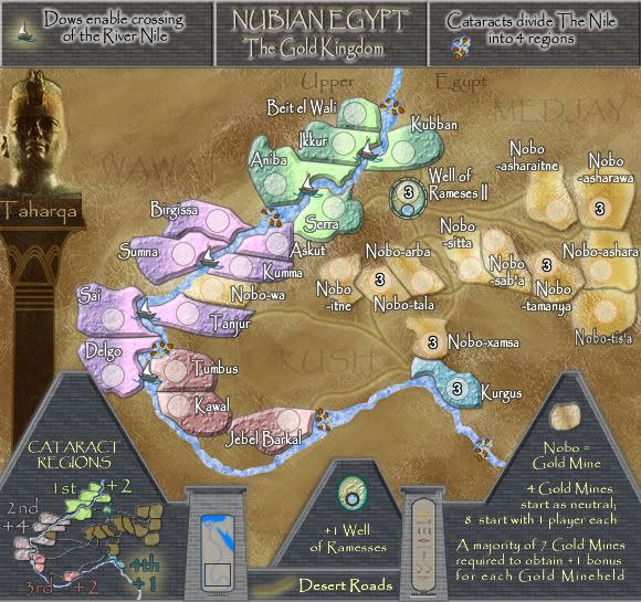
Here's current Version 9


* Pearl Harbour * Waterloo * Forbidden City * Jamaica * Pot Mosbi
- max is gr8
- Posts: 3720
- Joined: Sat Jan 21, 2006 6:44 am
- Location: In a big ball of light sent from the future
Re: NUBIAN EGYPT V9(P7) [I] - New Roads
The bits in the middle are a bit bland, maybe add farms or something along the side as scenery.
‹max is gr8› so you're a tee-total healthy-eating sex-addict?
‹New_rules› Everyone has some bad habits
(4th Jan 2010)
‹New_rules› Everyone has some bad habits
(4th Jan 2010)
Re: NUBIAN EGYPT V9(P7) [I] - New Roads
max...once again, thanks for the suggestion.max is gr8 wrote:The bits in the middle are a bit bland, maybe add farms or something along the side as scenery.
these territories are almost pure desert. farms would in most likely hood have been with those territories marked and not in the spare space. I know what you are saying, but it probably just wasn't there. This is a very harsh land. Even the current Sudanese only raise cattle in most of these areas and they are nomadic herds. The lower delta area was much more fertile for farming. if however i think of something appropriate i will addition it to the map.

* Pearl Harbour * Waterloo * Forbidden City * Jamaica * Pot Mosbi
-
Lone.prophet
- Posts: 1467
- Joined: Thu Oct 12, 2006 4:37 pm
- Location: Your basement Muahaha
Re: NUBIAN EGYPT V9(P7) [I] - New Roads
nice looking map here
though i dont like how the roads are now cause
1. they look messy and choppy
2. they are a bit to blended i think i didnt see them at first hand
3. they are confusion in direction and route
though i dont like how the roads are now cause
1. they look messy and choppy
2. they are a bit to blended i think i didnt see them at first hand
3. they are confusion in direction and route

Re: NUBIAN EGYPT V9(P7) [I] - New Roads
Thanks lone.prophetLone.prophet wrote:nice looking map here
though i dont like how the roads are now cause
1. they look messy and choppy
2. they are a bit to blended i think i didnt see them at first hand
3. they are confusion in direction and route

* Pearl Harbour * Waterloo * Forbidden City * Jamaica * Pot Mosbi
-
Lone.prophet
- Posts: 1467
- Joined: Thu Oct 12, 2006 4:37 pm
- Location: Your basement Muahaha
Re: NUBIAN EGYPT V9(P7) [I] - New Roads
and maybe the stones at Aniba and Askut it looks asif the connect the 2 territories i dunno if that also is the case
the rest look awesome
the rest look awesome

Re: NUBIAN EGYPT V9(P7) [I] - New Roads
Here's current Version 9


* Pearl Harbour * Waterloo * Forbidden City * Jamaica * Pot Mosbi
Re: NUBIAN EGYPT V9(P7) [I] - New Roads
ah, so i need to put the impassables on - the river and the cataracts.Lone.prophet wrote:and maybe the stones at Aniba and Askut it looks asif the connect the 2 territories i dunno if that also is the case
the rest look awesome

* Pearl Harbour * Waterloo * Forbidden City * Jamaica * Pot Mosbi
-
Lone.prophet
- Posts: 1467
- Joined: Thu Oct 12, 2006 4:37 pm
- Location: Your basement Muahaha
Re: NUBIAN EGYPT V9(P7) [I] - New Roads
i guess dont really understand, but now it looks asif they connect the 2 territories though i doubt that that is how you want it too

- AndyDufresne
- Posts: 24932
- Joined: Fri Mar 03, 2006 8:22 pm
- Location: A Banana Palm in Zihuatanejo
- Contact:
Re: NUBIAN EGYPT V9(P7) [I] - New Roads
Yes, they look like they are shallows connecting regions...maybe if you adjust the placement so at least 1 side is touching non-gameboard areas, that may clear up the issue.
--Andy
--Andy
Re: NUBIAN EGYPT V10(P7) [I] - New Roads & Legned
Rather than that Andy, I have added instructions to the legend about the Cataracts.AndyDufresne wrote:Yes, they look like they are shallows connecting regions...maybe if you adjust the placement so at least 1 side is touching non-gameboard areas, that may clear up the issue.
--Andy
These should be fixed now for the better....less confusing perhaps.Lone.prophet wrote:nice looking map here
though i dont like how the roads are now cause
1. they look messy and choppy
2. they are a bit to blended i think i didnt see them at first hand
3. they are confusion in direction and route
Version 10.

* Pearl Harbour * Waterloo * Forbidden City * Jamaica * Pot Mosbi
-
Lone.prophet
- Posts: 1467
- Joined: Thu Oct 12, 2006 4:37 pm
- Location: Your basement Muahaha
Re: NUBIAN EGYPT V9(P7) [I] - New Roads
def better but i think you can make them more noticable.
and as a question do the boatsterritories also connect to other boatsterritories on the same nile piece, like KUBBAN connects to SERRA?
and as a question do the boatsterritories also connect to other boatsterritories on the same nile piece, like KUBBAN connects to SERRA?

Re: NUBIAN EGYPT V9(P7) [I] - New Roads
Mmmmm !Lone.prophet wrote:def better but i think you can make them more noticable.
No. Perhaps i need to put there: The River Nile is passable only to territories opposite each other using the Dows....and as a question do the boatsterritories also connect to other boatsterritories on the same nile piece, like KUBBAN connects to SERRA?
or is that too wordy?

* Pearl Harbour * Waterloo * Forbidden City * Jamaica * Pot Mosbi
Re: NUBIAN EGYPT V10(P8) [I] - New Roads & Leegend
I don't think it's necessary as this wasn't an issue with Lower (quenched) or Upper (I,Gp,Gr) Egypt, which have the exact same Dow mechanic. I think everyone's simply assumed that it's "directly across" and nothing more spectacular, especially since you're selling all three maps as simple classic gameplay.
-
Lone.prophet
- Posts: 1467
- Joined: Thu Oct 12, 2006 4:37 pm
- Location: Your basement Muahaha
Re: NUBIAN EGYPT V10(P8) [I] - New Roads & Leegend
maybe the description with the divide may cause people to think boats attack but i didnt just wanted to make sure of it

Re: NUBIAN EGYPT V10(P8) [I] - New Roads & Leegend
So everyone's happy with it as it stands now?TaCktiX wrote:I don't think it's necessary as this wasn't an issue with Lower (quenched) or Upper (I,Gp,Gr) Egypt, which have the exact same Dow mechanic. I think everyone's simply assumed that it's "directly across" and nothing more spectacular, especially since you're selling all three maps as simple classic gameplay.

* Pearl Harbour * Waterloo * Forbidden City * Jamaica * Pot Mosbi
- gimil
- Posts: 8599
- Joined: Sat Mar 03, 2007 12:42 pm
- Gender: Male
- Location: United Kingdom (Scotland)
Re: NUBIAN EGYPT V10(P8) [I] - New Roads & Leegend
I got a few small questions.
1. The use of dows and cataracts may be a confusing aspect from a gameplay point of view. Would you consider using bridges instead? I feel it will cut out some headache that it may cause.
2. I dont really like the layer effects used the the top part of the legends/title, I prefer the simplier and cleaner text you have used on the lower legends on the map.
What do you know about map making, bitch?
Top Score:2403natty_dread wrote:I was wrong
Re: NUBIAN EGYPT V11(P8) [I] - Small adjustments
Version 11.
Small Changes:
1. adjusted the roads and darkened the top layer
2. re-spaced and increased size of some nobo terts
3. copied well of ramesses into the legend
4. changed the down text to see if that is clearer
5. changed the background colour on the column under Taharqa

Small Changes:
1. adjusted the roads and darkened the top layer
2. re-spaced and increased size of some nobo terts
3. copied well of ramesses into the legend
4. changed the down text to see if that is clearer
5. changed the background colour on the column under Taharqa


* Pearl Harbour * Waterloo * Forbidden City * Jamaica * Pot Mosbi
Re: NUBIAN EGYPT V10(P8) [I] - New Roads & Leegend
No, sorry...the theme of these Nile maps is using dows (Lower and Upper also) and apart from small stream wooden bridges (which may have been around), I don't beleive I've seen anything in writings of the ancients to suggest they build bridges over the Nile.gimil wrote:I got a few small questions.
1. The use of dows and cataracts may be a confusing aspect from a gameplay point of view. Would you consider using bridges instead? I feel it will cut out some headache that it may cause.
Fair enough, but this is the same style used on the other maps and i'd like to keep it. However, i may adjust the bottom somewhat.2. I dont really like the layer effects used the the top part of the legends/title, I prefer the simplier and cleaner text you have used on the lower legends on the map.
Thanks Gimil.
Current Version 11


* Pearl Harbour * Waterloo * Forbidden City * Jamaica * Pot Mosbi
- gimil
- Posts: 8599
- Joined: Sat Mar 03, 2007 12:42 pm
- Gender: Male
- Location: United Kingdom (Scotland)
Re: NUBIAN EGYPT V10(P8) [I] - New Roads & Leegend
I can live with the dows personally 
But the title area and the dow and cataracts explaination text jsutdoesnt do it for me, Its to bold and clumpy feeling rather than crisp and neat like the text throughout the other edgyt maps.
But the title area and the dow and cataracts explaination text jsutdoesnt do it for me, Its to bold and clumpy feeling rather than crisp and neat like the text throughout the other edgyt maps.
What do you know about map making, bitch?
Top Score:2403natty_dread wrote:I was wrong
Re: NUBIAN EGYPT V12(P8) [I] - New Legend
OK...hows this, same size as the other maps and same colours as the legend.gimil wrote:I can live with the dows personally
But the title area and the dow and cataracts explaination text jsutdoesnt do it for me, Its to bold and clumpy feeling rather than crisp and neat like the text throughout the other edgyt maps.
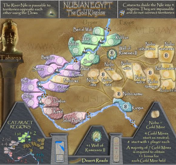
Version 12


* Pearl Harbour * Waterloo * Forbidden City * Jamaica * Pot Mosbi
Re: NUBIAN EGYPT V12(P8) [I] - New Legend
Not been back in here for a while - but this map has come on a lot.
1 small nitpick "Well of Ramessess" -> "Well of Ramessess II" (Can you make the name consistent between the 2)?
C.
1 small nitpick "Well of Ramessess" -> "Well of Ramessess II" (Can you make the name consistent between the 2)?
C.

Highest score : 2297
Re: NUBIAN EGYPT V12(P8) [I] - New Legend
Please F5....Thanks C...small but necessary nitpick so i forgive you LOLyeti_c wrote:Not been back in here for a while - but this map has come on a lot.
1 small nitpick "Well of Ramessess" -> "Well of Ramessess II" (Can you make the name consistent between the 2)?
C.

* Pearl Harbour * Waterloo * Forbidden City * Jamaica * Pot Mosbi

