Conquer Club

CC City Mogul [Quenched]

Care to peruse completed maps? Take a stroll through the Atlas.

Moderator: Cartographers

Forum rules
Please read the Community Guidelines before posting.

Postby DiM on Sat Jan 26, 2008 9:41 pm

InkL0sed wrote:
DiM wrote:
InkL0sed wrote:I see what you mean, but it still just seems out of place. It works on Doodle Earth because that's the theme of the map, but this map isn't particularly about children. Also, if it really was a bunch of kids coming upon their dad's blueprint, would their drawings have a neon glow? Besides the fact that they don't look good, it all just seems kind of random.


what seems random?


The drawings. There's nothing else to suggest on the map that it's a blueprint a bunch of kids decided to make into a risk board.

Maybe I'm wrong, but that's how I feel.


yea you're right. i know they're kids cause i'm thinking it but you're right. i'll see what i can do. i have a few ideas and i'll implement them when i get home.

maybe adding a few dice, perhaps some risk troops or something like that?

maybe a peanut butter covered fingerprint?
“In the beginning God said, the four-dimensional divergence of an antisymmetric, second rank tensor equals zero, and there was light, and it was good. And on the seventh day he rested.”- Michio Kaku
User avatar
Major DiM
 
Posts: 10415
Joined: Wed Feb 14, 2007 6:20 pm
Location: making maps for scooby snacks

Postby InkL0sed on Sat Jan 26, 2008 9:43 pm

DiM wrote:maybe adding a few dice, perhaps some risk troops or something like that?

maybe a peanut butter covered fingerprint?


I like it :D
User avatar
Lieutenant InkL0sed
 
Posts: 2370
Joined: Sat Jun 23, 2007 4:06 pm
Location: underwater

Postby DiM on Sat Jan 26, 2008 9:46 pm

InkL0sed wrote:
DiM wrote:maybe adding a few dice, perhaps some risk troops or something like that?

maybe a peanut butter covered fingerprint?


I like it :D


will do after i get home and sleep.
if you have any suggestions to further enhance this feeling feel free to post them. however i'd like something subtle (like the fingerprint) cause i don't want to clutter the image.
“In the beginning God said, the four-dimensional divergence of an antisymmetric, second rank tensor equals zero, and there was light, and it was good. And on the seventh day he rested.”- Michio Kaku
User avatar
Major DiM
 
Posts: 10415
Joined: Wed Feb 14, 2007 6:20 pm
Location: making maps for scooby snacks

Postby InkL0sed on Sat Jan 26, 2008 11:43 pm

Maybe if you made it so you could tell the whole thing is just a sheet of paper? Like making it so there's some kind of frame, and the edges of the map itself curling up like paper, or held down by a stone or something.
User avatar
Lieutenant InkL0sed
 
Posts: 2370
Joined: Sat Jun 23, 2007 4:06 pm
Location: underwater

Postby DiM on Sun Jan 27, 2008 8:00 am

InkL0sed wrote:Maybe if you made it so you could tell the whole thing is just a sheet of paper? Like making it so there's some kind of frame, and the edges of the map itself curling up like paper, or held down by a stone or something.


can't you see it's paper? i mean it has 2 horizontal folds, it has a crease in the top right, it has various shadows to highlight the fact that the the map is a 3d paper. but i guess i can add some corner curling.

i'm gonna go eat and i'll be back in an hour or 2 and start the update.
“In the beginning God said, the four-dimensional divergence of an antisymmetric, second rank tensor equals zero, and there was light, and it was good. And on the seventh day he rested.”- Michio Kaku
User avatar
Major DiM
 
Posts: 10415
Joined: Wed Feb 14, 2007 6:20 pm
Location: making maps for scooby snacks

Postby DiM on Sun Jan 27, 2008 11:34 am

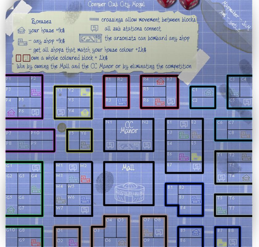
i just got home and did some quick changes.

v6
added hand print and figerprints
added some new coffee stains
and dice.

i'm not sure i can put the risk figurines on the map though. aren't they copyrighted? so i didn't add them.

i will be working on a curl but i'm not sure where to place it. bottom left and right is impossible cause the terits will curl, top right has a crease and sig. so only top left remains but that has the scotch tape there so i need a really small curl or something. i'll work on it.

Image
“In the beginning God said, the four-dimensional divergence of an antisymmetric, second rank tensor equals zero, and there was light, and it was good. And on the seventh day he rested.”- Michio Kaku
User avatar
Major DiM
 
Posts: 10415
Joined: Wed Feb 14, 2007 6:20 pm
Location: making maps for scooby snacks

Postby DiM on Sun Jan 27, 2008 11:51 am

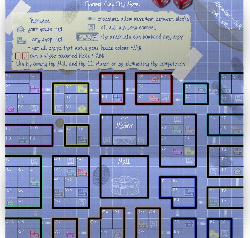
i managed to do the curl afterall. it's small but it looks good. :D

v7

curl


Image
“In the beginning God said, the four-dimensional divergence of an antisymmetric, second rank tensor equals zero, and there was light, and it was good. And on the seventh day he rested.”- Michio Kaku
User avatar
Major DiM
 
Posts: 10415
Joined: Wed Feb 14, 2007 6:20 pm
Location: making maps for scooby snacks

Postby InkL0sed on Sun Jan 27, 2008 11:59 am

Looking better, keep it up.
User avatar
Lieutenant InkL0sed
 
Posts: 2370
Joined: Sat Jun 23, 2007 4:06 pm
Location: underwater

Postby edbeard on Sun Jan 27, 2008 6:35 pm

maybe I'm getting a bit ahead of myself, though honestly I don't see any problems with the map, but where are the army counts going to go.

In many places it is obvious, but in others I have questions.


For instance, W1 (to the left of the Mall), are you going to place it in between the W1 and the S ? Or, over the S itself? Do you think this will look good?

Also, I suppose for the arsonists: is it going on top of the image you have?; above it?; again, will this look good?


For all I know the counts might actually fit right under the W1 text.
User avatar
Lieutenant edbeard
 
Posts: 2501
Joined: Thu Mar 29, 2007 12:41 am

Postby DiM on Sun Jan 27, 2008 6:39 pm

edbeard wrote:maybe I'm getting a bit ahead of myself, though honestly I don't see any problems with the map, but where are the army counts going to go.

In many places it is obvious, but in others I have questions.


For instance, W1 (to the left of the Mall), are you going to place it in between the W1 and the S ? Or, over the S itself? Do you think this will look good?

Also, I suppose for the arsonists: is it going on top of the image you have?; above it?; again, will this look good?


For all I know the counts might actually fit right under the W1 text.


thanks for the feedback ed.
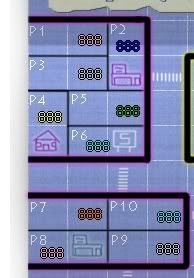
here's what i posted a few pages back:

DiM wrote:testing army numbers

Image


i hope that clears your concern. as for the arsonist that's the only place where the army number will overlay something because i will put it right in the window of the BAD shop. but that won't cause any readability probles.

anything else besides the numbers?
“In the beginning God said, the four-dimensional divergence of an antisymmetric, second rank tensor equals zero, and there was light, and it was good. And on the seventh day he rested.”- Michio Kaku
User avatar
Major DiM
 
Posts: 10415
Joined: Wed Feb 14, 2007 6:20 pm
Location: making maps for scooby snacks

Postby edbeard on Sun Jan 27, 2008 6:50 pm

not really. well a couple things I guess.


observations:

1. everyone has 3 borders to hold their starting colour area except green and red

2. it's a bit hard to tell the colours of certain shops. Mostly when they're in a different colour block. The one in P8 is that blue? cyan? green? I'm pretty sure it is cyan, but I'm sure someone else will be confused.

well, can a colour-blind player play the map? maybe add a letter to the shop picture to help distinguish.
User avatar
Lieutenant edbeard
 
Posts: 2501
Joined: Thu Mar 29, 2007 12:41 am

Postby mibi on Sun Jan 27, 2008 6:59 pm

I am a little bummed you are going the blueprints route with this. I was quote looking forward to a top down city map with all kinds of neat details. I think CC needs something like that and it would be unique as well. It seems to me that the blue print style is a bit of a cop out as far as graphics goes, especially considering the version you have currently shares more in common with doodle earth than anything you would see on a city planner's desk.

But if you continue with the blueprints maybe you can add a rule, compass, pencil and pen.
User avatar
Captain mibi
 
Posts: 3350
Joined: Thu Mar 01, 2007 8:19 pm
Location: The Great State of Vermont

Postby DiM on Sun Jan 27, 2008 7:03 pm

edbeard wrote:not really. well a couple things I guess.


observations:

1. everyone has 3 borders to hold their starting colour area except green and red

2. it's a bit hard to tell the colours of certain shops. Mostly when they're in a different colour block. The one in P8 is that blue? cyan? green? I'm pretty sure it is cyan, but I'm sure someone else will be confused.

well, can a colour-blind player play the map? maybe add a letter to the shop picture to help distinguish.


there's no starting area. each player gets a home and then all terits excetpt shops subs and mall+manor get randomly distributed.
so each player will get a home plus several other terits all over town.

as for the colors i think i'll switch them to the new colors used by CC that should make everything clear.
“In the beginning God said, the four-dimensional divergence of an antisymmetric, second rank tensor equals zero, and there was light, and it was good. And on the seventh day he rested.”- Michio Kaku
User avatar
Major DiM
 
Posts: 10415
Joined: Wed Feb 14, 2007 6:20 pm
Location: making maps for scooby snacks

Postby DiM on Sun Jan 27, 2008 7:07 pm

mibi wrote:I am a little bummed you are going the blueprints route with this. I was quote looking forward to a top down city map with all kinds of neat details. I think CC needs something like that and it would be unique as well. It seems to me that the blue print style is a bit of a cop out as far as graphics goes, especially considering the version you have currently shares more in common with doodle earth than anything you would see on a city planner's desk.

But if you continue with the blueprints maybe you can add a rule, compass, pencil and pen.


glad you're right on the spot. this is a blueprint some kids found on their dad's desk. they took a pen and drew some shops made up some instructions and colored the terits, then started playing risk. also they kinda put their dirty hands all over the map but that's not a problem since dad had already spilled coffee.

so if you saw doodle earth there then i'm pleased. adding rulers and stuff will not enhance the "kids @ play" feeling and will clutter the map.
“In the beginning God said, the four-dimensional divergence of an antisymmetric, second rank tensor equals zero, and there was light, and it was good. And on the seventh day he rested.”- Michio Kaku
User avatar
Major DiM
 
Posts: 10415
Joined: Wed Feb 14, 2007 6:20 pm
Location: making maps for scooby snacks

Postby mibi on Sun Jan 27, 2008 7:14 pm

DiM wrote:
mibi wrote:I am a little bummed you are going the blueprints route with this. I was quote looking forward to a top down city map with all kinds of neat details. I think CC needs something like that and it would be unique as well. It seems to me that the blue print style is a bit of a cop out as far as graphics goes, especially considering the version you have currently shares more in common with doodle earth than anything you would see on a city planner's desk.

But if you continue with the blueprints maybe you can add a rule, compass, pencil and pen.


glad you're right on the spot. this is a blueprint some kids found on their dad's desk. they took a pen and drew some shops made up some instructions and colored the terits, then started playing risk. also they kinda put their dirty hands all over the map but that's not a problem since dad had already spilled coffee.

so if you saw doodle earth there then i'm pleased. adding rulers and stuff will not enhance the "kids @ play" feeling and will clutter the map.


perhaps you need to accentuate the "kids @ play" aspect if thats what your going for because right now its ambiguously amateur. maybe a half eaten cookie or crayons or something.
User avatar
Captain mibi
 
Posts: 3350
Joined: Thu Mar 01, 2007 8:19 pm
Location: The Great State of Vermont

Postby edbeard on Sun Jan 27, 2008 7:17 pm

Since these are kids, that stain at the top right hot chocolate?

could you add the number of starting territories to the first post? Or, maybe also in the update posts.

And, maybe these too (just so I don't have to look for em :) )

the following terits will start as neutral:
mall - 15
manor - 15
arsonist - 5
subways - 3
shops - 3
User avatar
Lieutenant edbeard
 
Posts: 2501
Joined: Thu Mar 29, 2007 12:41 am

Postby DiM on Sun Jan 27, 2008 7:39 pm

mibi wrote:
DiM wrote:
mibi wrote:I am a little bummed you are going the blueprints route with this. I was quote looking forward to a top down city map with all kinds of neat details. I think CC needs something like that and it would be unique as well. It seems to me that the blue print style is a bit of a cop out as far as graphics goes, especially considering the version you have currently shares more in common with doodle earth than anything you would see on a city planner's desk.

But if you continue with the blueprints maybe you can add a rule, compass, pencil and pen.


glad you're right on the spot. this is a blueprint some kids found on their dad's desk. they took a pen and drew some shops made up some instructions and colored the terits, then started playing risk. also they kinda put their dirty hands all over the map but that's not a problem since dad had already spilled coffee.

so if you saw doodle earth there then i'm pleased. adding rulers and stuff will not enhance the "kids @ play" feeling and will clutter the map.


perhaps you need to accentuate the "kids @ play" aspect if thats what your going for because right now its ambiguously amateur. maybe a half eaten cookie or crayons or something.


the dice and the fingerprints where the kids thing. but the cookie is brilliant. i'll add the cookie tomorrow.
“In the beginning God said, the four-dimensional divergence of an antisymmetric, second rank tensor equals zero, and there was light, and it was good. And on the seventh day he rested.”- Michio Kaku
User avatar
Major DiM
 
Posts: 10415
Joined: Wed Feb 14, 2007 6:20 pm
Location: making maps for scooby snacks

Postby DiM on Sun Jan 27, 2008 7:40 pm

edbeard wrote:Since these are kids, that stain at the top right hot chocolate?

could you add the number of starting territories to the first post? Or, maybe also in the update posts.

And, maybe these too (just so I don't have to look for em :) )

the following terits will start as neutral:
mall - 15
manor - 15
arsonist - 5
subways - 3
shops - 3


added in first post.
“In the beginning God said, the four-dimensional divergence of an antisymmetric, second rank tensor equals zero, and there was light, and it was good. And on the seventh day he rested.”- Michio Kaku
User avatar
Major DiM
 
Posts: 10415
Joined: Wed Feb 14, 2007 6:20 pm
Location: making maps for scooby snacks

Postby fireedud on Sun Jan 27, 2008 9:05 pm

I thinkn you need to have a better table graphic.
me have no sig
Cook fireedud
 
Posts: 1704
Joined: Fri Mar 02, 2007 10:06 pm

Postby DiM on Sun Jan 27, 2008 9:23 pm

fireedud wrote:I thinkn you need to have a better table graphic.


what table? :shock:
“In the beginning God said, the four-dimensional divergence of an antisymmetric, second rank tensor equals zero, and there was light, and it was good. And on the seventh day he rested.”- Michio Kaku
User avatar
Major DiM
 
Posts: 10415
Joined: Wed Feb 14, 2007 6:20 pm
Location: making maps for scooby snacks

Postby edbeard on Sun Jan 27, 2008 9:41 pm

DiM wrote:
fireedud wrote:I thinkn you need to have a better table graphic.


what table? :shock:


maybe the white area that the blueprint is ontop?
User avatar
Lieutenant edbeard
 
Posts: 2501
Joined: Thu Mar 29, 2007 12:41 am

Postby DiM on Sun Jan 27, 2008 9:43 pm

edbeard wrote:
DiM wrote:
fireedud wrote:I thinkn you need to have a better table graphic.


what table? :shock:


maybe the white area that the blueprint is ontop?


oh right. hmm i never meant that to be as a table i actually made it to better see where i should place shadows :P

in the end that will be gone. it will be transparent.
“In the beginning God said, the four-dimensional divergence of an antisymmetric, second rank tensor equals zero, and there was light, and it was good. And on the seventh day he rested.”- Michio Kaku
User avatar
Major DiM
 
Posts: 10415
Joined: Wed Feb 14, 2007 6:20 pm
Location: making maps for scooby snacks

Postby oaktown on Mon Jan 28, 2008 12:36 am

so i was following this trail of breadcrumbs, and this is where it led me. Here are my thoughts, in no particular order. Keep in mind that I haven't read the entire thread - the first post should give enough info to base an initial opinion on, and if it doesn't you may want to edit it.

For starters, I love the idea of using $$ rather than armies. Clever. So is the arsonist idea, but I find the arsonist location illogical - next to the manor? The location is good for gameplay in that it should be equally accessible to everybody, but maybe it would work just as well in E4, since the block has no houses or crosswalks? That would make the CC Manor block less powerful, since it will already be a target for those going after the objective.

On that note, bjectives are hard to judge... will this be too easy? Will it be impossible? In this map the objective may be easier to capture and hold than in Magic (in which if you are strong enough to hold that objective the game is close to over anyway), but I am concerned that by having only the two access points to both objective territories (AND the valuable arsonist) you are creating a bottleneck to them. This might be alright since N1 and N2 can be hit by subway stations across the board, but it's worthy of a few lines of discussion.

Would it be too much trouble to count up the total number of territories on which players will start?

I know the graphics are still a work in progress, but I'd like to see the white lines even lighter... they should just give the map character, without being confusing.

It's hard for me to judge some of the bonuses because the colors are difficult for me to distinguish. For instance, I'm not sure which shops go with which houses. And are some of the blocks not supposed to be "colored" blocks and therefor don't get a bonus? The "E" block, for example? (Sometimes I think I was brought on board as a CA to give the colorblind perspective.)

Wait... what's a colored block - is it one block with color around it, or all of the blocks with a like color? Because B5-B6 is, by itself, a "Coloured Block."

Map size I see is 800x840... are you going to cut it down to 800x800? because I'm pretty sure you could.

Alright, this is on my radar now... I'll check back. :)
User avatar
Captain oaktown
 
Posts: 4451
Joined: Sun Dec 03, 2006 9:24 pm
Location: majorcommand

Postby DiM on Mon Jan 28, 2008 11:31 am

oaktown wrote:so i was following this trail of breadcrumbs, and this is where it led me. Here are my thoughts, in no particular order. Keep in mind that I haven't read the entire thread - the first post should give enough info to base an initial opinion on, and if it doesn't you may want to edit it.


to be honest i haven't read the first post in a while but it should have the basics.

oaktown wrote:For starters, I love the idea of using $$ rather than armies. Clever. So is the arsonist idea, but I find the arsonist location illogical - next to the manor? The location is good for gameplay in that it should be equally accessible to everybody, but maybe it would work just as well in E4, since the block has no houses or crosswalks? That would make the CC Manor block less powerful, since it will already be a target for those going after the objective.


i was thinking in putting an arsonist in both e4 and w5 instead of having it near the manor but then i realised it would be harder to get to. on the other hand i could leave the one near the manor and add both e4 and w5. 3 arsonists that can bombard shops. i'll ponder on this for a while.

oaktown wrote:On that note, bjectives are hard to judge... will this be too easy? Will it be impossible? In this map the objective may be easier to capture and hold than in Magic (in which if you are strong enough to hold that objective the game is close to over anyway), but I am concerned that by having only the two access points to both objective territories (AND the valuable arsonist) you are creating a bottleneck to them. This might be alright since N1 and N2 can be hit by subway stations across the board, but it's worthy of a few lines of discussion.


there's no such thing as a too easy objective. even if it has just 1 neutral it is still the same for all people. and to be honest i'd prefer a lower number of neutrals to tempt people going for it. however a lower number of neutrals doesn't mean it will be easy to win by holding the objective since all other people will try and stop you.

as for the bottleneck issue, as i said above i'm thinking to add 2 more arsonists. so the value of the manor area will decrease. but also i'm not sure it really is a bottleneck since N1 and N2 can be attacked from 12 other subways.

oaktown wrote:Would it be too much trouble to count up the total number of territories on which players will start?


8 houses
33 other places after i add the 2 arsonists in e4 and w5

oaktown wrote:I know the graphics are still a work in progress, but I'd like to see the white lines even lighter... they should just give the map character, without being confusing.


you mean dampen them? make them harder to see?

oaktown wrote:It's hard for me to judge some of the bonuses because the colors are difficult for me to distinguish. For instance, I'm not sure which shops go with which houses. And are some of the blocks not supposed to be "colored" blocks and therefor don't get a bonus? The "E" block, for example? (Sometimes I think I was brought on board as a CA to give the colorblind perspective.)


the E and W block are commercial blocks the manor and the mansion are objective and all the others are residential. so only the residential have coloured outlines. as it says in the legend only coloured blocks give a bonus and since W and E don't have a colour they get nothing.

also i will change the colours to match the new colours we have on CC so hopefully they will be more visible.

oaktown wrote:Wait... what's a colored block - is it one block with color around it, or all of the blocks with a like color? Because B5-B6 is, by itself, a "Coloured Block."


if you look in the legend i put the whole red block to show that you don't get the bonus for owning a fraction you get the bonus fro owning a whole. just like the legend says "own a whole coloured block ..."

oaktown wrote:Map size I see is 800x840... are you going to cut it down to 800x800? because I'm pretty sure you could.


the map itself has 800*800 but the extra 40px are for the white background so that the shadows are visible. that white background will be gone and only the shadows will remain so basically the map will be 800px tall and 800px wide, with a few extra px for shadows on the sides.

oaktown wrote:Alright, this is on my radar now... I'll check back. :)


will be waiting.
“In the beginning God said, the four-dimensional divergence of an antisymmetric, second rank tensor equals zero, and there was light, and it was good. And on the seventh day he rested.”- Michio Kaku
User avatar
Major DiM
 
Posts: 10415
Joined: Wed Feb 14, 2007 6:20 pm
Location: making maps for scooby snacks

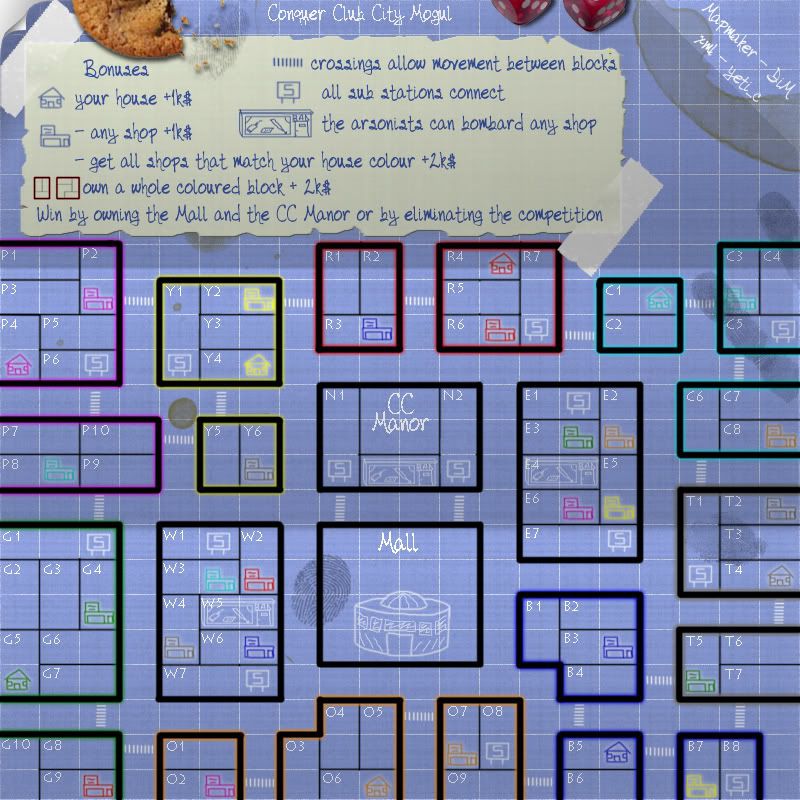
Postby DiM on Mon Jan 28, 2008 12:39 pm

V8

changed all colours to the new ones introduced on CC
added cookie
added 2 more arsonists on E4 and W5
reduced map to 800*800
various other tinkering.
what i want to know is if you guys see the top left corner as invisible, where the curl is. because with firefox i see it invisible. with IE i see it white. and i have no idea why :(

Image
“In the beginning God said, the four-dimensional divergence of an antisymmetric, second rank tensor equals zero, and there was light, and it was good. And on the seventh day he rested.”- Michio Kaku
User avatar
Major DiM
 
Posts: 10415
Joined: Wed Feb 14, 2007 6:20 pm
Location: making maps for scooby snacks

PreviousNext

Return to The Atlas

Who is online

Users browsing this forum: No registered users