- Click image to enlarge.
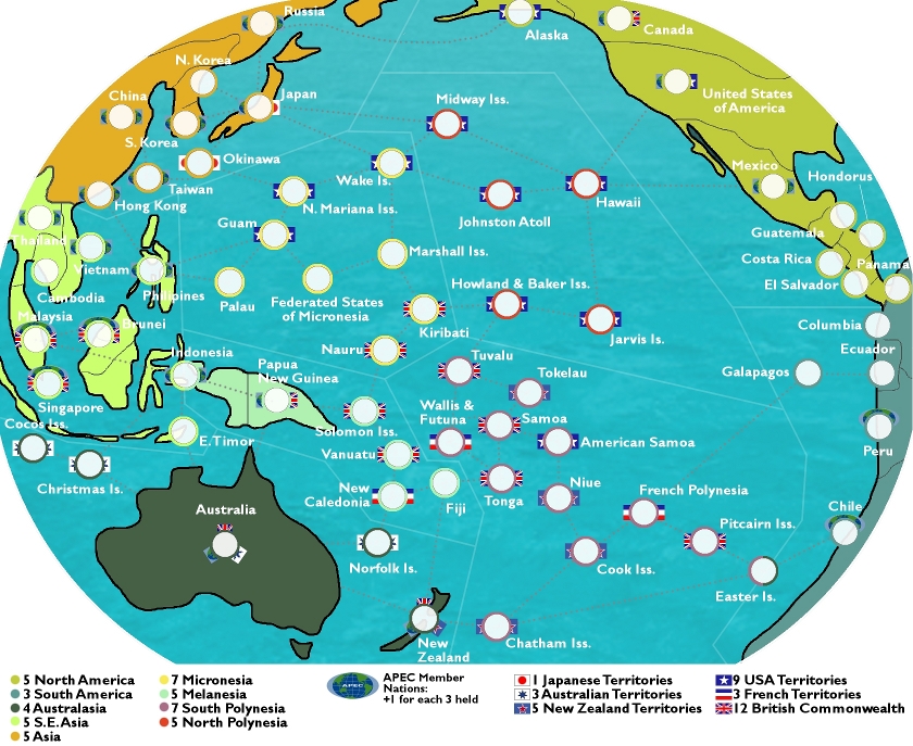
Continents: 9
Gameplay: can also get bonuses for holding all of a nation's territories (USA, British Commonwealth, etc.); plus holding APEC Member States will give a bonus (+1 for each 3 held: there are 21 APEC states, so max is +7)
Notes: Easter Island is part of both Polynesia & South America; Indonesia is part of both S.E. Asia & Melanesia.
Changes in V.2.5:
-Working on new ideas for indicating APEC Members: new prototypes are on Peru & Chile (APEC members with no other national affiliation); and on Singapore, Malaysia & Brunei (APEC members with a national affiliation, in these cases the British Commonwealth). The APEC logo now spans the top portion of the army circle, instead of trying to be part of the flag on one side (for example, as on China & the USA). Any ideas on how this might be done better are welcome.
-Small fixes, such as Brunei is no longer called Benin (though thinking about the two, I can kind of see how I confused them in my mind); the Commonwealth nations in SE Asia are no longer indicated as NZ Territories (oops).
Changes in V.2:
-Increased territory count to 66
-Increased continent count to 9 (divided Polynesia into N & S)
-Complete graphics overhaul (though still need work)
-Secondary bonuses indicated by "flags" on either side of army circle (the APEC flag currently sucks...I'll work on it)
To Do:
-the attack route lines need to be darkened
-Honduras needs to be spelled correctly
-graphics need work in general
-continent colours of SE Asia & Melanesia need to be more differentiated
Second version:
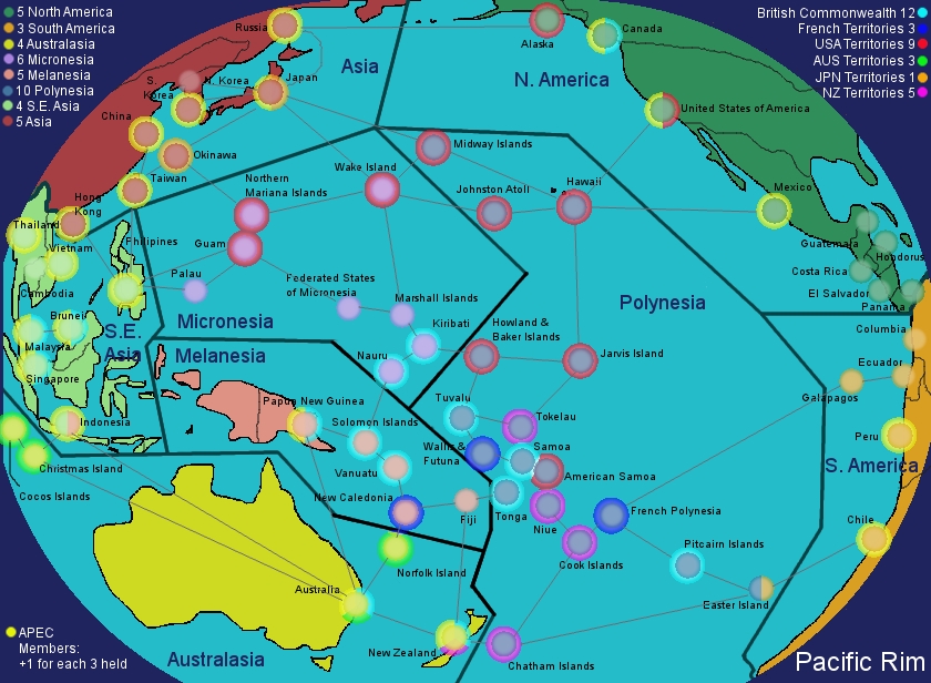
- Click image to enlarge.

- Click image to enlarge.
LC