Much clearer cairns, thanks. I still think that H and K lines look almost identical in color and would prefer one of them to be a different color but with the clearer station markings I can certainly figure out what is what.
I think I would disagree with those who want to change the coloring substantially in the backgrounds. The tradition of the rail series has been the starker backgrounds. Each of the other three are solid grey/black/brown type maps. I much prefer this background to the one in Australia which I find a little difficult to read (I'm not suggesting to do anything with that one-just comparing the two) and I find this grey to be easier on the eyes that Europe also.
Rail Africa [Quenched]
Moderator: Cartographers
Forum rules
Please read the Community Guidelines before posting.
Please read the Community Guidelines before posting.
-
barterer2002

- Posts: 6311
- Joined: Mon Jul 02, 2007 11:51 am
- Gender: Male
- Contact:



Re: RAIL AFRICA (V2) - New Silhouette
No i haven't forgotten the D army circles, those stations are shared.Night Strike wrote: Did you forget a couple of D army circles and a few others? If you want the stations to share the army circle, perhaps put the letters on each side of the circle rather than top/bottom. The top one looks empty with the top/bottom approach.
We have gone over this before in other maps, and the preference is to place them on top, on the right they get covered by the army numbers, and on the left the width becomes too wide to fit stations in certain places. Thus the vertical placement is preferred.

* Pearl Harbour * Waterloo * Forbidden City * Jamaica * Pot Mosbi
Re: RAIL AFRICA (V2) - New Silhouette
Yes i thought about that also. I will see what other design is appropriate there, but something with the silhouetted style of Africa.Night Strike wrote: I don't know if having the letter identifications between each army circle is going to work on the hubs because I can see some major colorblind issues with it.
H and K lines have too similar of a color to stay together both in the hub and coming out of it.
 i'll fix.
* Pearl Harbour * Waterloo * Forbidden City * Jamaica * Pot Mosbi
Re: RAIL AFRICA
thanks MrBenn for your comments. Let's see how everything pans.MrBenn wrote:...
I'd rather see some of the other stuff make it

* Pearl Harbour * Waterloo * Forbidden City * Jamaica * Pot Mosbi
Re: RAIL AFRICA (V2) - New Silhouette
Yes i thought it was easier on the eyes given all the different colours on it that are reflective of the different African cultures.barterer2002 wrote:Much clearer cairns, thanks. I still think that H and K lines look almost identical in color and would prefer one of them to be a different color but with the clearer station markings I can certainly figure out what is what.Colour changed next version to a brown
I think I would disagree with those who want to change the coloring substantially in the backgrounds. The tradition of the rail series has been the starker backgrounds. Each of the other three are solid grey/black/brown type maps. I much prefer this background to the one in Australia which I find a little difficult to read (I'm not suggesting to do anything with that one-just comparing the two) and I find this grey to be easier on the eyes that Europe also.

* Pearl Harbour * Waterloo * Forbidden City * Jamaica * Pot Mosbi
Re: RAIL AFRICA (V2) - New Silhouette
As in silhouettes?Night Strike wrote: Putting pyramids on the map would also be nice.
* Pearl Harbour * Waterloo * Forbidden City * Jamaica * Pot Mosbi
Re: RAIL AFRICA (V3)
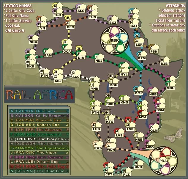
Version 3.
1. Removed the dark drop shadow on the continent.
2. Fixed those incorrect station identities
3. Changed the colour on the Inlander Line to brown
4. Inserted a B & W print of the Nairobi Railway Stations in the back ground
5. The legend will probably go for a simple railway type sign as it is very big.
1. Removed the dark drop shadow on the continent.
2. Fixed those incorrect station identities
3. Changed the colour on the Inlander Line to brown
4. Inserted a B & W print of the Nairobi Railway Stations in the back ground
5. The legend will probably go for a simple railway type sign as it is very big.
Last edited by cairnswk on Sat Jun 27, 2009 8:33 pm, edited 1 time in total.
* Pearl Harbour * Waterloo * Forbidden City * Jamaica * Pot Mosbi
-
captainwalrus
- Posts: 1018
- Joined: Sun Nov 11, 2007 3:19 pm
- Location: Finnmark
Re: RAIL AFRICA (V3)P3 -New Background
I like this much better. IS there a bonus for holding the main hubs? Why not?
-
SultanOfSurreal

- Posts: 97
- Joined: Thu Jul 03, 2008 3:53 am
- Gender: Male
Re: RAIL AFRICA (V3)P3 -New Background
the slats on the rail connections need to be much thinner or the connections be turned back into solid lines. as it stands now, they look like checkerboards.
title needs work too... that is seriously cliche and not very compelling, but i understand not mussing with it now.
really loving the lotus flower-like hubs. great idea.
overall this is looking promising. I've never played the other rail maps but they are interesting, and seeing the concept expanded is exciting.
when are we getting rail antarctica?
title needs work too... that is seriously cliche and not very compelling, but i understand not mussing with it now.
really loving the lotus flower-like hubs. great idea.
overall this is looking promising. I've never played the other rail maps but they are interesting, and seeing the concept expanded is exciting.
when are we getting rail antarctica?
-
gimil

- Posts: 8599
- Joined: Sat Mar 03, 2007 12:42 pm
- Gender: Male
- Location: United Kingdom (Scotland)
Re: RAIL AFRICA (V3)P3 -New Background
Just a small thought cairns.
Why not colour code the part of the legends that decodes territory names with the example you give? Sort of like this:
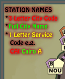
Obviously better colour it than I did but you get the idea.
Oh, and your image is a few px to big
Why not colour code the part of the legends that decodes territory names with the example you give? Sort of like this:
Obviously better colour it than I did but you get the idea.
Oh, and your image is a few px to big
What do you know about map making, bitch?
Top Score:2403natty_dread wrote:I was wrong
-
captainwalrus
- Posts: 1018
- Joined: Sun Nov 11, 2007 3:19 pm
- Location: Finnmark
Re: RAIL AFRICA (V3)P3 -New Background
The viper (J) is marked as I in a few places.
~ CaptainWalrus
Re: RAIL AFRICA (V3)P3 -New Background
thanks cappy...fixed next versioncaptainwalrus wrote:The viper (J) is marked as I in a few places.
* Pearl Harbour * Waterloo * Forbidden City * Jamaica * Pot Mosbi
Re: RAIL AFRICA (V3)P3 -New Background
All fixed. Thanks Gimilgimil wrote:Just a small thought cairns.
Why not colour code the part of the legends that decodes territory names with the example you give? Sort of like this:
Obviously better colour it than I did but you get the idea.
Oh, and your image is a few px to big
* Pearl Harbour * Waterloo * Forbidden City * Jamaica * Pot Mosbi

Re: RAIL AFRICA (V3)P3 -New Background
this looks like a great map. nice bright/highly contrasting colors - and the black rails - and the white background on territory markers make this easier to read.
if the white territory markers were a bit larger than the number text, then it would be even better.
any idea when this map will be done?
if the white territory markers were a bit larger than the number text, then it would be even better.
any idea when this map will be done?
Re: RAIL AFRICA (V3)P3 -New Background
Thanks Melech14 for commenting. We have to get it out of Drafts first, before it even looks like becoming a map.melech14 wrote:this looks like a great map. nice bright/highly contrasting colors - and the black rails - and the white background on territory markers make this easier to read.
if the white territory markers were a bit larger than the number text, then it would be even better.
any idea when this map will be done?
Version 4 shortly.
* Pearl Harbour * Waterloo * Forbidden City * Jamaica * Pot Mosbi
Re: RAIL AFRICA (V4)
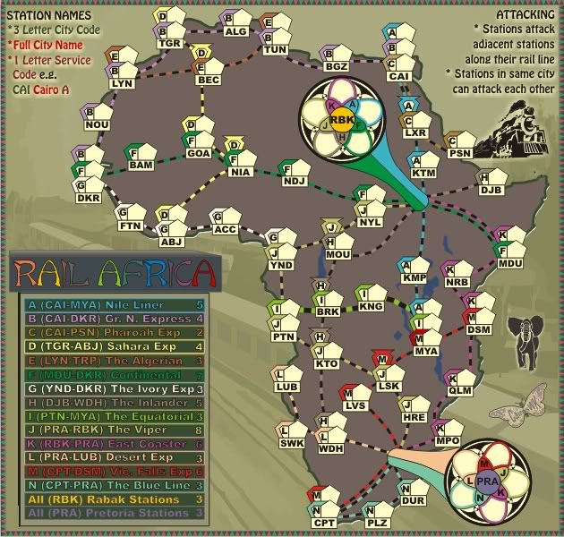
Version 4.
1. Added railway carriages to the Nairobi Railway station
2. added simple african triangle design border in earthy colours
3. put colour to the suggestions by Gimil for the "destructions"
4. changed the "line indicators" on the map to longer thicker lines so they don't look like checker boards
5. Added two bonuses for the RBK and PRA stations
1. Added railway carriages to the Nairobi Railway station
2. added simple african triangle design border in earthy colours
3. put colour to the suggestions by Gimil for the "destructions"
4. changed the "line indicators" on the map to longer thicker lines so they don't look like checker boards
5. Added two bonuses for the RBK and PRA stations
- Click image to enlarge.

* Pearl Harbour * Waterloo * Forbidden City * Jamaica * Pot Mosbi
-
captainwalrus
- Posts: 1018
- Joined: Sun Nov 11, 2007 3:19 pm
- Location: Finnmark
Re: RAIL AFRICA (V4)P3 - New Frame, Carriages & Design Elements
What are the carriages? Nairobi looks just like all the other stations. I like this muchy more than when it started.
~ CaptainWalrus
Re: RAIL AFRICA (V4)P3 - New Frame, Carriages & Design Elements
In the background image, i've added carriages to Nairobi station to make it look more like a train station.captainwalrus wrote:What are the carriages? Nairobi looks just like all the other stations. I like this muchy more than when it started.
* Pearl Harbour * Waterloo * Forbidden City * Jamaica * Pot Mosbi
-
Teflon Kris

- Posts: 4236
- Joined: Sun Jul 13, 2008 4:39 pm
- Gender: Male
- Location: Lancashire, United Kingdom
Re: RAIL AFRICA (V4)P3 - New Frame, Carriages & Design Elements
Nice map so far - would have preferred an ancient river niger civilisation map though - maybe a project somebody might take up another time.
-
SultanOfSurreal
- Posts: 97
- Joined: Thu Jul 03, 2008 3:53 am
- Gender: Male
Re: RAIL AFRICA (V4)P3 - New Frame, Carriages & Design Elements
while I like the thinner rail lines, I think you misconstrued what I was getting at. The slats themselves (the colored portions) are too thick compared to the black portions. There should be a few more of them and they should be thinner.

now that I think about it they may also look better if they stuck out a tiny bit past the black sections. And maybe you could go whole hog and add little metal rails to either side (the actual "rail" part of the railroad)
and if i may ask, why did you choose Rabak as one of the main hubs? it's not a very large or influential city. cairo or nairboi would make more sense.
- Click image to enlarge.

- Click image to enlarge.

now that I think about it they may also look better if they stuck out a tiny bit past the black sections. And maybe you could go whole hog and add little metal rails to either side (the actual "rail" part of the railroad)
and if i may ask, why did you choose Rabak as one of the main hubs? it's not a very large or influential city. cairo or nairboi would make more sense.
Re: RAIL AFRICA (V4)P3 - New Frame, Carriages & Design Elements
Mmmm. i think that belongs in the other Africa thread in suggestions. I was always going to do this map, and Asia and South America will come eventually also. Thanks anyway, DJ Teflon.DJ Teflon wrote:Nice map so far - would have preferred an ancient river niger civilisation map though - maybe a project somebody might take up another time.
* Pearl Harbour * Waterloo * Forbidden City * Jamaica * Pot Mosbi
Re: RAIL AFRICA (V4)P3 - New Frame, Carriages & Design Elements
Sultan, i can only view one of these images to understand what you are getting at. The last one comes up Forbidden 403SultanOfSurreal wrote:while I like the thinner rail lines, I think you misconstrued what I was getting at. The slats themselves (the colored portions) are too thick compared to the black portions. There should be a few more of them and they should be thinner.
http://lh5.google.com/pjczech/Rvf0Wg2z1 ... aucus1.jpg
http://www.panoramio.com/photos/original/9629.jpg
An Indian railway stations has no relevance for this map, but i will keep it in mind for the Aisa rail map when i do that later.
Not sure what you're getting at here either.now that I think about it they may also look better if they stuck out a tiny bit past the black sections. And maybe you could go whole hog and add little metal rails to either side (the actual "rail" part of the railroad)
This is not an Africa of present day map. A lot of these lines don't even exist today. If i did a map of existing lines, you wouldn't be able to play CC on it, because a lot of them don't connect across the continent.and if i may ask, why did you choose Rabak as one of the main hubs? it's not a very large or influential city. cairo or nairboi would make more sense.
It is future Rail Africa. On this map Cairo is not a major hub because it only has three station/line, where as Rabak has been allocated 5 and makes a sensible crossroad. Nairobi would not make a good 5 stations hub as i could only justify two/three stations there and those would involve creating more stations south of NYL.
The other consideration that must be made when designing something like thus is real estate, Where can one fit a large hub and create the graphics that allow a large 5 stations terminal. It was a huge consideration on this map.
* Pearl Harbour * Waterloo * Forbidden City * Jamaica * Pot Mosbi
-
SultanOfSurreal
- Posts: 97
- Joined: Thu Jul 03, 2008 3:53 am
- Gender: Male
Re: RAIL AFRICA (V4)P3 - New Frame, Carriages & Design Elements
That's how railroads across the world look. They have thin slats of wood very close together, and two rails on top. The slats of wood jut past the rails.cairnswk wrote:Sultan, i can only view one of these images to understand what you are getting at. The last one comes up Forbidden 403SultanOfSurreal wrote:while I like the thinner rail lines, I think you misconstrued what I was getting at. The slats themselves (the colored portions) are too thick compared to the black portions. There should be a few more of them and they should be thinner.
http://lh5.google.com/pjczech/Rvf0Wg2z1 ... aucus1.jpg
http://www.panoramio.com/photos/original/9629.jpg
An Indian railway stations has no relevance for this map, but i will keep it in mind for the Aisa rail map when i do that later.

if you're trying to make the connections look like rail lines then you should make the colored portions (which I assume represent the wooden portion of the railroad) thinner and closer together.
Re: RAIL AFRICA (V4)P3 - New Frame, Carriages & Design Elements
Oh that's what you're talking about.SultanOfSurreal wrote: if you're trying to make the connections look like rail lines then you should make the colored portions (which I assume represent the wooden portion of the railroad) thinner and closer together.
I wanted to give this map a different flavour for the rail connections, but we'll see what the rest of the community thinks.
* Pearl Harbour * Waterloo * Forbidden City * Jamaica * Pot Mosbi
Re: RAIL AFRICA (V4)
Version 4.
- Click image to enlarge.
* Pearl Harbour * Waterloo * Forbidden City * Jamaica * Pot Mosbi