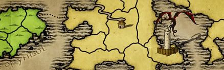
I don't think it matters where the map is. It's come pretty far and is close to being done. Close is a relative term though.
Things that need to be done
1. army circles centering. we haven't seen one with everything properly centered. there's no argument on this one. this is a requirement for the map.
Things that probably should be done
1. Even Andy agrees that borders are not uniform throughout. It's not a gameplay issue, but the foundry produces maps that have solid gameplay and look good. Not just one or the other.
I hate doing it. I think most people do. I'm not saying "I did it so you have to too." It's just to get the map looking its best. Redo those borders!
Things that are probably just matters of opinion
1. Legend
2. Land Texture
Not every map has to be a masterpiece. The issues people brought up are details that may or may not be done, depending on the mapmaker (in my opinion anyway (well the whole post is my opinion)).
Maps have to look good and this means balanced colours, good borders, etc...They don't have to be outstanding. I think we should strive to have every map possible be outstanding. But, having a few here and there be relatively average is fine. (I'm not trying to knock your map Tisha, but compare it to many of the maps coming out and it is average (so are mine btw!)).
The Puget Sound [Quenched]
Moderator: Cartographers
Forum rules
Please read the Community Guidelines before posting.
Please read the Community Guidelines before posting.
-
pepperonibread

- Posts: 954
- Joined: Sun Jan 28, 2007 4:33 pm
- Location: The Former Confederacy
-
gimil

- Posts: 8599
- Joined: Sat Mar 03, 2007 12:42 pm
- Gender: Male
- Location: United Kingdom (Scotland)
Wicked i completly agree. But like i said i have been unactive for a while and already mentioned that this is the foundry in generals fault not tishas. But even andy would comment on somethnig he was unhappy with before considering FF.wicked wrote:Gimil, if you had been following the map, you would've known the conversationg HAD died down and all the mentioned problems addressed.
What do you know about map making, bitch?
Top Score:2403natty_dread wrote:I was wrong

Let me try a maneuver from Wicked's play book.
First, make your statements:
1.Doodle Earth discussion was 67 pages, it make look simplistic but it was constantly refined countless times. Let's not get hasty with this one.
2. Wicked, you speak of the foundry like you actually know what goes on here, I actually question your sudden presence here.
3. Discussion of the foundry process always starts in the threads where the process isn't working. Get used to it.
4. I wouldn't advise budding cartographers to 'not listen' to other more experienced members, this process does not work in a vacuum.
5. I think discussions died down on this map because people simply were not interested. I mean, its not the most interesting map out there. If the comments are few and far between, it's up to the cartographer to go out there and elicit responses (thats what sigs are for, most cartographers use them). I never see Tisha commenting on other peoples maps so I am not surprise people haven't return the favor. Also, who ever moved this to the forge should have recognized this, and its lack of appeal... i mean discussion.
Second, it an attempt to moderate, make an appeal to stay on topic:
But c'mon people, lets stay on topic here. Let Tisha make changes.
First, make your statements:
1.Doodle Earth discussion was 67 pages, it make look simplistic but it was constantly refined countless times. Let's not get hasty with this one.
2. Wicked, you speak of the foundry like you actually know what goes on here, I actually question your sudden presence here.
3. Discussion of the foundry process always starts in the threads where the process isn't working. Get used to it.
4. I wouldn't advise budding cartographers to 'not listen' to other more experienced members, this process does not work in a vacuum.
5. I think discussions died down on this map because people simply were not interested. I mean, its not the most interesting map out there. If the comments are few and far between, it's up to the cartographer to go out there and elicit responses (thats what sigs are for, most cartographers use them). I never see Tisha commenting on other peoples maps so I am not surprise people haven't return the favor. Also, who ever moved this to the forge should have recognized this, and its lack of appeal... i mean discussion.
Second, it an attempt to moderate, make an appeal to stay on topic:
But c'mon people, lets stay on topic here. Let Tisha make changes.
I've read from Page 15. Here is my opinion.
Things I like
*I think the Whales are great.
*I think the Colors are great.
*I think the water is great, I like the way it gets lighter in some areas...I bet it's shallower there.
*I love the text, as it's easy to read.
*I love the borders, as they are easy to see.
*I love the texture of the surface of the territories, it's not as boring as a plain color, but not so obnoxious I can't read anything.
*I am fine with the ferry route that goes down instead of up, ferries don't all fly like airplanes....there is an island in the way.
Things I think should change
*I think King Co. in the Legend does appear like it is floating, along with Kitsap Co., and all the others are flat.
*I think the "Bremerton" label should be moved to the right, especially on the small map.
*I think the Sunny Slop text should move down, along with it's circle, to get the circle inside the territories borders.
Things I think are pointless
*I think the borders being jagged isn't bad, or good. I attribute it to the Artistic Expression. All artists do things differently, as this is CLEARLY an artists creation.
*I think the army circles are fine where they are, some are above, some are below, some are where they fit.
Things that piss me off
Way too much whining and bitching and biting back and forth and not enough CONSTRUCTIVE INFO.
Thats all I have to say.
Thanks!
Bedub1
Things I like
*I think the Whales are great.
*I think the Colors are great.
*I think the water is great, I like the way it gets lighter in some areas...I bet it's shallower there.
*I love the text, as it's easy to read.
*I love the borders, as they are easy to see.
*I love the texture of the surface of the territories, it's not as boring as a plain color, but not so obnoxious I can't read anything.
*I am fine with the ferry route that goes down instead of up, ferries don't all fly like airplanes....there is an island in the way.
Things I think should change
*I think King Co. in the Legend does appear like it is floating, along with Kitsap Co., and all the others are flat.
*I think the "Bremerton" label should be moved to the right, especially on the small map.
*I think the Sunny Slop text should move down, along with it's circle, to get the circle inside the territories borders.
Things I think are pointless
*I think the borders being jagged isn't bad, or good. I attribute it to the Artistic Expression. All artists do things differently, as this is CLEARLY an artists creation.
*I think the army circles are fine where they are, some are above, some are below, some are where they fit.
Things that piss me off
Way too much whining and bitching and biting back and forth and not enough CONSTRUCTIVE INFO.
Thats all I have to say.
Thanks!
Bedub1
-
gimil
- Posts: 8599
- Joined: Sat Mar 03, 2007 12:42 pm
- Gender: Male
- Location: United Kingdom (Scotland)
there has been plenty of constutive critisim, yes there is alot of back and forth crap and arguments going on, thats what the foundry does when making maps. but all the critisims ive seem have been well structured as to why they think that way.bedub1 wrote: Things that piss me off
Way too much whining and bitching and biting back and forth and not enough CONSTRUCTIVE INFO.
Thats all I have to say.
Thanks!
Bedub1
What do you know about map making, bitch?
Top Score:2403natty_dread wrote:I was wrong
-
gimil
- Posts: 8599
- Joined: Sat Mar 03, 2007 12:42 pm
- Gender: Male
- Location: United Kingdom (Scotland)
As with hte thousands of posts that go slightly of topic every single day?bedub1 wrote:My reply should be deleted, as it has nothing to do with the map....as does your reply.gimil wrote:there has been plenty of constutive critisim, yes there is alot of back and forth crap and arguments going on, thats what the foundry does when making maps. but all the critisims ive seem have been well structured as to why they think that way.bedub1 wrote: Things that piss me off
Way too much whining and bitching and biting back and forth and not enough CONSTRUCTIVE INFO.
Thats all I have to say.
Thanks!
Bedub1

What do you know about map making, bitch?
Top Score:2403natty_dread wrote:I was wrong
-
reverend_kyle

- Posts: 9250
- Joined: Tue Mar 21, 2006 4:08 pm
- Location: 1000 post club
- Contact:
right tisha I misspoke, but oaktown understood and translated the next post. The inconsistancy still hasn't been fixed.oaktown wrote:Right, check the shadow you have in King Co - its not the same as the others.reverend_kyle wrote:The army shadows seem really inconsistant.
that was page 8. It's not like I posted it yesterday

DANCING MUSTARD FOR POOP IN '08!
-
rebelman

- Posts: 2968
- Joined: Thu Aug 02, 2007 5:24 pm
- Gender: Male
- Location: People's Republic of Cork
- Contact:
I really like this map but I would like to make one small suggestion having just looked at the map again - could the bridges in Pierce co and heading out to camano island be adjusted so there is a clearer distinction as to where one territory stops and the next one starts - as of now it looks like they roll into each other with no obvious start/stop although im guessing they do not cross the water although this is unclear in the map.
Don't now why people on here don't like being cooks, remember under siege: A former SEAL, now cook, is the only person who can stop a gang of terrorists when they sieze control of a US Navy battleship.
My main problem with this map is thats its too boring and plain. Where is the appeal?
Seriously, where is the people? Can the people who really like this map tell me why they like it.
First of all, the subject, Puget Sound, is a bit esoteric. But this doesn't have to be a detriment to it's likability since a cartographer can draw in a person with a maps charm and flavor. Indochina is a good example. Indochina? Whats that? I dunno, but this map looks like it wants to be played. Italy is another one. Im not Italian, I could give two shits about Italy, but the Italy maps exudes Italian flavor like no other. It makes me feel Italian just playing it. Also take South America, a standard geography map, but the colors really pull this map together to make it breathe South America. Even older maps like Tameriel and Ireland embody what there are about.
Now back to the Puget Sound. I could care less about this small geographic location, as I am sure many other users could. But that doesn't me you can win me over with flavor and style. But this map has none. What I see is this; a standard geography map, with standard colors, in a standard font, with standard textures, and standard layer effects. All of this adds up to something that is quite substandard by todays foundry standards.
What I suggest is that your breath some life into this map and it make exude Pugent Sound. What IS the Pugent Sound, why do you like it enough to make a map of it. You have added two wales. Great, but it looks more like some sloppy afterthought rather any real character.
Bottomline, this map has no passion in it. It feels like the cartographer is just going through the motions, and the mods were just going through the motions in final forging it. Tisha, you obviously have enough passion to defend your map from its critiques, you should direct that inwards, on to the map itself.
Seriously, where is the people? Can the people who really like this map tell me why they like it.
First of all, the subject, Puget Sound, is a bit esoteric. But this doesn't have to be a detriment to it's likability since a cartographer can draw in a person with a maps charm and flavor. Indochina is a good example. Indochina? Whats that? I dunno, but this map looks like it wants to be played. Italy is another one. Im not Italian, I could give two shits about Italy, but the Italy maps exudes Italian flavor like no other. It makes me feel Italian just playing it. Also take South America, a standard geography map, but the colors really pull this map together to make it breathe South America. Even older maps like Tameriel and Ireland embody what there are about.
Now back to the Puget Sound. I could care less about this small geographic location, as I am sure many other users could. But that doesn't me you can win me over with flavor and style. But this map has none. What I see is this; a standard geography map, with standard colors, in a standard font, with standard textures, and standard layer effects. All of this adds up to something that is quite substandard by todays foundry standards.
What I suggest is that your breath some life into this map and it make exude Pugent Sound. What IS the Pugent Sound, why do you like it enough to make a map of it. You have added two wales. Great, but it looks more like some sloppy afterthought rather any real character.
Bottomline, this map has no passion in it. It feels like the cartographer is just going through the motions, and the mods were just going through the motions in final forging it. Tisha, you obviously have enough passion to defend your map from its critiques, you should direct that inwards, on to the map itself.

The colors of the map represent a totem pole, representing the Indian culture here. I don't know where to add a totem pole to signify that though??? Mt Rainier was an actual picture of a mountain at first, but it never looked quite right, so was dropped. If we could somehow convey those two things, it would help identify the region better, but how to do that?

Indonesian China...mibi wrote:Indochina is a good example. Indochina? Whats that?
I.e. Parts of Indonesia that the Chinese conquered...
Also known as FRENCH INDO-CHINA...
I.e. Parts of Indonesia that the french conquered after the Chinese conquered...
This area has been one massive warzone for a hell of a long time...
C.

Highest score : 2297
I dunno, but your headed down the right road. There must be several ways to represent the indian culture there. That would add some of the character this map needs.wicked wrote:The colors of the map represent a totem pole, representing the Indian culture here. I don't know where to add a totem pole to signify that though??? Mt Rainier was an actual picture of a mountain at first, but it never looked quite right, so was dropped. If we could somehow convey those two things, it would help identify the region better, but how to do that?
-
WidowMakers
- Posts: 2774
- Joined: Mon Nov 20, 2006 9:25 am
- Gender: Male
- Location: Detroit, MI
Sorry but I don't know if the border issue has been resolved. I did not have time to read the entire thread from page 15.
Here are some examples of border issues from qwerts Iwo Jima Thread. Hope they help. They show how to achieve smoother lines with different setting in photoshop.
First, this is your original image.

We believe you used a pencil effect to do this, possibly with vectors, like one of the three I'm going to show you here.


We all have agreed we would prefer it if you did one of the following and applied the effect to all the borders in the map.


Here are some examples of border issues from qwerts Iwo Jima Thread. Hope they help. They show how to achieve smoother lines with different setting in photoshop.
First, this is your original image.
We believe you used a pencil effect to do this, possibly with vectors, like one of the three I'm going to show you here.
We all have agreed we would prefer it if you did one of the following and applied the effect to all the borders in the map.

-
James Vazquez

- Posts: 482
- Joined: Wed Jul 04, 2007 12:05 pm
- Location: rochester NY
tishas map
thank you widomaker for you advice and expertise.
As far as mibi goes noone cares if you like the content or not that is none of your business. You dont like the map dont play it. focus your commenst on the map itself. plenty of people wanna play the map. Why, for countless reasons. You dont understand, well who cares. Make your maps as you see fit and leave what is obviously a popular map alone.
I'm sure if i choose i could flood this thread with people who want to play this map but that would be a waist of time and effort. So lets just focus on getting this up to snuff and get playing on this map.
Noone wants a pissing contest!
As far as mibi goes noone cares if you like the content or not that is none of your business. You dont like the map dont play it. focus your commenst on the map itself. plenty of people wanna play the map. Why, for countless reasons. You dont understand, well who cares. Make your maps as you see fit and leave what is obviously a popular map alone.
I'm sure if i choose i could flood this thread with people who want to play this map but that would be a waist of time and effort. So lets just focus on getting this up to snuff and get playing on this map.
Noone wants a pissing contest!
Re: tishas map
Exactly James, which is why we've already moved on from that. Thanks.James Vazquez wrote:Noone wants a pissing contest!


yes..that has been changed.. probably page 8 or nine..i have done alot of updatesreverend_kyle wrote:right tisha I misspoke, but oaktown understood and translated the next post. The inconsistancy still hasn't been fixed.oaktown wrote:Right, check the shadow you have in King Co - its not the same as the others.reverend_kyle wrote:The army shadows seem really inconsistant.
that was page 8. It's not like I posted it yesterday
i had a totem pole, mt. rainier..i had the whales...which were NOT an afterthought.. and was told over and over that they distracted from the mapmibi wrote:I dunno, but your headed down the right road. There must be several ways to represent the indian culture there. That would add some of the character this map needs.wicked wrote:The colors of the map represent a totem pole, representing the Indian culture here. I don't know where to add a totem pole to signify that though??? Mt Rainier was an actual picture of a mountain at first, but it never looked quite right, so was dropped. If we could somehow convey those two things, it would help identify the region better, but how to do that?
Last edited by Tisha on Tue Nov 20, 2007 12:44 pm, edited 1 time in total.
i have redrawn the line for the small map... because someone didn't like the jagged lines..WidowMakers wrote:Sorry but I don't know if the border issue has been resolved. I did not have time to read the entire thread from page 15.
Here are some examples of border issues from qwerts Iwo Jima Thread. Hope they help. They show how to achieve smoother lines with different setting in photoshop.
First, this is your original image.
We believe you used a pencil effect to do this, possibly with vectors, like one of the three I'm going to show you here.
We all have agreed we would prefer it if you did one of the following and applied the effect to all the borders in the map.
. and the lines around the islands Whidbey and Camano still look thicker on the east side of the island..i have no shadow added and used the same size brush all the way around-
pepperonibread
- Posts: 954
- Joined: Sun Jan 28, 2007 4:33 pm
- Location: The Former Confederacy
Re: tishas map
"If mibi doesn't like the content, then it's none of his buisness" doesn't make any sense. The content (graphics) is what people talk about more than half the time in the foundry. It is part of the map itself. All he asked was a question: Can the people who really like this map tell me why they like it?James Vazquez wrote:thank you widomaker for you advice and expertise.
As far as mibi goes noone cares if you like the content or not that is none of your business. You dont like the map dont play it. focus your commenst on the map itself. plenty of people wanna play the map. Why, for countless reasons. You dont understand, well who cares. Make your maps as you see fit and leave what is obviously a popular map alone.
I'm sure if i choose i could flood this thread with people who want to play this map but that would be a waist of time and effort. So lets just focus on getting this up to snuff and get playing on this map.
Noone wants a pissing contest!
You didn't even answer that. All you said was "You dont understand, well who cares." That's helpful.

Re: tishas map
please stop..if your not posting about my map...then don't post. i really don't need any more negative posts in here..pepperonibread wrote:"If mibi doesn't like the content, then it's none of his buisness" doesn't make any sense. The content (graphics) is what people talk about more than half the time in the foundry. It is part of the map itself. All he asked was a question: Can the people who really like this map tell me why they like it?James Vazquez wrote:thank you widomaker for you advice and expertise.
As far as mibi goes noone cares if you like the content or not that is none of your business. You dont like the map dont play it. focus your commenst on the map itself. plenty of people wanna play the map. Why, for countless reasons. You dont understand, well who cares. Make your maps as you see fit and leave what is obviously a popular map alone.
I'm sure if i choose i could flood this thread with people who want to play this map but that would be a waist of time and effort. So lets just focus on getting this up to snuff and get playing on this map.
Noone wants a pissing contest!
You didn't even answer that. All you said was "You dont understand, well
who cares." That's helpful.
-
AndyDufresne

- Posts: 24919
- Joined: Fri Mar 03, 2006 8:22 pm
- Location: A Banana Palm in Zihuatanejo
- Contact:

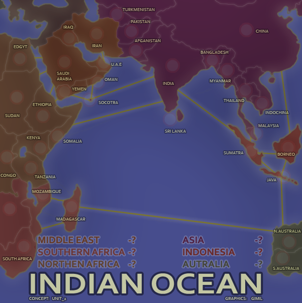

That's a joke, right spiesr? Because the mapmaker and I are laughing.spiesr wrote:Could you redraw the map to look more like this example?

Let's get back to talking about what it will take to get this map quenched. Gameplay issues seem to be finalized, so it's just a matter of cleaning some things up, right? Here's what i see from the last few pages:
Borders: most look good, really. A few are stilled pixely, such as those along the river on the bottom left corner.
A bigger concern for me is that many of the borders don't match the meeting of the land/water. The edge of Shelton sticks out under the border, as does Tahuya, Gig Harbor, Lakewood, Seattle, Port Townsend... well, most of the shorelines really. This may or may not be an easy fix depending on how the borders were drawn to begin with, but if it were my map I'd want to get it right.
Army circles: the location of the circles should be fine. The coordinates, well, actually they all look a bit to the left and high, but welcome to Conquer Club. My guess is that the width of each circle is an even number of pixels while the numbers themselves are odd, so unless you swap out all of the circles you'll never get it perfect. I say leave them, but I don't have the final say.
Legend: number placement is clearly inconsistent. Easy fix.
I still think the whales look amateurish on an otherwise classy map, but that's just my opinion and this call should belong to the mapmaker.
The Mt Rainier border is so square it looks like legend info... I seem to recall this being discussed earlier so if this is old news you can tell me where to stick it.
Have I missed anything?