

Netherlands [Quenched]
Forum rules
Please read the Community Guidelines before posting.
Please read the Community Guidelines before posting.
-
spinwizard
- Posts: 5016
- Joined: Sun Dec 10, 2006 9:52 am

-
Lone.prophet
- Posts: 1467
- Joined: Thu Oct 12, 2006 4:37 pm
- Location: Your basement Muahaha

 highest score: 2157 (Major) / Verd ori'shya beskar'gam

-
Lt. Strike

- Posts: 49
- Joined: Mon Oct 08, 2007 4:52 am

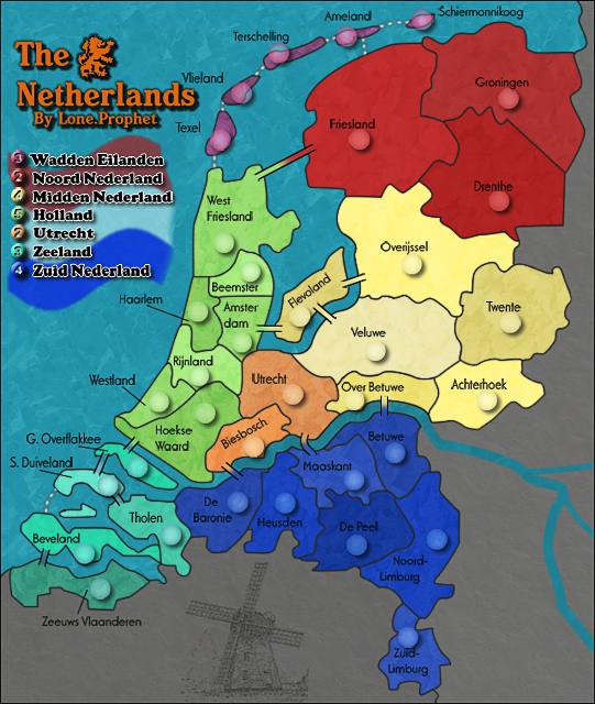
Lone.prophet, I am inclined to agree with Coleman on the remarks above, and i beleive it also translates to the large map.Coleman wrote:I think you may need a blur on a lot of the small map borders. They look scratchy, for lack of a better word coming to mind for me at the moment.
I have to say that I am still not entirely happy with the two reds at the tops of the legend list as they are very close together in colour, whereas all the other colours are quite distinctive. I'm not asking you to change them altogether, but is there anything you might be able to do to make them more distinct?
Apart from the above...a very clean map. Well done.


* Pearl Harbour * Waterloo * Forbidden City * Jamaica * Pot Mosbi
-
spinwizard
- Posts: 5016
- Joined: Sun Dec 10, 2006 9:52 am
Use gaurtucian blur to blur the lines, it works wellcairnswk wrote:Lone.prophet, I am inclined to agree with Coleman on the remarks above, and i beleive it also translates to the large map.Coleman wrote:I think you may need a blur on a lot of the small map borders. They look scratchy, for lack of a better word coming to mind for me at the moment.
I have to say that I am still not entirely happy with the two reds at the tops of the legend list as they are very close together in colour, whereas all the other colours are quite distinctive. I'm not asking you to change them altogether, but is there anything you might be able to do to make them more distinct?
Apart from the above...a very clean map. Well done.
-
Lone.prophet
- Posts: 1467
- Joined: Thu Oct 12, 2006 4:37 pm
- Location: Your basement Muahaha
-
Lone.prophet
- Posts: 1467
- Joined: Thu Oct 12, 2006 4:37 pm
- Location: Your basement Muahaha
-
spinwizard
- Posts: 5016
- Joined: Sun Dec 10, 2006 9:52 am
-
Lone.prophet
- Posts: 1467
- Joined: Thu Oct 12, 2006 4:37 pm
- Location: Your basement Muahaha
lone.prophet....i have asked this question twice before....the red rectangle on the legend shows (particularly on the small map) that these two colours are very close.
Is there anything you can do to make them more distinguishable in colour on the legend by lightening the first one for instance so that the colours are not so close?

Is there anything you can do to make them more distinguishable in colour on the legend by lightening the first one for instance so that the colours are not so close?
* Pearl Harbour * Waterloo * Forbidden City * Jamaica * Pot Mosbi



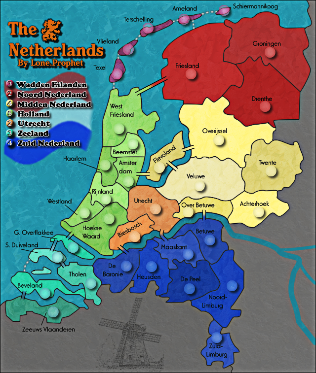
Hmm... I kinda like this map?Lone.prophet wrote:
I really really don't like the army circles. I think they look really out of place. It's like some kind of pegboard. I think you should really lose or lessen the drop shadows. Did you ever consider not using army circles? You really don't need them for this map. Your countries are clearly defined. If your circles are on a separate layer, could you turn it off and post a map without them?
The spheres that hold the bonus amounts also look a little out of place. The bevel on the numbers makes them blurry. I can read them, but it just doesn't look as good as it could. Too much inner shadow i think.
I'm not sure I like the different shades of the same color for the countries. And I definitely would not put the brown/orange right beside the tan/yellow areas in the center. Even not being color blind, they still blend in to each other. But I do like the bold colors, especially the red & green.
Sorry I didn't vote in the bridges poll - but I do not like them. I think it's the way they extend onto the lands. I would prefer closed borders, with some sort of line connectors - but I guess it's been polled & voted. So be it.
It looks like when you reduced the size for the small map, some of the country names got blurred. The "O" in Ovenjissel and the "U" in Utecht jump out at me. If you just flattened the map and resized it, try resizing just the map layers and keeping the text layer as is (and the army circle layer also). Then adjust the font's as needed on the smaller map. I think it will help. I did that for my Italy map and it worked well.
I think your ocean water came out great, and I really like the subtle patterns behind the territories. The windmill is not needed and looks out of place to me. And I think the flag behind the legend is screwing with me also.
But - keep it up Lone Prophet. You'll get there. You've done great so far. Hope I wasn't to critical - just trying to help. And most of that is just my opinion.


-
serious_conq

- Posts: 77
- Joined: Tue Jun 19, 2007 6:04 am
-
ParadiceCity9
- Posts: 4239
- Joined: Thu Feb 15, 2007 4:10 pm
-
gimil

- Posts: 8599
- Joined: Sat Mar 03, 2007 12:42 pm
- Gender: Male
- Location: United Kingdom (Scotland)
I very much like hte version its crisp and clean. I have two very small concerns.ParadiceCity9 wrote:I still like the old version. Make a poll on whether or not you should bring back the old version.
1. The stroke you used on the legends is pixalated to solve this reduce the opacitly and experiment with a white outerglow to try and soften it up.
2. The damn boarder is needed around the river in the dead territory lol. I know its been discussed before but i dont see how the community could agree that its better no to have them it just gives me a horrible feeling inside.
What do you know about map making, bitch?
Top Score:2403natty_dread wrote:I was wrong
-
unriggable

- Posts: 8036
- Joined: Thu Feb 08, 2007 9:49 pm

-
gimil
- Posts: 8599
- Joined: Sat Mar 03, 2007 12:42 pm
- Gender: Male
- Location: United Kingdom (Scotland)
isnt sexual suppose to make you feel good insideunriggable wrote:Sexual Inuendo?gimil wrote:I know its been discussed before but i dont see how the community could agree that its better not to have them it just gives me a horrible feeling inside.
Anyways, I agree.
What do you know about map making, bitch?
Top Score:2403natty_dread wrote:I was wrong
-
DiM

- Posts: 10415
- Joined: Wed Feb 14, 2007 6:20 pm
- Gender: Male
- Location: making maps for scooby snacks
RjBeals wrote: I really really don't like the army circles. I think they look really out of place. It's like some kind of pegboard. I think you should really lose or lessen the drop shadows. Did you ever consider not using army circles? You really don't need them for this map. Your countries are clearly defined. If your circles are on a separate layer, could you turn it off and post a map without them?
The spheres that hold the bonus amounts also look a little out of place. The bevel on the numbers makes them blurry. I can read them, but it just doesn't look as good as it could. Too much inner shadow i think.
I'm not sure I like the different shades of the same color for the countries. And I definitely would not put the brown/orange right beside the tan/yellow areas in the center. Even not being color blind, they still blend in to each other. But I do like the bold colors, especially the red & green.
Sorry I didn't vote in the bridges poll - but I do not like them. I think it's the way they extend onto the lands. I would prefer closed borders, with some sort of line connectors - but I guess it's been polled & voted. So be it.
It looks like when you reduced the size for the small map, some of the country names got blurred. The "O" in Ovenjissel and the "U" in Utecht jump out at me. If you just flattened the map and resized it, try resizing just the map layers and keeping the text layer as is (and the army circle layer also). Then adjust the font's as needed on the smaller map. I think it will help. I did that for my Italy map and it worked well.
I think your ocean water came out great, and I really like the subtle patterns behind the territories. The windmill is not needed and looks out of place to me. And I think the flag behind the legend is screwing with me also.
But - keep it up Lone Prophet. You'll get there. You've done great so far. Hope I wasn't to critical - just trying to help. And most of that is just my opinion.
i agree with everything above except for the army circles. they do look out of place and they need a bit of tweaking but removing them completely is wrong.
imagine blue armies in zuid. completely unreadable.

“In the beginning God said, the four-dimensional divergence of an antisymmetric, second rank tensor equals zero, and there was light, and it was good. And on the seventh day he rested.”- Michio Kaku