yeah you can make the rear yard shorter and have doghouse as -1 or somethingAndyDufresne wrote:Interesting idea...I've thought for a while a house map might work...we'll see how the idea develops.
Maybe you should add a 'Doghouse', as you know someone always ends up there...and may a doggie door too.
--Andy
Madness (Our House) [Quenched]
Moderator: Cartographers
Forum rules
Please read the Community Guidelines before posting.
Please read the Community Guidelines before posting.
- cena-rules
- Posts: 9740
- Joined: Sat Apr 28, 2007 2:27 am
- Gender: Male
- Location: Chat
19:41:22 ‹jakewilliams› I was a pedo
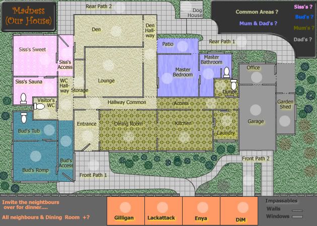
Version 2 Update
Below is some small changes:
1. Some different floor coversing applied.
2. Dad's area changed to gray
3. Additions of the 2nd front and rear paths, and the dog house
4. Names of neighbours changed to four CC members.
5. Font changed to legibility

Below is some small changes:
1. Some different floor coversing applied.
2. Dad's area changed to gray
3. Additions of the 2nd front and rear paths, and the dog house
4. Names of neighbours changed to four CC members.
5. Font changed to legibility


* Pearl Harbour * Waterloo * Forbidden City * Jamaica * Pot Mosbi
- rebelman
- Posts: 2968
- Joined: Thu Aug 02, 2007 5:24 pm
- Gender: Male
- Location: People's Republic of Cork
- Contact:
i'm going for luch today with 3 buddies that are architects I will bounce if off them to see if there are any other packages systems out there that are free and wil meet your needs.cairnswk wrote:DiM, your 3D model comes from Plan3D i think doesn't it.DiM wrote:full 3d is unfortunately not possible right now bacause without a 3d environment for the maps it's useless do do something 3d just to take a screenshot and play in 2d. i merely posted that image as a source of inspiration for cairnswk. if he can manage a pseudo 3d it would be great.jako wrote:those are some scary pics, perfect for halloween time
i totally like this idea, but i dont think cairns can do full 3D like urs DiM.
but i do agree on the better font and more homestyle textures for each part of the houe including maybe a gray texture for the garage maybe even a oil spil for details?
Anyways, i went in there, and downloaded that and will see if it is possible to get something up in that style,,,but this program is very tedious and slow on my computer.
I may still have to try working something in Fireworks with the 3D psuedo dimension to it like I did in Pearl.
I'll see what i can develop that is interesting.
Don't now why people on here don't like being cooks, remember under siege: A former SEAL, now cook, is the only person who can stop a gang of terrorists when they sieze control of a US Navy battleship.
Champion...rebelman....champion...thank you for your offer...most generous of you!rebelman wrote: i'm going for luch today with 3 buddies that are architects I will bounce if off them to see if there are any other packages systems out there that are free and wil meet your needs.

* Pearl Harbour * Waterloo * Forbidden City * Jamaica * Pot Mosbi
lets start shall we, will do bonusses later (already worked them out but later is better)
Common Area's:
Look great to me, but what do you think we use that Entrance door as a 1 way border? only attackable inwards?
rest is great so far, but what can give us in a wooden/laminate surface?
Mum & Dad's:
This looks more then fine, but rearrange the "Master Bedroom" name and army shade
Siss's:
Looks great, thou following notes:
- Siss's Sweet name tag and shade above eachother like other area's (Kitchen for excample)
- Switch name and army shade of "Siss's Access", let the army shade be at the bottum
Bud's:
Can we call this "Bro's" , you silly aussie!
- Move the "Bud's Romp" acess inbetween the army shade and name of "Bud's Access" (middle of that hallway)
Mum's:
stereotyp ftw!
the floor covers make the names hard to read, perhaps a more stoney surface?
Dad's:
only those 3 things right? (Office, Garage and Garden Shed)
looks good
Paths:
Rear path 1 runs upto the garden shed no?
Again a discussion with the 2 doors on the paths, perhaps make front path 1 => Bud's Access 1 way and so do Rear path 2 => Siss's Access?
Give the dog house a wooden coloring, it isn't part of any territorie so other color wouldn't mak a difference?
Those hobo's:
Who's Enya?
the usual center that, allighn that stuff
Common Area's:
Look great to me, but what do you think we use that Entrance door as a 1 way border? only attackable inwards?
rest is great so far, but what can give us in a wooden/laminate surface?
Mum & Dad's:
This looks more then fine, but rearrange the "Master Bedroom" name and army shade
Siss's:
Looks great, thou following notes:
- Siss's Sweet name tag and shade above eachother like other area's (Kitchen for excample)
- Switch name and army shade of "Siss's Access", let the army shade be at the bottum
Bud's:
Can we call this "Bro's"
- Move the "Bud's Romp" acess inbetween the army shade and name of "Bud's Access" (middle of that hallway)
Mum's:
stereotyp ftw!
the floor covers make the names hard to read, perhaps a more stoney surface?
Dad's:
only those 3 things right? (Office, Garage and Garden Shed)
looks good
Paths:
Rear path 1 runs upto the garden shed no?
Again a discussion with the 2 doors on the paths, perhaps make front path 1 => Bud's Access 1 way and so do Rear path 2 => Siss's Access?
Give the dog house a wooden coloring, it isn't part of any territorie so other color wouldn't mak a difference?
Those hobo's:
Who's Enya?
the usual center that, allighn that stuff
Emperor of the Benelux
Founder of the Commonwealth of Planets
Founder and CEO of JF
Founder of the Commonwealth of Planets
Founder and CEO of JF
- Fireside Poet
- Posts: 2671
- Joined: Mon Apr 24, 2006 1:49 pm
cairnswrk ... I really like the work on the other maps and I know that this won't mean a hill of beans to you, but I'll never play this map. Everytime I see it I think of that horrid, gut-retching, vomit-inducing song that I absolutely loathe and have seething hatred for.
Thank you for this fine opportunity to express my personal opinion ... now carry on.
Thank you for this fine opportunity to express my personal opinion ... now carry on.
- Night Strike
- Posts: 8509
- Joined: Wed Apr 18, 2007 2:52 pm
- Gender: Male
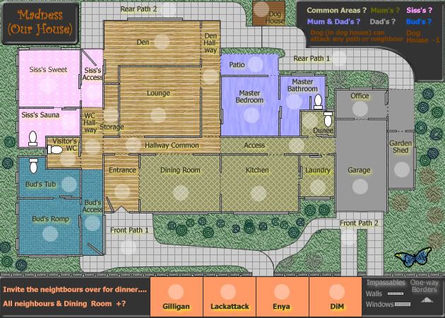
Version3 Update
Most of this has to do with onbekende's requests, but he didn't get all his own way....LOL
Don't know what you mean by "stereotyp ftw!"
Floor coverings changed.
Dog House has wooden covering.
New condition for dog in legend.
Enya is a member here who occasionally pops and makes comment, she was very instrumental in assisting with the development of CCC; and I thought a female name in here might be a good mix -> can't have the neighbourhood totally domainted by males.

Most of this has to do with onbekende's requests, but he didn't get all his own way....LOL
One-way front door attackable inwards only is OK, laminated floors are OK.onbekende wrote:lets start shall we, will do bonusses later (already worked them out but later is better)
Common Area's:
Look great to me, but what do you think we use that Entrance door as a 1 way border? only attackable inwards?
rest is great so far, but what can give us in a wooden/laminate surface?
DoneMum & Dad's:
This looks more then fine, but rearrange the "Master Bedroom" name and army shade
Done -> bottum -> bottomSiss's:
Looks great, thou following notes:
- Siss's Sweet name tag and shade above eachother like other area's (Kitchen for excample)
- Switch name and army shade of "Siss's Access", let the army shade be at the bottum
You silly Belgian! I don't like Bro as a name. While I recognise is it the current venacular for "mate" or friend or brother, I prefer Bud, being a good male name and something a Dad might "nickname" his son. Bud's access done.Bud's:
Can we call this "Bro's", you silly aussie!
- Move the "Bud's Romp" acess inbetween the army shade and name of "Bud's Access" (middle of that hallway)
Dad's:Mum's:
stereotyp ftw!
the floor covers make the names hard to read, perhaps a more stoney surface?
Don't know what you mean by "stereotyp ftw!"
Floor coverings changed.
Yes only three things.only those 3 things right? (Office, Garage and Garden Shed)
looks good
Not in favour of too many one ways, one for the front door is OK.Paths:
Rear path 1 runs upto the garden shed no?
Again a discussion with the 2 doors on the paths, perhaps make front path 1 => Bud's Access 1 way and so do Rear path 2 => Siss's Access?
Give the dog house a wooden coloring, it isn't part of any territorie so other color wouldn't mak a difference?
Dog House has wooden covering.
New condition for dog in legend.
Hobo's eh? They'd be impressed I'm sure!Those hobo's:
Who's Enya?
the usual center that, allighn that stuff
Enya is a member here who occasionally pops and makes comment, she was very instrumental in assisting with the development of CCC; and I thought a female name in here might be a good mix -> can't have the neighbourhood totally domainted by males.


* Pearl Harbour * Waterloo * Forbidden City * Jamaica * Pot Mosbi
Fireside Poet....sorry you don't lilke the song....i think it's a GAS.Fireside Poet wrote:cairnswrk ... I really like the work on the other maps and I know that this won't mean a hill of beans to you, but I'll never play this map. Everytime I see it I think of that horrid, gut-retching, vomit-inducing song that I absolutely loathe and have seething hatred for.
Thank you for this fine opportunity to express my personal opinion ... now carry on.
Shouldn't stop you from playing the map though.

* Pearl Harbour * Waterloo * Forbidden City * Jamaica * Pot Mosbi
Thanks for the suggestion....i'm still considering that....for now though i'll just flutter around the gardenNight Strike wrote:I think that for the neighbors, you should name yourself as one and that should also be where you place your signature. It would be unique.

* Pearl Harbour * Waterloo * Forbidden City * Jamaica * Pot Mosbi
- DiM
- Posts: 10415
- Joined: Wed Feb 14, 2007 6:20 pm
- Gender: Male
- Location: making maps for scooby snacks
i'm at work so a quick comment.
map looks much better. it seems more clean. i like it.
neighbor names. hmm. i'd say replace them with non CC names. as much as i'd like to have my name as a terit on a map i think it might cause some unnecesary dispute as to why those names where chosen. but if nobody has any objection then let them stay
and one more thing. the images i posted are made in google sketchup 6. free easy to use and you can find various freeware things for it.
“In the beginning God said, the four-dimensional divergence of an antisymmetric, second rank tensor equals zero, and there was light, and it was good. And on the seventh day he rested.”- Michio Kaku
Thanks DiM....appreciate your comment about your name being there...i'll see what the reaction is and if no objections, then i'll still consider it later.DiM wrote:i'm at work so a quick comment.
map looks much better. it seems more clean. i like it.
neighbor names. hmm. i'd say replace them with non CC names. as much as i'd like to have my name as a terit on a map i think it might cause some unnecesary dispute as to why those names where chosen. but if nobody has any objection then let them stay
and one more thing. the images i posted are made in google sketchup 6. free easy to use and you can find various freeware things for it.
I'll take a look at Sketchup 6 later in the week....off to work soon, thanks for the lead.

* Pearl Harbour * Waterloo * Forbidden City * Jamaica * Pot Mosbi
- DiM
- Posts: 10415
- Joined: Wed Feb 14, 2007 6:20 pm
- Gender: Male
- Location: making maps for scooby snacks
also the 4 neighbor squares make them like little houses 
and make me at the window with a telescope spying on the neighbors
and make me at the window with a telescope spying on the neighbors
“In the beginning God said, the four-dimensional divergence of an antisymmetric, second rank tensor equals zero, and there was light, and it was good. And on the seventh day he rested.”- Michio Kaku
- DiM
- Posts: 10415
- Joined: Wed Feb 14, 2007 6:20 pm
- Gender: Male
- Location: making maps for scooby snacks
could be fun.Coleman wrote:100% for this. Final 4 get names on the map.BeakerWMA wrote:Cairns: maybe have a Tournament and the winner gets his name on your map?
“In the beginning God said, the four-dimensional divergence of an antisymmetric, second rank tensor equals zero, and there was light, and it was good. And on the seventh day he rested.”- Michio Kaku
- Night Strike
- Posts: 8509
- Joined: Wed Apr 18, 2007 2:52 pm
- Gender: Male
very nice cairnwsk, 1 thing you overlooked: the Rear path doesn't run completely to te garden shed and office.
pfftDone -> bottum -> bottom
okay on the Bro's thingy, YOU SILLY AUSSIE!!
the stereotyp was that you put mum in the kitchen (not that it difference much in any household)
/me wants taser to fight of the dog, nice idea thou!
Emperor of the Benelux
Founder of the Commonwealth of Planets
Founder and CEO of JF
Founder of the Commonwealth of Planets
Founder and CEO of JF
Updated Version 4onbekende wrote:


(imagine a ton more of these)
very nice cairnwsk, 1 thing you overlooked: the Rear path doesn't run completely to te garden shed and office.
pfftDone -> bottum -> bottom
okay on the Bro's thingy, YOU SILLY AUSSIE!!
the stereotyp was that you put mum in the kitchen (not that it difference much in any household)
/me wants taser to fight of the dog, nice idea thou!
Rear path thingyh fixed with a BBQ area.


* Pearl Harbour * Waterloo * Forbidden City * Jamaica * Pot Mosbi
- DiM
- Posts: 10415
- Joined: Wed Feb 14, 2007 6:20 pm
- Gender: Male
- Location: making maps for scooby snacks
muahahahaha. i LOVE it.cairnswk wrote:DiM wrote:also the 4 neighbor squares make them like little houses
and make me at the window with a telescope spying on the neighbors
Version 4 Update
You ask for it!!!
“In the beginning God said, the four-dimensional divergence of an antisymmetric, second rank tensor equals zero, and there was light, and it was good. And on the seventh day he rested.”- Michio Kaku


