Conquer Club

WWII Pearl Harbor - [Quenched]

Care to peruse completed maps? Take a stroll through the Atlas.

Moderator: Cartographers

Forum rules
Please read the Community Guidelines before posting.

Postby Coleman on Mon Aug 20, 2007 8:13 pm

Looks great to me. Andy will probably want to wait a day to see if anyone has anything else to say, but hopefully he'll stop by soon and tell us what he needs.
Warning: You may be reading a really old topic.
User avatar
Sergeant Coleman
 
Posts: 5402
Joined: Tue Jan 02, 2007 10:36 pm
Location: Midwest

Postby WidowMakers on Tue Aug 21, 2007 9:45 pm

I have something to say.....................Quench!!!
Image
Major WidowMakers
 
Posts: 2774
Joined: Mon Nov 20, 2006 9:25 am
Location: Detroit, MI

Postby hulmey on Tue Aug 21, 2007 9:50 pm

widow's always got something to say :roll: :roll: :roll:
[img]http://img801.imageshack.us/img801/9761/41922610151374166770386.jpg[/mg]
User avatar
Lieutenant hulmey
 
Posts: 3742
Joined: Fri Nov 03, 2006 7:33 am
Location: Las Vegas

Postby WidowMakers on Tue Aug 21, 2007 9:51 pm

hulmey wrote:widow's always got something to say :roll: :roll: :roll:
Do I? I probably post less here than most everyone else.
Image
Major WidowMakers
 
Posts: 2774
Joined: Mon Nov 20, 2006 9:25 am
Location: Detroit, MI

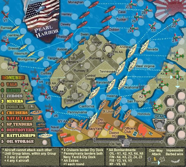
V37 Update Replaced Legend Fonts

Postby cairnswk on Fri Aug 24, 2007 2:11 am

This is a return to the old font of Stencil is ued for the legend before, as I looked at the Eras font in V36 above and wasn't satisfied with it.

V37 Small
Image

V37 Large
Image
Image
* Pearl Harbour * Waterloo * Forbidden City * Jamaica * Pot Mosbi
User avatar
Private cairnswk
 
Posts: 11510
Joined: Sat Feb 03, 2007 8:32 pm
Location: Australia

Postby cairnswk on Fri Aug 24, 2007 2:18 am

WidowMakers wrote:I have something to say.....................Quench!!!


WM...sorry i haven't got back before this, but have been off for a few days....appreciate your support....Gracia!
Image
* Pearl Harbour * Waterloo * Forbidden City * Jamaica * Pot Mosbi
User avatar
Private cairnswk
 
Posts: 11510
Joined: Sat Feb 03, 2007 8:32 pm
Location: Australia

Postby edbeard on Fri Aug 24, 2007 5:23 am

I prefer the 35 font, but this one is satisfactory too.
User avatar
Lieutenant edbeard
 
Posts: 2501
Joined: Thu Mar 29, 2007 12:41 am

Postby cairnswk on Fri Aug 24, 2007 5:38 am

edbeard wrote:I prefer the 35 font, but this one is satisfactory too.
Thanks edbeard....this stencil font was developed specifically for war stencilling...that's why i though it was appropriate. v35 was the Atlantic line font. :)
Image
* Pearl Harbour * Waterloo * Forbidden City * Jamaica * Pot Mosbi
User avatar
Private cairnswk
 
Posts: 11510
Joined: Sat Feb 03, 2007 8:32 pm
Location: Australia

Postby casper on Fri Aug 24, 2007 8:36 am

Can Tennessee's army circle be moved to the lower right side of the ship...closer to the Tennessee text? It's just confusing because the circle is on land yet all the other ship's circles are on water. Just think it could be tweaked a little better. As it is I can see people getting Maryland's circle confused with Tennessee since the Tennessee text is so close to Maryland's circle and Tennessee's circle being so far away from the actual text over the land. Other than that it looks great. :)
User avatar
Major casper
 
Posts: 416
Joined: Wed Feb 01, 2006 6:36 pm
Location: Chicago

Postby Coleman on Fri Aug 24, 2007 8:41 am

The Tennessee circle is in the same position as the circle for the other 2 ships in its line. It is much less confusing where it is. You knew it was the Tennessee circle.
Warning: You may be reading a really old topic.
User avatar
Sergeant Coleman
 
Posts: 5402
Joined: Tue Jan 02, 2007 10:36 pm
Location: Midwest

Postby casper on Fri Aug 24, 2007 9:22 am

Ok. What about moving Tennessee above the circle and moving FIN AA text above its circle? Maybe even move Arizona text up. I'm just not a fan of having the text so far away from the circles. I just noticed St. Louis as well near the bottom. That text should be to the right of the circle under San Francisco imo.
User avatar
Major casper
 
Posts: 416
Joined: Wed Feb 01, 2006 6:36 pm
Location: Chicago

Postby AndyDufresne on Fri Aug 24, 2007 11:04 am

I also like V35 font...V36 just didn't agree with me eyes. :)


--Andy
User avatar
Corporal 1st Class AndyDufresne
 
Posts: 24935
Joined: Fri Mar 03, 2006 8:22 pm
Location: A Banana Palm in Zihuatanejo

Postby cairnswk on Fri Aug 24, 2007 11:55 am

casper wrote:Ok. What about moving Tennessee above the circle and moving FIN AA text above its circle? Maybe even move Arizona text up. I'm just not a fan of having the text so far away from the circles. I just noticed St. Louis as well near the bottom. That text should be to the right of the circle under San Francisco imo.


Casper, thanks for posting.
I'll see what i can do about moving names (not circles) for FIN AA aetc about. However, St Louis is staying in its position otherwise that area of the map becomes too cluttered to the right , and leaves this great gap over the dock area.

To others...
Changing the legend font was a two fold issue, Keyogi had probs with the original, and the map was oversized, so i changed it to the ERAS font on V36, but found i didn't like this. The map is now two versions.
To change the legend font means changing it for all those items on both maps, which I have just done twice already, and is over two hours work. Unless there is absolutely a very necessary reasons to change this font i.e. someone can't read it, then I would prefer to leave it as it is. Please consider this b4 asking me to change it again. Thanks.
Image
* Pearl Harbour * Waterloo * Forbidden City * Jamaica * Pot Mosbi
User avatar
Private cairnswk
 
Posts: 11510
Joined: Sat Feb 03, 2007 8:32 pm
Location: Australia

Postby AndyDufresne on Fri Aug 24, 2007 11:14 pm

I don't think changing the font is that necessary. The current version is clear, easy to read, but still has some character. Keep it. :)


--Andy
User avatar
Corporal 1st Class AndyDufresne
 
Posts: 24935
Joined: Fri Mar 03, 2006 8:22 pm
Location: A Banana Palm in Zihuatanejo

Postby cairnswk on Fri Aug 24, 2007 11:48 pm

AndyDufresne wrote:I don't think changing the font is that necessary. The current version is clear, easy to read, but still has some character. Keep it. :)


--Andy

Phew! 8)
Image
* Pearl Harbour * Waterloo * Forbidden City * Jamaica * Pot Mosbi
User avatar
Private cairnswk
 
Posts: 11510
Joined: Sat Feb 03, 2007 8:32 pm
Location: Australia

Postby cairnswk on Tue Aug 28, 2007 12:02 pm

casper wrote:Ok. What about moving Tennessee above the circle and moving FIN AA text above its circle? Maybe even move Arizona text up. I'm just not a fan of having the text so far away from the circles. I just noticed St. Louis as well near the bottom. That text should be to the right of the circle under San Francisco imo.
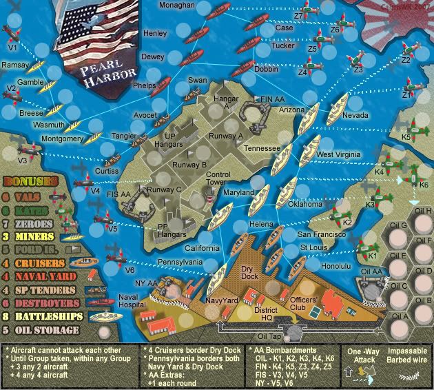
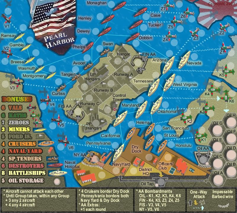
casper...some adjustments for you...r these OK?

Image

Image
Image
* Pearl Harbour * Waterloo * Forbidden City * Jamaica * Pot Mosbi
User avatar
Private cairnswk
 
Posts: 11510
Joined: Sat Feb 03, 2007 8:32 pm
Location: Australia

V38 Army Tests

Postby cairnswk on Wed Aug 29, 2007 4:09 am

V38 Small Army Test

Image

V38 Large Army Test

Image
Image
* Pearl Harbour * Waterloo * Forbidden City * Jamaica * Pot Mosbi
User avatar
Private cairnswk
 
Posts: 11510
Joined: Sat Feb 03, 2007 8:32 pm
Location: Australia

Postby AndyDufresne on Wed Aug 29, 2007 4:05 pm

Mind posting the text links for the large and small maps, along with the XML?


--Andy
User avatar
Corporal 1st Class AndyDufresne
 
Posts: 24935
Joined: Fri Mar 03, 2006 8:22 pm
Location: A Banana Palm in Zihuatanejo

Postby cairnswk on Wed Aug 29, 2007 4:23 pm

AndyDufresne wrote:Mind posting the text links for the large and small maps, along with the XML?


--Andy


Andy...I just took out all three of you - HighC540, lackattack and yourself in our VOTKs game. I'm chuffed. :)

Andy....requests from above as below....many thanks!
XML
http://www.sendspace.com/file/vuctu1
V38 Small
http://i155.photobucket.com/albums/s282 ... urV38S.jpg
V38 Large
http://i155.photobucket.com/albums/s282 ... urV38L.jpg
Image
* Pearl Harbour * Waterloo * Forbidden City * Jamaica * Pot Mosbi
User avatar
Private cairnswk
 
Posts: 11510
Joined: Sat Feb 03, 2007 8:32 pm
Location: Australia

Postby KEYOGI on Wed Aug 29, 2007 11:59 pm

There's a few coordinates on the large that look a bit out... Dewey and Dobin are the ones I can notice. Small looks good though.

I still don't think the legend does the map justice, but I'm alone on this one so I'll shut up. :wink:
Sergeant 1st Class KEYOGI
 
Posts: 1632
Joined: Tue Oct 10, 2006 6:09 am

Postby cairnswk on Thu Aug 30, 2007 7:45 am

KEYOGI wrote:There's a few coordinates on the large that look a bit out... Dewey and Dobin are the ones I can notice. Small looks good though.

I still don't think the legend does the map justice, but I'm alone on this one so I'll shut up. :wink:


Fixed in the image V38 Large above Keyogi...please refresh your browser.
The xml did not need to be changed. :D
Image
* Pearl Harbour * Waterloo * Forbidden City * Jamaica * Pot Mosbi
User avatar
Private cairnswk
 
Posts: 11510
Joined: Sat Feb 03, 2007 8:32 pm
Location: Australia

Postby unriggable on Thu Aug 30, 2007 5:26 pm

Arrows from oklahoma to K6 looks strange.
Image
User avatar
Cook unriggable
 
Posts: 8037
Joined: Thu Feb 08, 2007 9:49 pm

Postby Wisse on Fri Aug 31, 2007 1:40 am

if you look to the boneses naval yard has a thick outliner, why?
other than that i don't see anything that can be improved :wink:
Image Image
User avatar
Sergeant Wisse
 
Posts: 4448
Joined: Fri Oct 13, 2006 2:59 pm
Location: The netherlands, gelderland, epe

Postby cairnswk on Fri Aug 31, 2007 4:07 am

unriggable wrote:Arrows from oklahoma to K6 looks strange.


unriggable...there is only 1 arrow from oklahoma to to K6.
What is strange about that arrow?
Please fill me in. :roll:
Image
* Pearl Harbour * Waterloo * Forbidden City * Jamaica * Pot Mosbi
User avatar
Private cairnswk
 
Posts: 11510
Joined: Sat Feb 03, 2007 8:32 pm
Location: Australia

Postby cairnswk on Fri Aug 31, 2007 5:37 am

KEYOGI wrote:There's a few coordinates on the large that look a bit out... Dewey and Dobin are the ones I can notice. Small looks good though.

I still don't think the legend does the map justice, but I'm alone on this one so I'll shut up. :wink:


Keyogi
Does this solution look better or worse...it needs tidying up but you get the general idea.
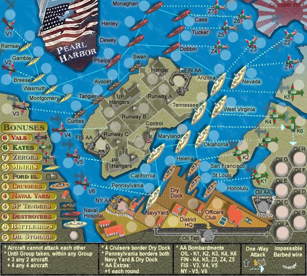
Image
Image
* Pearl Harbour * Waterloo * Forbidden City * Jamaica * Pot Mosbi
User avatar
Private cairnswk
 
Posts: 11510
Joined: Sat Feb 03, 2007 8:32 pm
Location: Australia

PreviousNext

Return to The Atlas

Who is online

Users browsing this forum: No registered users