one further spelling mistake "comand" should be command
Really like the way this is progressing.
WWII Operation Iwo Jima [Quenched]
Moderator: Cartographers
Forum rules
Please read the Community Guidelines before posting.
Please read the Community Guidelines before posting.
-
steve monkey
- Posts: 490
- Joined: Sat May 13, 2006 5:25 pm
- Location: London


-
unriggable

- Posts: 8036
- Joined: Thu Feb 08, 2007 9:49 pm


well you can also have a bonus of 10 only protecting 4 territories.unriggable wrote:Plan B should be bonus 2, and find a way to fix the Plan A and Plan B being held together with only 2 countries to defend from.
I'm not sure if this is good or bad. I think it might be fine because these are the 'easy' to hold areas, so getting these places will be a priority for everyone.
-
Qwert

- SoC Training Adviser
- Posts: 9262
- Joined: Tue Nov 07, 2006 5:07 pm
- Location: VOJVODINA
- Contact:
unriggable
Joined: 09 Feb 2007
Posts: 4082
Location: Anywhere and Everywhere
Posted: 07 Aug 2007 22:56 Post subject:
--------------------------------------------------------------------------------
Plan B should be bonus 2, and find a way to fix the Plan A and Plan B being held together with only 2 countries to defend from.
Well you late,i have these discusion far before(Look page 1-bonus poll and option)

-
DiM

- Posts: 10415
- Joined: Wed Feb 14, 2007 6:20 pm
- Gender: Male
- Location: making maps for scooby snacks
if the black is gone when you look at the map you see just the map on the screen without the nasty looking black. at least try it. it will be better.qwert wrote:_________________can you make the black margin transparent? it would look much be better.
Dont understand what will be beter if i put transparent?
“In the beginning God said, the four-dimensional divergence of an antisymmetric, second rank tensor equals zero, and there was light, and it was good. And on the seventh day he rested.”- Michio Kaku

-
Ruben Cassar
- Posts: 2160
- Joined: Thu Nov 16, 2006 6:04 am
- Gender: Male
- Location: Civitas Invicta, Melita, Evropa


-
Qwert
- SoC Training Adviser
- Posts: 9262
- Joined: Tue Nov 07, 2006 5:07 pm
- Location: VOJVODINA
- Contact:
Ruben Cassar
Joined: 16 Nov 2006
Posts: 1244
Location: Civitas Invicta, Melita, Evropa
Posted: 10 Aug 2007 09:14 Post subject:
--------------------------------------------------------------------------------
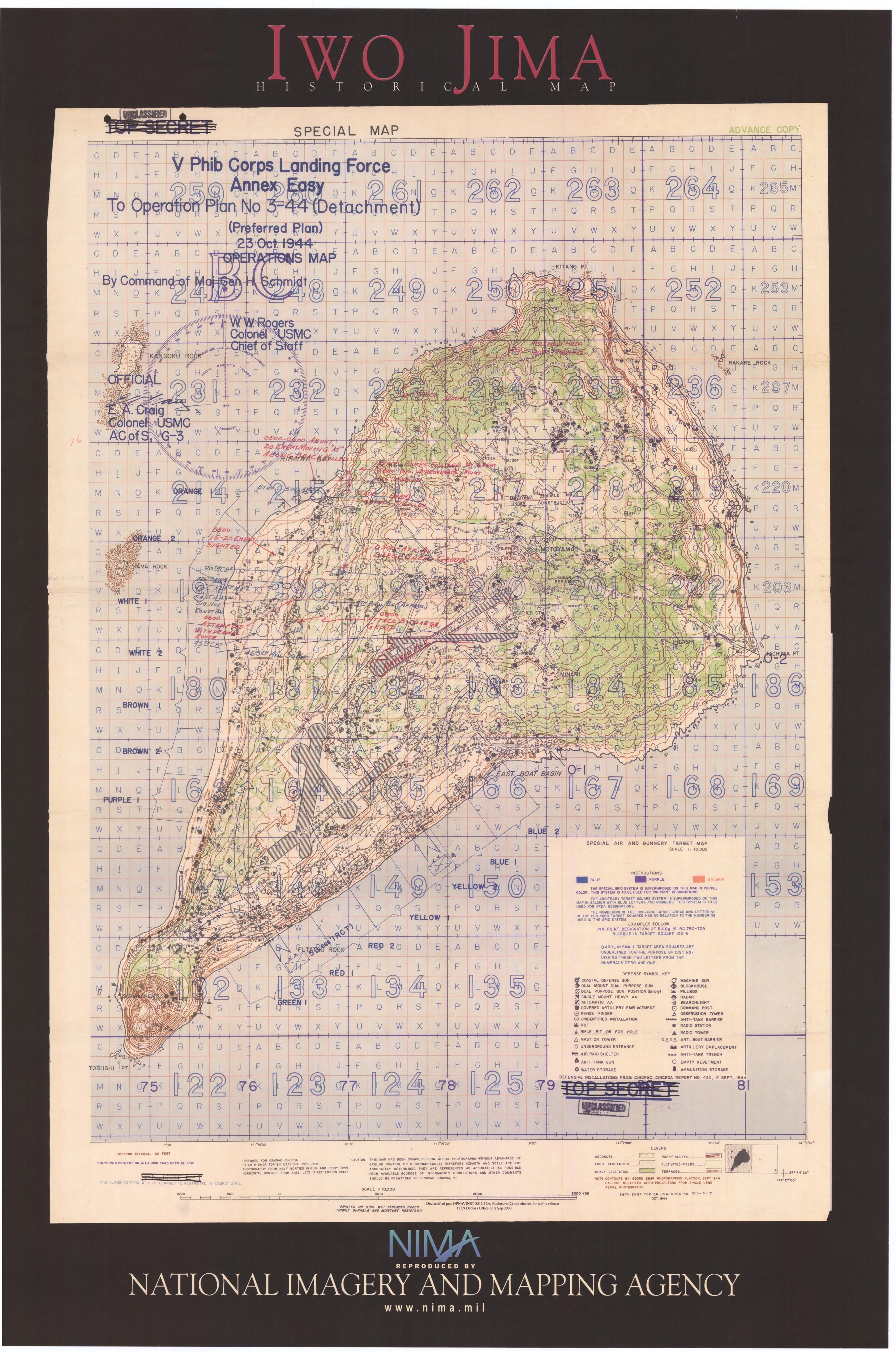
The only thing that I don't like is the font. It looks too modern for such an old map.
_________________
To modern?How many time i must show original map of these operation?
These font is same from mine source for these map,and if you say that these is modern, then these mean that americans whas modern in year 1945.

America has always been a bit industrial, and as new age as we'd like to pretend to be a lot of things still look the same today they did back then. I guess it's about perspective. Anyway, it isn't too modern, it's as qwert already said, about the same as the original.Ruben Cassar wrote:The only thing that I don't like is the font. It looks too modern for such an old map.
Warning: You may be reading a really old topic.
-
AndyDufresne

- Posts: 24919
- Joined: Fri Mar 03, 2006 8:22 pm
- Location: A Banana Palm in Zihuatanejo
- Contact:
It's looking good qwert. I'd maybe consider making the infantry barrier 'x's a little less perfect and symmetrical, or at least less like 'type x's '...like on a keyboard or on a typewriter.
Also maybe fade your signature, make it transparent with the map, so it doesn't stick out so much and blends with the map. But since it's your signature, you can surely keep it whatever way you'd like. I just like signatures that don't immediately get caught by my eye.
--Andy
Also maybe fade your signature, make it transparent with the map, so it doesn't stick out so much and blends with the map. But since it's your signature, you can surely keep it whatever way you'd like.
--Andy
-
Qwert
- SoC Training Adviser
- Posts: 9262
- Joined: Tue Nov 07, 2006 5:07 pm
- Location: VOJVODINA
- Contact:
Like you notice,these is a strategic military map,and these is not a some perfect and summetrical X,its just simple symbol who present barrier on map."All in page 1"you can se that i present 4 diferent barrier symbols and people vote for these symbol,who is very simple,but very good present barriers in these map.AndyDufresne
It's looking good qwert. I'd maybe consider making the infantry barrier 'x's a little less perfect and symmetrical, or at least less like 'type x's '...like on a keyboard or on a typewriter.
Also maybe fade your signature, make it transparent with the map, so it doesn't stick out so much and blends with the map. But since it's your signature, you can surely keep it whatever way you'd like. I just like signatures that don't immediately get caught by my eye.
--Andy
I want to all mine signature be same in all map,i hope that you agree with these(These is a flag of mine country,and i hope that lack will find these flag and change in mine profile old flag)

The font is actually pretty close to the original military font.
http://www.lib.utexas.edu/maps/historic ... a_2003.jpg
http://www.lib.utexas.edu/maps/historic ... a_2003.jpg
-
Qwert
- SoC Training Adviser
- Posts: 9262
- Joined: Tue Nov 07, 2006 5:07 pm
- Location: VOJVODINA
- Contact:
mibi
if this is a military map why are you using a comic sans type font. maybe a more military oriented font would give the map a more accurate military feel.
Keyogi is right,i will be 100% accurate if i know what font Americans use in hes map 1944 years.But i think that i very close to these military font(maybe 95-98% close).KEYOGI
Cartography Assistant
The font is actually pretty close to the original military font.
well isn't that wackyKEYOGI wrote:The font is actually pretty close to the original military font.
http://www.lib.utexas.edu/maps/historic ... a_2003.jpg

About your signature. Andy is right. It is not in the style of the map. You can fade it like the background of the map. Its a eyecatcher, you immediately look to the signature and the not the rest of the map. It's not proper on the map.AndyDufresne wrote:It's looking good qwert. I'd maybe consider making the infantry barrier 'x's a little less perfect and symmetrical, or at least less like 'type x's '...like on a keyboard or on a typewriter.
Also maybe fade your signature, make it transparent with the map, so it doesn't stick out so much and blends with the map. But since it's your signature, you can surely keep it whatever way you'd like.
--Andy
Grtz
MarVal
 highest score: 2157 (Major) / Verd ori'shya beskar'gam
