Conquer Club

WWII Pearl Harbor - [Quenched]

Care to peruse completed maps? Take a stroll through the Atlas.

Moderator: Cartographers

Forum rules
Please read the Community Guidelines before posting.

Postby Qwert on Fri Jul 06, 2007 3:15 am

qwert


Joined: 07 Nov 2006
Posts: 1454
Location: VOJVODINA
Posted: 01 Jul 2007 12:48 Post subject:

--------------------------------------------------------------------------------

Can you explane to me better bonuses(number of terittory,borders,attack borders).

You dont need to show me visual,just with words,here example:
Kates-X terittory,X borders,X attack borders--bonuses.
I hope that you understand what i want to understand.
Image
NEW REVOLUTION-NEW RANKS PRESS THESE LINK viewtopic.php?f=471&t=47578&start=0
User avatar
Major Qwert
SoC Training Adviser
 
Posts: 9262
Joined: Tue Nov 07, 2006 5:07 pm
Location: VOJVODINA

Postby cairnswk on Fri Jul 06, 2007 3:41 am

hulmey wrote:Yes attack lines map is much nicer....But you could alot to get ride of the clutter and confusion just by removing certain things that dont really lend to the map......

You know what i mean :wink:


Please state your case Hulmey, just don't ask for the oil tap to go...coz i've already stated it stays!
Image
* Pearl Harbour * Waterloo * Forbidden City * Jamaica * Pot Mosbi
User avatar
Private cairnswk
 
Posts: 11510
Joined: Sat Feb 03, 2007 8:32 pm
Location: Australia

V27 Updates

Postby cairnswk on Fri Jul 06, 2007 4:04 pm

qwert wrote:Can you explane to me better bonuses(number of terittory,borders,attack borders).

You dont need to show me visual,just with words,here example:
Kates-X terittory,X borders,X attack borders--bonuses.
I hope that you understand what i want to understand.[/quote]

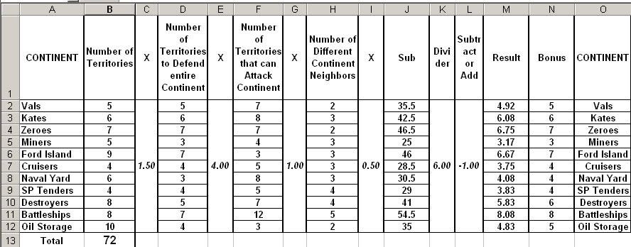
Hi Qwert...below is the spreadsheet for the bonus calcalations.

Image

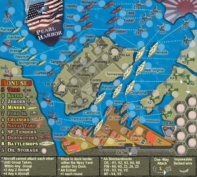
Also the V27 map, with minor colour changes to the bonus area....I don't particularly like this change....I prefere the colour gradients in the background of the bonus area...but this is a hulmey request to remove the "fireworks" so I am trying it.
I would not want to remove any further colour from the map otherwise is becomes too drab, and while i recognise this is a war scene, I also want it to be a celebration with colours.

Image
Image
* Pearl Harbour * Waterloo * Forbidden City * Jamaica * Pot Mosbi
User avatar
Private cairnswk
 
Posts: 11510
Joined: Sat Feb 03, 2007 8:32 pm
Location: Australia

Postby Qwert on Fri Jul 06, 2007 4:19 pm

i loking yours table,and i see that you have to many very hard to hold country:
1.Vals -5-5
2.Kates-6-6
3.Zeroes-7-7
4.Cruisers-4-4
5.SP tenders-4-4
I think that is to many country where you must defend all terittory for bonuses,there is no chance to create some not atacable borders?
Image
NEW REVOLUTION-NEW RANKS PRESS THESE LINK viewtopic.php?f=471&t=47578&start=0
User avatar
Major Qwert
SoC Training Adviser
 
Posts: 9262
Joined: Tue Nov 07, 2006 5:07 pm
Location: VOJVODINA

Postby cairnswk on Fri Jul 06, 2007 4:29 pm

qwert wrote:i loking yours table,and i see that you have to many very hard to hold country:
1.Vals -5-5
2.Kates-6-6
3.Zeroes-7-7
4.Cruisers-4-4
5.SP tenders-4-4
I think that is to many country where you must defend all terittory for bonuses,there is no chance to create some not atacable borders?

Qwert...what u think these bonus must be?
Image
* Pearl Harbour * Waterloo * Forbidden City * Jamaica * Pot Mosbi
User avatar
Private cairnswk
 
Posts: 11510
Joined: Sat Feb 03, 2007 8:32 pm
Location: Australia

Postby Qwert on Fri Jul 06, 2007 6:24 pm

No i dont talk for bonuses i talk for to many defending borders.
Image
NEW REVOLUTION-NEW RANKS PRESS THESE LINK viewtopic.php?f=471&t=47578&start=0
User avatar
Major Qwert
SoC Training Adviser
 
Posts: 9262
Joined: Tue Nov 07, 2006 5:07 pm
Location: VOJVODINA

Postby yeti_c on Sat Jul 07, 2007 1:10 am

Cairns.

The shadow of Z1 plane is a bit vertical compared to the other planes...

Bonuswise - I like the fact that it's hard to hold the continents - but remember there are stepped bonuses along the way for the planes.

C.
Image
Highest score : 2297
User avatar
Lieutenant yeti_c
 
Posts: 9624
Joined: Thu Jan 04, 2007 9:02 am

Postby hulmey on Sat Jul 07, 2007 3:03 am

My case would be that alot of people of are saying the map is busy and cluttered....So an idea would be lessen what is going on with the map.

The oil tap does not really fit in with the game paly and graphics and i find that it makes the map look odd!!!
[img]http://img801.imageshack.us/img801/9761/41922610151374166770386.jpg[/mg]
User avatar
Lieutenant hulmey
 
Posts: 3742
Joined: Fri Nov 03, 2006 7:33 am
Location: Las Vegas

Postby cairnswk on Sat Jul 07, 2007 4:53 am

hulmey wrote:My case would be that alot of people of are saying the map is busy and cluttered....So an idea would be lessen what is going on with the map.

The oil tap does not really fit in with the game paly and graphics and i find that it makes the map look odd!!!


Hulmey...thanks for stating your case....although I am disappointed that you are still on this oil tap business...i was looking to hear something different from you. Yes a lot of people are saying the map is cluttered and busy...and yes an idea would be to lessen what is going on....but I see that you are the only one calling for the removal of the oil tap. No-one else has come and said remove it. One person saying remove it is not enough justification in my eyes to do so.

The map has become cluttered because there are now 72 terts instead of the original 57 that I had drawn in draft 1. This has gradually grown to elevate the map to give it historical status that it deserves as a battle map, and it became more cluttered with the inclusion of the Vals and AABs, plane shadows etc, not the oil tap.. The oil tap assists in making an even 72 terts. Also, the busy state comes from the combination of the attack lines, tert names, army shadows, plane shadows and 3d images. The 3D images actually add drama to the design.

I am going to retain the oil tap as it also makes a good attack tactic in this area of the map, regardless of the fact that you think it may not be in tune with what is going on in the rest of the map, which is your personal view that you are entitled to. If there are other posts that call for the its removal then i will consider them in conjunction with yours.

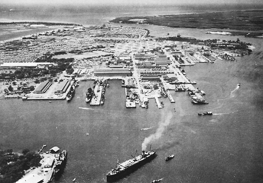
Now...to fortify my reasons for retaining the oil tap, i am going to draw your attention to two photos A & B below that are in US archives showing the area behind the dry docks near the hospital and navy yards....both photos show oil tanks in this region which I have not put into the map, but replaced them with an oil tap.

These are totally separate to the oil tanks on the map, which are to the east of the submarine base which i show below in photo C

Here are the photos.
A.
Image
B.
Image
C.
Image
Image
* Pearl Harbour * Waterloo * Forbidden City * Jamaica * Pot Mosbi
User avatar
Private cairnswk
 
Posts: 11510
Joined: Sat Feb 03, 2007 8:32 pm
Location: Australia

Postby DiM on Sat Jul 07, 2007 4:59 am

keep the oil tap. if you remove it the map won't be less cluttered but you'll lose some tactical options. :wink:
“In the beginning God said, the four-dimensional divergence of an antisymmetric, second rank tensor equals zero, and there was light, and it was good. And on the seventh day he rested.”- Michio Kaku
User avatar
Major DiM
 
Posts: 10415
Joined: Wed Feb 14, 2007 6:20 pm
Location: making maps for scooby snacks

Postby cairnswk on Sat Jul 07, 2007 5:01 am

qwert wrote:No i dont talk for bonuses i talk for to many defending borders.


Qwert...i understand what you say. :)

I will look at this on the for Cuisers and Sp Tenders....but planes stay as they are.

To assist in fortifying the planes there is the bonuses for holding two or four planes in the gameplay legend.
Image
* Pearl Harbour * Waterloo * Forbidden City * Jamaica * Pot Mosbi
User avatar
Private cairnswk
 
Posts: 11510
Joined: Sat Feb 03, 2007 8:32 pm
Location: Australia

Postby cairnswk on Sat Jul 07, 2007 5:03 am

yeti_c wrote:Cairns.

The shadow of Z1 plane is a bit vertical compared to the other planes...

Bonuswise - I like the fact that it's hard to hold the continents - but remember there are stepped bonuses along the way for the planes.

C.

Yeti_c....hello....i'v e fixed that Z1 shadow in the nextr version.
I agree with you about the bonuses, but I am happy to alter maybe the Sp TEnders and Cruisers as stated in reply to Qwert, although this will be minimal.
Image
* Pearl Harbour * Waterloo * Forbidden City * Jamaica * Pot Mosbi
User avatar
Private cairnswk
 
Posts: 11510
Joined: Sat Feb 03, 2007 8:32 pm
Location: Australia

Postby cairnswk on Sat Jul 07, 2007 5:07 am

DiM wrote:keep the oil tap. if you remove it the map won't be less cluttered but you'll lose some tactical options. :wink:


Hi DiM....i agree with you...and i think this tactical option is important for some variation on the standard attack tactic....it makes that area interesting to try and conquer if attacking from the oil tanks....which is eactly what I have tried to achieve.
Image
* Pearl Harbour * Waterloo * Forbidden City * Jamaica * Pot Mosbi
User avatar
Private cairnswk
 
Posts: 11510
Joined: Sat Feb 03, 2007 8:32 pm
Location: Australia

Postby hulmey on Sat Jul 07, 2007 5:26 am

Yes it is a tactical option but i feel it does not fit in with the overall graphics and looks odd. You already have the oil drums which are what the photographs show.....The oil tap would have run underground as well and would have been seen by the enemy, who would have attacked the oil drums for maximium damage.

If you want it to stay which is your right i then reverse the question apon to you.

What are you going to do to relieve the clutter and busyness of the map?
[img]http://img801.imageshack.us/img801/9761/41922610151374166770386.jpg[/mg]
User avatar
Lieutenant hulmey
 
Posts: 3742
Joined: Fri Nov 03, 2006 7:33 am
Location: Las Vegas

Postby DiM on Sat Jul 07, 2007 5:57 am

i actually don't think the map is too cluttered. you have to consider that the image above is the small version. in the large one there will be plenty of space and i think the cluttering feeling will fade away.
“In the beginning God said, the four-dimensional divergence of an antisymmetric, second rank tensor equals zero, and there was light, and it was good. And on the seventh day he rested.”- Michio Kaku
User avatar
Major DiM
 
Posts: 10415
Joined: Wed Feb 14, 2007 6:20 pm
Location: making maps for scooby snacks

Postby cairnswk on Sat Jul 07, 2007 6:13 am

hulmey wrote:Yes it is a tactical option but i feel it does not fit in with the overall graphics and looks odd. You already have the oil drums which are what the photographs show.....The oil tap would have run underground as well and would have been seen by the enemy, who would have attacked the oil drums for maximium damage.

If you want it to stay which is your right i then reverse the question apon to you.

What are you going to do to relieve the clutter and busyness of the map?


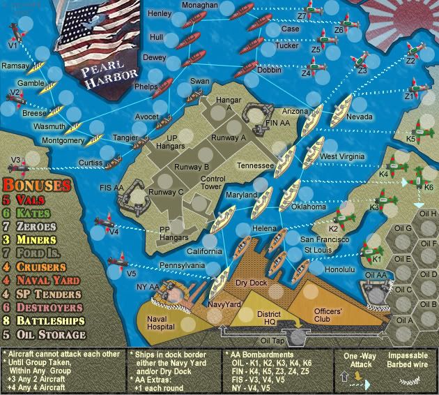
Apart from reducing the terts, this is one solution that I don't think works, because the map loses it "soul"....removed all the 3d buildings, plane shadows and icons in the legend.

I also don't believe the map is too cluttered...perhaps it looks cluttered because it is so evenly spread. :wink:

Image
Image
* Pearl Harbour * Waterloo * Forbidden City * Jamaica * Pot Mosbi
User avatar
Private cairnswk
 
Posts: 11510
Joined: Sat Feb 03, 2007 8:32 pm
Location: Australia

Postby DiM on Sat Jul 07, 2007 7:35 am

cairnswk wrote:removed all the 3d buildings, plane shadows and icons in the legend.


bad idea. looks awful without that stuff :(
“In the beginning God said, the four-dimensional divergence of an antisymmetric, second rank tensor equals zero, and there was light, and it was good. And on the seventh day he rested.”- Michio Kaku
User avatar
Major DiM
 
Posts: 10415
Joined: Wed Feb 14, 2007 6:20 pm
Location: making maps for scooby snacks

Postby cairnswk on Sat Jul 07, 2007 8:01 am

DiM wrote:
cairnswk wrote:removed all the 3d buildings, plane shadows and icons in the legend.


bad idea. looks awful without that stuff :(

Agreed DiM :)
Image
* Pearl Harbour * Waterloo * Forbidden City * Jamaica * Pot Mosbi
User avatar
Private cairnswk
 
Posts: 11510
Joined: Sat Feb 03, 2007 8:32 pm
Location: Australia

Postby hulmey on Sat Jul 07, 2007 9:57 am

It looks easier on the eye.....You got a problem coz alot of people are saying the map looks cluttered etc.....

What i suggest is adjust the map as you see best so that you have 3 versions and make a poll as you did with the attack lines!!

Then obviously we can move on....
[img]http://img801.imageshack.us/img801/9761/41922610151374166770386.jpg[/mg]
User avatar
Lieutenant hulmey
 
Posts: 3742
Joined: Fri Nov 03, 2006 7:33 am
Location: Las Vegas

Postby cairnswk on Sat Jul 07, 2007 11:24 am

hulmey wrote:It looks easier on the eye.....You got a problem coz alot of people are saying the map looks cluttered etc.....

What i suggest is adjust the map as you see best so that you have 3 versions and make a poll as you did with the attack lines!!

Then obviously we can move on....


Or we could just put the icons and shadows back, give the map its soul back; recognise that it is a busy map; accept it and just move on without all the drama of a poll.
I still think there is no way around this because the cluttered look is something new and people simply have to get used to seeing this on some of my maps especially if i decide to use icons and have large numbers of terts.
Image
* Pearl Harbour * Waterloo * Forbidden City * Jamaica * Pot Mosbi
User avatar
Private cairnswk
 
Posts: 11510
Joined: Sat Feb 03, 2007 8:32 pm
Location: Australia

Postby hulmey on Sat Jul 07, 2007 1:43 pm

I liked the shadows of the aeroplanes but honestly there is a difference between having too much and having too little.
[img]http://img801.imageshack.us/img801/9761/41922610151374166770386.jpg[/mg]
User avatar
Lieutenant hulmey
 
Posts: 3742
Joined: Fri Nov 03, 2006 7:33 am
Location: Las Vegas

Postby cairnswk on Sat Jul 07, 2007 2:17 pm

hulmey wrote:I liked the shadows of the aeroplanes but honestly there is a difference between having too much and having too little.

Hulmey....i am in agreeance on this point...I think the plane shadows could be ditched, but i would like to put the building icons back on both the legend and the terts. :)
Image
* Pearl Harbour * Waterloo * Forbidden City * Jamaica * Pot Mosbi
User avatar
Private cairnswk
 
Posts: 11510
Joined: Sat Feb 03, 2007 8:32 pm
Location: Australia

Postby DiM on Sat Jul 07, 2007 2:20 pm

cairnswk wrote:
hulmey wrote:I liked the shadows of the aeroplanes but honestly there is a difference between having too much and having too little.

Hulmey....i am in agreeance on this point...I think the plane shadows could be ditched, but i would like to put the building icons back on both the legend and the terts. :)


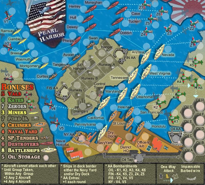
cairnswk could you do a resize of the current image to make it for the large map?? don't bother with adjusting army circles. just a simple resize.

my bet is that the map won't feel so cluttered. :wink:
“In the beginning God said, the four-dimensional divergence of an antisymmetric, second rank tensor equals zero, and there was light, and it was good. And on the seventh day he rested.”- Michio Kaku
User avatar
Major DiM
 
Posts: 10415
Joined: Wed Feb 14, 2007 6:20 pm
Location: making maps for scooby snacks

Postby cairnswk on Sat Jul 07, 2007 2:47 pm

DiM wrote:
cairnswk wrote:
hulmey wrote:I liked the shadows of the aeroplanes but honestly there is a difference between having too much and having too little.

Hulmey....i am in agreeance on this point...I think the plane shadows could be ditched, but i would like to put the building icons back on both the legend and the terts. :)


cairnswk could you do a resize of the current image to make it for the large map?? don't bother with adjusting army circles. just a simple resize.

my bet is that the map won't feel so cluttered. :wink:


Image
Image
* Pearl Harbour * Waterloo * Forbidden City * Jamaica * Pot Mosbi
User avatar
Private cairnswk
 
Posts: 11510
Joined: Sat Feb 03, 2007 8:32 pm
Location: Australia

Postby DiM on Sat Jul 07, 2007 2:54 pm

looks great not cramped at all.
“In the beginning God said, the four-dimensional divergence of an antisymmetric, second rank tensor equals zero, and there was light, and it was good. And on the seventh day he rested.”- Michio Kaku
User avatar
Major DiM
 
Posts: 10415
Joined: Wed Feb 14, 2007 6:20 pm
Location: making maps for scooby snacks

PreviousNext

Return to The Atlas

Who is online

Users browsing this forum: No registered users

cron