Templars 4.22
Moderator: Cartographers
Forum rules
Please read the Community Guidelines before posting.
Please read the Community Guidelines before posting.
- TrafalgarLaw01
- Clan Director

- Posts: 669
- Joined: Tue Aug 20, 2013 5:43 pm
- Gender: Male
- Location: Buenos Aires
Re: Templars
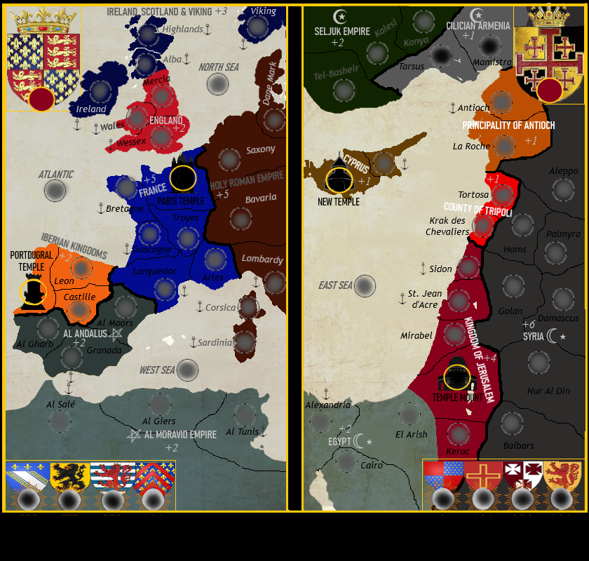
Looking much better than the first draft, borders are much clearer, so are terts, now we would need to see how it would look with the legend maybe.
- MichelSableheart
- Posts: 781
- Joined: Sat Jun 27, 2009 5:10 pm
Re: Templars
If you're trying to show that Wessex can only attack into the Atlantic, and not into the north sea, then yes, that's excellent.SoN!c wrote:Perhaps like this?MichelSableheart wrote:I have to agree that the connections are a lot clearer in the second one. It could be an idea to mark the borders for the sea territories, to make those connections even more clear?
Terrs that can access the sea have a small anchor
MichelSableheart,
Een van de Veroveraars der Lage Landen
And a member of the Republic
Een van de Veroveraars der Lage Landen
And a member of the Republic
- SoN!c
- Posts: 1012
- Joined: Tue May 11, 2021 10:23 am
- Location: Going supersonic, be there in 30 seconds!
Re: Templars
Well your right, Wessex is the only terr that should be able to acces North Sea too so a double anchor perhaps, one one both sides..
then all seas are single killer neuts (north sea connects to atlantic, atlantic to west sea, west sea to east and vice versa), I'll post it in the legend (to be made).
Would there be other "sea connections" needed for good strategic gameplay (like saxony connection to North sea for example)?
--
Then for balance Troyes will get the "Grand Fair of Troyes" +1 auto deploy.
So west side :
6 small bonusses
1 autodeploy (troyes) +1
4 +2 regions
1 +3
2 big bonusses:
2 +5
East has :
6 small bonusses
4 +1 regions,
2 +2 regions
2 big bonusses
1 + 4
1 +6
extra bonusses are :
caliph of the almohads bonus (the pentagon symbol) for holding al andalus and al al moravid
sultan of the ayyubids bonus : (hollow) half moon + star = syria and egypt
emir of the seljuks: (full) moon and crescent star = seljuk + cilician
any suggestions on the balance part?

- SoN!c
- Posts: 1012
- Joined: Tue May 11, 2021 10:23 am
- Location: Going supersonic, be there in 30 seconds!
Re: Templars
Here is the "final" version (2.00):


Last edited by SoN!c on Sat Jun 17, 2023 2:05 am, edited 1 time in total.

Re: Templars
Hey SoN!C! ...i have a slew of super helpful feedback for sprucing it up, but running low on time right now, and want to be able to read through this whole thread a few times over to see what you're going for in terms of gameplay flow on the map.
It looks great though
Could you maybe help me understand where EXACTLY the nobles connect to-and-from. As well as access to-and-from the 'Overlords'? Thanks
It looks great though
Could you maybe help me understand where EXACTLY the nobles connect to-and-from. As well as access to-and-from the 'Overlords'? Thanks
- SoN!c
- Posts: 1012
- Joined: Tue May 11, 2021 10:23 am
- Location: Going supersonic, be there in 30 seconds!
Re: Templars
Yes, so the nobles (bottom corner) is the starting point. 4 on east side, 4 on west side/ They can attack all "christian" terrs (= all non muslim terrs) on their side of the map.Murphalot wrote:Hey SoN!C! ...i have a slew of super helpful feedback for sprucing it up, but running low on time right now, and want to be able to read through this whole thread a few times over to see what you're going for in terms of gameplay flow on the map.
It looks great though
Could you maybe help me understand where EXACTLY the nobles connect to-and-from. As well as access to-and-from the 'Overlords'? Thanks
Overlords have to be taken from a temple (also on the same side of the map).
So this is what it should look with "fixed" neutral positions (rest is random drop except any player gets a "nobles" starting point):
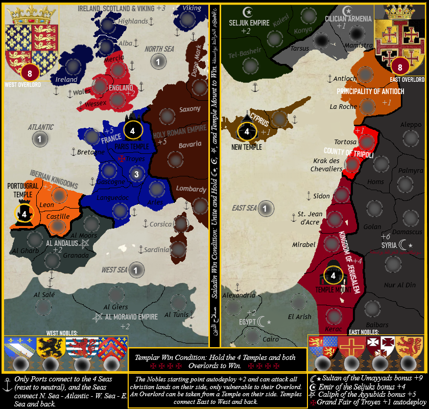
So for example, the nobles of the east are called:
The Prince of Antioch
The Count of Tripoli
The Baron of Ibellin
The Lord of Oultrejordain and they can attack any non muslim terr on their side of the map like Cyprus, Kingdom of Jerusalem, County of Tripoli and Principiality of Antioch.
Im thinking on autodeploys for the Temples too (it should profit "big" to hold them)

Re: Templars
i'm thinking that it's too easy to go between the two halves of the map: two ways from each of the four temples, plus one each from west sea and east sea, meaning five ways from each half. going between temples on opposite halves ought to be harder than the easiest attack on the board.
there is currently a very high chance that player one will have a clear advantage because he's likely to start with a bonus.
please number each map version, so that we can refer to our favourite one easily.
ian.
there is currently a very high chance that player one will have a clear advantage because he's likely to start with a bonus.
please number each map version, so that we can refer to our favourite one easily.
ian.
- SoN!c
- Posts: 1012
- Joined: Tue May 11, 2021 10:23 am
- Location: Going supersonic, be there in 30 seconds!
Re: Templars
Thx for the advice! Much appreciated! Also needed because sometimes your to close to see such things, not seeing the forest due to the trees..
So only Paris Temple and Temple Mount connect (besides the sea), i call this version "2.01" (+ some small tidy ups too graphic wise like small visual faults on the oultrejordain shield) :

also i feel like the overlord should yield extra bonus, like +? for every noble he holds, or +? for every terr you hold on his side of the map or something
So only Paris Temple and Temple Mount connect (besides the sea), i call this version "2.01" (+ some small tidy ups too graphic wise like small visual faults on the oultrejordain shield) :

also i feel like the overlord should yield extra bonus, like +? for every noble he holds, or +? for every terr you hold on his side of the map or something

- TrafalgarLaw01
- Clan Director

- Posts: 669
- Joined: Tue Aug 20, 2013 5:43 pm
- Gender: Male
- Location: Buenos Aires
Re: Templars
Looking at it better I like the last version. Mayve would make the overlords with more neutrals to make it harder for a stack and run for the kill
-
Fuchsia tude
- Posts: 159
- Joined: Tue Sep 06, 2011 4:36 am
Re: Templars
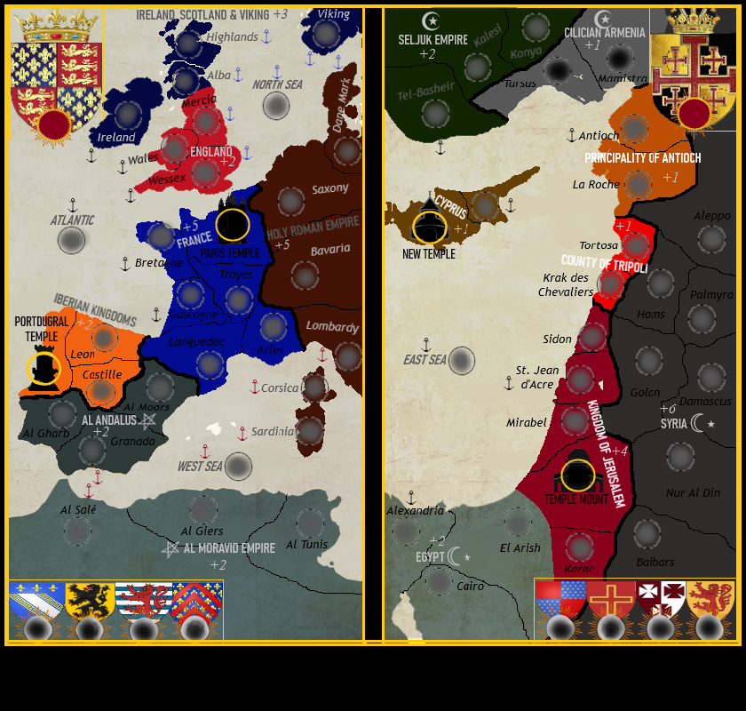
Maybe you could color code the anchors and their corresponding seas? That would remove all ambiguity.SoN!c wrote:Well your right, Wessex is the only terr that should be able to acces North Sea too so a double anchor perhaps, one one both sides..
Also, please don't write black on dark colors, at least without adding a light-colored glow. Same with the white text over the seas--at least add a dark shadow to them. Half of the map is illegible right now.
- SoN!c
- Posts: 1012
- Joined: Tue May 11, 2021 10:23 am
- Location: Going supersonic, be there in 30 seconds!
Re: Templars
yeah, ill make it some nice fuchsia and some salmon roseate fluoFuchsia tude wrote:Maybe you could color code the anchors and their corresponding seas? That would remove all ambiguity.SoN!c wrote:Well your right, Wessex is the only terr that should be able to acces North Sea too so a double anchor perhaps, one one both sides..
Also, please don't write black on dark colors, at least without adding a light-colored glow. Same with the white text over the seas--at least add a dark shadow to them. Half of the map is illegible right now.
This is wha it looks with color code anchors (version 2.02):

Re: Templars v2.02
iancanton wrote:going between temples on opposite halves ought to be harder than the easiest attack on the board.
the attack from paris temple to temple mount is still equal to the easiest attack on the board. u can solve this and keep much of ur original intent by letting eastern and western temples connect only if a player holds both temples of one side.SoN!c wrote:So only Paris Temple and Temple Mount connect (besides the sea), i call this version "2.01"
the different anchors of v2.02 are a good improvement.
put the latest version number in the title of the original post, as i have done above to the current post, to help readers.
ian.
- Shannon Apple
- Chatter

- Posts: 2182
- Joined: Wed Jan 14, 2009 8:40 pm
- Gender: Female
- Location: Ireland
Re: Templars
Please use light text on dark backgrounds. Many people will have trouble reading it. =) You can use a light shade of the colour you used for the country if it's a dark colour. So on France, you could use a pale blue for the text.
I don't think the graphic style of this map is one that needs a bunch of outer glows, but some repositioning and re-colouring of text could make a difference.
A very subtle drop shadow on the white text could work.
Let me know if you need any help.
I don't think the graphic style of this map is one that needs a bunch of outer glows, but some repositioning and re-colouring of text could make a difference.
A very subtle drop shadow on the white text could work.
Let me know if you need any help.
00:33:53 ‹riskllama› will her and i ever hook up, LLT???
00:34:09 ‹LiveLoveTeach› You and Shannon?
00:34:20 ‹LiveLoveTeach› Bahahahahahaha
00:34:22 ‹LiveLoveTeach› I doubt it
00:34:30 ‹LiveLoveTeach› I don't think she's into farm animals
00:34:09 ‹LiveLoveTeach› You and Shannon?
00:34:20 ‹LiveLoveTeach› Bahahahahahaha
00:34:22 ‹LiveLoveTeach› I doubt it
00:34:30 ‹LiveLoveTeach› I don't think she's into farm animals
- SoN!c
- Posts: 1012
- Joined: Tue May 11, 2021 10:23 am
- Location: Going supersonic, be there in 30 seconds!
Re: Templars v2.03
Feel free to give your opinion on what colours should be used:Shannon Apple wrote:Please use light text on dark backgrounds. Many people will have trouble reading it. =) You can use a light shade of the colour you used for the country if it's a dark colour. So on France, you could use a pale blue for the text.
I don't think the graphic style of this map is one that needs a bunch of outer glows, but some repositioning and re-colouring of text could make a difference.
A very subtle drop shadow on the white text could work.
Let me know if you need any help.
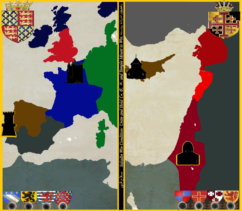
reddish in the east = Holy Land, should have same colour spectrum, same goes for the islamic terrs (currently greyish), thinking on a new bonus terr portugal and cyprus (templar ground)..
if we have the colours right to begin with we can move forward

- Shannon Apple
- Chatter

- Posts: 2182
- Joined: Wed Jan 14, 2009 8:40 pm
- Gender: Female
- Location: Ireland
Re: Templars
Okay, I will take a look tomorrow. It's midnight here hehe!
Also... the shields are distorted. I'm not sure what program you're using. But, if you go back to the original images you used, hold down the shift button while you drag the corner to resize. This should keep the shields in their original shape. Always use the shift button when resizing images.
Also... the shields are distorted. I'm not sure what program you're using. But, if you go back to the original images you used, hold down the shift button while you drag the corner to resize. This should keep the shields in their original shape. Always use the shift button when resizing images.
00:33:53 ‹riskllama› will her and i ever hook up, LLT???
00:34:09 ‹LiveLoveTeach› You and Shannon?
00:34:20 ‹LiveLoveTeach› Bahahahahahaha
00:34:22 ‹LiveLoveTeach› I doubt it
00:34:30 ‹LiveLoveTeach› I don't think she's into farm animals
00:34:09 ‹LiveLoveTeach› You and Shannon?
00:34:20 ‹LiveLoveTeach› Bahahahahahaha
00:34:22 ‹LiveLoveTeach› I doubt it
00:34:30 ‹LiveLoveTeach› I don't think she's into farm animals
- SoN!c
- Posts: 1012
- Joined: Tue May 11, 2021 10:23 am
- Location: Going supersonic, be there in 30 seconds!
Re: Templars
I know i will have to make the map all over again so the shields are just there as a fast decoration.Shannon Apple wrote:Okay, I will take a look tomorrow. It's midnight here hehe!
Also... the shields are distorted. I'm not sure what program you're using. But, if you go back to the original images you used, hold down the shift button while you drag the corner to resize. This should keep the shields in their original shape. Always use the shift button when resizing images.
Very frustrating if you have to start over with step 1 (the colours, and they already changed twice due to comments.."too light so you cant see the white numbers well", then comments "too dark"...)
But since it has to start from scratch again we better rethink it all (hence the "new bonus' region portugal and cyprus together)

- Shannon Apple
- Chatter

- Posts: 2182
- Joined: Wed Jan 14, 2009 8:40 pm
- Gender: Female
- Location: Ireland
Re: Templars
Why do you have to start from scratch? What program/app are you using to create your map? Maybe i can suggest something better.
Changing text and colours should be fairly simple without having to change everything. That would frustrate me too.
Changing text and colours should be fairly simple without having to change everything. That would frustrate me too.
00:33:53 ‹riskllama› will her and i ever hook up, LLT???
00:34:09 ‹LiveLoveTeach› You and Shannon?
00:34:20 ‹LiveLoveTeach› Bahahahahahaha
00:34:22 ‹LiveLoveTeach› I doubt it
00:34:30 ‹LiveLoveTeach› I don't think she's into farm animals
00:34:09 ‹LiveLoveTeach› You and Shannon?
00:34:20 ‹LiveLoveTeach› Bahahahahahaha
00:34:22 ‹LiveLoveTeach› I doubt it
00:34:30 ‹LiveLoveTeach› I don't think she's into farm animals
Re: Templars
I am happy to help with the xml of this map  get updated art and I can make you the xml file
I can also get the map onto the beta site
I can also get the map onto the beta site
plurple is not purple 


- SoN!c
- Posts: 1012
- Joined: Tue May 11, 2021 10:23 am
- Location: Going supersonic, be there in 30 seconds!
Re: Templars
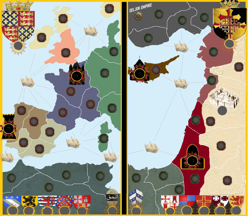
This is where we currently are. 150 steps forward, 149 back...

Re: Templars
This is much more legibleSoN!c wrote:This is where we currently are. 150 steps forward, 149 back...
plurple is not purple 


Re: Templars
That might make the map a bit crowded, but didn't templars land in Damiette (Egypt) once?

- SoN!c
- Posts: 1012
- Joined: Tue May 11, 2021 10:23 am
- Location: Going supersonic, be there in 30 seconds!
Re: Templars
well, that's tru.
so here is the version with Damiette, legend, neutrals and bonusses (version 3.19). If it's played 1vs1 each player gets 1 noble on west and east side (and so on).
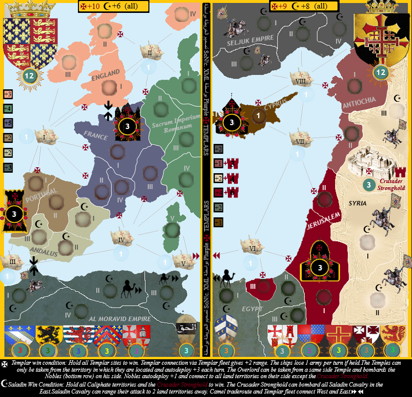
so here is the version with Damiette, legend, neutrals and bonusses (version 3.19). If it's played 1vs1 each player gets 1 noble on west and east side (and so on).

Last edited by SoN!c on Sat Apr 26, 2025 6:27 pm, edited 1 time in total.
Re: Templars
the temples no longer connect across the east-west divide, which makes sense.
however, there are too many 2-region and 3-region bonuses, so u'll have to find a way to stop player from starting so often with one or more of them.
experience with waterloo shows that the 1v1 gameplay here is likely to be west against east instead of christian against muslim. one method of encouraging the latter is, for example, to state in the legend that each player may receive either christian or muslim country bonuses, but not both, at the start of a turn.
put the latest version number in the title of the original post and current post to help readers, otherwise it's hard to refer to a particular version clearly.
ian.

