Conquer Club

New York 1695 v15

Maps that may be nearing the end of production. Finalize maps here, while testing.

Moderator: Cartographers

Forum rules
Please read the Community Guidelines before posting.

New York 1695 v15

Postby Minister X on Sun Aug 02, 2020 6:54 pm

Map Name: New York 1695
Mapmaker(s): Minister X
Number of Territories: 62
Special Features: Streets reset after every player's turn.

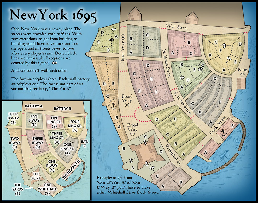
What Makes This Map Worthy of Being Made: It's probably just luck but in the last several games I've played I've gone first and been able to win a bonus that first turn, upsetting game balance right off the bat and winning each game quickly. This map is designed to prevent that from occurring. There will be lots of neutrals to start and you'll probably have to build up for a turn before venturing into the streets. In addition, this map is decidedly odd in that you can rarely go from one tert in a bonus region directly to another. You must usually go out into the street first. This makes bonus regions less cohesive and harder to hold. That will place a premium, at least early in the game, on just taking as many random terts as possible. The map is easy to read and use; the area and era depicted are interesting; and though not heavy on special features gameplay should be unique in character and unpredictable.
Image

The Fort and The Yards surrounding it (at least A and C) should all start neutral. That area will be pretty important. The small batteries start neutral. Streets might start neutral 2, 3 or 4, and though I say they reset to 2, that is subject to play-testing. The Fort might start neutral more than just 3. I think that nearly half the bonus terts should start neutral for a two-player game, descending with player count but still more than is usual. That will accentuate the "slow start" character of this map. There would need to be some pretty careful playtest for this map to reach its potential. I'm quite unsure about the bonus amounts given the odd rules. What I've shown are just initial guesses.

Note: there are many versions of the underlying map, created by a John Miller back then. There are no known copyrights or limitations on use of the original, though some versions are offered for sale via image vendors. Many versions are on library and institutional websites and I found several that explicitly say "no limitations on use". I looked at several maps to get the street names. I realize that "Broad Way" and "Broad Street" can be a bit confusing but that's what they were called. I tried to find maps that would give me at least some hints about what I might call the various blocks of buildings that form the bonus areas but couldn't find a thing. I'm guessing that they were all mixed residential and commercial and though there might have been some subareas with specialized use none would take up the whole of one of my blocks. So I've chosen to use what amount to street addresses. If anyone can come up with a better suggestion please have at it.

FINALLY: I've posted several maps here recently and gotten fairly little in the way of feedback or comment. I like making maps so I won't complain about doing all this work for nothing but I am curious: are new maps still welcome at CC? If they are then there must be something lacking in my maps -- they must not be meeting the needs/wants of the CC cartographers (other than HitRed). I'd very much appreciate some guidance. What am I doing wrong or missing?

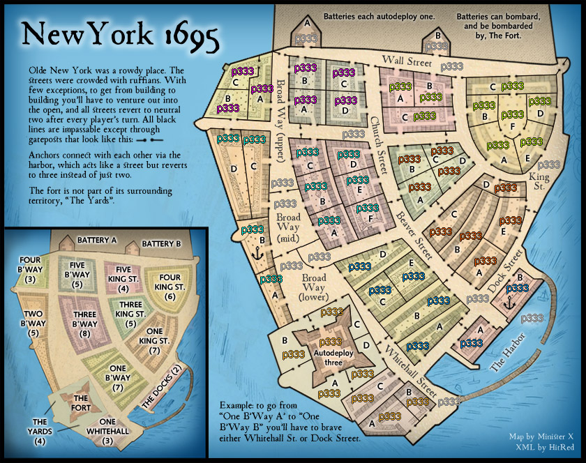
Latest Large Map:

Image
Last edited by Minister X on Sun Dec 27, 2020 5:59 pm, edited 16 times in total.
User avatar
Major Minister X
 
Posts: 424
Joined: Tue Nov 11, 2008 4:45 pm

Re: New York 1695

Postby riskllama on Sun Aug 02, 2020 6:58 pm

i don't think you're doing anything wrong, Min X - quite the opposite, in fact. there's just not a lot of people interested in making new maps these days...*shrugs*.

sad... :(
Image
User avatar
Lieutenant riskllama
 
Posts: 8907
Joined: Thu Jan 30, 2014 9:50 pm
Location: deep inside Queen Charlotte.

Re: New York 1695

Postby HitRed on Sun Aug 02, 2020 8:31 pm

I love the art. Fresh inviting look. You got talent.
User avatar
Major HitRed
 
Posts: 4866
Joined: Fri Jun 26, 2015 12:16 pm

Re: New York 1695

Postby Minister X on Sun Aug 02, 2020 8:41 pm

Thanks. BTW I think I'll replace the dotted red lines for street borders with solid green lines. Do I need to make it clear that they are passable?
User avatar
Major Minister X
 
Posts: 424
Joined: Tue Nov 11, 2008 4:45 pm

Re: New York 1695

Postby HitRed on Sun Aug 02, 2020 8:42 pm

To answer your Foundry question maps are being tested in Beta. You might want to sign up as a Beta tester to get more exposer. Currently the tools we use to test maps are disabled and who knows how long that will last. That is hurting things tramendously. Till fixeD Beta Testing and some feedback here and there is what we have.

HitRed
User avatar
Major HitRed
 
Posts: 4866
Joined: Fri Jun 26, 2015 12:16 pm

Re: New York 1695

Postby HitRed on Sun Aug 02, 2020 8:47 pm

I would still like you to knock out a Switzerland map like you did here. You make it look easy.
User avatar
Major HitRed
 
Posts: 4866
Joined: Fri Jun 26, 2015 12:16 pm

Re: New York 1695

Postby Minister X on Sun Aug 02, 2020 9:27 pm

I got started on Switzerland and then got side-tracked. I'm really bad at making mountains. I'll see what I can do. Regarding Beta: how do I sign up?
User avatar
Major Minister X
 
Posts: 424
Joined: Tue Nov 11, 2008 4:45 pm

Re: New York 1695

Postby HitRed on Sun Aug 02, 2020 10:44 pm

viewtopic.php?f=739&t=198049&p=5165457#p5165457

Just post. It might take a bit. Once you get it email me and I'll show you how to get in.

Cool on the map. You can do it! :D
User avatar
Major HitRed
 
Posts: 4866
Joined: Fri Jun 26, 2015 12:16 pm

Re: New York 1695

Postby Minister X on Sun Aug 02, 2020 11:17 pm

I tried your link. I got "You are not authorised to read this forum." Unable to post.
User avatar
Major Minister X
 
Posts: 424
Joined: Tue Nov 11, 2008 4:45 pm

Re: New York 1695

Postby HitRed on Sun Aug 02, 2020 11:45 pm

viewtopic.php?f=10&t=213707

Ask Iancanton. It says closed but try anyway.
User avatar
Major HitRed
 
Posts: 4866
Joined: Fri Jun 26, 2015 12:16 pm

Re: New York 1695

Postby Keefie on Sun Aug 02, 2020 11:58 pm

This has the makings of a great map :)
User avatar
Major Keefie
Clan Director
Clan Director
 
Posts: 6546
Joined: Sun Dec 03, 2006 1:05 pm
Location: Sleepy Hollow
3

Re: New York 1695

Postby Minister X on Mon Aug 03, 2020 8:26 am

I can't IM Ian Canton (not available on his profile) but I posted to his wall.

Thanks, Keefie! But I should note that prior to playtest there's only a possibility that this will even be a playable map. The street rule is so unusual. There's a possibility that play will be way too slow or boring. With the number of neutrals I'm contemplating in a six-player game each would start out with maybe four or five terts. Is that enough? And consider a tert like Three B'Way "F". Granted, you must first get through a street, but it "connects" (in that secondary manner) to 14 different terts! That's got to be more than any other tert in the whole of CC connects to directly. Will that make gameplay interesting and challenging or just plain impossible?? We can try to imagine the implications of these rules but without actual tests it's impossible to know if this map might approach "great" or just be utterly frustrating.

Some minor improvements: street borders and note at lower right, added a connection between 3 King ST. "D" and "E", and in far lower left corner replaced white arrow with two black lines.

Image
User avatar
Major Minister X
 
Posts: 424
Joined: Tue Nov 11, 2008 4:45 pm

Re: New York 1695

Postby iancanton on Sat Aug 08, 2020 5:11 pm

a very promising start!

don't worry about the first few turns being slow: feudal war is one of the most popular maps, despite not meeting any opponents for several rounds.

it feels wrong that u need to lose troops to visit ur neighbour, but there's a free and instant boat connection to the other side of town. who pays the ferryman?

ian. :)
Image
User avatar
Brigadier iancanton
Foundry Foreman
Foundry Foreman
 
Posts: 2431
Joined: Fri Jun 01, 2007 5:40 am
Location: europe

Re: New York 1695

Postby Minister X on Sat Aug 08, 2020 6:02 pm

Ah, good point about the sea connect. I'll add a mid-harbor neutral that behaves like a street.

Also a good point about the slow start. I find the popularity of those Feudal maps a bit mysterious but popular they indeed are.

"it feels wrong that u need to lose troops to visit ur neighbour" -- yes indeed, but that's what makes this map different. Now if, during playtest, that's found to be just too weird or discouraging or otherwise bad, it's easy enough to simply change the rule about dotted lines being impassable (and get rid of those double arrows). That would make this a much more normal map and it might be a good map that way, but I think it's worth trying out the weird rule first and seeing if it's playable.
User avatar
Major Minister X
 
Posts: 424
Joined: Tue Nov 11, 2008 4:45 pm

Re: New York 1695

Postby HitRed on Sat Aug 08, 2020 6:24 pm

Great start MX =D>
User avatar
Major HitRed
 
Posts: 4866
Joined: Fri Jun 26, 2015 12:16 pm

Re: New York 1695

Postby Minister X on Sun Aug 09, 2020 10:03 am

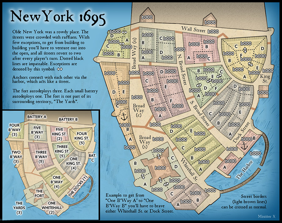
Latest version: army numbers added; harbor added so transit between anchors is costly; some other minor adjustments. This JPG is 900 pixels wide. It's a challenge, when adding army numbers and then resizing the image to post here, to make it so the army numbers end up appearing at exactly the same size they would be if the map were published for real. Can anyone tell me how many pixels high a '0' in the army number is as actually presented at CC?

As I look at the preview I think my army numbers are just a touch larger than they'd end up being, which is great because it may mean I can reduce this map to 800 pixels wide or so. That's got to be pretty good for a map with 65 terts.

I made all the army numbers white. I don't think there would any problem reading them regardless of their eventual color. Anyone disagree? I can easily display all the different colors. But it would help if I knew the exact RGB or HSB of each possible army color. Is this info available anywhere?

Image
User avatar
Major Minister X
 
Posts: 424
Joined: Tue Nov 11, 2008 4:45 pm

Re: New York 1695

Postby iancanton on Mon Aug 10, 2020 5:13 pm

Minister X wrote:"it feels wrong that u need to lose troops to visit ur neighbour" -- yes indeed, but that's what makes this map different.

Minister X wrote:harbor added so transit between anchors is costly

if the boat trip costs more than going next door, then i'm fully in favour of the novel approach to movement into and out of buildings. i think u've fixed it!

Minister X wrote:This JPG is 900 pixels wide.

the standard maximum map dimensions are 630 x 600 for the small map and 840 x 800 for the large map.

Minister X wrote:I made all the army numbers white. I don't think there would any problem reading them regardless of their eventual color. Anyone disagree? I can easily display all the different colors. But it would help if I knew the exact RGB or HSB of each possible army color. Is this info available anywhere?

this is the troop count information that u want.

https://www.conquerclub.com/forum/viewtopic.php?f=649&t=151232

number each map version in the subject title, so that it's easier to refer to a specific version.

ian. :)
Image
User avatar
Brigadier iancanton
Foundry Foreman
Foundry Foreman
 
Posts: 2431
Joined: Fri Jun 01, 2007 5:40 am
Location: europe

Re: New York 1695 v3

Postby Dukasaur on Mon Aug 10, 2020 6:16 pm

Very nice!
“‎Life is a shipwreck, but we must not forget to sing in the lifeboats.”
― Voltaire
User avatar
Sergeant 1st Class Dukasaur
Community Coordinator
 
Posts: 27714
Joined: Sat Nov 20, 2010 4:49 pm
Location: Beautiful Niagara
32

Re: New York 1695 v4

Postby Minister X on Mon Aug 10, 2020 6:39 pm

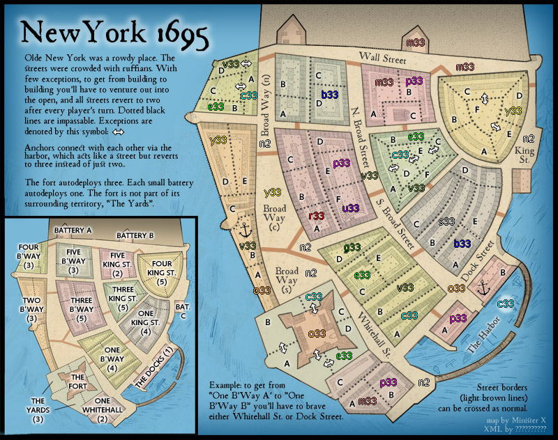
Version 4: Map now 800 pixels wide. Regulation army numbers added (thanks, Ian!) and placed on closest similar colors and in tight spaces as tests. Text modified to reflect different cost for harbor vs. streets. I think 3 vs 2 is appropriate. These are not long voyages and there were no pirates about whereas the general theme of the map is that the streets were very dangerous. I would note that on many maps where it costs nothing to move across a simple land border it also costs nothing for fairly long sea connections. Consider the Central America map as an example. This route is less than a mile long.

Image

So are we okay on army numbers? The worst seems to be Two B'Way "A". I could put the number for it just into the water?? Also the silver number on One King St. "B" is a bit tough to read, but I've seen worse. I'd really hate to have to put white circles or rectangles everywhere. If these numbers are deemed insufficiently readable I'd prefer to just make the underlying map details more transparent so there's greater contrast between the numbers and what's behind them, but that background adds a lot of character to this map so that would be unfortunate if necessary.
User avatar
Major Minister X
 
Posts: 424
Joined: Tue Nov 11, 2008 4:45 pm

Re: New York 1695 v4

Postby HitRed on Mon Aug 10, 2020 8:30 pm

I'm still willing to do the XML if needed. You are rejuvenating the Fountry. :D
User avatar
Major HitRed
 
Posts: 4866
Joined: Fri Jun 26, 2015 12:16 pm

Re: New York 1695 v4

Postby Minister X on Mon Aug 10, 2020 9:44 pm

Next version I'll replace those question marks in the lower right corner. :D
User avatar
Major Minister X
 
Posts: 424
Joined: Tue Nov 11, 2008 4:45 pm

Re: New York 1695 v4

Postby iancanton on Wed Aug 12, 2020 5:12 pm

Minister X wrote:Regulation army numbers added (thanks, Ian!) and placed on closest similar colors and in tight spaces as tests.

the silver troop count is worst for me, but it's just about legible. u might have to experiment with a different shade of grey for one king st.

Minister X wrote:Text modified to reflect different cost for harbor vs. streets. I think 3 vs 2 is appropriate. These are not long voyages and there were no pirates about whereas the general theme of the map is that the streets were very dangerous.

agreed!

ian. :)
Image
User avatar
Brigadier iancanton
Foundry Foreman
Foundry Foreman
 
Posts: 2431
Joined: Fri Jun 01, 2007 5:40 am
Location: europe

Re: New York 1695 v4

Postby Minister X on Wed Aug 12, 2020 10:05 pm

iancanton wrote: u might have to experiment with a different shade of grey for one king st.

I could make it more of a blue. I'll make that change next revision.
User avatar
Major Minister X
 
Posts: 424
Joined: Tue Nov 11, 2008 4:45 pm

Re: New York 1695 v5

Postby Minister X on Fri Aug 14, 2020 1:02 pm

Several small changes/improvements:
• Recolored One King Street. Now it's more like the Fort and Two B'Way and should be fine as a background for army numbers.
• Moved Battery names from the inset to the main map since they have autodeploys instead of bonuses. Showed Army # for Bat.C in the water with a white background.
• Moved Army # for 2B'Way "A" into the water (with white background) and moved the "A" to a better position.
• Gave HitRed some credit.
• Fixed line spacing on the "Olde New York..." text block and altered size/position just a touch.
• Upped the overall brightness and contrast just a tiny bit.

Image
User avatar
Major Minister X
 
Posts: 424
Joined: Tue Nov 11, 2008 4:45 pm

Re: New York 1695 v5

Postby Minister X on Fri Aug 14, 2020 1:04 pm

Should I also move "THE FORT" text from inset or main map? Or move the Battery texts back to the inset?
User avatar
Major Minister X
 
Posts: 424
Joined: Tue Nov 11, 2008 4:45 pm

Next

Return to Beta Maps

Who is online

Users browsing this forum: No registered users