Conquer Club

WWII Pearl Harbor - [Quenched]

Care to peruse completed maps? Take a stroll through the Atlas.

Moderator: Cartographers

Forum rules
Please read the Community Guidelines before posting.

v20 Update

Postby cairnswk on Fri Jun 15, 2007 5:27 am

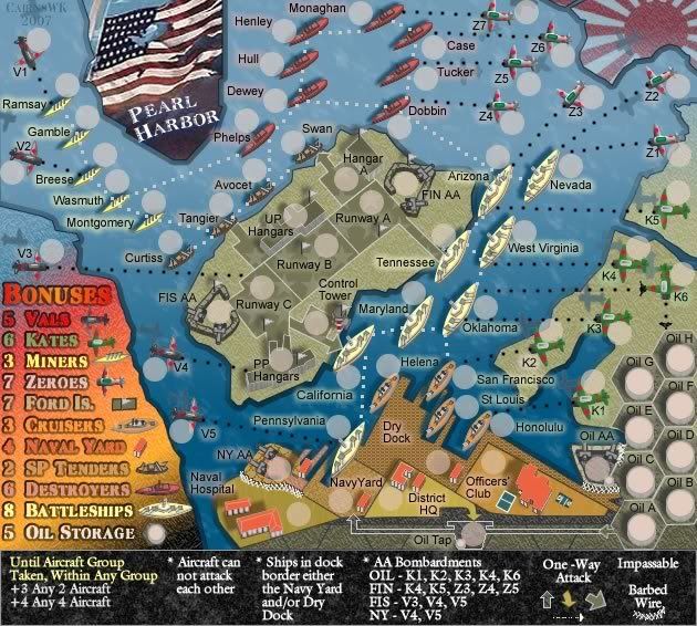
Small V20 Update at 100%
Image

Large V20 Update at 100%
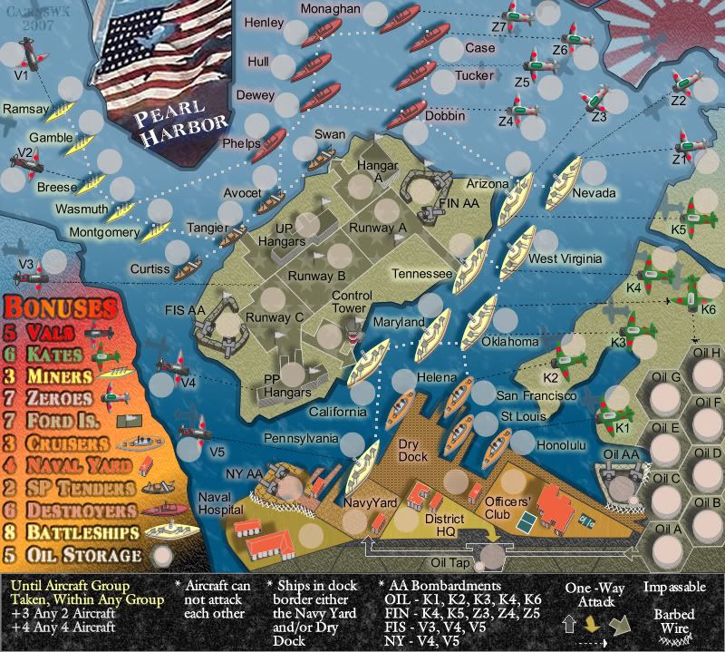
Image
Image
* Pearl Harbour * Waterloo * Forbidden City * Jamaica * Pot Mosbi
User avatar
Private cairnswk
 
Posts: 11510
Joined: Sat Feb 03, 2007 8:32 pm
Location: Australia

Postby cairnswk on Fri Jun 15, 2007 5:31 am

Wisse wrote:
Wisse wrote:i like the new attack route betwwen the boats but the one from the aircrafts are not good the shapes aren't all the same, or is this because you saved it not 100% quality?

i would like to see a 100% quality map for that ;)

you missed my comment


Wisse....100% qualioty maps posted above in V20 update...just for you. :)

I have changed the shapes of the aircraft attack routes but i don't know if there is any improvement. What do you think?
Image
* Pearl Harbour * Waterloo * Forbidden City * Jamaica * Pot Mosbi
User avatar
Private cairnswk
 
Posts: 11510
Joined: Sat Feb 03, 2007 8:32 pm
Location: Australia

Postby cairnswk on Fri Jun 15, 2007 5:34 am

hulmey wrote:ok mate , its just the oil trap looks odd there thats all....I can imagine there being an oil trap and it moree than likely being targeted by the Japenese for attack.......

I prefer to see the attack lines a different colour other than white.....

For example if its a boat v boat attack it could be black.

A aeroplane v boat attack red.

Its up to you really just a suggestion


Hulmey...good suggestion about the different coloured lines....i tried a few different colours, and most of them lit the map up like a carnival of lights at the fairgrounds.

The aircraft red doesn't work because it is background on blue and almost looks black anyway, so i made them all black.

The ship-ship lines i made dull white, almost a very light gray, for some contrast....this seems to work, does it work for you>
Image
* Pearl Harbour * Waterloo * Forbidden City * Jamaica * Pot Mosbi
User avatar
Private cairnswk
 
Posts: 11510
Joined: Sat Feb 03, 2007 8:32 pm
Location: Australia

Postby cairnswk on Fri Jun 15, 2007 6:09 am

yeti_c wrote:In your Key...

I'd be tempted to order it a bit differently... Planes, Ships, Land

i.e.
Vals,
Kates,
Zeroes,
Miners,
Cruisers,
SP Tenders,
Destroyers,
Battleships,
Ford Island
Naval Yard
Oil Storage.

I can see it's because you wanted the shorter names at the top to fit the island contour though... but the better order might be less confusing...

You could always order it planes, land, ships. Planes are all short - and the Land ones are mostly short - with the ships being the longest... i,e,


Vals,
Kates,
Zeroes,
Ford Is
Naval Yard
Oil Storage.
Miners,
Cruisers,
SP Tenders,
Destroyers,
Battleships,

Whaddya reckon?

C.


Yeti_c
Thanks for your suggestion. I'm not adverse to changing things, but i see no advantage from your explanantions to re-order the legend.
It is just as scattered as the rest of the map, but the graded top to bottom contour lines actually provide some contrast to the scatteredness of the rest of the map. The icons also cover any questions that might arise from attempting to determine what is what on the map.

If you would, and i know you're someone who has excellent xml experience, would you care to comment on gameplay...does it work for you, if not what can be done to imrove the gameplay? :)
You're feedback is very much appreciated.
Image
* Pearl Harbour * Waterloo * Forbidden City * Jamaica * Pot Mosbi
User avatar
Private cairnswk
 
Posts: 11510
Joined: Sat Feb 03, 2007 8:32 pm
Location: Australia

Postby Wisse on Fri Jun 15, 2007 6:11 am

nope no improvement for the att routes of the aircrafts, they just seem bad and ugly
and also the arrow on the large map (from oil tap to navy yard) seems bad
Image Image
User avatar
Sergeant Wisse
 
Posts: 4448
Joined: Fri Oct 13, 2006 2:59 pm
Location: The netherlands, gelderland, epe

Postby cairnswk on Fri Jun 15, 2007 6:13 am

Wisse wrote:nope no improvement for the att routes of the aircrafts, they just seem bad and ugly
and also the arrow on the large map (from oil tap to navy yard) seems bad


Aw....Wisse!! :cry:
Oh well...back to the drawing board.
Image
* Pearl Harbour * Waterloo * Forbidden City * Jamaica * Pot Mosbi
User avatar
Private cairnswk
 
Posts: 11510
Joined: Sat Feb 03, 2007 8:32 pm
Location: Australia

Postby cairnswk on Fri Jun 15, 2007 6:18 am

Wisse...the attack lines are currently set in rectangles and have smooth anti-alias on the lines. what if i bumped them up to 2 points...the same size as the boat-boat attack lines....do you have objections to see if that works?
Image
* Pearl Harbour * Waterloo * Forbidden City * Jamaica * Pot Mosbi
User avatar
Private cairnswk
 
Posts: 11510
Joined: Sat Feb 03, 2007 8:32 pm
Location: Australia

Postby Wisse on Fri Jun 15, 2007 7:40 am

cairnswk wrote:Wisse...the attack lines are currently set in rectangles and have smooth anti-alias on the lines. what if i bumped them up to 2 points...the same size as the boat-boat attack lines....do you have objections to see if that works?

nope no objections, just try it ;) and hope it becomes something good
Image Image
User avatar
Sergeant Wisse
 
Posts: 4448
Joined: Fri Oct 13, 2006 2:59 pm
Location: The netherlands, gelderland, epe

V21 Update.

Postby cairnswk on Fri Jun 15, 2007 11:48 am

Wisse wrote:
cairnswk wrote:Wisse...the attack lines are currently set in rectangles and have smooth anti-alias on the lines. what if i bumped them up to 2 points...the same size as the boat-boat attack lines....do you have objections to see if that works?

nope no objections, just try it ;) and hope it becomes something good


Well, what do you think?

Image
Image
* Pearl Harbour * Waterloo * Forbidden City * Jamaica * Pot Mosbi
User avatar
Private cairnswk
 
Posts: 11510
Joined: Sat Feb 03, 2007 8:32 pm
Location: Australia

Postby edbeard on Fri Jun 15, 2007 2:45 pm

I don't like it. Makes the whole map look odd. All one colour was much better
User avatar
Lieutenant edbeard
 
Posts: 2501
Joined: Thu Mar 29, 2007 12:41 am

Postby cairnswk on Fri Jun 15, 2007 2:51 pm

edbeard wrote:I don't like it. Makes the whole map look odd. All one colour was much better


Thanks edbeard...what about the shape of the attack lines....should the aircraft-ship attack lines be different to the ship-ship attack lines?
Image
* Pearl Harbour * Waterloo * Forbidden City * Jamaica * Pot Mosbi
User avatar
Private cairnswk
 
Posts: 11510
Joined: Sat Feb 03, 2007 8:32 pm
Location: Australia

Postby edbeard on Fri Jun 15, 2007 2:55 pm

well to be honest, I'd need to see them all being white to judge

But, I'm pretty sure I like the ship to ship lines better.
User avatar
Lieutenant edbeard
 
Posts: 2501
Joined: Thu Mar 29, 2007 12:41 am

Postby hulmey on Fri Jun 15, 2007 3:01 pm

Fanatastic job Cairns......

I think the different coloured / looking attack lines really help to make the map look less daunting...

I like the ship lines and the aeroplane attack lines are ok...

You seem to have 2 different types of aeroplane attack lines...Why is this?

I prefer the ome that looks like machine gun fire!!!
[img]http://img801.imageshack.us/img801/9761/41922610151374166770386.jpg[/mg]
User avatar
Lieutenant hulmey
 
Posts: 3742
Joined: Fri Nov 03, 2006 7:33 am
Location: Las Vegas

Postby cairnswk on Fri Jun 15, 2007 3:04 pm

edbeard wrote:well to be honest, I'd need to see them all being white to judge

But, I'm pretty sure I like the ship to ship lines better.


edbeard...white line just for you.
Image
Image
* Pearl Harbour * Waterloo * Forbidden City * Jamaica * Pot Mosbi
User avatar
Private cairnswk
 
Posts: 11510
Joined: Sat Feb 03, 2007 8:32 pm
Location: Australia

Postby wrightfan123 on Fri Jun 15, 2007 3:08 pm

wow... my eyes are confused...
User avatar
Corporal wrightfan123
 
Posts: 601
Joined: Sat Jan 06, 2007 2:58 pm
Location: Looking over every baseball team's schedule to try to determine who will win the World Series.

Postby cairnswk on Fri Jun 15, 2007 3:09 pm

hulmey wrote:Fanatastic job Cairns......

I think the different coloured / looking attack lines really help to make the map look less daunting...

I like the ship lines and the aeroplane attack lines are ok...

You seem to have 2 different types of aeroplane attack lines...Why is this?

I prefer the ome that looks like machine gun fire!!!


So hulmey...for the plane-ship lines. you prefer the black dash lines rather than the thick white round dot lines?
Image
* Pearl Harbour * Waterloo * Forbidden City * Jamaica * Pot Mosbi
User avatar
Private cairnswk
 
Posts: 11510
Joined: Sat Feb 03, 2007 8:32 pm
Location: Australia

Postby cairnswk on Fri Jun 15, 2007 3:11 pm

wrightfan123 wrote:wow... my eyes are confused...

Hi wrightfan123....what are they confused about...please explain!? :)
Image
* Pearl Harbour * Waterloo * Forbidden City * Jamaica * Pot Mosbi
User avatar
Private cairnswk
 
Posts: 11510
Joined: Sat Feb 03, 2007 8:32 pm
Location: Australia

Postby edbeard on Fri Jun 15, 2007 3:14 pm

yes that's much better. You have a lot going on already, which is fine.

I don't think you need to add to it by having different coloured lines and drastically different styles on the lines.

All the attack lines work the same anyway, so have them look the same. I realize you have squares and circles for ship to ship and ship to aircraft respectively, and I think that is fine. Slightly different, but nothing distracting.
User avatar
Lieutenant edbeard
 
Posts: 2501
Joined: Thu Mar 29, 2007 12:41 am

Postby cairnswk on Fri Jun 15, 2007 3:17 pm

edbeard wrote:yes that's much better. You have a lot going on already, which is fine.

I don't think you need to add to it by having different coloured lines and drastically different styles on the lines.

All the attack lines work the same anyway, so have them look the same. I realize you have squares and circles for ship to ship and ship to aircraft respectively, and I think that is fine. Slightly different, but nothing distracting.


Mmmmm..OK...thanks for that. somehow, though i think this one might end up with a possible poll! :wink:
Image
* Pearl Harbour * Waterloo * Forbidden City * Jamaica * Pot Mosbi
User avatar
Private cairnswk
 
Posts: 11510
Joined: Sat Feb 03, 2007 8:32 pm
Location: Australia

Postby wrightfan123 on Fri Jun 15, 2007 3:23 pm

cairnswk wrote:
wrightfan123 wrote:wow... my eyes are confused...

Hi wrightfan123....what are they confused about...please explain!? :)


lots of territories... lots of lines... lots of colors... lots of school related things during SUMMER VACATION!
User avatar
Corporal wrightfan123
 
Posts: 601
Joined: Sat Jan 06, 2007 2:58 pm
Location: Looking over every baseball team's schedule to try to determine who will win the World Series.

Postby cairnswk on Fri Jun 15, 2007 3:29 pm

wrightfan123 wrote:
cairnswk wrote:
wrightfan123 wrote:wow... my eyes are confused...

Hi wrightfan123....what are they confused about...please explain!? :)


lots of territories... lots of lines... lots of colors... lots of school related things during SUMMER VACATION!


I understand...but all i can say is :lol: :lol: :lol:
Image
* Pearl Harbour * Waterloo * Forbidden City * Jamaica * Pot Mosbi
User avatar
Private cairnswk
 
Posts: 11510
Joined: Sat Feb 03, 2007 8:32 pm
Location: Australia

Postby hulmey on Fri Jun 15, 2007 3:47 pm

I think it was better how it was before to ybe quite honest....Now its harder to see which attacks which again.

Maybe you could come up with a few different styles and hold a vote on it because it does make alot of difference to how th map is viewed. Individuals have different tastes but i think it made the whole map easier to understand with different collours before.

Again good job and thanks for listening
[img]http://img801.imageshack.us/img801/9761/41922610151374166770386.jpg[/mg]
User avatar
Lieutenant hulmey
 
Posts: 3742
Joined: Fri Nov 03, 2006 7:33 am
Location: Las Vegas

Postby cairnswk on Fri Jun 15, 2007 3:54 pm

hulmey wrote:I think it was better how it was before to ybe quite honest....Now its harder to see which attacks which again.

Maybe you could come up with a few different styles and hold a vote on it because it does make alot of difference to how th map is viewed. Individuals have different tastes but i think it made the whole map easier to understand with different collours before.

Again good job and thanks for listening

hulmey...pleased to have you on board...i myself am kinda of thinking about prefering a different colour...so i will have to experiment more, and yes a poll is definitely an option.
Image
* Pearl Harbour * Waterloo * Forbidden City * Jamaica * Pot Mosbi
User avatar
Private cairnswk
 
Posts: 11510
Joined: Sat Feb 03, 2007 8:32 pm
Location: Australia

Postby Wisse on Fri Jun 15, 2007 4:43 pm

this looks bad, i will try something for you
Image Image
User avatar
Sergeant Wisse
 
Posts: 4448
Joined: Fri Oct 13, 2006 2:59 pm
Location: The netherlands, gelderland, epe

V21b Straight blue ship-ship; red tracer aircraft-ship

Postby cairnswk on Fri Jun 15, 2007 5:22 pm

hulmey wrote:I think it was better how it was before to ybe quite honest....Now its harder to see which attacks which again.

Maybe you could come up with a few different styles and hold a vote on it because it does make alot of difference to how th map is viewed. Individuals have different tastes but i think it made the whole map easier to understand with different collours before.

Again good job and thanks for listening


Hulmey...another option below....that kinda works for me...
your red attack lines but doubled, with straight solid attack lines for the ship->ship lines
What do you think?
Image
Image
* Pearl Harbour * Waterloo * Forbidden City * Jamaica * Pot Mosbi
User avatar
Private cairnswk
 
Posts: 11510
Joined: Sat Feb 03, 2007 8:32 pm
Location: Australia

PreviousNext

Return to The Atlas

Who is online

Users browsing this forum: No registered users

cron