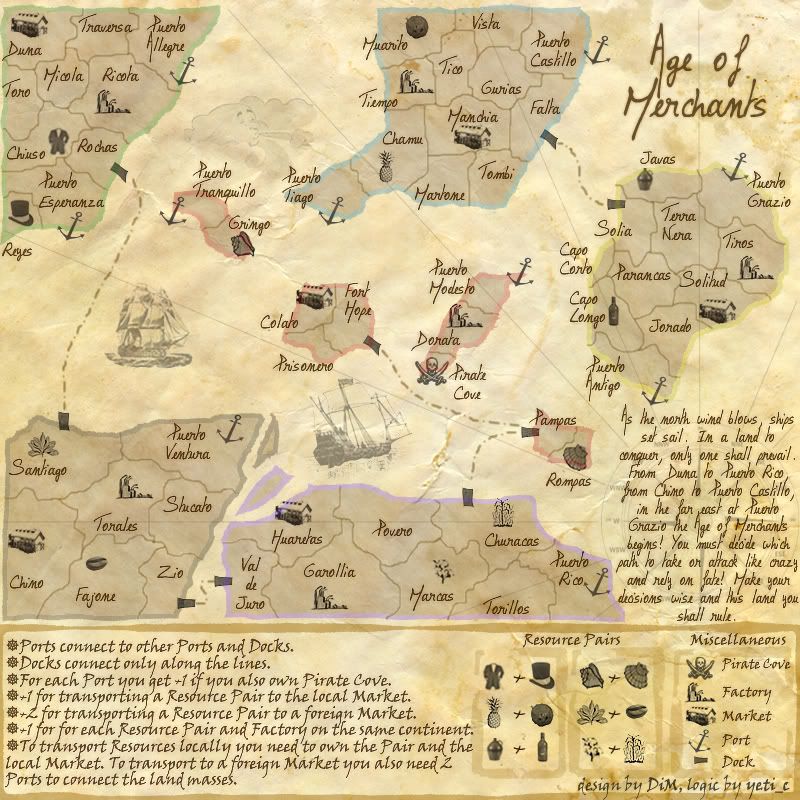
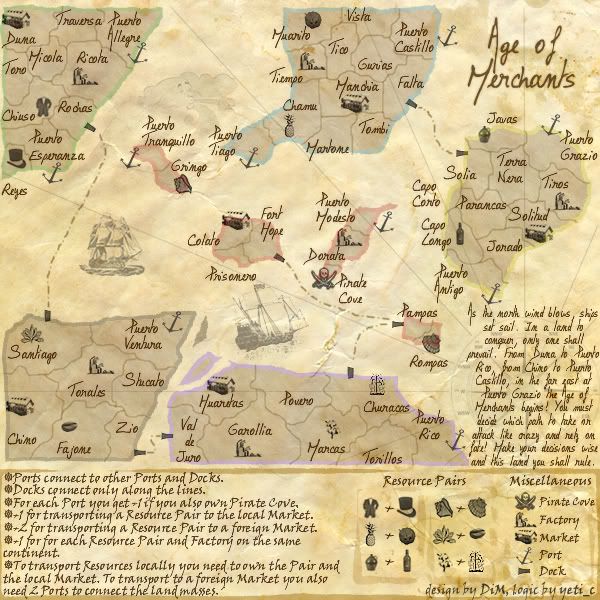
Age of Merchants - [Quenched]
Moderator: Cartographers
updated in the post above.
“In the beginning God said, the four-dimensional divergence of an antisymmetric, second rank tensor equals zero, and there was light, and it was good. And on the seventh day he rested.”- Michio Kaku
-

 DiM
DiM
- Posts: 10415
- Joined: Wed Feb 14, 2007 6:20 pm
- Location: making maps for scooby snacks


this one i don't quite understand. you want me to remove everything after 'Age of Merchants begins!'? or do you want me to put that to the end?
i'm not too keen on changing that because i had a contest of stories and this is the one that won.
I like the story up until after 'Age of Merchants begins!'. But, it also seems like that is just a fitting end to the story also! But don't worry, about it.
--Andy
-

 AndyDufresne
- Posts: 24935
- Joined: Fri Mar 03, 2006 8:22 pm
- Location: A Banana Palm in Zihuatanejo


AndyDufresne wrote:this one i don't quite understand. you want me to remove everything after 'Age of Merchants begins!'? or do you want me to put that to the end?
i'm not too keen on changing that because i had a contest of stories and this is the one that won.
I like the story up until after 'Age of Merchants begins!'. But, it also seems like that is just a fitting end to the story also! But don't worry, about it.The coordinates are looking good and so is the rest of the map. I'll see if Keyogi and I can give it a proper look over soon.
--Andy
k thanks.
“In the beginning God said, the four-dimensional divergence of an antisymmetric, second rank tensor equals zero, and there was light, and it was good. And on the seventh day he rested.”- Michio Kaku
-

 DiM
DiM
- Posts: 10415
- Joined: Wed Feb 14, 2007 6:20 pm
- Location: making maps for scooby snacks


AndyDufresne wrote:I'll see if Keyogi and I can give it a proper look over soon.
--Andy
i know the xml is much larger than normal because of the complicated bonus system but please double or triple check it. i don't want problems on connections or bonuses. i did check the connections the spelling and all and got some 18 thousand warnings but those are warnings because of the fact i don't have continents.
“In the beginning God said, the four-dimensional divergence of an antisymmetric, second rank tensor equals zero, and there was light, and it was good. And on the seventh day he rested.”- Michio Kaku
-

 DiM
DiM
- Posts: 10415
- Joined: Wed Feb 14, 2007 6:20 pm
- Location: making maps for scooby snacks


DiM?
Now that the new XML features are in?
We could tweak the map a touch using "Neutral" territories?
I.e. I think the Pirate Cove should be Neutral for starters (That way no-one would get the port+pirate bonus)
I can't think of anything else that needs to be done...
But of course you could make all the resources neutral too?
C.

Highest score : 2297
-

 yeti_c
- Posts: 9624
- Joined: Thu Jan 04, 2007 9:02 am


I think the legend could be improved with more icons and less arrows.
So instead of:
(arrow) Ports connect to other Ports and Docks
Have:
(anchor) Ports connect to other Ports and Docks
(dock) Docks connect only along the lines
For each port you also get a +1 if you have a Pirate Cover (pirate cove)
The rest you could do with arrows. I think an "X" marks the spot style icon might make a better bullet point on this map though.
-
 dolemite
- Posts: 48
- Joined: Fri Mar 16, 2007 3:49 pm
dolemite wrote:I think the legend could be improved with more icons and less arrows.
So instead of:
(arrow) Ports connect to other Ports and Docks
Have:
(anchor) Ports connect to other Ports and Docks
(dock) Docks connect only along the lines
For each port you also get a +1 if you have a Pirate Cover (pirate cove)
The rest you could do with arrows. I think an "X" marks the spot style icon might make a better bullet point on this map though.
if i add icons in the legend tha will make it stretch vertically and not fit anymore. i have the important words capped and to the right you can see each icon and what it means.
the X bullets. i innitially had x bullets. look in the first pages but people said they cramp the image so i removed them.
“In the beginning God said, the four-dimensional divergence of an antisymmetric, second rank tensor equals zero, and there was light, and it was good. And on the seventh day he rested.”- Michio Kaku
-

 DiM
DiM
- Posts: 10415
- Joined: Wed Feb 14, 2007 6:20 pm
- Location: making maps for scooby snacks


yeti_c wrote:DiM?
Now that the new XML features are in?
We could tweak the map a touch using "Neutral" territories?
I.e. I think the Pirate Cove should be Neutral for starters (That way no-one would get the port+pirate bonus)
I can't think of anything else that needs to be done...
But of course you could make all the resources neutral too?
C.
all the resources neutral, definitely not.
as for the pirate cove i'm ok with it. good idea. but are the new features implemented? i did not think they were
added pirate cove as neutral that starts with 3 terits.
here is the latest xml:
http://www.sendspace.com/file/alldu4
“In the beginning God said, the four-dimensional divergence of an antisymmetric, second rank tensor equals zero, and there was light, and it was good. And on the seventh day he rested.”- Michio Kaku
-

 DiM
DiM
- Posts: 10415
- Joined: Wed Feb 14, 2007 6:20 pm
- Location: making maps for scooby snacks


they are not updated yet. but should be shortly from what ive read...as for the pirate cove i'm ok with it. good idea. but are the new features implemented? i did not think they were
my new site - http://www.spritestitch.com/ - A video game craft weblog...
-

 johloh
- Posts: 472
- Joined: Mon Dec 04, 2006 12:58 pm
- Location: San Francisco


They are coming out soon. 
In regards to what dolemite mentioned, and what you mentioned Dim, what other type of bullets have you considered (besides the X you mentioned) and the current arrows? Maybe there are too many arrows. Maybe you could use a traditional bullet for say the top 2, as they don't specifically talk about bonuses. It might make the legend easier to follow, and help differentiate information.
--Andy
-

 AndyDufresne
- Posts: 24935
- Joined: Fri Mar 03, 2006 8:22 pm
- Location: A Banana Palm in Zihuatanejo


AndyDufresne wrote:They are coming out soon.
In regards to what dolemite mentioned, and what you mentioned Dim, what other type of bullets have you considered (besides the X you mentioned) and the current arrows? Maybe there are too many arrows. Maybe you could use a traditional bullet for say the top 2, as they don't specifically talk about bonuses. It might make the legend easier to follow, and help differentiate information.
--Andy
i only used X and rrows. i don't want to put different bullets because i'll spoil the symetry and uniformity. plus it might cause confusion making some info appear more important
“In the beginning God said, the four-dimensional divergence of an antisymmetric, second rank tensor equals zero, and there was light, and it was good. And on the seventh day he rested.”- Michio Kaku
-

 DiM
DiM
- Posts: 10415
- Joined: Wed Feb 14, 2007 6:20 pm
- Location: making maps for scooby snacks


AndyDufresne wrote:If you think so! I think the other set of bullets would be beneficial.
--Andy
i really don't want to have several types of bullets.
but i am ok with changing the arrows if you guys feel they need to be changed. i was actually fond of the X but since people said no i removed it
“In the beginning God said, the four-dimensional divergence of an antisymmetric, second rank tensor equals zero, and there was light, and it was good. And on the seventh day he rested.”- Michio Kaku
-

 DiM
DiM
- Posts: 10415
- Joined: Wed Feb 14, 2007 6:20 pm
- Location: making maps for scooby snacks


just curious abut the xml.
in the latest version i have the pirate cove starting as neutral with 3 armies in it.
if this map gets quenched before the new xml features will the xml work? normally it should. and when the new features are implemented will the neutral thing start to function imediately for all new games? again, normally it should
“In the beginning God said, the four-dimensional divergence of an antisymmetric, second rank tensor equals zero, and there was light, and it was good. And on the seventh day he rested.”- Michio Kaku
-

 DiM
DiM
- Posts: 10415
- Joined: Wed Feb 14, 2007 6:20 pm
- Location: making maps for scooby snacks


Why not just use a smaller X or a smaller set of icons? I don't have too much of a problem with the legend, I'm just trying to think how it could look better. The arrows seem slightly out place, even a different style of arrow might work.
(BTW, I do really like the concept behind this map).
(BTW, I do really like the concept behind this map).
-
 dolemite
- Posts: 48
- Joined: Fri Mar 16, 2007 3:49 pm
DiM wrote:just curious abut the xml.
in the latest version i have the pirate cove starting as neutral with 3 armies in it.
if this map gets quenched before the new xml features will the xml work? normally it should. and when the new features are implemented will the neutral thing start to function imediately for all new games? again, normally it should
I imagine the neutral tag will be ignored until it is parsed by the new system... PM Lack to check though.
C.

Highest score : 2297
-

 yeti_c
- Posts: 9624
- Joined: Thu Jan 04, 2007 9:02 am


i just found the perfect bullet. it's a ship steering wheel  i'm not sure how it's called. it fits the theme and it is very visible.
so here are the 100% quality images:


and the xml:
http://www.sendspace.com/file/alldu4
so here are the 100% quality images:


and the xml:
http://www.sendspace.com/file/alldu4
“In the beginning God said, the four-dimensional divergence of an antisymmetric, second rank tensor equals zero, and there was light, and it was good. And on the seventh day he rested.”- Michio Kaku
-

 DiM
DiM
- Posts: 10415
- Joined: Wed Feb 14, 2007 6:20 pm
- Location: making maps for scooby snacks


dolemite wrote:Why not just use a smaller X or a smaller set of icons? I don't have too much of a problem with the legend, I'm just trying to think how it could look better. The arrows seem slightly out place, even a different style of arrow might work.
(BTW, I do really like the concept behind this map).
indeed the arrows don't fit the them but look above this post i think the problem is solved.
a treasure X is also good but since this is the Age of Merchants i think the above icon fits better. if it had been the Age of Pirates the X would have been better.
“In the beginning God said, the four-dimensional divergence of an antisymmetric, second rank tensor equals zero, and there was light, and it was good. And on the seventh day he rested.”- Michio Kaku
-

 DiM
DiM
- Posts: 10415
- Joined: Wed Feb 14, 2007 6:20 pm
- Location: making maps for scooby snacks


yeti_c wrote:DiM wrote:just curious abut the xml.
in the latest version i have the pirate cove starting as neutral with 3 armies in it.
if this map gets quenched before the new xml features will the xml work? normally it should. and when the new features are implemented will the neutral thing start to function imediately for all new games? again, normally it should
I imagine the neutral tag will be ignored until it is parsed by the new system... PM Lack to check though.
C.
my thoughts exactly. but i'll pm lack to be sure.
“In the beginning God said, the four-dimensional divergence of an antisymmetric, second rank tensor equals zero, and there was light, and it was good. And on the seventh day he rested.”- Michio Kaku
-

 DiM
DiM
- Posts: 10415
- Joined: Wed Feb 14, 2007 6:20 pm
- Location: making maps for scooby snacks


fireedud wrote:On the small map the steering wheel, doesn't look like a steering wheel, it looks more like a circle to circles on bigger than the other.
to me it looks very clear. maybe it's your monitor? adjust the contrast or something.
does anybody else have the same problem?
“In the beginning God said, the four-dimensional divergence of an antisymmetric, second rank tensor equals zero, and there was light, and it was good. And on the seventh day he rested.”- Michio Kaku
-

 DiM
DiM
- Posts: 10415
- Joined: Wed Feb 14, 2007 6:20 pm
- Location: making maps for scooby snacks


DiM wrote:fireedud wrote:On the small map the steering wheel, doesn't look like a steering wheel, it looks more like a circle to circles on bigger than the other.
to me it looks very clear. maybe it's your monitor? adjust the contrast or something.
does anybody else have the same problem?
I tried that, but it's still next to impossible to see the lines going through it.
-
 fireedud
- Posts: 1704
- Joined: Fri Mar 02, 2007 10:06 pm


fireedud wrote:DiM wrote:fireedud wrote:On the small map the steering wheel, doesn't look like a steering wheel, it looks more like a circle to circles on bigger than the other.
to me it looks very clear. maybe it's your monitor? adjust the contrast or something.
does anybody else have the same problem?
I tried that, but it's still next to impossible to see the lines going through it.
i looked at the map on 4 different monitors and i did not encounter this problem. so i think it's definitely a problem on your side. maybe the monitor is too small. i don't know
if i make it any larger it looks bad on my monitor so if this is an isolated incident i'll have to leave it as it is otherwise if i make the steering wheel larger it will skew the image for the others.
“In the beginning God said, the four-dimensional divergence of an antisymmetric, second rank tensor equals zero, and there was light, and it was good. And on the seventh day he rested.”- Michio Kaku
-

 DiM
DiM
- Posts: 10415
- Joined: Wed Feb 14, 2007 6:20 pm
- Location: making maps for scooby snacks


Who is online
Users browsing this forum: No registered users


