
well it looks great, the perspective is really well done.WidowMakers wrote:They are an actual picture of people in a stadium. I them deleted out spaces with different eraser shapes. I added a bevel to the entire crowd to help with the lighting.mibi wrote:WM this maps looks fantastic, you are very talented... how did you make the people?
[Official] Circus Maximus REVAMP [Quenched]
Moderator: Cartographers
Forum rules
Please read the Community Guidelines before posting.
Please read the Community Guidelines before posting.
yeah but if you would paint a line from thin part near caligvla you will see that part is much thicker while it is not much distance from eachotherWidowMakers wrote:It is called perspective. The point of view of the camera makes the close side look thinner. That is the nature of 3D.Wisse wrote:also from the symmetry DIM is talking about the things where the crowd is:
the side in the front looks much higher than the other side
and the one in the front the thin part is to thin
and also if you want to make perspective then you must change the thick part to i guess



Could you change the colouring of the crowd?WidowMakers wrote:They are an actual picture of people in a stadium. I them deleted out spaces with different eraser shapes. I added a bevel to the entire crowd to help with the lighting.mibi wrote:WM this maps looks fantastic, you are very talented... how did you make the people?
Someone else pointed out that they are mostly Red...
Could you have sections of different supporters for each team taking place?
i.e. a red, green, blue, yellow, cyan and pink section?
C.
PS I prefered my Hoardings idea for names but not sure if it would work?
PPS Prefered the bumpier track.

Highest score : 2297



-
AndyDufresne

- Posts: 24919
- Joined: Fri Mar 03, 2006 8:22 pm
- Location: A Banana Palm in Zihuatanejo
- Contact:
There is a difference between people not playing a map because they don't like the style of play it promotes, and people not playing a map because the gameplay is broken. I may not like the style of play Circus Maximus promotes, but I don't think it's broken. I think it is fine and should stay the way it is.
--Andy
--Andy

exactly. its an original style of gameplay...and people love it or hate it. either way it shouldnt be changed....make a new map if you want different gameplay.I may not like the style of play Circus Maximus promotes, but I don't think it's broken. I think it is fine and should stay the way it is.
my new site - http://www.spritestitch.com/ - A video game craft weblog...
-
anamainiacks

- Posts: 1778
- Joined: Sat Mar 03, 2007 9:21 am
- Gender: Male
-
WidowMakers
- Posts: 2774
- Joined: Mon Nov 20, 2006 9:25 am
- Gender: Male
- Location: Detroit, MI
OK here is another update.
*I added some different colors to the crowd
*Made the center of the track closer to the pictures I have found on the net.
XML
http://www.mediamax.com/dzlqps/Hosted/C ... imus_3.xml


*I added some different colors to the crowd
*Made the center of the track closer to the pictures I have found on the net.
XML
http://www.mediamax.com/dzlqps/Hosted/C ... imus_3.xml

-
dominationnation
- Posts: 4234
- Joined: Sat Jan 13, 2007 10:20 am


-
AndyDufresne
- Posts: 24919
- Joined: Fri Mar 03, 2006 8:22 pm
- Location: A Banana Palm in Zihuatanejo
- Contact:
Hm, I'm liking the look of the map. It brings me back to the days when Rocksolid was trying to hash out this idea in the Foundry.
Hm, would you consider moving the Diocletian name slightly, so the coordinates aren't so close to it?
Also maybe move the coordinates slightly for Flavius, as they are much closer to the arrow point than in the other 'countries' on the map.
I still see a lot of red in the crowd. But as I usually create most of the games I play, I guess I'd be fine with the extra crowd support.
--Andy
Hm, would you consider moving the Diocletian name slightly, so the coordinates aren't so close to it?
Also maybe move the coordinates slightly for Flavius, as they are much closer to the arrow point than in the other 'countries' on the map.
I still see a lot of red in the crowd.
But as I usually create most of the games I play, I guess I'd be fine with the extra crowd support. --Andy
-
DiM

- Posts: 10415
- Joined: Wed Feb 14, 2007 6:20 pm
- Gender: Male
- Location: making maps for scooby snacks
again nobody seems to be responding to my suggestions so i have to quote again:
DiM wrote:since my post seems to be ignored i'll quote it again:
DiM wrote:well, in the picture you used the gates are symmetrical while in your map there is clear difference. this kind of asymmetry would have never been accepted in roman architecture. that's why it bugs me.WidowMakers wrote:There are many different pictures or renderings of it on the web. I used a different one.DiM wrote:if you look at the bottom image put by molacole you'll see the gates are symmetrical. on top of the gate you have 2 lateral towers and a center one. the center one is really in the center at equal distance from the lateral ones. in your map the center tower is a bit towards the left tower. and this looks strange.
I used different aspects of several images and my own touch. Plus the actual Length to Width of the circus and the map is no where near the same. I have had to make adjustments.
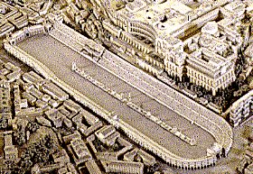
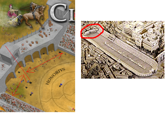
here's an image to make things clearer:
notice on the photo how the middle tower is right in the middle and the number of arches is the same on each side?
now look at your map. not only the middle tower is not centered but the arches are wrong. you have 4 small arches on the right side and 2 larger ones on the left.
*i like that you added the emperor's stand but you should also add the entrance in the lower part. near caligula.
*also on the chariots bit. making them bigger would greatly enhance the feel. at the moment they look like fleas. make them bigger and you'll have a nice effect. don't exaggerate with how big you make them though.
*the shapes in the middle. the chariots are nice but the rest don't quite fit. where are the dolphins? and what about the symmetry? the have no order, those are just random cubes and cones.
PS: one thing i just noticed. the flags on the emperor's side are waving in the wind while the ones in the bottom part are simple triangles. make those wavy too.
“In the beginning God said, the four-dimensional divergence of an antisymmetric, second rank tensor equals zero, and there was light, and it was good. And on the seventh day he rested.”- Michio Kaku
-
WidowMakers
- Posts: 2774
- Joined: Mon Nov 20, 2006 9:25 am
- Gender: Male
- Location: Detroit, MI
-
DiM
- Posts: 10415
- Joined: Wed Feb 14, 2007 6:20 pm
- Gender: Male
- Location: making maps for scooby snacks
k thanks.WidowMakers wrote:Sorry DiM. I did not mean to ignore you I just missed it. I will see what I can do.

“In the beginning God said, the four-dimensional divergence of an antisymmetric, second rank tensor equals zero, and there was light, and it was good. And on the seventh day he rested.”- Michio Kaku
-
MR. Nate

- Posts: 951
- Joined: Tue Dec 19, 2006 10:59 am
- Gender: Male
- Location: Locked in the warehouse.
Well, I'm still not sure if I like the gameplay of the Circus, but I'll definitely give it another shop once this is finished.
Gorgeous work, WidowMakers.
Gorgeous work, WidowMakers.
AAFitz wrote:There will always be cheaters, abusive players, terrible players, and worse. But we have every right to crush them.
End the Flame Wars.MeDeFe wrote:This is a forum on the internet, what do you expect?
-
WidowMakers
- Posts: 2774
- Joined: Mon Nov 20, 2006 9:25 am
- Gender: Male
- Location: Detroit, MI
Here are the changes.
*changed the north entrance arches to be the same size.
*crowd is more colored (not just red)
*Fixed the Diocletian name and moved the coordinates slightly for Flavius
XML
http://www.mediamax.com/dzlqps/Hosted/C ... imus_3.xml


*changed the north entrance arches to be the same size.
*crowd is more colored (not just red)
*Fixed the Diocletian name and moved the coordinates slightly for Flavius
XML
http://www.mediamax.com/dzlqps/Hosted/C ... imus_3.xml

Looks Great
Awesome... I think its just about perfect...
-
fisherman5

- Posts: 48
- Joined: Fri Jan 12, 2007 9:33 pm
