[Abandoned] Alamo
Moderator: Cartographers
Re: Alamo map [4/7/13] Pg19
How's the update coming general?? You have a couple more weeks before we will have to move this into the Recycling Box. Hope to see something soon! 
-
 isaiah40
- Posts: 3990
- Joined: Mon Aug 27, 2007 7:14 pm


Re: Alamo map [4/7/13] Pg19
[Moved]
Seems the progress of this map has stalled. (for sure this time...) This map will be placed on vacation for 6 months, after which time this map will be considered abandoned. Should the mapmaker wish to pick up the progress of this map, they only need to make an update, and contact any CA. Gameplay my be reviewed further upon its return to the main foundry floor. Should the gameplay NOT meet current gameplay standards, updates to gameplay will need to be made. The gameplay stamp may be removed at such time the CA's deem gameplay to be deficient.
Seems the progress of this map has stalled. (for sure this time...) This map will be placed on vacation for 6 months, after which time this map will be considered abandoned. Should the mapmaker wish to pick up the progress of this map, they only need to make an update, and contact any CA. Gameplay my be reviewed further upon its return to the main foundry floor. Should the gameplay NOT meet current gameplay standards, updates to gameplay will need to be made. The gameplay stamp may be removed at such time the CA's deem gameplay to be deficient.


-

 RedBaron0
- Posts: 2657
- Joined: Sun Aug 19, 2007 12:59 pm
- Location: Pennsylvania


Re: [Vacation valid till Nov. 2013] -Alamo map
I only looked at it briefly and I don't have expertise in judging maps but some of the soldiers look as if they had been decapitated. Hopefully I am not the only one who thinks this. =)
-

 Viceroy63
- Posts: 1117
- Joined: Mon Aug 15, 2011 8:34 pm
- Location: A little back water, hill billy hick place called Earth.


Re: [Vacation valid till Nov. 2013] -Alamo map
Sorry for being away for so long. I would like to continue with this if that is ok.
-
 generalhead
- Posts: 806
- Joined: Mon Apr 26, 2010 10:09 pm


Re: [Vacation valid till Nov. 2013] -Alamo map
koontz1973 wrote:Nice to see you back GH.
Nice to be back. I missed it.
-
 generalhead
- Posts: 806
- Joined: Mon Apr 26, 2010 10:09 pm


Re: Alamo map 29/9
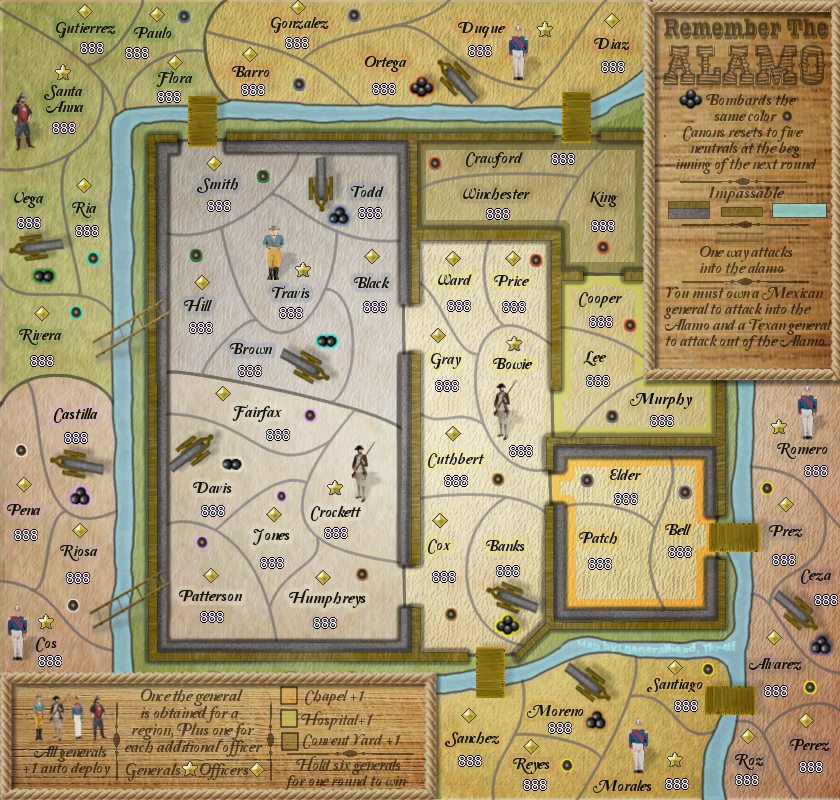
Trying a new Santa Anna figure.
Do the size of the cannons and generals not match?
Should I change the Crockett and Bowie Figures?
Do the size of the cannons and generals not match?
Should I change the Crockett and Bowie Figures?
-
 generalhead
- Posts: 806
- Joined: Mon Apr 26, 2010 10:09 pm


Re: Alamo map 29/9
gh, other Anna was better.  As I said, glad to see you doing this again. It has been a long while since we spoke so I hope all is good with you.
I really do not have much to add now apart from glows. You know it is my old bug bear with you and your glows.
  Lets see what you have been learning while away.
I really do not have much to add now apart from glows.

-

 koontz1973
- Posts: 6960
- Joined: Thu Jan 01, 2009 10:57 am


Re: Alamo map 29/9
koontz1973 wrote:gh, other Anna was better.As I said, glad to see you doing this again. It has been a long while since we spoke so I hope all is good with you.

I really do not have much to add now apart from glows.You know it is my old bug bear with you and your glows.
Lets see what you have been learning while away.
This Santa Anna is closer to real life than the last one. I say keep it.
Highest Rank: 26 Highest Score: 3480


-

 Bruceswar
- Posts: 9713
- Joined: Sun Dec 23, 2007 12:36 am
- Location: Cow Pastures


Re: Alamo map 29/9
Bruceswar wrote:koontz1973 wrote:gh, other Anna was better.As I said, glad to see you doing this again. It has been a long while since we spoke so I hope all is good with you.

I really do not have much to add now apart from glows.You know it is my old bug bear with you and your glows.
Lets see what you have been learning while away.
This Santa Anna is closer to real life than the last one. I say keep it.
Thanks for the input guys. I am just trying to get all of the figures to match. That is one thing that has always bothered me is that they never
completely matched. I will keep working with them; I have a new set of figures that I want to try. I am not deleting the old ones so if the new ones don't work I can always revert back.
-
 generalhead
- Posts: 806
- Joined: Mon Apr 26, 2010 10:09 pm


Re: Alamo map 29/9
generalhead wrote:Bruceswar wrote:koontz1973 wrote:gh, other Anna was better.As I said, glad to see you doing this again. It has been a long while since we spoke so I hope all is good with you.

I really do not have much to add now apart from glows.You know it is my old bug bear with you and your glows.
Lets see what you have been learning while away.
This Santa Anna is closer to real life than the last one. I say keep it.
Thanks for the input guys. I am just trying to get all of the figures to match. That is one thing that has always bothered me is that they never
completely matched. I will keep working with them; I have a new set of figures that I want to try. I am not deleting the old ones so if the new ones don't work I can always revert back.
Glad to hear you are keeping the old ones in case. When I look at Santa Anna pictures, he seems to be wearing a red tunic though, hence my reason to not use the new one.
But one thing I think will help with the figures over all is lowering the intensity of the colours. Bowie and Crockett are really nice and I would say to not touch them from now on. But for all of the others go into your colour tab and play with the hue saturation levels. Just the lightness and saturation sliders. This should give them less of a pasted look and make them feel more like the map.

-

 koontz1973
- Posts: 6960
- Joined: Thu Jan 01, 2009 10:57 am


Re: Alamo map 29/9
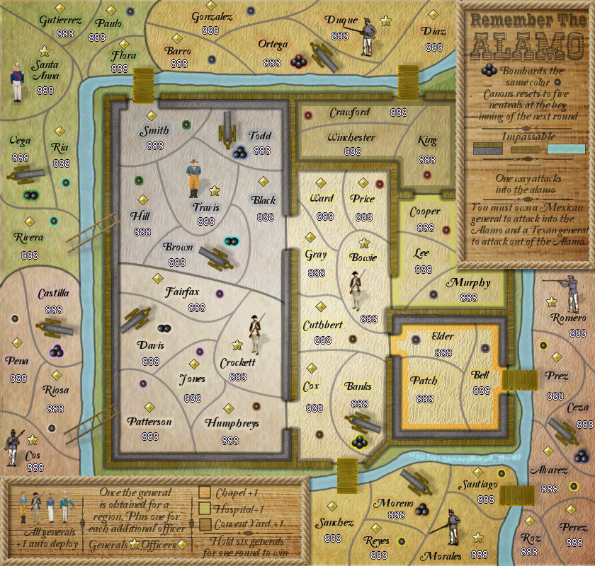
Here are the new figures. What do you think?
I will work on the glows for the names next and figure out how to do the figures for the legend if these ones are good.
I will work on the glows for the names next and figure out how to do the figures for the legend if these ones are good.
-
 generalhead
- Posts: 806
- Joined: Mon Apr 26, 2010 10:09 pm


Re: Alamo map 29/9
To the new figures, they are the best yet. If you can do the same for all of the others, you will have a winner for them. Great work I would say.

-

 koontz1973
- Posts: 6960
- Joined: Thu Jan 01, 2009 10:57 am


Re: Alamo map 29/9
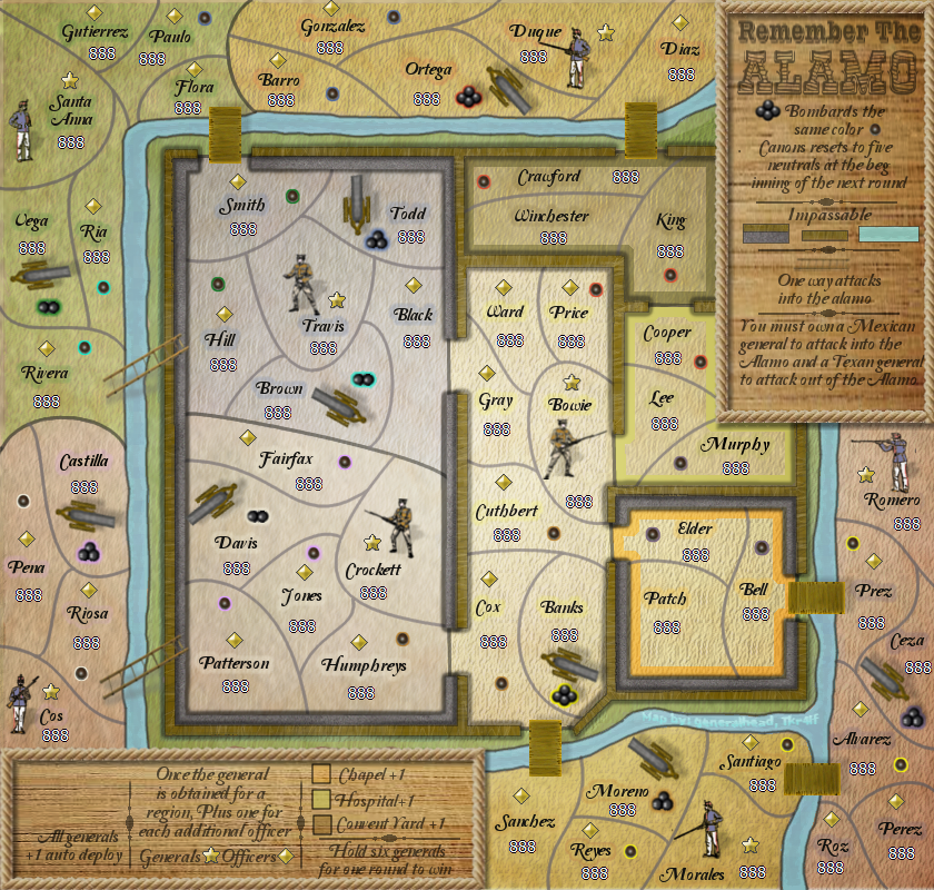
I got the rest of the Figures done. I just wanted to see what they looked liked.
Will work on the glows next.
Will work on the glows next.
-
 generalhead
- Posts: 806
- Joined: Mon Apr 26, 2010 10:09 pm


Re: Alamo map 29/9
koontz1973 wrote:Mexico good, America bad. Revert to the original American ones.
Actually they look spot on. Sans the Bowie who needs a knife. I like the new ones.
Highest Rank: 26 Highest Score: 3480


-

 Bruceswar
- Posts: 9713
- Joined: Sun Dec 23, 2007 12:36 am
- Location: Cow Pastures


Re: Alamo map 29/9
Bruceswar wrote:koontz1973 wrote:Mexico good, America bad. Revert to the original American ones.
Actually they look spot on. Sans the Bowie who needs a knife. I like the new ones.
But they look like the Americans ones but with a colour placed over the tunic rather badly.

-

 koontz1973
- Posts: 6960
- Joined: Thu Jan 01, 2009 10:57 am


Re: Alamo map 29/9
koontz1973 wrote:Bruceswar wrote:koontz1973 wrote:Mexico good, America bad. Revert to the original American ones.
Actually they look spot on. Sans the Bowie who needs a knife. I like the new ones.
But they look like the Americans ones but with a colour placed over the tunic rather badly.
I agree they don't look good. They look like they are from WWII and not the Alamo. I will change them.
-
 generalhead
- Posts: 806
- Joined: Mon Apr 26, 2010 10:09 pm


Re: Alamo map 29/9
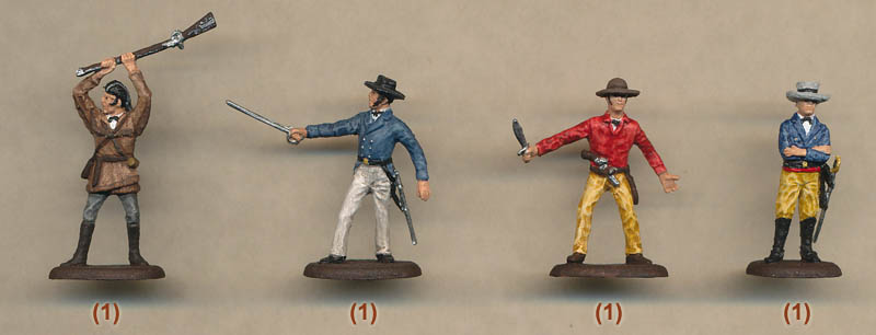
Thanks Bruceswar. I have tried figures like this before. when you scale them down they end up not looking right. I have tried probably around 6 or so different figures sets just like this. I wish they would look like this when they were done. I will see what I can do.
-
 generalhead
- Posts: 806
- Joined: Mon Apr 26, 2010 10:09 pm


Re: Alamo map 29/9
I dunno about the Texan figures.... To me Travis looks like Wolverine to me, and Davy Crockett almost seems a little obscene to me. Mexicans look ok to me. just okay.
Still think you need to add in a representation of the familiar facade of the Alamo, somewhere to be sure.
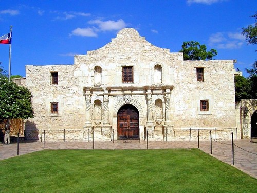
Still think you need to add in a representation of the familiar facade of the Alamo, somewhere to be sure.


-

 RedBaron0
- Posts: 2657
- Joined: Sun Aug 19, 2007 12:59 pm
- Location: Pennsylvania


Re: Alamo map 29/9
RedBaron0 wrote:I dunno about the Texan figures.... To me Travis looks like Wolverine to me, and Davy Crockett almost seems a little obscene to me. Mexicans look ok to me. just okay.
Still think you need to add in a representation of the familiar facade of the Alamo, somewhere to be sure.
Thanks RB0. I had the facade in there early on, but it was very intrusive. I always liked it myself. I will see if I can add it back in.
-
 generalhead
- Posts: 806
- Joined: Mon Apr 26, 2010 10:09 pm


Re: Alamo map 29/9
-Salut Gen--
I haven't visited here in a while, and let Me tell Ya, Lovin everything about this, all the changes and improvements since I last saw it, very clear and very ready to become played upon I believe from what I see,, Send this to the list of maps so We can play it 4SURE!! Great job Gen, and all who've helped along the way-- >>>>>---------MAG-OUT----------> '')
I haven't visited here in a while, and let Me tell Ya, Lovin everything about this, all the changes and improvements since I last saw it, very clear and very ready to become played upon I believe from what I see,, Send this to the list of maps so We can play it 4SURE!! Great job Gen, and all who've helped along the way-- >>>>>---------MAG-OUT----------> '')
-

 MagnusGreeol
- Posts: 1499
- Joined: Mon Aug 15, 2011 5:39 pm
- Location: ¥- ♎ BOSTONIA ♎ -¥


Re: Alamo map 29/9
MagnusGreeol wrote:-Salut Gen--
I haven't visited here in a while, and let Me tell Ya, Lovin everything about this, all the changes and improvements since I last saw it, very clear and very ready to become played upon I believe from what I see,, Send this to the list of maps so We can play it 4SURE!! Great job Gen, and all who've helped along the way-- >>>>>---------MAG-OUT----------> '')
Thanks bro' appreciate that.
I am trying a layout change and should have it posted in a few days to see if it is approved. It combines the legends into one legend at the bottom and opens up the map. It will also help me incorporate a facade of the Alamo into the title. If you want me to post what I have before it is finished let me know.
-
 generalhead
- Posts: 806
- Joined: Mon Apr 26, 2010 10:09 pm


Re: Alamo map 29/9
Absolutely don't post before Your finished,, An artist doesn't show his canvass until he''s ready too,, And as a fan of the Alamo map, I await patiently for the release of it '')
-

 MagnusGreeol
- Posts: 1499
- Joined: Mon Aug 15, 2011 5:39 pm
- Location: ¥- ♎ BOSTONIA ♎ -¥


Who is online
Users browsing this forum: No registered users


