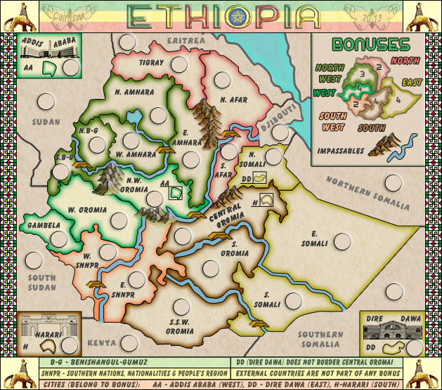
fair enough, but not necessarily my viewBruceswar wrote:I also think with a light map like this you do not need army circles? Seems a bit unneeded?
[Beta] - Ethiopia [26.8.13] V16 XML Stamped
Moderator: Cartographers
Forum rules
Please read the Community Guidelines before posting.
Please read the Community Guidelines before posting.
Re: Re: Ethiopia [5.7.13] V11(PS)-p7 Gfx Discussion

* Pearl Harbour * Waterloo * Forbidden City * Jamaica * Pot Mosbi
- RedBaron0
- Posts: 2657
- Joined: Sun Aug 19, 2007 12:59 pm
- Gender: Male
- Location: Pennsylvania
- Contact:
Re: Re: Ethiopia [5.7.13] V11(PS)-p7 Gfx Discussion
I'd agree with Bruce, the bevel around them now also makes the circles vaguely look like pimples on the map.  The outline around the Red Sea is also oddly different from the other lines on the map.


Re: Re: Ethiopia [5.7.13] V11(PS)-p7 Gfx Discussion
Pimples yes i agree, but i like them like that...somewhat different from other mapsRedBaron0 wrote:I'd agree with Bruce, the bevel around them now also makes the circles vaguely look like pimples on the map.
Yes it is isn't it? but i am happy with it.The outline around the Red Sea is also oddly different from the other lines on the map.
although i will adjust the opacity of the pimple there.

* Pearl Harbour * Waterloo * Forbidden City * Jamaica * Pot Mosbi
Re: Re: Ethiopia [5.7.13] V11(PS)-p7 Gfx Discussion
I think the pimples look pretty unique and cool. Looks like glass disks that have been placed over a cloth map at the strategic locations, awaiting miniature figurines of Dragoons to be placed atop themcairnswk wrote:Pimples yes i agree, but i like them like that...somewhat different from other mapsRedBaron0 wrote:I'd agree with Bruce, the bevel around them now also makes the circles vaguely look like pimples on the map.

Yes it is isn't it? but i am happy with it.The outline around the Red Sea is also oddly different from the other lines on the map.
although i will adjust the opacity of the pimple there.

Silvanus wrote:perch is a North Korean agent to infiltrate south Korean girls
- Teflon Kris
- Posts: 4236
- Joined: Sun Jul 13, 2008 4:39 pm
- Gender: Male
- Location: Lancashire, United Kingdom
Re: Ethiopia [5.7.13] V11(PS)-p7 Gfx Discussion
Graphics look great to me - nothing I would specifically want to change - the cities insets are particularly ace 
Re: Ethiopia [5.7.13] V11(PS)-p7 Gfx Discussion
You know, it just occured to me (and it may be more political than you care to get) but the region currently labeled "Northern Somalia" would be much more accurately named "Somaliland" as that region has been a de facto sovereign state for over 20 years now. See the wikipedia article: Somaliland
Then of course you could just call what you have as "Southern Somalia" simply "Somalia" and poor old Puntland will just have to wait for another CC map to make an appearance on.
Then of course you could just call what you have as "Southern Somalia" simply "Somalia" and poor old Puntland will just have to wait for another CC map to make an appearance on.

Silvanus wrote:perch is a North Korean agent to infiltrate south Korean girls
Re: Ethiopia [5.7.13] V11(PS)-p7 Gfx Discussion
Yes that is modern political perchorin, had you brought it up earlier it might have been considered but i don't want to change the map now since it has been gameplay stamped.
Thanks for the suggestion though.
Thanks for the suggestion though.

* Pearl Harbour * Waterloo * Forbidden City * Jamaica * Pot Mosbi
Re: Ethiopia [10.7.13] V12(PS)-p8
Version 12.
Adjusted the army circles opacity, and added signature and date in somewhat ethiopian style
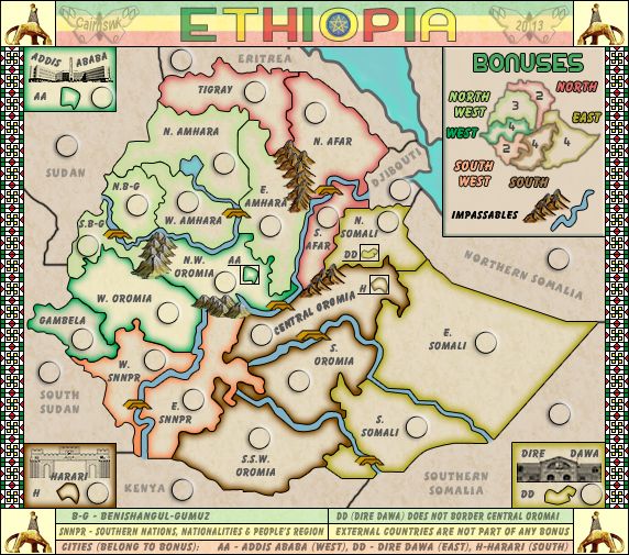
Adjusted the army circles opacity, and added signature and date in somewhat ethiopian style


* Pearl Harbour * Waterloo * Forbidden City * Jamaica * Pot Mosbi
- RedBaron0
- Posts: 2657
- Joined: Sun Aug 19, 2007 12:59 pm
- Gender: Male
- Location: Pennsylvania
- Contact:
Re: Ethiopia [5.7.13] V11(PS)-p7 Gfx Discussion
I think this is just asking for a territory name change, but that's subjective and completely up to the mapmaker.perchorin wrote:You know, it just occured to me (and it may be more political than you care to get) but the region currently labeled "Northern Somalia" would be much more accurately named "Somaliland" as that region has been a de facto sovereign state for over 20 years now. See the wikipedia article: Somaliland
Then of course you could just call what you have as "Southern Somalia" simply "Somalia" and poor old Puntland will just have to wait for another CC map to make an appearance on.
I believe the color your using for Northwest is very very light and can stand to be a more distinct shade of green.


Re: Ethiopia [5.7.13] V13(PS)-p8 Gfx Discussion
Yes i understand, but i don't think it is necessary and will require border change, and that may lead to adding two southern regions, which i do not want to go to.RedBaron0 wrote:I think this is just asking for a territory name change, but that's subjective and completely up to the mapmaker.perchorin wrote:You know, it just occured to me (and it may be more political than you care to get) but the region currently labeled "Northern Somalia" would be much more accurately named "Somaliland" as that region has been a de facto sovereign state for over 20 years now. See the wikipedia article: Somaliland
Then of course you could just call what you have as "Southern Somalia" simply "Somalia" and poor old Puntland will just have to wait for another CC map to make an appearance on.
Fixed with darker greenI believe the color your using for Northwest is very very light and can stand to be a more distinct shade of green.
Version 13.
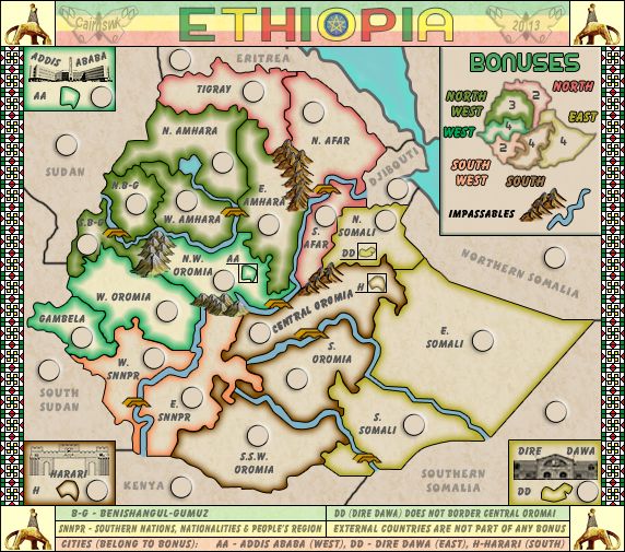

* Pearl Harbour * Waterloo * Forbidden City * Jamaica * Pot Mosbi
- RedBaron0
- Posts: 2657
- Joined: Sun Aug 19, 2007 12:59 pm
- Gender: Male
- Location: Pennsylvania
- Contact:
Re: Re: Ethiopia [10.7.13] V13(PS)-p8
I think the orange of south west now is also too light, mainly in comparison to the other bonus regions. It can also stand an uptick or two in color. And is it me, or is the green bonus regions have a wider girth than the other color bands?


Re: Ethiopia [13.7.13] V14-p8
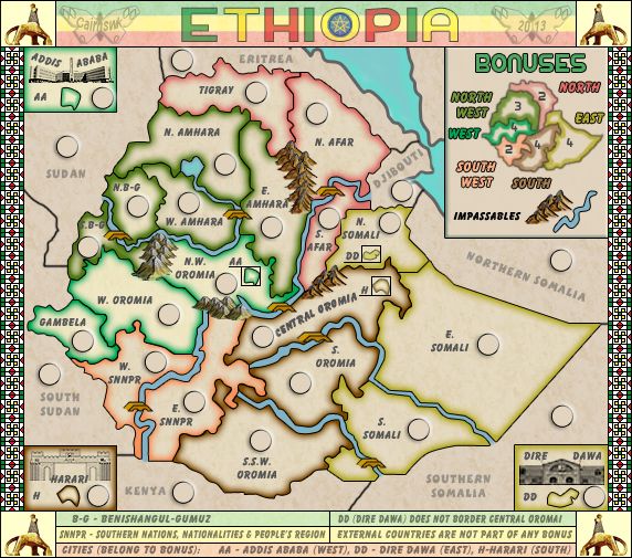
You were correct, the green was larger because i had the setting on precise instead of softer.RedBaron0 wrote:I think the orange of south west now is also too light, mainly in comparison to the other bonus regions. It can also stand an uptick or two in color. And is it me, or is the green bonus regions have a wider girth than the other color bands?
I've also adjusted the colours on the mini-map
Version 14

* Pearl Harbour * Waterloo * Forbidden City * Jamaica * Pot Mosbi
Re: Ethiopia [13.7.13] V14-p8
I assume everyone's happy with this??

* Pearl Harbour * Waterloo * Forbidden City * Jamaica * Pot Mosbi
- Teflon Kris
- Posts: 4236
- Joined: Sun Jul 13, 2008 4:39 pm
- Gender: Male
- Location: Lancashire, United Kingdom
Re: Ethiopia [13.7.13] V14-p8
All Rastaman is Irie Ites wid da Motherland map 


Re: Ethiopia [13.7.13] V14-p8
Thanks for commenting, consider done!Nola_lifer wrote:Like to see tert text a little darker and Central Oromia seems to be bolder than the other text. Only issue I see. Colors are nice and your mountains are probably the best I've seen.

* Pearl Harbour * Waterloo * Forbidden City * Jamaica * Pot Mosbi
Re: Ethiopia [13.7.13] V14-p8
Tanks manDJ Teflon wrote:All Rastaman is Irie Ites wid da Motherland map


* Pearl Harbour * Waterloo * Forbidden City * Jamaica * Pot Mosbi
Re: Ethiopia [13.7.13] V14-p8
I have only one little thing. The mountains here  seem to look pasted on, while the others look good to me.
Other than that one small thing I don't see anything else jumping out at me. The CB tests all look good, so it's time to get the large and the 888 test up!
 seem to look pasted on, while the others look good to me.
Other than that one small thing I don't see anything else jumping out at me. The CB tests all look good, so it's time to get the large and the 888 test up!
Re: Ethiopia [24.7.13] V15 L&S
Texts made darker - Central Oromia was indeed darker but is now the same as all others, outer countries darkened but not as dark as main map.cairnswk wrote:Thanks for commenting, consider done!Nola_lifer wrote:Like to see tert text a little darker and Central Oromia seems to be bolder than the other text. Only issue I see. Colors are nice and your mountains are probably the best I've seen.
Mountains enhanced all around.isaiah40 wrote:I have only one little thing. The mountains hereseem to look pasted on, while the others look good to me.
Other than that one small thing I don't see anything else jumping out at me. The CB tests all look good, so it's time to get the large and the 888 test up!
Larger posted.
Done.RedBaron0 wrote:And the large version made and checked out.
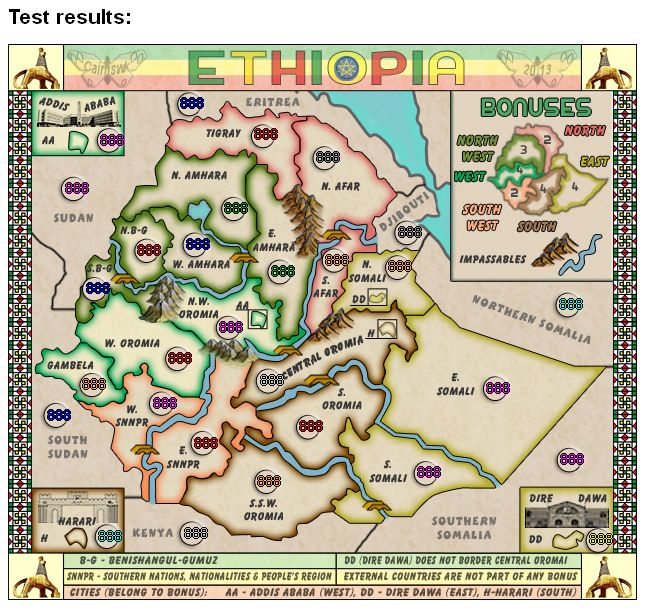
You'll notice from the 888s. i've changed the text on Central Oromia so the numbers don't overlap it.
888s produced from xml.
Title also enhanced on the main .png files.
Small
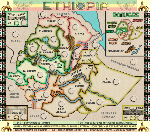
Large Small 888
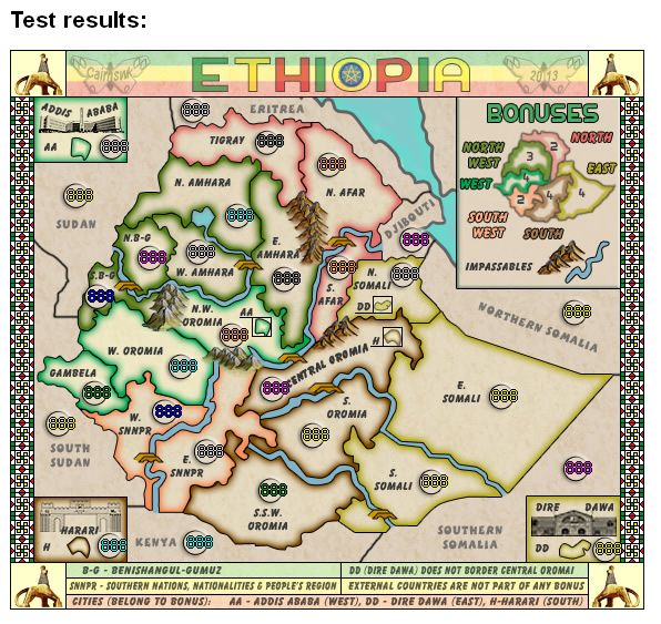
Large 888

* Pearl Harbour * Waterloo * Forbidden City * Jamaica * Pot Mosbi
- Nola_Lifer
- Posts: 819
- Joined: Mon Oct 13, 2008 4:46 pm
- Location: 雪山
- Contact:
Re: Re: Ethiopia [13.7.13] V15 L&S-p8
The 8's need to be centered on the circles..
Overall I think the map needs a slight bit more texture of some kind...
Overall I think the map needs a slight bit more texture of some kind...
Highest Rank: 26 Highest Score: 3480


Re: Re: Ethiopia [13.7.13] V15 L&S-p8
Bruceswar, i am well-aware of the centering situation now having 35 maps quenched.Bruceswar wrote:The 8's need to be centered on the circles..
Overall I think the map needs a slight bit more texture of some kind...
This was preliminary 888s showing that there is no overalpping...the rest will come after graphics stamping.
I rather feel there is enough texture on the map

* Pearl Harbour * Waterloo * Forbidden City * Jamaica * Pot Mosbi
Re: Re: Ethiopia [13.7.13] V15 L&S-p8
cairnswk wrote:Bruceswar, i am well-aware of the centering situation now having 35 maps quenched.Bruceswar wrote:The 8's need to be centered on the circles..
Overall I think the map needs a slight bit more texture of some kind...
This was preliminary 888s showing that there is no overalpping...the rest will come after graphics stamping.
I rather feel there is enough texture on the map
I figured as much, but I can only go off what I see.
Highest Rank: 26 Highest Score: 3480


Re: Re: Ethiopia [13.7.13] V15 L&S-p8
Bruceswar wrote:cairnswk wrote:Bruceswar, i am well-aware of the centering situation now having 35 maps quenched.Bruceswar wrote:The 8's need to be centered on the circles..
Overall I think the map needs a slight bit more texture of some kind...
This was preliminary 888s showing that there is no overalpping...the rest will come after graphics stamping.
I rather feel there is enough texture on the map
I figured as much, but I can only go off what I see.
That's fine, but realise that i only do centering properly at final stage.
if there are others who feel texture needs increasing, then i will change.

* Pearl Harbour * Waterloo * Forbidden City * Jamaica * Pot Mosbi

