wow! this map has changed a lot since i was last on! its looks really good

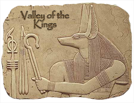
i like the title- are the pictures the hyroglyphics that say the title? sorry if this was already explained X|. im not sure bout the striped effect of the letters though.
a couple of ideas-
thanx 4 putting the region letters on the legend- could you also include them on the regions on the actual map somehow? im not exactly sure where you would put them, but i think if would improve the clarity.
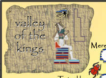
my eyes keep crossing whenever i look at the striped tomb heads on the dark background- the ones on the bottom right corner. is there anything which would help that? im not telling you to loose the striped background tho- that a nice effect. the only thing i can think of is to use 2 different colours but im not sure if that would look right. any1 else with ideas?
and could you make the eye of horus symbol darker and maybe larger to increase visibility? the hardest thing about this map is making the convoluted attack routes clear

.
ur well on ur way to making another really nice map
sorry for not keeping up better X|.
Do you need an excuse to have a war? I mean, who for? Can't you just say "You got lots of cash and land, but I've got a big sword, so divy up right now, chop chop."
Terry Pratchet