agree to what? that the plus sign is crap? to be honest i never thought about it but you were right. thus the change in the font.yeti_c wrote:Much nicer... I assume you agreed?
C.
Age of Merchants - [Quenched]
Moderator: Cartographers
Forum rules
Please read the Community Guidelines before posting.
Please read the Community Guidelines before posting.
-
DiM

- Posts: 10415
- Joined: Wed Feb 14, 2007 6:20 pm
- Gender: Male
- Location: making maps for scooby snacks
“In the beginning God said, the four-dimensional divergence of an antisymmetric, second rank tensor equals zero, and there was light, and it was good. And on the seventh day he rested.”- Michio Kaku
-
DiM
- Posts: 10415
- Joined: Wed Feb 14, 2007 6:20 pm
- Gender: Male
- Location: making maps for scooby snacks
so map components:
1. gameplay
2. graphics
3. theme/feeling
1. i think the gameplay is 100% set. i've got a clear bonus system, movement points, connections, etc. i don't think there's anything else to be improved here.
2. graphics. i think their ok but i'm not the one to say. it's up to you guys.
3. the theme and the feeling are 100% finished, so no work here.
is there anything else to do? probably graphics. so i'm waiting for feedback.
1. gameplay
2. graphics
3. theme/feeling
1. i think the gameplay is 100% set. i've got a clear bonus system, movement points, connections, etc. i don't think there's anything else to be improved here.
2. graphics. i think their ok but i'm not the one to say. it's up to you guys.
3. the theme and the feeling are 100% finished, so no work here.
is there anything else to do? probably graphics. so i'm waiting for feedback.
“In the beginning God said, the four-dimensional divergence of an antisymmetric, second rank tensor equals zero, and there was light, and it was good. And on the seventh day he rested.”- Michio Kaku
If you get the all clear from the Panda or the Monkey on Gameplay - I'll redo your bonus xml...DiM wrote:so map components:
1. gameplay
2. graphics
3. theme/feeling
1. i think the gameplay is 100% set. i've got a clear bonus system, movement points, connections, etc. i don't think there's anything else to be improved here.
2. graphics. i think their ok but i'm not the one to say. it's up to you guys.
3. the theme and the feeling are 100% finished, so no work here.
is there anything else to do? probably graphics. so i'm waiting for feedback.
C.

Highest score : 2297
-
DiM
- Posts: 10415
- Joined: Wed Feb 14, 2007 6:20 pm
- Gender: Male
- Location: making maps for scooby snacks
the map is not even in final forge so there's no hurry yet.yeti_c wrote:If you get the all clear from the Panda or the Monkey on Gameplay - I'll redo your bonus xml...DiM wrote:so map components:
1. gameplay
2. graphics
3. theme/feeling
1. i think the gameplay is 100% set. i've got a clear bonus system, movement points, connections, etc. i don't think there's anything else to be improved here.
2. graphics. i think their ok but i'm not the one to say. it's up to you guys.
3. the theme and the feeling are 100% finished, so no work here.
is there anything else to do? probably graphics. so i'm waiting for feedback.
C.

“In the beginning God said, the four-dimensional divergence of an antisymmetric, second rank tensor equals zero, and there was light, and it was good. And on the seventh day he rested.”- Michio Kaku
-
DiM
- Posts: 10415
- Joined: Wed Feb 14, 2007 6:20 pm
- Gender: Male
- Location: making maps for scooby snacks
10x.KEYOGI wrote:Would you like to have an animated map as a third option? (besides small and large) (see page 34)
yes
45% [ 24 ]
no
54% [ 29 ]
Total Votes : 53
“In the beginning God said, the four-dimensional divergence of an antisymmetric, second rank tensor equals zero, and there was light, and it was good. And on the seventh day he rested.”- Michio Kaku

Icons??
Hi DiM....I haven't visited your map since way back when U did the story line. Consequently, you'll probably say run away, but I just thought having not seen the map for so long it would be good if u got some perspective from someone coming to the map fresh and not seeing all the recent changes or knowing of them. The map is looking great (although i feel all the background is a tad to busy as there appears to be four effects on the background) and i know the amount of work and patience you have had with all these versions. Commendations on that alone! 
I am not suggesting change, but for someone seeing this for the first time, possibly the resource pair icons are unclear to me as to what they are exactly, and the factory icon looks catoonish compared with the other icons. I can understand the hat and clothes but the others are somewhat of a mystery to me.
I think that is a cow and crocodile, it looks like a whisky flagon and bottle, i have no idea what the top two are in the middle column, there is water drop in one, and i seem to recall something about cotton in the last pair in the middle column from my previous visist weay back. The market icon is great, as is pirates and the water drop.
Just input that might be valuable.
I am not suggesting change, but for someone seeing this for the first time, possibly the resource pair icons are unclear to me as to what they are exactly, and the factory icon looks catoonish compared with the other icons. I can understand the hat and clothes but the others are somewhat of a mystery to me.
I think that is a cow and crocodile, it looks like a whisky flagon and bottle, i have no idea what the top two are in the middle column, there is water drop in one, and i seem to recall something about cotton in the last pair in the middle column from my previous visist weay back. The market icon is great, as is pirates and the water drop.
Just input that might be valuable.

* Pearl Harbour * Waterloo * Forbidden City * Jamaica * Pot Mosbi
-
DiM
- Posts: 10415
- Joined: Wed Feb 14, 2007 6:20 pm
- Gender: Male
- Location: making maps for scooby snacks
Re: Icons??
thanks for the input.cairnswk wrote:Hi DiM....I haven't visited your map since way back when U did the story line. Consequently, you'll probably say run away, but I just thought having not seen the map for so long it would be good if u got some perspective from someone coming to the map fresh and not seeing all the recent changes or knowing of them. The map is looking great (although i feel all the background is a tad to busy as there appears to be four effects on the background) and i know the amount of work and patience you have had with all these versions. Commendations on that alone!
I am not suggesting change, but for someone seeing this for the first time, possibly the resource pair icons are unclear to me as to what they are exactly, and the factory icon looks catoonish compared with the other icons. I can understand the hat and clothes but the others are somewhat of a mystery to me.
I think that is a cow and crocodile, it looks like a whisky flagon and bottle, i have no idea what the top two are in the middle column, there is water drop in one, and i seem to recall something about cotton in the last pair in the middle column from my previous visist weay back. The market icon is great, as is pirates and the water drop.
Just input that might be valuable.
indeed there are lots of effects everywhere, i don't think there's a single thing on that map that does not have effects. and some objects even have 8-10 effects at the same time.

you say the background is a bit busy. well i guess it can be toned down but i really want the old wrinkled torn stained yellowish paper look. it defines the whole theme.
some resources may be unclear. it's already been adressed after mibi said the same thing. the reason why i'm not too keen on changing them is because they don't really matter. it's important thet they are all different and that they form pairs. when i look at a continent i see a few icons. an anchor. cool that's the port. a house, i check the legend yup that's the market. thought so. and a factory. cool. so what are the other 2 plant icons. oh look they are resources. great. so i have 2 resources a factoey and market. let's get trading.
i don't care if those are plants, socks or zombies on crack. all i care is that they are a pair and they are resources. and because the resources are unique and the pairs are unique, and there are only 2 res per continent, there's no way i'm going to make mistakes and think the water forms a pair with the top hat.
PS: the pairs are:
tux + top hat = luxury clothing
alligator+cow = skins
rum jug + whiskey bottle = booze
shell 1 + shell 2 = traditional hand crafting
bucket+water = mineral water industry
plant1+plant2=ceraels
“In the beginning God said, the four-dimensional divergence of an antisymmetric, second rank tensor equals zero, and there was light, and it was good. And on the seventh day he rested.”- Michio Kaku
Re: Icons??
kewl!DiM wrote:thanks for the input.cairnswk wrote:Hi DiM....I haven't visited your map since way back when U did the story line. Consequently, you'll probably say run away, but I just thought having not seen the map for so long it would be good if u got some perspective from someone coming to the map fresh and not seeing all the recent changes or knowing of them. The map is looking great (although i feel all the background is a tad to busy as there appears to be four effects on the background) and i know the amount of work and patience you have had with all these versions. Commendations on that alone!
I am not suggesting change, but for someone seeing this for the first time, possibly the resource pair icons are unclear to me as to what they are exactly, and the factory icon looks catoonish compared with the other icons. I can understand the hat and clothes but the others are somewhat of a mystery to me.
I think that is a cow and crocodile, it looks like a whisky flagon and bottle, i have no idea what the top two are in the middle column, there is water drop in one, and i seem to recall something about cotton in the last pair in the middle column from my previous visist weay back. The market icon is great, as is pirates and the water drop.
Just input that might be valuable.
indeed there are lots of effects everywhere, i don't think there's a single thing on that map that does not have effects. and some objects even have 8-10 effects at the same time.
you say the background is a bit busy. well i guess it can be toned down but i really want the old wrinkled torn stained yellowish paper look. it defines the whole theme.
some resources may be unclear. it's already been adressed after mibi said the same thing. the reason why i'm not too keen on changing them is because they don't really matter. it's important thet they are all different and that they form pairs. when i look at a continent i see a few icons. an anchor. cool that's the port. a house, i check the legend yup that's the market. thought so. and a factory. cool. so what are the other 2 plant icons. oh look they are resources. great. so i have 2 resources a factoey and market. let's get trading.
i don't care if those are plants, socks or zombies on crack. all i care is that they are a pair and they are resources. and because the resources are unique and the pairs are unique, and there are only 2 res per continent, there's no way i'm going to make mistakes and think the water forms a pair with the top hat.
PS: the pairs are:
tux + top hat = luxury clothing
alligator+cow = skins
rum jug + whiskey bottle = booze
shell 1 + shell 2 = traditional hand crafting
bucket+water = mineral water industry
plant1+plant2=ceraels
OK.* Pearl Harbour * Waterloo * Forbidden City * Jamaica * Pot Mosbi

Re: Icons??
you may not care. but it would hardly fit the theme if players thought they were trafficking zombies on crack. i know its late in the game and you would rather not make changes but i think some better resources are in order. just imagine being on team and telling your teammate "you should go for the house looking thing and i will go for the thing that looks like a shedding tree" .. it kinda takes a player out of the merchant mentality.DiM wrote: i don't care if those are plants, socks or zombies on crack. all i care is that they are a pair and they are resources. and because the resources are unique and the pairs are unique, and there are only 2 res per continent, there's no way i'm going to make mistakes and think the water forms a pair with the top hat.
PS: the pairs are:
tux + top hat = luxury clothing
alligator+cow = skins
rum jug + whiskey bottle = booze
shell 1 + shell 2 = traditional hand crafting
bucket+water = mineral water industry
plant1+plant2=ceraels
-
DiM
- Posts: 10415
- Joined: Wed Feb 14, 2007 6:20 pm
- Gender: Male
- Location: making maps for scooby snacks
Re: Icons??
3 point explanation:mibi wrote:you may not care. but it would hardly fit the theme if players thought they were trafficking zombies on crack. i know its late in the game and you would rather not make changes but i think some better resources are in order. just imagine being on team and telling your teammate "you should go for the house looking thing and i will go for the thing that looks like a shedding tree" .. it kinda takes a player out of the merchant mentality.DiM wrote: i don't care if those are plants, socks or zombies on crack. all i care is that they are a pair and they are resources. and because the resources are unique and the pairs are unique, and there are only 2 res per continent, there's no way i'm going to make mistakes and think the water forms a pair with the top hat.
PS: the pairs are:
tux + top hat = luxury clothing
alligator+cow = skins
rum jug + whiskey bottle = booze
shell 1 + shell 2 = traditional hand crafting
bucket+water = mineral water industry
plant1+plant2=ceraels
1.no matter what icons i put they can always be misinterpreted. let's take for example the water drop. to me it's clear it's water to somebody else it might look like a tear drop and cause him to wonder since when tears are valuable resources.
2. adding names for each resource in the legen would be disastrous as it would totally clutter the map and further increase the already large legend.
3. in a team game people can refer to various resources by the territory names. i don't think anybody will say: you go for the top hat and i'll take the weird looking plant.
“In the beginning God said, the four-dimensional divergence of an antisymmetric, second rank tensor equals zero, and there was light, and it was good. And on the seventh day he rested.”- Michio Kaku

Re: Icons??
o but they will- the territory names arent clear enough to useDiM wrote: 3. in a team game people can refer to various resources by the territory names. i don't think anybody will say: you go for the top hat and i'll take the weird looking plant.
seriously though. i dont understand y u continuously refute everyones suggestions! you know its never gonna get forged the way it is.Do you need an excuse to have a war? I mean, who for? Can't you just say "You got lots of cash and land, but I've got a big sword, so divy up right now, chop chop."
Terry Pratchet
Terry Pratchet
-
DiM
- Posts: 10415
- Joined: Wed Feb 14, 2007 6:20 pm
- Gender: Male
- Location: making maps for scooby snacks
coffee is doable.mibi wrote:well its up to you, but here are some more iconic resources to consider,
coffee, sugar
bananas, pineapple, coconut (fruit)
uh.. slaves
gold, copper, silver
tobbaco
sugar is already there as sugar can
bananas pineapple coconut doable.
slaves...better not. i don't want to start any unneeded discussions
gold copper silver won't work because all the icons are b&w. maybe just one of them. a gold bar.
tobacco. could be.
i'll work on them.
“In the beginning God said, the four-dimensional divergence of an antisymmetric, second rank tensor equals zero, and there was light, and it was good. And on the seventh day he rested.”- Michio Kaku
How's about...mibi wrote:well its up to you, but here are some more iconic resources to consider,
coffee, sugar
bananas, pineapple, coconut (fruit)
uh.. slaves
gold, copper, silver
tobbaco
Tobacco & Marijuana
Not sure there was much Gold, Copper & Silver in the Windies...
Coffee Beans should be easy - & a Cane Sugar Icon should be OK?
Suggest that Slaves isn't a good idea? (Esp as they don't really work into a factory?)
C.
Highest score : 2297
-
DiM
- Posts: 10415
- Joined: Wed Feb 14, 2007 6:20 pm
- Gender: Male
- Location: making maps for scooby snacks
Re: Icons??
i'm not refusing suggestions without a reason.Enigma wrote:o but they will- the territory names arent clear enough to useDiM wrote: 3. in a team game people can refer to various resources by the territory names. i don't think anybody will say: you go for the top hat and i'll take the weird looking plant.
and enigma, i've lost hope in this map ever getting forged. i'm still working on it cause i like to work and it's fun. i have it printed and i play on it with my friends. that's enough for me. i've got more updates for minor things then probably the last 3 quenched maps put together and still people are not happy. now i'll implement mibi's suggested resources but probably someone will come and say that coffee looks a bit too roasted or he prefers it grounded.
or probably i'll put tobacco leaves and they'll say they look like cannabis.
there's no way i can satisfy each and everyone's request. by refusing some of them (with good reasons) i'm trying to keep something long enough on the map so it can be finally accepted.
Last edited by DiM on Wed Apr 25, 2007 10:19 am, edited 1 time in total.
“In the beginning God said, the four-dimensional divergence of an antisymmetric, second rank tensor equals zero, and there was light, and it was good. And on the seventh day he rested.”- Michio Kaku
-
DiM
- Posts: 10415
- Joined: Wed Feb 14, 2007 6:20 pm
- Gender: Male
- Location: making maps for scooby snacks
no marijuana. people might think i'm running a pro drugs campaign with this map. then various people will take sides and we'll have an arguement on our hands.yeti_c wrote:How's about...mibi wrote:well its up to you, but here are some more iconic resources to consider,
coffee, sugar
bananas, pineapple, coconut (fruit)
uh.. slaves
gold, copper, silver
tobbaco
Tobacco & Marijuana
Not sure there was much Gold, Copper & Silver in the Windies...
Coffee Beans should be easy - & a Cane Sugar Icon should be OK?
Suggest that Slaves isn't a good idea? (Esp as they don't really work into a factory?)
C.
same goes for slaves. feel free to imagine they work in the factory but as long as they aren't graphically present i avoid useless arguing.
“In the beginning God said, the four-dimensional divergence of an antisymmetric, second rank tensor equals zero, and there was light, and it was good. And on the seventh day he rested.”- Michio Kaku
-
DiM
- Posts: 10415
- Joined: Wed Feb 14, 2007 6:20 pm
- Gender: Male
- Location: making maps for scooby snacks
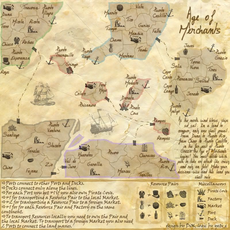
here. i put tobacco and coffee instead of water and bucket
and coconut+pineapple instead of cow and alligator.
anything else?
v74.
and coconut+pineapple instead of cow and alligator.
anything else?
v74.
“In the beginning God said, the four-dimensional divergence of an antisymmetric, second rank tensor equals zero, and there was light, and it was good. And on the seventh day he rested.”- Michio Kaku

-
skanska

- Posts: 121
- Joined: Sat May 20, 2006 10:04 am
- Location: terrorist training camp, Washington DC
dude,......... i freakin love this latest version, i have gotten so bored with the same game play all the time, trying to spaz it up with this new feature or that new map, i think this idea is absolutly wonderful, i can't tell you how great it would be for this to go through, it would finnaly add some variation to the game!!!!

-
DiM
- Posts: 10415
- Joined: Wed Feb 14, 2007 6:20 pm
- Gender: Male
- Location: making maps for scooby snacks
i'm glad you like it. gringo does not need a connection to colato because the 2 islands are already connected from puerto tranquillo to fort hope.coolpsp wrote:very good and in my opinion it's ready for use it looks very fun i cant wait to use it and grimgo should connect via port to colato(spelling
“In the beginning God said, the four-dimensional divergence of an antisymmetric, second rank tensor equals zero, and there was light, and it was good. And on the seventh day he rested.”- Michio Kaku
-
DiM
- Posts: 10415
- Joined: Wed Feb 14, 2007 6:20 pm
- Gender: Male
- Location: making maps for scooby snacks
thanks for the appreciation. i'm trying to spice up the boring style we have now. if only more people shared your thoughtsskanska wrote:dude,......... i freakin love this latest version, i have gotten so bored with the same game play all the time, trying to spaz it up with this new feature or that new map, i think this idea is absolutly wonderful, i can't tell you how great it would be for this to go through, it would finnaly add some variation to the game!!!!

“In the beginning God said, the four-dimensional divergence of an antisymmetric, second rank tensor equals zero, and there was light, and it was good. And on the seventh day he rested.”- Michio Kaku
I havent been checking up on this map lately...but i am happy to say that the legend text makes sense to me now...im glad you cleared up the wording.
i like the resource graphics, but im not a huge fan of the market and the factory graphics...i feel like they could look a little more factory or marketish...
also...the main issue i see is the making of the small map...do you have any plan for that? I think your big map is already too big (800X800) but thats not a huge deal...I dont see anyway to make the map small and have all that tons of text...you might want to play around and see if you can pull it off?
i like the resource graphics, but im not a huge fan of the market and the factory graphics...i feel like they could look a little more factory or marketish...
also...the main issue i see is the making of the small map...do you have any plan for that? I think your big map is already too big (800X800) but thats not a huge deal...I dont see anyway to make the map small and have all that tons of text...you might want to play around and see if you can pull it off?
my new site - http://www.spritestitch.com/ - A video game craft weblog...
To be honest... I don't think this is an issue... I reckon the small text could have an icon based legend that says "For more details see Large map" or similar?johloh wrote:I havent been checking up on this map lately...but i am happy to say that the legend text makes sense to me now...im glad you cleared up the wording.
i like the resource graphics, but im not a huge fan of the market and the factory graphics...i feel like they could look a little more factory or marketish...
also...the main issue i see is the making of the small map...do you have any plan for that? I think your big map is already too big (800X800) but thats not a huge deal...I dont see anyway to make the map small and have all that tons of text...you might want to play around and see if you can pull it off?
Is this a good idea Keyogi?
C.
Highest score : 2297