Classic Cities :Pot Mosbi [Quenched]
Moderator: Cartographers
Forum rules
Please read the Community Guidelines before posting.
Please read the Community Guidelines before posting.
-
Nola_Lifer

- Posts: 819
- Joined: Mon Oct 13, 2008 4:46 pm
- Location: 雪山
- Contact:


Re: Classic Cities :Pot Mosbi [31.3.12] V12-P13 - GFX?
it's better now that the bonus zone borders aren't pure black, except the border on kanudi gas ples is exactly the same as the shadow colour on the impassable mountain ridges.RedBaron0 wrote:he black border next to the river between Mid Wes (incidentally is that supposed to be "Wes" or "West?") and "Mails" why is is there? It should be deleted.
with the n.n. names, the map does lose a bit of character. although i prefer the napanapa to be written in full, i see why the refinery name needs to be abbreviated.cairnswk wrote:For the Napa Napa Road...This of course is again a road name that is part fo the flavour of Port Moresby.RedBaron0 wrote:Ugh in the morning I just forget words...
Do all the "NapaNapa" territories need "NapaNapa" in the their names? Seems kinda redundant... especially for the huge territory name for the Oil refinery.
I would be reluctant again to change that, however, having nothing to do in my opinion with sanity sake, but perhaps more to be influenced by space consideration in the xml drop list, i would be prepared to adjust to the following:
In the top legend for inclusion...N.N. = Napa Napa
On the territory names for both map and xml, N.N. Rot Wan, N.N. Rot Tu. etc. and also N.N. Oil Refinery.
ian.


Re: Classic Cities :Pot Mosbi [31.3.12] V12-P13 - GFX?
Ian the dark green on the mountains is #4A5118iancanton wrote:it's better now that the bonus zone borders aren't pure black, except the border on kanudi gas ples is exactly the same as the shadow colour on the impassable mountain ridges.RedBaron0 wrote:he black border next to the river between Mid Wes (incidentally is that supposed to be "Wes" or "West?") and "Mails" why is is there? It should be deleted.
the border line dark grey is #425542
sorry if they both look the same
well the N.N. things does loose the flavour but then RBO doesn't want NapaNapa on 5 territory names...so my suggestions is to slug it out with him, because i would prefer to have NapaNapa in full on the names.with the n.n. names, the map does lose a bit of character. although i prefer the napanapa to be written in full, i see why the refinery name needs to be abbreviated.cairnswk wrote:For the Napa Napa Road...This of course is again a road name that is part fo the flavour of Port Moresby.RedBaron0 wrote:Ugh in the morning I just forget words...
Do all the "NapaNapa" territories need "NapaNapa" in the their names? Seems kinda redundant... especially for the huge territory name for the Oil refinery.
I would be reluctant again to change that, however, having nothing to do in my opinion with sanity sake, but perhaps more to be influenced by space consideration in the xml drop list, i would be prepared to adjust to the following:
In the top legend for inclusion...N.N. = Napa Napa
On the territory names for both map and xml, N.N. Rot Wan, N.N. Rot Tu. etc. and also N.N. Oil Refinery.
ian.

* Pearl Harbour * Waterloo * Forbidden City * Jamaica * Pot Mosbi

Re: Classic Cities :Pot Mosbi [16.4.12] V13-P13 - GFX?


Re: Classic Cities :Pot Mosbi [16.4.12] V13-P13 - GFX?
In the end, i don't think there is much of a problem here with putting the full names in as you can see from the small list below of already xml'ed maps where there are regions that have longer names that what is in this Pot Mosbi map.
so yes, i would like to return to the full names. That in turn will enable players to directly look for that name and not have to remember or check the legend each time to see what N.N. stands for. It will also free up that spoace in the legend again for better eye real estate.
so yes, i would like to return to the full names. That in turn will enable players to directly look for that name and not have to remember or check the legend each time to see what N.N. stands for. It will also free up that spoace in the legend again for better eye real estate.
Also, as i've said before there is the cultural aspect that has to be considered.B.T.F. Barrikady Tractor Factory Inf
D.T.F. Dzerzhinsky Tyre Factory Inf
R 13th Guards Rifle Div B Inf
Gorodische Fields East Arm
6 Train: Financial District Station
A/F Train: The Village Station
S) Santissima Trinidad Stern
(S) Principe de Asturias Stern
(B) Royal Sovereign Stern
(S) Principe de Asturias Stern
Soldatenschlafzimmer A
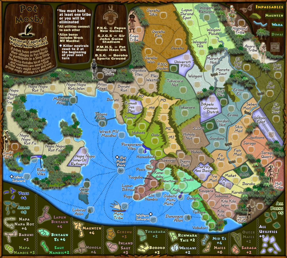
Napa Napa Rot Faiv
Napa Napa InterOil Refinery
Bigpela Gavman District
Danuagua Ailan
Murray Army Basis
Gabatu Mata Mata
Poreporeno Viles
Laptaun Biktaun
I think to alter these altogether is like asking someone to rename the Ben Franklin Bridge from your Philadelphia map.
You see, i think in making these maps we owe it to culture to stick to the names given on map as much as possible, even if there is a small creative license involved.
* Pearl Harbour * Waterloo * Forbidden City * Jamaica * Pot Mosbi
Re: Classic Cities :Pot Mosbi [16.4.12] V13-P13 - GFX?
What else needs attending to on this graphics wise?
* Pearl Harbour * Waterloo * Forbidden City * Jamaica * Pot Mosbi
Re: Classic Cities :Pot Mosbi [16.4.12] V13-P13 - GFX?
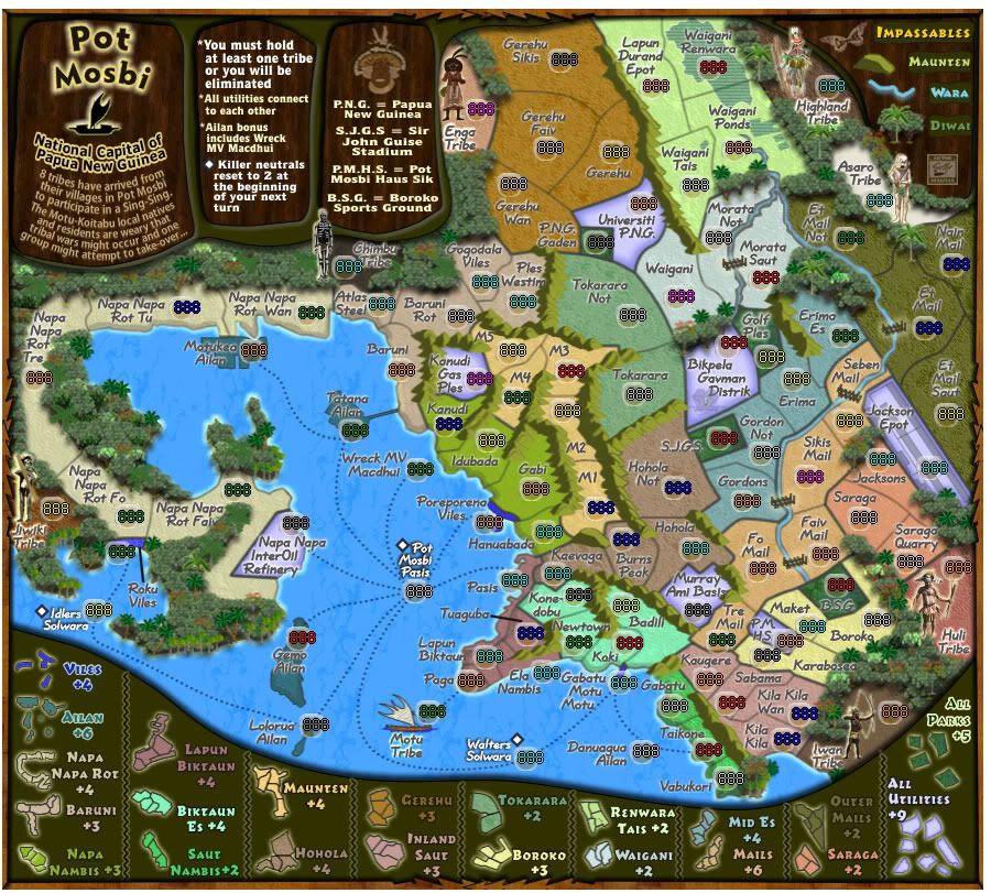
I believe this is getting really close, so stickied for now! Can you please update the OP with the color blind check and version with 888's.
Re: Classic Cities :Pot Mosbi [16.4.12] V13-P13 - GFX?
isaish40isaiah40 wrote:I believe this is getting really close, so stickied for now! Can you please update the OP with the color blind check and version with 888's.
OP has latest version with CB checks.
Here is the 888s worked from a very basic xml.
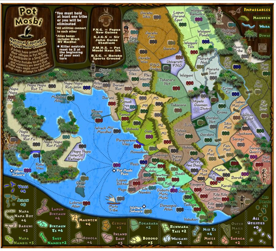
Version 14 with changes made to Napa Napa Rot names
* Pearl Harbour * Waterloo * Forbidden City * Jamaica * Pot Mosbi

Re: Classic Cities :Pot Mosbi [29.4.12] V14-P13 - GFX?
Golf ples or plas is hard to read
nappa nappa whatever tree is covered by the numbers
enga tribe all kind of blurs together...maybe consider extending the 'pinkish background more behind the text there so it isn't trees. This could solve that issue
Looks good otherwise. it is a big map to take in just initial impression wise.
nappa nappa whatever tree is covered by the numbers
enga tribe all kind of blurs together...maybe consider extending the 'pinkish background more behind the text there so it isn't trees. This could solve that issue
Looks good otherwise. it is a big map to take in just initial impression wise.
Re: Classic Cities :Pot Mosbi [29.4.12] V14-P13 - GFX?
Jippd...fantastic feedback...thank you for dropping and giving your thoughts.
I will see what i can do to improve those aspects.
I will see what i can do to improve those aspects.
* Pearl Harbour * Waterloo * Forbidden City * Jamaica * Pot Mosbi
-
Nola_Lifer
- Posts: 819
- Joined: Mon Oct 13, 2008 4:46 pm
- Location: 雪山
- Contact:
Re: Classic Cities :Pot Mosbi [29.4.12] V14-P13 - GFX?
In your legend All Parks looks blurry and the "s" on the Parks is sitting on your border. Only other thing B.S.G. could use a little darkening. Can't wait to play this one 

Re: Classic Cities :Pot Mosbi [29.4.12] V14-P13 - GFX?
Slightly agree with the tree's looking blurry. I feel the palm trees are more 'crisp' looking then the other trees.
Bikpela Gavman Distrik - consider moving Distrik slightly to the left so the 'k' is not on the border
Consider the same things I said about Enga tribe overlaying on the trees with the other tribes as well ( jiwiki / jimbu / highland / the I and W in Iwan )
Can you sharpen the images of the characters next to each tribe too? So they stand out more/look slightly more detailed?
There is no line between lapun biktur and tuaguba....should there be?
Also I have a slight difficulty with continuity in the legend in the bottom that depicts region bonus'. Take Tokarara for an example. Similar? Yes...Exactly proportionate? No....Is there a way you can cut and paste the resize the territory without the names from the map to the legend? This way the exact region bonus shapes are the same as in the legend which will increase the ease of reading the legend.
I seem to not be able to understand what a utility is and what a parka is...I see they each have a bonus for holding all of them and that all utilities connect, but don't know what a utility or a parka is by looking at the map. Clue me in?
Re: Classic Cities :Pot Mosbi [29.4.12] V14-P13 - GFX?
Parks...fixed.Nola_Lifer wrote:In your legend All Parks looks blurry and the "s" on the Parks is sitting on your border. Only other thing B.S.G. could use a little darkening. Can't wait to play this one
B.S.G.... do youy mean lightening?
the map is done in Fireworks and imported to Coreldraw for text and legend.Jippd wrote:Slightly agree with the tree's looking blurry. I feel the palm trees are more 'crisp' looking then the other trees.
Next Version. the image has adaptaive unsharpening applied
DoneBikpela Gavman Distrik - consider moving Distrik slightly to the left so the 'k' is not on the border
the tribe images are being re-done..so this will be attended to.Consider the same things I said about Enga tribe overlaying on the trees with the other tribes as well ( jiwiki / jimbu / highland / the I and W in Iwan )
i take it you mean text here..if so, doneCan you sharpen the images of the characters next to each tribe too? So they stand out more/look slightly more detailed?
there is, but it is covered on what you see...next version fixed.There is no line between lapun biktur and tuaguba....should there be?
this method has already been applied, but because of space limitations in some parts of the legend some scaling is not always equal. I will try to improve this.Also I have a slight difficulty with continuity in the legend in the bottom that depicts region bonus'. Take Tokarara for an example. Similar? Yes...Exactly proportionate? No....Is there a way you can cut and paste the resize the territory without the names from the map to the legend? This way the exact region bonus shapes are the same as in the legend which will increase the ease of reading the legend.
Ah...do you have utilities in the US? You know - water, gas, electric, telephone...well appliy that principle here and you have the purple territories as utilities (unless you are CB)I seem to not be able to understand what a utility is and what a parka is...I see they each have a bonus for holding all of them and that all utilities connect, but don't know what a utility or a parka is by looking at the map. Clue me in?
Can you not see the parks are dark green?
* Pearl Harbour * Waterloo * Forbidden City * Jamaica * Pot Mosbi
Re: Classic Cities :Pot Mosbi [29.4.12] V14-P13 - GFX?
We do have utilities here. I understand it now. Looking at the description for utilities I was confused because they look white in the legend and more blue on the map itself.
I also feel the textures underlaid on jackson epo and the distrik make the utilities look less uniform which may add to confusion for people looking at the map and trying to figure out what is what.
I also feel the textures underlaid on jackson epo and the distrik make the utilities look less uniform which may add to confusion for people looking at the map and trying to figure out what is what.
-
AndyDufresne

- Posts: 24919
- Joined: Fri Mar 03, 2006 8:22 pm
- Location: A Banana Palm in Zihuatanejo
- Contact:
Re: Classic Cities :Pot Mosbi [29.4.12] V14-P13 - GFX?
I can see where Jippd is coming from, in regards to how utilities look on the map vs the legend, etc.Jippd wrote:We do have utilities here. I understand it now. Looking at the description for utilities I was confused because they look white in the legend and more blue on the map itself.
I also feel the textures underlaid on jackson epo and the distrik make the utilities look less uniform which may add to confusion for people looking at the map and trying to figure out what is what.
--Andy
Re: Classic Cities :Pot Mosbi [29.4.12] V14-P13 - GFX?
^^^ Agreed, there is slight colour variation, but surely they all look purple...not blue?
Also, since they are completely seperated in the map, it is not possible to put them all together like the other continents.
Unfortunately, i cannot think of another way of displaying them graphically.
I will however, change the colour to make it more uniform.
i'm not in favour of removing the underlying textures from the airport or government district, particularly the later.
* Pearl Harbour * Waterloo * Forbidden City * Jamaica * Pot Mosbi
-
AndyDufresne
- Posts: 24919
- Joined: Fri Mar 03, 2006 8:22 pm
- Location: A Banana Palm in Zihuatanejo
- Contact:
Re: Classic Cities :Pot Mosbi [29.4.12] V14-P13 - GFX?
You could do more of the cross-hatching / stitching you have on the map for the Parks, and apply something similar to the Utilities, and then in the legend show the cross-hatching.
Since they are semi-special regions in a semi-special bonus (not continuous, etc) it could make sense to have a little more differentiation.
Best,
--Andy
Since they are semi-special regions in a semi-special bonus (not continuous, etc) it could make sense to have a little more differentiation.
Best,
--Andy

Re: Classic Cities :Pot Mosbi [29.4.12] V14-P13 - GFX?
Ooh! 
Wasn't expecting that yet...am still in the process of sorting out natives images, moving trees and some stuff that is mentioned above. --ee--
thanks anyways RBO, but didn't like the kiddo bit...i'm a bit older than that
Wasn't expecting that yet...am still in the process of sorting out natives images, moving trees and some stuff that is mentioned above. --ee--
thanks anyways RBO, but didn't like the kiddo bit...i'm a bit older than that
* Pearl Harbour * Waterloo * Forbidden City * Jamaica * Pot Mosbi
Re: Classic Cities :Pot Mosbi [29.4.12] V14-P13 - GFX?
me too... get that stuff all setup and you're fine.
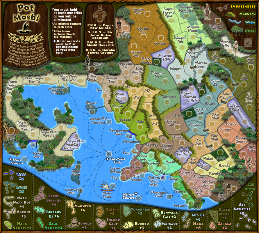
Re: Classic Cities :Pot Mosbi [5.5.12] V15-P15 - Small & Lge
Version 15
I hope this addresses all the issues raised above.
I've tried for different background/more disctinct patterns on the parks and utitlities...and to be honest it looked like crap and i wasn't happy with it. I think the map is already busy enough with the text, so i went for a subtler pattern on the parks and left the utilities as are.
the tribes are finished being re-done, and various names have been moved etc, also lots of trees felled to make things clearer.
And this is the large at 1000 x 897
Version 15 - 888s
I hope this addresses all the issues raised above.
I've tried for different background/more disctinct patterns on the parks and utitlities...and to be honest it looked like crap and i wasn't happy with it. I think the map is already busy enough with the text, so i went for a subtler pattern on the parks and left the utilities as are.
the tribes are finished being re-done, and various names have been moved etc, also lots of trees felled to make things clearer.
And this is the large at 1000 x 897
- Click image to enlarge.
* Pearl Harbour * Waterloo * Forbidden City * Jamaica * Pot Mosbi
Re: Classic Cities :Pot Mosbi [5.5.12] V15-P15 Small & Lge
Sully, here is the basic xml file for you to work on.
- Attachments
-
- PotMosbi1.xml
- (34.36 KiB) Downloaded 711 times
* Pearl Harbour * Waterloo * Forbidden City * Jamaica * Pot Mosbi
-
Victor Sullivan

- Posts: 6010
- Joined: Mon Feb 08, 2010 8:17 pm
- Gender: Male
- Location: Columbus, OH
- Contact:
Re: Classic Cities :Pot Mosbi [5.5.12] V15-P15 Small & Lge
I'm on the case!

-Sully
-Sully
Beckytheblondie: "Don't give us the dispatch, give us a mustache ride."
Scaling back on my CC involvement...
Scaling back on my CC involvement...
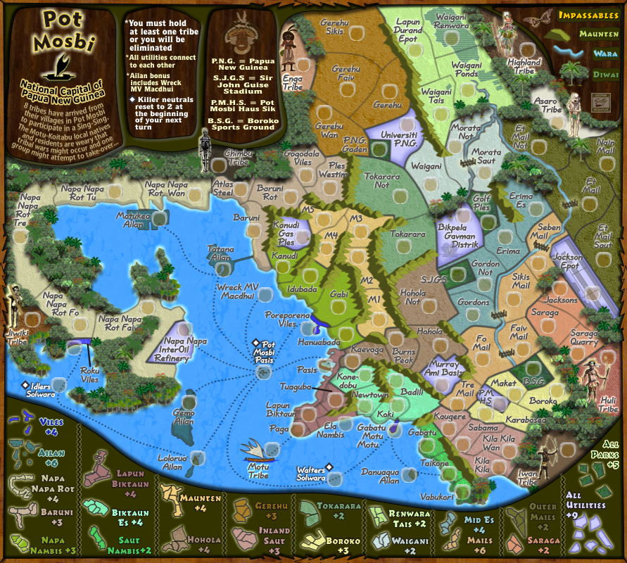
Re: Classic Cities :Pot Mosbi [5.5.12] V15-P15 Small & Lge
Tribes are much clearer to read. Nice work
As for the utilities I definitely see an improvement but if you can tweak the shading on the minimap(legend) of the utilities to have them shaded more or more of a purple hue it would be better I think.
I think the problem is that the fade with purple border fading to a white on the regular map the purple stands out more so it looks purple. This may because the image is bigger in size or the border is thick. Or the actual purples used may be different. When looking at it in the legend though it does not look the same shade to me. I'm guessing because the fade is not as noticable/the purple border is not as pronounced/wide in the minimap/legend.
They are close, but don't look exact to me.
Though I can't tell if it is blue or purple though so who knows!
Re: Classic Cities :Pot Mosbi [5.5.12] V15-P15 Small & Lge
^^ Jippd...is something like this going to work for you.Jippd wrote:Tribes are much clearer to read. Nice work
As for the utilities I definitely see an improvement but if you can tweak the shading on the minimap(legend) of the utilities to have them shaded more or more of a purple hue it would be better I think.
I think the problem is that the fade with purple border fading to a white on the regular map the purple stands out more so it looks purple. This may because the image is bigger in size or the border is thick. Or the actual purples used may be different. When looking at it in the legend though it does not look the same shade to me. I'm guessing because the fade is not as noticable/the purple border is not as pronounced/wide in the minimap/legend.
They are close, but don't look exact to me.
Though I can't tell if it is blue or purple though so who knows!

* Pearl Harbour * Waterloo * Forbidden City * Jamaica * Pot Mosbi