Egypt: Valley Of The Kings [Quenched]
Moderator: Cartographers
Forum rules
Please read the Community Guidelines before posting.
Please read the Community Guidelines before posting.

I think it would be cool if the after life was one way, meaning you can't attack out of it. otherwise its like people coming back from the dead. i think it would pretty sweet if in order to get the glyph bonus you had to send a ton of armies into the after life to get and hold it, but you would be condemning those armies to death,er, the after life. Isn't what many ancient kings did? they were buried along with their armies or horses. just an idea.

mibi wrote:I think it would be cool if the after life was one way, meaning you can't attack out of it. otherwise its like people coming back from the dead. i think it would pretty sweet if in order to get the glyph bonus you had to send a ton of armies into the after life to get and hold it, but you would be condemning those armies to death,er, the after life. Isn't what many ancient kings did? they were buried along with their armies or horses. just an idea.
 Mibi...I have to say that when I started this map, it was started because there appeared to have been no-one who had taken up the Ancient Egypt challenge. I new this would be a difficult taks to use the concept of the scarab beetles from "The Mummy", the idea of the Aterlife having bonuses, and the concept of having to attack the tomb robbers in order to ravage another tomb/pharoah, i.e. conquer neighbouring territory and grow your Region.
I must say that with all the creative minds in The Foundary, I am elated at the ideas that are being expressed to develop this map. You guys are just amazing. Many thanks, and yes, the idea expressed above is fantastic. It is indeed what happened when a Pharoah died.
Although it is Hollowyood at its finest, The Mummy is the perfect expression of this.

* Pearl Harbour * Waterloo * Forbidden City * Jamaica * Pot Mosbi

Re: VOK - V2 update
A good update indeed, why so low army bonusses?cairnswk wrote:

Overall:
as I said, small bonusses for tombs, as people won't always get that they get more when holding a section of tombs + some glyphs.
Perhaps arrange the glyphs from important to less? Like this (in a circilure fashion offcourse):
Code: Select all
Sa - Ankh - Leb
Maat - Ka - Pshent
Amente - StaffsTombs A:
Good
Tombs B:
Good
Tombs C:
Move "Merenptah" to the left.
Move king Tut up (geez, names and pharaos).
Move "Ramses V & VI" up.
Tombs D:
Good
Tombs E:
some of the names are hard to read (Twosret, Tia, ...)
Nice work
Emperor of the Benelux
Founder of the Commonwealth of Planets
Founder and CEO of JF
Founder of the Commonwealth of Planets
Founder and CEO of JF
Re: VOK - V2 update
No, the pharoahs held a staff and flail...so i simply called them staffs. IN V3 they are out anyway.onbekende wrote: isn't there a better name for "Staffs"?
Also, the bonuses are still being worked out, they may increase in future versions depending on how convincing people are.
Fixed I believe.some of the names are hard to read (Twosret, Tia, ...)
Thanks!Nice work

* Pearl Harbour * Waterloo * Forbidden City * Jamaica * Pot Mosbi
Sunday Apr 22 V3 Update
Well, here is new update with some requests:
* Afterlife glyphs dropped to five with new bonuses points.
* Region colours changed to more "Egypitian" colours
* smoothing of territories
* reqorkm of legend
I tried very hard to get the afterlife in the middle of the regions, but it simply won't work if the pathways are to be kept in this same fashion, which I think is imperitive to the overall map.
Hope you enjoy! I'm sure there'll be plenty of feedback from this one.

* Afterlife glyphs dropped to five with new bonuses points.
* Region colours changed to more "Egypitian" colours
* smoothing of territories
* reqorkm of legend
I tried very hard to get the afterlife in the middle of the regions, but it simply won't work if the pathways are to be kept in this same fashion, which I think is imperitive to the overall map.
Hope you enjoy! I'm sure there'll be plenty of feedback from this one.
* Pearl Harbour * Waterloo * Forbidden City * Jamaica * Pot Mosbi
Re: Sunday Apr 22 V3 Update
very nicely done, perhaps but Ankh on top, left Sa and right Leb, bottom left Pshent, bottom right Amentecairnswk wrote:
Ansle, "Tutankhamun" and " Ramessess IV & V" need to be reaalighend with there tombs (and iV => IV)
some look bolded? or is that me?
also those diagonal in C, allign them so they are all the same diagonal, now they look strange
Ramesses X1? (top right)
sorry I didn't use my form, forgot
Emperor of the Benelux
Founder of the Commonwealth of Planets
Founder and CEO of JF
Founder of the Commonwealth of Planets
Founder and CEO of JF
-
WidowMakers
- Posts: 2775
- Joined: Mon Nov 20, 2006 9:25 am
- Gender: Male
- Location: Detroit, MI
I read through the posts and this map has come a long way in a short time. I like it. I do have a couple questions:
Are you going to make Soul 1-way. I agree that armies should go to the afterlife and not come back. If this is going to be implemented then the legend needs to be changed and explain this.
And second, how many territories do you have?. I counted 46. 48 seems to be the best number in this area due to the fact that it is leaves the least neutral armies for 3,4,5 and 6 player games.
Plus I just noticed the horizontal stripes going through the tomb territories. Those might interfere with the army numbers legibility. I don't know but maybe. Could we get a next pic with armies?
Great Work.
Are you going to make Soul 1-way. I agree that armies should go to the afterlife and not come back. If this is going to be implemented then the legend needs to be changed and explain this.
And second, how many territories do you have?. I counted 46. 48 seems to be the best number in this area due to the fact that it is leaves the least neutral armies for 3,4,5 and 6 player games.
Plus I just noticed the horizontal stripes going through the tomb territories. Those might interfere with the army numbers legibility. I don't know but maybe. Could we get a next pic with armies?
Great Work.

-
DiM

- Posts: 10415
- Joined: Wed Feb 14, 2007 6:20 pm
- Gender: Male
- Location: making maps for scooby snacks
nice going. good updates. the gameplay is definitely better now thanks to the new bonus system and the scarab attacking other scarabs. i like the soul as a one way path it a really nice idea. BUT there's a huge problem.
what if a guy gets 2-4 terits in the afterlife circle and by the time his turn comes all his other terits are gone. this means he'll be stuck in the afterlife circle without anything to do about it. the chances of this happening aren't so slim as you might think. especially in a team game, my first move would be to coordinate my team to ensure he leoses all the terits and is stuck in the afterlife.
also do the tomb bonuses legend like the afterlife legend. so lose the black square. the colours of the tombs in the legend can be represented by small gradient lines under the text (like san francisco map).
also the legend must have an egyptian style. either make the text like it's written on papyrus or like it is on stone. either one is fine.
also i'd imagine a valley of the kings with very bland colours manly predominant in tones of yellow and brown and a few traces of pale paint that's been eaten by time.
what if a guy gets 2-4 terits in the afterlife circle and by the time his turn comes all his other terits are gone. this means he'll be stuck in the afterlife circle without anything to do about it. the chances of this happening aren't so slim as you might think. especially in a team game, my first move would be to coordinate my team to ensure he leoses all the terits and is stuck in the afterlife.
also do the tomb bonuses legend like the afterlife legend. so lose the black square. the colours of the tombs in the legend can be represented by small gradient lines under the text (like san francisco map).
also the legend must have an egyptian style. either make the text like it's written on papyrus or like it is on stone. either one is fine.
also i'd imagine a valley of the kings with very bland colours manly predominant in tones of yellow and brown and a few traces of pale paint that's been eaten by time.
“In the beginning God said, the four-dimensional divergence of an antisymmetric, second rank tensor equals zero, and there was light, and it was good. And on the seventh day he rested.”- Michio Kaku
Here is V4 update.
This has:
* Onbekende: fixed some allignments of names athough not sure what you meant by the diagonal in C; the re-arrangement of the afterlife bonuses will happen soon, maybe next version.
* WidowMakers: army numbers on white background; territory numbers I'll fix next post
* DiM: to alleviate the problem of getting stuck in the Afterlife, I have changed gameplay so that now one enters the afterlife through the Underworld (not the Soul - which is how it is supposed to be), and can leave the Afterlife through the Underworld. You must hold a Scarab to enter the Underworld. If you have an Afterlife territory, and you want ot fortify a tomb or robber, then you have to attack the Underworld first, and then you can attach anyone.
* DiM: The legend now sits on a background of onyx, I think this looks better allround. Colours and dropping that bonuses inner cartouche I'll look at next update.

This has:
* Onbekende: fixed some allignments of names athough not sure what you meant by the diagonal in C; the re-arrangement of the afterlife bonuses will happen soon, maybe next version.
* WidowMakers: army numbers on white background; territory numbers I'll fix next post
* DiM: to alleviate the problem of getting stuck in the Afterlife, I have changed gameplay so that now one enters the afterlife through the Underworld (not the Soul - which is how it is supposed to be), and can leave the Afterlife through the Underworld. You must hold a Scarab to enter the Underworld. If you have an Afterlife territory, and you want ot fortify a tomb or robber, then you have to attack the Underworld first, and then you can attach anyone.
* DiM: The legend now sits on a background of onyx, I think this looks better allround. Colours and dropping that bonuses inner cartouche I'll look at next update.
* Pearl Harbour * Waterloo * Forbidden City * Jamaica * Pot Mosbi
Ramessess III, Amenmesse, Ramesses I and Seti I are placed siteways to makke them fit, but they are all ina different oriantation, one more horizontal then the other
for the rest everything looks spot on, whatever you make next, I would love it
for the rest everything looks spot on, whatever you make next, I would love it
Emperor of the Benelux
Founder of the Commonwealth of Planets
Founder and CEO of JF
Founder of the Commonwealth of Planets
Founder and CEO of JF
Thanks onbedenke.onbekende wrote:Ramessess III, Amenmesse, Ramesses I and Seti I are placed siteways to makke them fit, but they are all ina different oriantation, one more horizontal then the other
for the rest everything looks spot on, whatever you make next, I would love it
Now i understand, i'll finx that next map version.* Pearl Harbour * Waterloo * Forbidden City * Jamaica * Pot Mosbi

colours are mch better maybe a little higher saturation for the green continent?
in fact, actually, hmm. right now the scarabs look out of place, but the colours could be changed to help them blend more- the egyptions were actually sum of the first to use very bright colours, including the first synthetic colours. the pharoh heads look a little out of place- maybe you could pick up the colours in both the scarabs and the heads.
sorry im in a hurry- ill see if i can find an example in a little bit.
maybe a little higher saturation for the green continent?in fact, actually, hmm. right now the scarabs look out of place, but the colours could be changed to help them blend more- the egyptions were actually sum of the first to use very bright colours, including the first synthetic colours. the pharoh heads look a little out of place- maybe you could pick up the colours in both the scarabs and the heads.
sorry im in a hurry- ill see if i can find an example in a little bit.
Do you need an excuse to have a war? I mean, who for? Can't you just say "You got lots of cash and land, but I've got a big sword, so divy up right now, chop chop."
Terry Pratchet
Terry Pratchet
ok. sorry for not being clear.
what i was trying to say is that right now you have colours from several different schemes mixed in the map, and i dont think they portray the egyptian theme you're going for. im not sure where the striped pharohs are coming from, but to me they seem to make the map busy, and are too... tropically coloured lol. the pharohs used colour to a great extent, but the shades were mostly deep and rich. think crayola (if you have that company in aussie lol) bold

this site also helps: http://africanhistory.about.com/od/egyp ... Colour.htm
in my opinion this map needs to portray heat and wealth, and i think these rich colours do that.
(another reason is that dull and light colours are very popular on many maps. the bold colours rarely get used because they are deemed too dark to see the army numbers against. you could make another very unique map if you could use them without getting smacked down. )
)
what i was trying to say is that right now you have colours from several different schemes mixed in the map, and i dont think they portray the egyptian theme you're going for. im not sure where the striped pharohs are coming from, but to me they seem to make the map busy, and are too... tropically coloured lol. the pharohs used colour to a great extent, but the shades were mostly deep and rich. think crayola (if you have that company in aussie lol) bold
this site also helps: http://africanhistory.about.com/od/egyp ... Colour.htm
in my opinion this map needs to portray heat and wealth, and i think these rich colours do that.
(another reason is that dull and light colours are very popular on many maps. the bold colours rarely get used because they are deemed too dark to see the army numbers against. you could make another very unique map if you could use them without getting smacked down.
)Do you need an excuse to have a war? I mean, who for? Can't you just say "You got lots of cash and land, but I've got a big sword, so divy up right now, chop chop."
Terry Pratchet
Terry Pratchet
another thought- font suggestions. the one you have is ok, but theres nothing special about it. remember, hieroglyphics were made with a reed stylus, not with a brush.
the problem, of course, is finding something readable on a small scale...
some ideas, but by no means absolute:
http://www.dafont.com/pirho-herakles.font
http://www.dafont.com/elektra.font
http://www.dafont.com/justinian.font
http://www.dafont.com/satyr.font
http://www.dafont.com/mcapitals.font
http://www.dafont.com/rezland.font
http://www.dafont.com/rippen.font
the problem, of course, is finding something readable on a small scale...
some ideas, but by no means absolute:
http://www.dafont.com/pirho-herakles.font
http://www.dafont.com/elektra.font
http://www.dafont.com/justinian.font
http://www.dafont.com/satyr.font
http://www.dafont.com/mcapitals.font
http://www.dafont.com/rezland.font
http://www.dafont.com/rippen.font
Do you need an excuse to have a war? I mean, who for? Can't you just say "You got lots of cash and land, but I've got a big sword, so divy up right now, chop chop."
Terry Pratchet
Terry Pratchet
-
DiM
- Posts: 10415
- Joined: Wed Feb 14, 2007 6:20 pm
- Gender: Male
- Location: making maps for scooby snacks
also make the afterlife bonuses rectangle be as a part of the actual bonuses rectangle. just as you have the tomb bonuses. title and content in the same rectangle.cairnswk wrote: * DiM: to alleviate the problem of getting stuck in the Afterlife, I have changed gameplay so that now one enters the afterlife through the Underworld (not the Soul - which is how it is supposed to be), and can leave the Afterlife through the Underworld. You must hold a Scarab to enter the Underworld. If you have an Afterlife territory, and you want ot fortify a tomb or robber, then you have to attack the Underworld first, and then you can attach anyone.
* DiM: The legend now sits on a background of onyx, I think this looks better allround. Colours and dropping that bonuses inner cartouche I'll look at next update.
also maybe try and do the stone with some rough edges like it's been eaten by time. and make the text like it's carved into the rock.
something like this
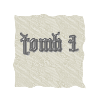
edit// pharaoh in the legend is spelt wrong
“In the beginning God said, the four-dimensional divergence of an antisymmetric, second rank tensor equals zero, and there was light, and it was good. And on the seventh day he rested.”- Michio Kaku
-
DiM
- Posts: 10415
- Joined: Wed Feb 14, 2007 6:20 pm
- Gender: Male
- Location: making maps for scooby snacks
use this font people will deffinitely undeerstand everything
http://www.dafont.com/pharaoh-glyph.font
PS: enigma's fonts look greek not egyptian.
edit// also try to make the title more... umm.... egyptian. maybe make the writting as slabs of rock with hieroglyphs on them, or maybe some papyrus rolls
http://www.dafont.com/pharaoh-glyph.font
PS: enigma's fonts look greek not egyptian.
edit// also try to make the title more... umm.... egyptian. maybe make the writting as slabs of rock with hieroglyphs on them, or maybe some papyrus rolls
“In the beginning God said, the four-dimensional divergence of an antisymmetric, second rank tensor equals zero, and there was light, and it was good. And on the seventh day he rested.”- Michio Kaku
DiM...U funny man....u do try, don't UDiM wrote:use this font people will deffinitely undeerstand everything
http://www.dafont.com/pharaoh-glyph.font

* Pearl Harbour * Waterloo * Forbidden City * Jamaica * Pot Mosbi
yes, i know, many of them are greek lol. but i think they pick up the same idea of combining many straight lines with pure curves, while still being very legible. h/e, the last couple arent greek- something like one of those might be better.DiM wrote: PS: enigma's fonts look greek not egyptian.
Do you need an excuse to have a war? I mean, who for? Can't you just say "You got lots of cash and land, but I've got a big sword, so divy up right now, chop chop."
Terry Pratchet
Terry Pratchet
Hi All, its been a short while since I've been in contact, please be aware that I have read the suggestions, and am working to implement new fonts, colour schemes as per you suggestions.
This may take some time as I am using the links you gave to give some good research to these suggestions. Thanks awfully, and a new version will appear soon.
This may take some time as I am using the links you gave to give some good research to these suggestions. Thanks awfully, and a new version will appear soon.
* Pearl Harbour * Waterloo * Forbidden City * Jamaica * Pot Mosbi
V5 update - redesign using colours and fonts suggested.
Enigma, I visited all those fonts you suiggested and went looking for others only to find I had the Papyrus font on my computer all along, which is the one used on the King (not Pharaohs anymore as that term was a greek term from my research) names, Matisse ITC is used in the title and the Afterlife title.
I also visisted the Egyption colours site, and have all those colours in this map, with the main theme obviously blue and yellows representing the radiance of RA fading into the Afterlife darkness of indigo and black. The stars used in the background of the blue are representative of the stars that decorated the tombs and whilst the Afterlife star is not the same style of star as used in heiroglyphs, i was unable to fit that star into the theme but used in in the background stars.
The colours in the Afterlife represent blood and silver/white represents purity etc.
I have changed all the masks representing king territoires to yellow and blue and alos userd that colour scheme on the font colours to reverse the schemata style.
DiM, I deliberately stayed away from the stone style because I felt this theme using stars etc was better for the theme of the Afterlife.
Onbedenke, I changed the angle of those tomb names.
Hope you llike this one. Lots of thought went into it to get some theme happening and using those fonts and colours suggestions.

I also visisted the Egyption colours site, and have all those colours in this map, with the main theme obviously blue and yellows representing the radiance of RA fading into the Afterlife darkness of indigo and black. The stars used in the background of the blue are representative of the stars that decorated the tombs and whilst the Afterlife star is not the same style of star as used in heiroglyphs, i was unable to fit that star into the theme but used in in the background stars.
The colours in the Afterlife represent blood and silver/white represents purity etc.
I have changed all the masks representing king territoires to yellow and blue and alos userd that colour scheme on the font colours to reverse the schemata style.
DiM, I deliberately stayed away from the stone style because I felt this theme using stars etc was better for the theme of the Afterlife.
Onbedenke, I changed the angle of those tomb names.
Hope you llike this one. Lots of thought went into it to get some theme happening and using those fonts and colours suggestions.
* Pearl Harbour * Waterloo * Forbidden City * Jamaica * Pot Mosbi
-
freezie
- Posts: 3901
- Joined: Fri Apr 06, 2007 12:18 pm
- Gender: Male
- Location: Somewhere between here and there.
Little change I would suggest, the ''b'' in the afterlife bonuses is quite hard to read. Easy to guess, but it needs to be clear.
I am also a bit reticent on the underworld beeing able to attack anyone. It would be easy to only hold a single tomb+the afterlife bonus, massing the armies there AND on the underworld to have the game in hand easily. No one will be able to hold anything if you have the underworld.
I sugest they should border the scarabs and afterlife bonuses only, it makes everything too hard to hold.
I am also a bit reticent on the underworld beeing able to attack anyone. It would be easy to only hold a single tomb+the afterlife bonus, massing the armies there AND on the underworld to have the game in hand easily. No one will be able to hold anything if you have the underworld.
I sugest they should border the scarabs and afterlife bonuses only, it makes everything too hard to hold.

-
DiM
- Posts: 10415
- Joined: Wed Feb 14, 2007 6:20 pm
- Gender: Male
- Location: making maps for scooby snacks
i like the stars theme. but some names are hard to read (rameses VII).
also you currently have 4 fonts on the map. i think that's a tad too much. i like consistency. maybe reduce to only 2 fonts.
also regarding the legend consistency.
the afterlife bonuses title is in a rectangle and the actual bonuses are in another rectangle. for consistency reasons do them like the tomb bonuses.
also. is this the large or the small version? if it is the large you're gonna have much trouble with the readability of the text in the small one.
PS: underworld attacking everyone is bad. make it only scarabs
also you currently have 4 fonts on the map. i think that's a tad too much. i like consistency. maybe reduce to only 2 fonts.
also regarding the legend consistency.
the afterlife bonuses title is in a rectangle and the actual bonuses are in another rectangle. for consistency reasons do them like the tomb bonuses.
also. is this the large or the small version? if it is the large you're gonna have much trouble with the readability of the text in the small one.
PS: underworld attacking everyone is bad. make it only scarabs
“In the beginning God said, the four-dimensional divergence of an antisymmetric, second rank tensor equals zero, and there was light, and it was good. And on the seventh day he rested.”- Michio Kaku
the stars theme is brilliant
ditto dim, cant read ramesses vii
maybe bring more red tones into the map via the scarabs, since they are the connectin to the afterlife
i totally forgot about the papyrus font. it looks very egyptian- it just seems a little crowded. however as dim can tell you i pretty much always like very simple fonts, so if others dont have a problem ignore me.
the bonuses font doesnt match the rest of the map, not consistent.
i agree with freezie about the underworld being able to attack everyone- sounds like a major inbalance.
the 1st 2 instructions in the legend are obvious- it is always possible to attack adjacent territories unless there are impassables.
the 4th instruction is somewhat ambiguous, theres probably a better way of wording it but im not sure what it is.
if at all possible i think it would be better to put all the "robber" labels in their respective territories, which may mean adjusting some territory shapes. it would help to differentiate between the robbers and the tombs.
wheres cleopatra?
im not sure how you picked which tombs should be connected to scarabs but it may be good to connect them to famous and/or very important pharohs/kings. for example tutankhamun and hatshepsut.
title needs work
the underworld circle not being centered is annoying, though i know ur trying to fit in the symbol.
you have 2 different versions of the tomb icons, which is nice- but keep all the tombs in a single continent the same version. for example ramesses xi.
make sure words and lines are clearly distinguishable from their backgrounds.
ok cant think of nething else right now
ditto dim, cant read ramesses vii
maybe bring more red tones into the map via the scarabs, since they are the connectin to the afterlife
i totally forgot about the papyrus font. it looks very egyptian- it just seems a little crowded. however as dim can tell you i pretty much always like very simple fonts, so if others dont have a problem ignore me.
the bonuses font doesnt match the rest of the map, not consistent.
i agree with freezie about the underworld being able to attack everyone- sounds like a major inbalance.
the 1st 2 instructions in the legend are obvious- it is always possible to attack adjacent territories unless there are impassables.
the 4th instruction is somewhat ambiguous, theres probably a better way of wording it but im not sure what it is.
if at all possible i think it would be better to put all the "robber" labels in their respective territories, which may mean adjusting some territory shapes. it would help to differentiate between the robbers and the tombs.
wheres cleopatra?
im not sure how you picked which tombs should be connected to scarabs but it may be good to connect them to famous and/or very important pharohs/kings. for example tutankhamun and hatshepsut.
title needs work
the underworld circle not being centered is annoying, though i know ur trying to fit in the symbol.
you have 2 different versions of the tomb icons, which is nice- but keep all the tombs in a single continent the same version. for example ramesses xi.
make sure words and lines are clearly distinguishable from their backgrounds.
ok cant think of nething else right now
Do you need an excuse to have a war? I mean, who for? Can't you just say "You got lots of cash and land, but I've got a big sword, so divy up right now, chop chop."
Terry Pratchet
Terry Pratchet
Phew...I was a bit concerned that this wouldn't go over too well. I'm pleasedDiM wrote:i like the stars theme.
fixed in V6but some names are hard to read (rameses VII).
also you currently have 4 fonts on the map. i think that's a tad too much. i like consistency. maybe reduce to only 2 fonts.
also regarding the legend consistency.
the afterlife bonuses title is in a rectangle and the actual bonuses are in another rectangle. for consistency reasons do them like the tomb bonuses.
DiM, this is the small map. I prefer to work small then large.also. is this the large or the small version? if it is the large you're gonna have much trouble with the readability of the text in the small one.
OK, done, seeems a popular choice.PS: underworld attacking everyone is bad. make it only scarabs
Fixed.freezie wrote:Little change I would suggest, the ''b'' in the afterlife bonuses is quite hard to read. Easy to guess, but it needs to be clear.
amended, as above.I am also a bit reticent on the underworld beeing able to attack anyone. It would be easy to only hold a single tomb+the afterlife bonus, massing the armies there AND on the underworld to have the game in hand easily. No one will be able to hold anything if you have the underworld. I sugest they should border the scarabs and afterlife bonuses only, it makes everything too hard to hold.
* Pearl Harbour * Waterloo * Forbidden City * Jamaica * Pot Mosbi