Slovakia - V12 - Pg 1&14
Moderator: Cartographers
Forum rules
Please read the Community Guidelines before posting.
Please read the Community Guidelines before posting.
-
natty dread

- Posts: 12876
- Joined: Fri Feb 08, 2008 8:58 pm
- Location: just plain fucked
Re: Slovakia [22.01.12] - V5 - P1&5
My only concern is, the region borders are a bit hard to see at some places, mainly at the middle of the map where there's lots of things happening under them (the flag)... Maybe you could highlight them a bit more?

-
DiM

- Posts: 10415
- Joined: Wed Feb 14, 2007 6:20 pm
- Gender: Male
- Location: making maps for scooby snacks
Re: Slovakia [22.01.12] - V5 - P1&5
the borders will change. i'll make each continent have a continuous border and keep the dotted ones for the terits inside each continent.
“In the beginning God said, the four-dimensional divergence of an antisymmetric, second rank tensor equals zero, and there was light, and it was good. And on the seventh day he rested.”- Michio Kaku
-
thenobodies80

- Posts: 5401
- Joined: Wed Sep 05, 2007 4:30 am
- Gender: Male
- Location: Milan
Re: Slovakia [22.01.12] - V5 - P1&5
Now it's 24 regions so I changed back to sticky. 
Nobodies
Nobodies
-
DiM
- Posts: 10415
- Joined: Wed Feb 14, 2007 6:20 pm
- Gender: Male
- Location: making maps for scooby snacks
Re: Slovakia [22.01.12] - V5 - P1&5
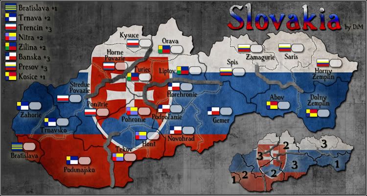
V6:
*made different borders for each province
*made a minimap
*moved the title.
*made different borders for each province
*made a minimap
*moved the title.
- Click image to enlarge.
“In the beginning God said, the four-dimensional divergence of an antisymmetric, second rank tensor equals zero, and there was light, and it was good. And on the seventh day he rested.”- Michio Kaku
-
natty dread
- Posts: 12876
- Joined: Fri Feb 08, 2008 8:58 pm
- Location: just plain fucked
Re: Slovakia [22.01.12] - V5 - P1&5
Couple of graphical things... firstly, the borders look good now. Also, I think the mountains could be a bit more visible at some places, maybe have them pop out a bit more or make them a bit lighter... but it's not a huge issue. The main issue I have is this...
The colourful flags that you use to denote bonuses (I guess they're some sort of regional flags/emblems/shields etc) are very fitting thematically, but from a purely aesthetic perspective - I don't think they fit on the map. At. All.
You have a really nice, stone-like, bleak, gothic feel on the map, with the grey background and the red-white-blue colour scheme, which overall has a cold feel to it... but then, all these warm, harlequinesque colours of the flags kinda ruin it.
I don't know the "right" solution here - anything you decide will have to be a compromise, IMO: either you sacrifice some thematic integrity or you sacrifice some visual appeal... a bad deal either way... but I think if you put your mind to it you can come up with a decent solution here.
The colourful flags that you use to denote bonuses (I guess they're some sort of regional flags/emblems/shields etc) are very fitting thematically, but from a purely aesthetic perspective - I don't think they fit on the map. At. All.
You have a really nice, stone-like, bleak, gothic feel on the map, with the grey background and the red-white-blue colour scheme, which overall has a cold feel to it... but then, all these warm, harlequinesque colours of the flags kinda ruin it.
I don't know the "right" solution here - anything you decide will have to be a compromise, IMO: either you sacrifice some thematic integrity or you sacrifice some visual appeal... a bad deal either way... but I think if you put your mind to it you can come up with a decent solution here.
-
DiM
- Posts: 10415
- Joined: Wed Feb 14, 2007 6:20 pm
- Gender: Male
- Location: making maps for scooby snacks
Re: Slovakia [22.01.12] - V5 - P1&5
goodnatty_dread wrote:Couple of graphical things... firstly, the borders look good now.
will donatty_dread wrote:Also, I think the mountains could be a bit more visible at some places, maybe have them pop out a bit more or make them a bit lighter... but it's not a huge issue. The main issue I have is this...
you're right. will fix now.natty_dread wrote:The colourful flags that you use to denote bonuses (I guess they're some sort of regional flags/emblems/shields etc) are very fitting thematically, but from a purely aesthetic perspective - I don't think they fit on the map. At. All.
You have a really nice, stone-like, bleak, gothic feel on the map, with the grey background and the red-white-blue colour scheme, which overall has a cold feel to it... but then, all these warm, harlequinesque colours of the flags kinda ruin it.
I don't know the "right" solution here - anything you decide will have to be a compromise, IMO: either you sacrifice some thematic integrity or you sacrifice some visual appeal... a bad deal either way... but I think if you put your mind to it you can come up with a decent solution here.
“In the beginning God said, the four-dimensional divergence of an antisymmetric, second rank tensor equals zero, and there was light, and it was good. And on the seventh day he rested.”- Michio Kaku
-
DiM
- Posts: 10415
- Joined: Wed Feb 14, 2007 6:20 pm
- Gender: Male
- Location: making maps for scooby snacks
Re: Slovakia [22.01.12] - V5 - P1&5
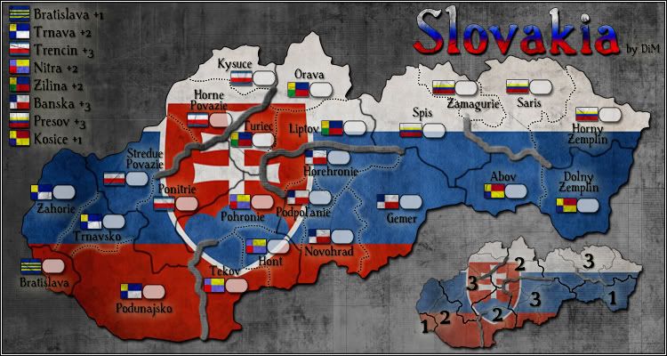
V7:
*made the mountains pop up more
*made grungier flags
*made the mountains pop up more
*made grungier flags
- Click image to enlarge.
“In the beginning God said, the four-dimensional divergence of an antisymmetric, second rank tensor equals zero, and there was light, and it was good. And on the seventh day he rested.”- Michio Kaku
-
natty dread
- Posts: 12876
- Joined: Fri Feb 08, 2008 8:58 pm
- Location: just plain fucked
Re: Slovakia [30.01.12] - V7 - P1&6
Well, that's a decent solution and it does look better. I still have a slight issue with the yellow colour, but that may just be because I hate yellow for some reason... 

Re: Slovakia [30.01.12] - V7 - P1&6
just one notice - impassables are rivers, not mountains...
but nice progres
Oneyed
but nice progres
Oneyed
-
DiM
- Posts: 10415
- Joined: Wed Feb 14, 2007 6:20 pm
- Gender: Male
- Location: making maps for scooby snacks
Re: Slovakia [30.01.12] - V7 - P1&6
thanks oneyed.Oneyed wrote:just one notice - impassables are rivers, not mountains...
but nice progres
Oneyed
PS: any chance of getting a stamp?

“In the beginning God said, the four-dimensional divergence of an antisymmetric, second rank tensor equals zero, and there was light, and it was good. And on the seventh day he rested.”- Michio Kaku
-
natty dread
- Posts: 12876
- Joined: Fri Feb 08, 2008 8:58 pm
- Location: just plain fucked
Re: Slovakia [30.01.12] - V7 - P1&6
Patience, young grasshopper...DiM wrote:PS: any chance of getting a stamp?
I'll put a good word in for you
About the yellow - I wonder if it'd be possible to adjust the yellow colour just a bit, to more of a cold yellow... Kind of like what's between yellow and lime? If you know what I mean... maybe that would fit better with the overall colour scheme? Might be worth a try...
-
DiM
- Posts: 10415
- Joined: Wed Feb 14, 2007 6:20 pm
- Gender: Male
- Location: making maps for scooby snacks
Re: Slovakia [30.01.12] - V7 - P1&6
that would mean messing with official flags. i'd rather not do it since this pretty much means some people will get pissed and complainnatty_dread wrote:Patience, young grasshopper...DiM wrote:PS: any chance of getting a stamp?
I'll put a good word in for you
About the yellow - I wonder if it'd be possible to adjust the yellow colour just a bit, to more of a cold yellow... Kind of like what's between yellow and lime? If you know what I mean... maybe that would fit better with the overall colour scheme? Might be worth a try...
“In the beginning God said, the four-dimensional divergence of an antisymmetric, second rank tensor equals zero, and there was light, and it was good. And on the seventh day he rested.”- Michio Kaku
-
natty dread
- Posts: 12876
- Joined: Fri Feb 08, 2008 8:58 pm
- Location: just plain fucked
Re: Slovakia [30.01.12] - V7 - P1&6
I wouldn't be messing as such. You'd just be adjusting the hue of the yellow a bit, it'd still be yellow - it could be compared to viewing the flag in a different lighting: it would still be the same flag, but the perception of it would be different.DiM wrote:that would mean messing with official flags. i'd rather not do it since this pretty much means some people will get pissed and complain


Re: Slovakia [30.01.12] - V7 - P1&6
I think the colours themselves are fine, but maybe if the flags were round instead of square they would be less visually jarring?DiM wrote:that would mean messing with official flags. i'd rather not do it since this pretty much means some people will get pissed and complainnatty_dread wrote:Patience, young grasshopper...DiM wrote:PS: any chance of getting a stamp?
I'll put a good word in for you
About the yellow - I wonder if it'd be possible to adjust the yellow colour just a bit, to more of a cold yellow... Kind of like what's between yellow and lime? If you know what I mean... maybe that would fit better with the overall colour scheme? Might be worth a try...

Just an idea.
“Life is a shipwreck, but we must not forget to sing in the lifeboats.”
― Voltaire
― Voltaire
Re: Slovakia [30.01.12] - V7 - P1&6
these are Czech military mark and flag...Dukasaur wrote:
Just an idea.
 Re: Slovakia [30.01.12] - V7 - P1&6
Here you go DiM!!

Re: Slovakia [30.01.12] - V7 - P1&6
I noticed it also for graphic change. I think rivers should look as rivers, not mountainsDiM wrote:thanks oneyed.Oneyed wrote:just one notice - impassables are rivers, not mountains...
but nice progres
Oneyed

congrat to stamp
Oneyed
Re: Slovakia [30.01.12] - V7 - P1&6
Why do you misinterpret everything I say?Oneyed wrote:these are Czech military mark and flag...Dukasaur wrote:
Just an idea.
I know the difference between a Czech flag and a Slovak flag; I was just using it for an example, not suggesting that he use those colours.
I was just showing how the round is less obtrusive than the square, even when colours are the same. DiM's problem was that the flags were too obtrusive. Natty suggested that he should make the colours muddier to make them stand out less. I was just offering a suggestion that instead of muddying the colours he could make the flags round instead of square.
“Life is a shipwreck, but we must not forget to sing in the lifeboats.”
― Voltaire
― Voltaire
Re: Slovakia [30.01.12] - V7 - P1&6
everything? sorry, but about what you are talking here?Dukasaur wrote: Why do you misinterpret everything I say?
ok. but then you should know how contestation is using something what reminds Czechoslovak flag for Slovak symbols...Dukasaur wrote: I know the difference between a Czech flag and a Slovak flag; I was just using it for an example, not suggesting that he use those colours.
flags used by DiM are official flags of regions. I agree that round looks better. maybe coat of arms would be a way...?Dukasaur wrote: I was just showing how the round is less obtrusive than the square, even when colours are the same. DiM's problem was that the flags were too obtrusive. Natty suggested that he should make the colours muddier to make them stand out less. I was just offering a suggestion that instead of muddying the colours he could make the flags round instead of square.
Oneyed
-
Victor Sullivan

- Posts: 6010
- Joined: Mon Feb 08, 2010 8:17 pm
- Gender: Male
- Location: Columbus, OH
- Contact:
Re: Slovakia [30.01.12] - V7 - P1&6
As far as bonuses go, for such a small map I don't think having a single-region bonus area is a good idea. Therefore, I think Bratislava should simply be +0. In addition, it has such a peripheral location and it only borders Trnava, so one could easily hold Trnava and Bratislava for a solid +3. Secondly, I think Presov should be lowered to +2. At first, it seems somewhat appropriate, given holding a bonus in a small map is a bit harder than it would be in a large map, however, Banska is also a 4-region bonus area and it is appropriately a +3. And, in a smaller map, smaller bonuses go further.
-Sully
Beckytheblondie: "Don't give us the dispatch, give us a mustache ride."
Scaling back on my CC involvement...
Scaling back on my CC involvement...
Re: Slovakia [30.01.12] - V7 - P1&6
DiM, for Banska in legend use Banska Bystrica or shortly B. Bystrica.
you do not use ˇ´ but in Podpoľanie you have ľ. so maybe you would use only l.
Oneyed
you do not use ˇ´ but in Podpoľanie you have ľ. so maybe you would use only l.
Oneyed

Re: Slovakia [30.01.12] - V7 - P1&6
You have mixed up the flags of Bratislava and Trnava. They should be the other way around.
And the region-divisions look pretty strange to me. What did you use for reference?
And the region-divisions look pretty strange to me. What did you use for reference?
Re: Slovakia [30.01.12] - V7 - P1&6
yes.tokle wrote:You have mixed up the flags of Bratislava and Trnava. They should be the other way around.
there are only 8 official regions in Slovakia. and there was a problem with too little regions for gameplay. regions used now are historical-cultural regions of Slovakia.tokle wrote: And the region-divisions look pretty strange to me. What did you use for reference?
bonuses are based on 8 official regions.
Oneyed
Re: Slovakia [30.01.12] - V7 - P1&6
Yes. I meant the bonus regions. They don't correspond to the borders of the regions as they are in reality.Oneyed wrote:there are only 8 official regions in Slovakia. and there was a problem with too little regions for gameplay. regions used now are historical-cultural regions of Slovakia.tokle wrote: And the region-divisions look pretty strange to me. What did you use for reference?
bonuses are based on 8 official regions.
Oneyed
-
DiM
- Posts: 10415
- Joined: Wed Feb 14, 2007 6:20 pm
- Gender: Male
- Location: making maps for scooby snacks
Re: Slovakia [30.01.12] - V7 - P1&6
tokle wrote:Yes. I meant the bonus regions. They don't correspond to the borders of the regions as they are in reality.Oneyed wrote:there are only 8 official regions in Slovakia. and there was a problem with too little regions for gameplay. regions used now are historical-cultural regions of Slovakia.tokle wrote: And the region-divisions look pretty strange to me. What did you use for reference?
bonuses are based on 8 official regions.
Oneyed
i did the territories according to this map:

if you have suggestions as to how i should do the bonus regions i'm wide open.
“In the beginning God said, the four-dimensional divergence of an antisymmetric, second rank tensor equals zero, and there was light, and it was good. And on the seventh day he rested.”- Michio Kaku