Yes please.cairnswk wrote:isaiah40, i can't in coreldraw with that particular font (no paragraph formatting). I'll have to import from another program.isaiah40 wrote:cairns, can you adjust the kerning on the title a tad?
what is your objective...do you want the letters spaced a bit more for better eye space?
Re: RAIL ASIA [1.11.12] QUENCHED
Moderator: Cartographers
Forum rules
Please read the Community Guidelines before posting.
Please read the Community Guidelines before posting.
Re: RAIL ASIA [22.1.12] V23-P19 Sml/Lge

Re: RAIL ASIA [22.1.12] V23-P19 Sml/Lge
Is this suitable? Space across each bar with a gap in the middle?isaiah40 wrote:Yes please.cairnswk wrote:isaiah40, i can't in coreldraw with that particular font (no paragraph formatting). I'll have to import from another program.isaiah40 wrote:cairns, can you adjust the kerning on the title a tad?
what is your objective...do you want the letters spaced a bit more for better eye space?


* Pearl Harbour * Waterloo * Forbidden City * Jamaica * Pot Mosbi
Re: RAIL ASIA [22.1.12] V23-P19 Sml/Lge
Looks good to me, now it looks as if the letters are actually attached to the bars!! Thank you!
Re: RAIL ASIA [22.1.12] V23-P19 Sml/Lge
my pleasureisaiah40 wrote:Looks good to me, now it looks as if the letters are actually attached to the bars!! Thank you!
* Pearl Harbour * Waterloo * Forbidden City * Jamaica * Pot Mosbi
-
koontz1973
- Posts: 6960
- Joined: Thu Jan 01, 2009 10:57 am
Re: Re: RAIL ASIA [22.1.12] V23-P19 Sml/Lge
I asked for that a couple of pages ago and you said no way. What made you change your mind?
But glad you did it. It does look nice.koontz1973 wrote:Either put each letter on a separate post so it looks like it has been attached. Something very simple.

Re: Re: RAIL ASIA [22.1.12] V23-P19 Sml/Lge
I'm sorry koontz1973....i was probably caught up in being obstinate with the whole change the font scenario, and didn't want to do it. My bad. Glad you like it though.koontz1973 wrote:I asked for that a couple of pages ago and you said no way. What made you change your mind?But glad you did it. It does look nice.koontz1973 wrote:Either put each letter on a separate post so it looks like it has been attached. Something very simple.
* Pearl Harbour * Waterloo * Forbidden City * Jamaica * Pot Mosbi
Re: RAIL ASIA [23.1.12] V24-P19 Sml/Lge
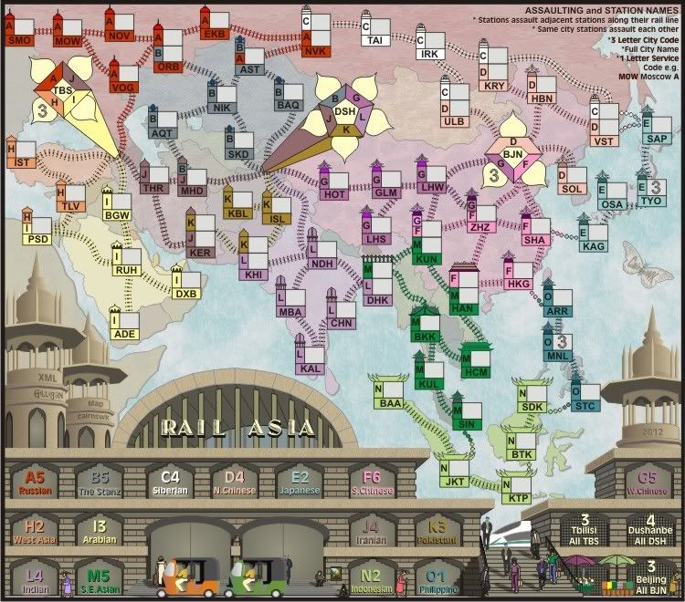
Version 24 Sml and Lge
1. The legend for the terminals BJN, DSH, and TBL have been increased in size to make them more legible on the small map.
2. A small glow has been added to increase the legibility of the legend names only - concern over the illegibility of the Iranian one.
1. The legend for the terminals BJN, DSH, and TBL have been increased in size to make them more legible on the small map.
2. A small glow has been added to increase the legibility of the legend names only - concern over the illegibility of the Iranian one.
- Click image to enlarge.

Last edited by cairnswk on Sun Jan 22, 2012 4:52 pm, edited 1 time in total.
* Pearl Harbour * Waterloo * Forbidden City * Jamaica * Pot Mosbi
-
sannemanrobinson
- Posts: 255
- Joined: Mon Dec 20, 2010 6:35 am
- Gender: Male
Re: Re: RAIL ASIA [23.1.12] V24-P19 Sml/Lge
Both images are small 
And the glow behind N. Chinese and Japanese is not really making it more readable. Iranian is clear in here.
And the glow behind N. Chinese and Japanese is not really making it more readable. Iranian is clear in here.
Re: Re: RAIL ASIA [23.1.12] V24-P19 Sml/Lge
Thanks for your comments...sannemanrobinson wrote:Both images are small
And the glow behind N. Chinese and Japanese is not really making it more readable. Iranian is clear in here.
Large map fixed.
Both of those territories are more legible on the large map, but i'll see what can be done next version to increase clarity.
* Pearl Harbour * Waterloo * Forbidden City * Jamaica * Pot Mosbi

Re: Re: RAIL ASIA [23.1.12] V24-P19 Sml/Lge
What about the solid extrusion trick? Could it help, or is it already there, but not showing much because the N. Chinese and Japanese are directly in front of the vanishing point?
-
gimil

- Posts: 8599
- Joined: Sat Mar 03, 2007 12:42 pm
- Gender: Male
- Location: United Kingdom (Scotland)
Re: RAIL ASIA [23.1.12] V24-P19 Sml/Lge
The new spacing on the title sits much better with me. It makes the title look part of the map now.
I have noticed that 'S.E. Asian' drop shadow in the legends seem to be a few pixels lower than any of its counterparts, I am guessing this isn't intentional?
Finally, I also noticed that the poles behind the title are flat. I am guessing they are suppose to represent a cylindrical pole shape? If so a quick gradient to shade and round them wouldn't hurt, just to give them a 3D touch like the other cylindrical shapes on your map.
Apart from those I will be happy to stamp this once all other graphical discussion is concluded.
What do you know about map making, bitch?
Top Score:2403natty_dread wrote:I was wrong
Re: Re: RAIL ASIA [23.1.12] V24-P19 Sml/Lge
NO ender516, i tried that the other day when i was adjusting the glow behind the names.ender516 wrote:What about the solid extrusion trick? Could it help, or is it already there, but not showing much because the N. Chinese and Japanese are directly in front of the vanishing point?
It only makes the legibility of the words much worse because the increment of extrusion is only whole numbers and not decimals.
* Pearl Harbour * Waterloo * Forbidden City * Jamaica * Pot Mosbi
Re: RAIL ASIA [23.1.12] V24-P19 Sml/Lge
Goodgimil wrote:The new spacing on the title sits much better with me. It makes the title look part of the map now.
FixedI have noticed that 'S.E. Asian' drop shadow in the legends seem to be a few pixels lower than any of its counterparts, I am guessing this isn't intentional?
no, those are meant to be flat, like flat supports with glass in between them.Finally, I also noticed that the poles behind the title are flat. I am guessing they are suppose to represent a cylindrical pole shape? If so a quick gradient to shade and round them wouldn't hurt, just to give them a 3D touch like the other cylindrical shapes on your map.
Thank you.Apart from those I will be happy to stamp this once all other graphical discussion is concluded.
* Pearl Harbour * Waterloo * Forbidden City * Jamaica * Pot Mosbi
Re: RAIL ASIA [24.1.12] V24-P19 Sml/Lge
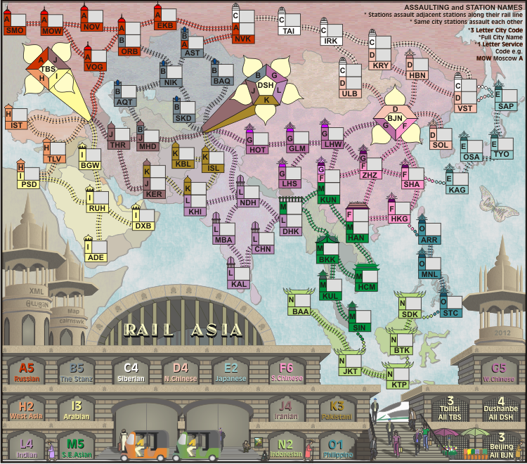
Version 24 has been updated to address the glows behind the legends names
Please f5 to see the changes.
Please f5 to see the changes.
- Click image to enlarge.
* Pearl Harbour * Waterloo * Forbidden City * Jamaica * Pot Mosbi
-
gimil
- Posts: 8599
- Joined: Sat Mar 03, 2007 12:42 pm
- Gender: Male
- Location: United Kingdom (Scotland)
Re: RAIL ASIA [23.1.12] V24-P19 Sml/Lge
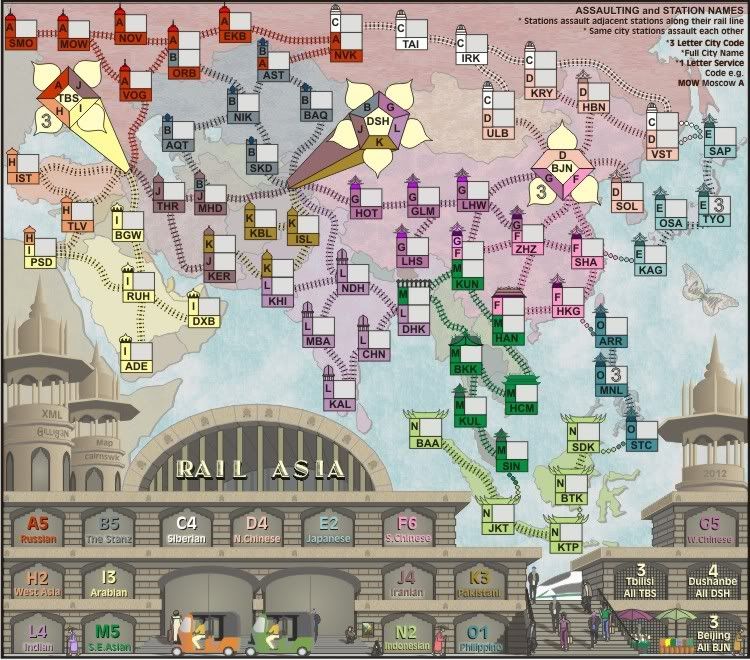
Got you. As a final suggestion how about another line following where the glass would meet the ceiling. Just to get a feel that there is glass there. Something like this?no, those are meant to be flat, like flat supports with glass in between them.
- Click image to enlarge.

What do you know about map making, bitch?
Top Score:2403natty_dread wrote:I was wrong
Re: RAIL ASIA [23.1.12] V24-P19 Sml/Lge
Really gimil, next you'll want nuts and bolts, but if it makes you happy then i'll put it in the next version, but really i'd prefer not to as the edges of the steel posts should tell enough of the story...imagination is wonderful when one has something to imagine.
* Pearl Harbour * Waterloo * Forbidden City * Jamaica * Pot Mosbi
-
gimil
- Posts: 8599
- Joined: Sat Mar 03, 2007 12:42 pm
- Gender: Male
- Location: United Kingdom (Scotland)
Re: RAIL ASIA [23.1.12] V24-P19 Sml/Lge
Well to me the steel posts don't. You have earned your stamp but I feel your attitude has been a little poor lately after 28 quenched maps (many that I have contributed to) you would of known that I am only making suggestions to help make your map better.cairnswk wrote:Really gimil, next you'll want nuts and bolts, but if it makes you happy then i'll put it in the next version, but really i'd prefer not to as the edges of the steel posts should tell enough of the story...imagination is wonderful when one has something to imagine.

Have a nice day.
What do you know about map making, bitch?
Top Score:2403natty_dread wrote:I was wrong
Re: RAIL ASIA [23.1.12] V24-P19 Sml/Lge
Thank you gimil, you too have a nice day.gimil wrote:Well to me the steel posts don't. You have earned your stamp but I feel your attitude has been a little poor lately after 28 quenched maps (many that I have contributed to) you would of known that I am only making suggestions to help make your map better.cairnswk wrote:Really gimil, next you'll want nuts and bolts, but if it makes you happy then i'll put it in the next version, but really i'd prefer not to as the edges of the steel posts should tell enough of the story...imagination is wonderful when one has something to imagine.
Have a nice day.
* Pearl Harbour * Waterloo * Forbidden City * Jamaica * Pot Mosbi
Re: RAIL ASIA [27.1.12] V25-P20 Sml/Lge
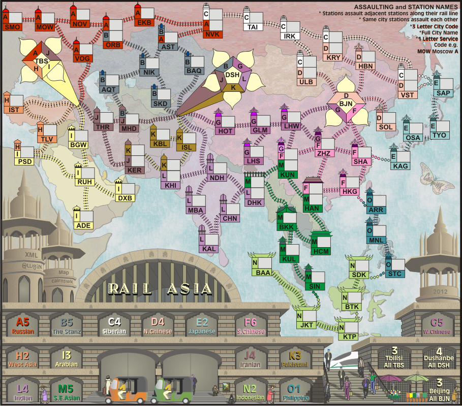
Version 25
1. Gimil's glass line has been added.
2. i wanted to put some asian gargloyle on the tops of those floors, but after adding them, it looked unconvincing, so i dropped them and made a small steam engine stencil and added that to the roof line fronts to break up those long pieces of nothingness and i think it works well. Of course it is not blantantly obvious what they are, and these probably show better in .pngs, but they are meant to be totally subtle almost like all those character one would see on the front of asian buildings.
Small
Large
Neutrals
1. Gimil's glass line has been added.
2. i wanted to put some asian gargloyle on the tops of those floors, but after adding them, it looked unconvincing, so i dropped them and made a small steam engine stencil and added that to the roof line fronts to break up those long pieces of nothingness and i think it works well. Of course it is not blantantly obvious what they are, and these probably show better in .pngs, but they are meant to be totally subtle almost like all those character one would see on the front of asian buildings.
Small
Large
- Click image to enlarge.
Last edited by cairnswk on Fri Feb 03, 2012 12:14 pm, edited 3 times in total.
* Pearl Harbour * Waterloo * Forbidden City * Jamaica * Pot Mosbi
Re: RAIL ASIA [3.2.12] V25-P20 Sml/Lge/Neutral pngs
The above version 25 has been updated....
1. There is an opacity at 80% layer across the station and sundry items, hopefully to make the map stand out slightly more; this layer sits under the title and legend text, very subtle but it is there. I always intended to have this layer, and is the same effect applied to Rail Africa map, although more apparent on that map.
2. the above images are converted to pngs, with the addition of the neutral map also on the front page for reference.
* Pearl Harbour * Waterloo * Forbidden City * Jamaica * Pot Mosbi
Re: RAIL ASIA [3.2.12] V25-P20 Sml/Lge/Neutral pngs
SMO - Smolensk? (Yes)
NOV - Novgorod
AQT - Aqtau
NIK - Nikolskiy
SKD - Samarkand (could this be a problem with SDK in Indonesia?
LHS - Lhasa
GLM - Golmud (start of branch line to Lhasa)
LHW - Lanzhou
DHK - Dhaka (Bangladesh)
KUL - Kuala Lumpur
BAQ = Balqash
KER - Kerman
KRY = Karymskoye
NOV - Novgorod
AQT - Aqtau
NIK - Nikolskiy
SKD - Samarkand (could this be a problem with SDK in Indonesia?
LHS - Lhasa
GLM - Golmud (start of branch line to Lhasa)
LHW - Lanzhou
DHK - Dhaka (Bangladesh)
KUL - Kuala Lumpur
BAQ = Balqash
KER - Kerman
KRY = Karymskoye
* Pearl Harbour * Waterloo * Forbidden City * Jamaica * Pot Mosbi

Re: RAIL ASIA [3.2.12] V25-P20 Sml/Lge/Neutral pngs
sorry, gilligan i hadf to get up from this desk for a while and walk.Gilligan wrote:Perhaps make SKD SAK.
Taishet should be Tayshet
Actually we can't change Samarkand from SKD re my discussion bak here http://www.conquerclub.com/forum/viewto ... 0#p3482238
and SDK is the officail code for Sandakan in Indonesia, so leave them as be, at least they are in two different continents and notated as such, and they are miles apart.
* Pearl Harbour * Waterloo * Forbidden City * Jamaica * Pot Mosbi
Re: RAIL ASIA [3.2.12] V25-P20 Sml/Lge/Neutral pngs
cairns - I need a blank small version of the map. Latest posts and first post all have the neutral 3 starts on them.

Re: RAIL ASIA [3.2.12] V25-P20 Sml/Lge/Neutral pngs
Gilligan, i've just re-loaded V25 Small without the neutrals.Gilligan wrote:cairns - I need a blank small version of the map. Latest posts and first post all have the neutral 3 starts on them.
* Pearl Harbour * Waterloo * Forbidden City * Jamaica * Pot Mosbi