Yeah, pretty much that. It might take away from the 'written upon' feel that you have going with text, but it does highlight those areas.
--Andy
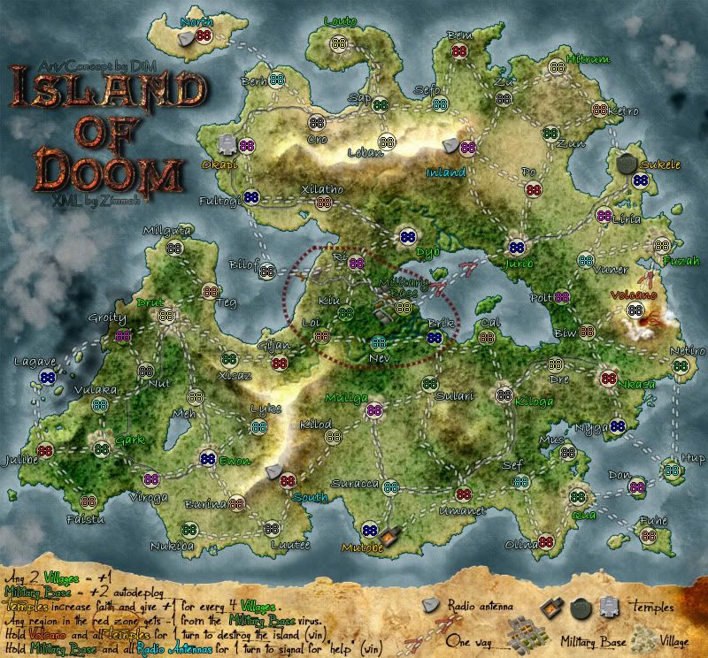
Island of Doom
Moderator: Cartographers
Forum rules
Please read the Community Guidelines before posting.
Please read the Community Guidelines before posting.
-
AndyDufresne

- Posts: 24919
- Joined: Fri Mar 03, 2006 8:22 pm
- Location: A Banana Palm in Zihuatanejo
- Contact:
-
DiM

- Posts: 10415
- Joined: Wed Feb 14, 2007 6:20 pm
- Gender: Male
- Location: making maps for scooby snacks
Re: Island of Doom [23.Dec.11] - V9 - p1&7
okey, i'll do that and start on the small.
“In the beginning God said, the four-dimensional divergence of an antisymmetric, second rank tensor equals zero, and there was light, and it was good. And on the seventh day he rested.”- Michio Kaku

Re: Island of Doom [23.Dec.11] - V9 - p1&7
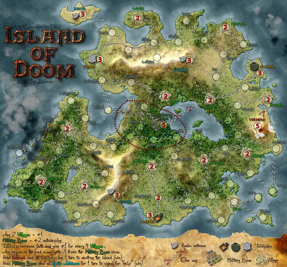
the word temples right below the red zone in the legend is hard to read.
probably early to say but maybe adding some cloud effects above the sea may improve the looks even more. i mean like dark strom clouds that apear to be hovering above the sea and maybe also a little bit around the volcano.
oh wait i think the volcano actually already has clouds, now that i look at it again.
the mountain peaks seem to emit light, they're pretty bright to my taste.
- Click image to enlarge.

-
DiM
- Posts: 10415
- Joined: Wed Feb 14, 2007 6:20 pm
- Gender: Male
- Location: making maps for scooby snacks
Re: Island of Doom [23.Dec.11] - V9 - p1&7
the word temples is a bit obstructed by the red zone but i think it will be fine cause it's colour coded.
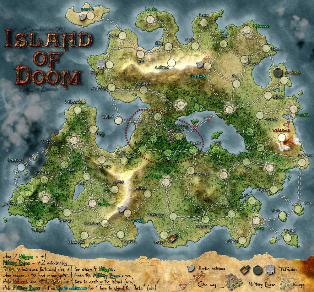
V10:
*added stormclouds
*reduced brightness of the snow
*tweaked legend text
V10:
*added stormclouds
*reduced brightness of the snow
*tweaked legend text
- Click image to enlarge.
Last edited by DiM on Mon Dec 26, 2011 5:01 pm, edited 1 time in total.
“In the beginning God said, the four-dimensional divergence of an antisymmetric, second rank tensor equals zero, and there was light, and it was good. And on the seventh day he rested.”- Michio Kaku
Re: Island of Doom [23.Dec.11] - V9 - p1&7
DiM wrote:the word temples is a bit obstructed by the red zone but i think it will be fine cause it's colour coded.
V10:
*added stormclouds
*reduced brightness of the snow
- Click image to enlarge.
it's actually better in this one, i guess the black outline helps to improve readability greatly.
- Click image to enlarge.
-
DiM
- Posts: 10415
- Joined: Wed Feb 14, 2007 6:20 pm
- Gender: Male
- Location: making maps for scooby snacks
Re: Island of Doom [26.Dec.11] - V10 - p1&7
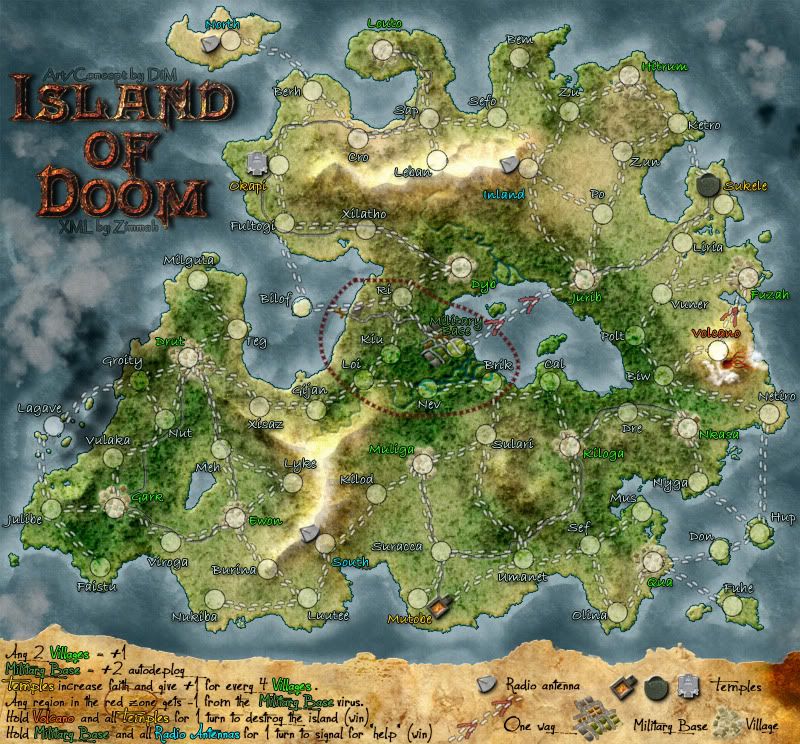
V11:
*made the small map
*minor tweaks here and there
large:
small:
*made the small map
*minor tweaks here and there
large:
- Click image to enlarge.
- Click image to enlarge.
Last edited by DiM on Tue Dec 27, 2011 4:47 pm, edited 1 time in total.
“In the beginning God said, the four-dimensional divergence of an antisymmetric, second rank tensor equals zero, and there was light, and it was good. And on the seventh day he rested.”- Michio Kaku
-
AndyDufresne
- Posts: 24919
- Joined: Fri Mar 03, 2006 8:22 pm
- Location: A Banana Palm in Zihuatanejo
- Contact:
Re: Island of Doom [27.Dec.11] - V11 - p1&8
Looks good. The region text on the small map could probably benefit from a slight increase in size, since it looks like there is ample space in most every area to do so.
Otherwise, many thumbs up.
--Andy
Otherwise, many thumbs up.
--Andy
Re: Island of Doom [27.Dec.11] - V11 - p1&8
agreedAndyDufresne wrote:Looks good. The region text on the small map could probably benefit from a slight increase in size, since it looks like there is ample space in most every area to do so.
Otherwise, many thumbs up.
--Andy
- Click image to enlarge.
-
DiM
- Posts: 10415
- Joined: Wed Feb 14, 2007 6:20 pm
- Gender: Male
- Location: making maps for scooby snacks
Re: Island of Doom [27.Dec.11] - V11 - p1&8
increased region text as well as legend text on the small map and updated the image in the previous post.
“In the beginning God said, the four-dimensional divergence of an antisymmetric, second rank tensor equals zero, and there was light, and it was good. And on the seventh day he rested.”- Michio Kaku
Re: Island of Doom [27.Dec.11] - V11 - p1&8
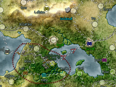
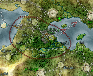
the army circle at ewon looks strange. but i don't really know why.
- Click image to enlarge.
-
DiM
- Posts: 10415
- Joined: Wed Feb 14, 2007 6:20 pm
- Gender: Male
- Location: making maps for scooby snacks
Re: Island of Doom [27.Dec.11] - V11 - p1&8
it's perfectly identical with all the other circles since it is a copied layer.
maybe it's just an optical illusion.
maybe it's just an optical illusion.
“In the beginning God said, the four-dimensional divergence of an antisymmetric, second rank tensor equals zero, and there was light, and it was good. And on the seventh day he rested.”- Michio Kaku
Re: Island of Doom [27.Dec.11] - V11 - p1&8
yes i thought so too, but i think i'll just point it outDiM wrote:it's perfectly identical with all the other circles since it is a copied layer.
maybe it's just an optical illusion.
- Click image to enlarge.
-
gimil

- Posts: 8599
- Joined: Sat Mar 03, 2007 12:42 pm
- Gender: Male
- Location: United Kingdom (Scotland)
Re: Island of Doom [27.Dec.11] - V11 - p1&8
DiM can I please see a version of the maps with 88 digits on them? This is so I can check how the overall map will feel. Right now I am concerned that alot of details are eaten up by the heavy texture. This may not be the case with the digits in place.
What do you know about map making, bitch?
Top Score:2403natty_dread wrote:I was wrong
-
DiM
- Posts: 10415
- Joined: Wed Feb 14, 2007 6:20 pm
- Gender: Male
- Location: making maps for scooby snacks
Re: Island of Doom [27.Dec.11] - V11 - p1&8
digits fit just fine and are perfectly visible.gimil wrote:DiM can I please see a version of the maps with 88 digits on them? This is so I can check how the overall map will feel. Right now I am concerned that alot of details are eaten up by the heavy texture. This may not be the case with the digits in place.
here's a sample from the small map.
“In the beginning God said, the four-dimensional divergence of an antisymmetric, second rank tensor equals zero, and there was light, and it was good. And on the seventh day he rested.”- Michio Kaku
-
gimil
- Posts: 8599
- Joined: Sat Mar 03, 2007 12:42 pm
- Gender: Male
- Location: United Kingdom (Scotland)
Re: Island of Doom [27.Dec.11] - V11 - p1&8
I would still like to see the overall version please  For my own reasons.
What do you know about map making, bitch?
Top Score:2403natty_dread wrote:I was wrong
-
DiM
- Posts: 10415
- Joined: Wed Feb 14, 2007 6:20 pm
- Gender: Male
- Location: making maps for scooby snacks
Re: Island of Doom [27.Dec.11] - V11 - p1&8
jerk.gimil wrote:I would still like to see the overall version please
“In the beginning God said, the four-dimensional divergence of an antisymmetric, second rank tensor equals zero, and there was light, and it was good. And on the seventh day he rested.”- Michio Kaku
-
DiM
- Posts: 10415
- Joined: Wed Feb 14, 2007 6:20 pm
- Gender: Male
- Location: making maps for scooby snacks
Re: Island of Doom [27.Dec.11] - V11 - p1&8
here you go. happy? 
- Click image to enlarge.
Last edited by DiM on Wed Dec 28, 2011 8:57 pm, edited 1 time in total.
“In the beginning God said, the four-dimensional divergence of an antisymmetric, second rank tensor equals zero, and there was light, and it was good. And on the seventh day he rested.”- Michio Kaku
-
gimil
- Posts: 8599
- Joined: Sat Mar 03, 2007 12:42 pm
- Gender: Male
- Location: United Kingdom (Scotland)
Re: Island of Doom [27.Dec.11] - V11 - p1&8
Would it be possible to punch up the terr names a size or two? So that their colours shine through a little better? Some are just a little to dark and difficult to read for me.
Cheers,
gimil
Cheers,
gimil
What do you know about map making, bitch?
Top Score:2403natty_dread wrote:I was wrong
-
DiM
- Posts: 10415
- Joined: Wed Feb 14, 2007 6:20 pm
- Gender: Male
- Location: making maps for scooby snacks
Re: Island of Doom [27.Dec.11] - V11 - p1&8
gimil wrote:Would it be possible to punch up the terr names a size or two? So that their colours shine through a little better? Some are just a little to dark and difficult to read for me.
Cheers,
gimil
updated the image in previous post with bigger terit names.
“In the beginning God said, the four-dimensional divergence of an antisymmetric, second rank tensor equals zero, and there was light, and it was good. And on the seventh day he rested.”- Michio Kaku
-
gimil
- Posts: 8599
- Joined: Sat Mar 03, 2007 12:42 pm
- Gender: Male
- Location: United Kingdom (Scotland)
Re: Island of Doom [27.Dec.11] - V11 - p1&8
Military base colour is to similar in tone to the background it is placed in. I find it difficult to read. There are still some other territories that are concerning me as to whether they are clear enough. But I am tired right now so I will check them with a clear head and fresh eyes tomorrow and get back to you.
What do you know about map making, bitch?
Top Score:2403natty_dread wrote:I was wrong
-
DiM
- Posts: 10415
- Joined: Wed Feb 14, 2007 6:20 pm
- Gender: Male
- Location: making maps for scooby snacks
Re: Island of Doom [27.Dec.11] - V11 - p1&8
gimil wrote:Military base colour is to similar in tone to the background it is placed in. I find it difficult to read. There are still some other territories that are concerning me as to whether they are clear enough. But I am tired right now so I will check them with a clear head and fresh eyes tomorrow and get back to you.
would it help if i added a light colour glow like this?
if you still can't see that, then you're blind as a bat, that's all
“In the beginning God said, the four-dimensional divergence of an antisymmetric, second rank tensor equals zero, and there was light, and it was good. And on the seventh day he rested.”- Michio Kaku
Re: Island of Doom [27.Dec.11] - V11 - p1&8
lol, yes it helps.DiM wrote:gimil wrote:Military base colour is to similar in tone to the background it is placed in. I find it difficult to read. There are still some other territories that are concerning me as to whether they are clear enough. But I am tired right now so I will check them with a clear head and fresh eyes tomorrow and get back to you.
would it help if i added a light colour glow like this?
if you still can't see that, then you're blind as a bat, that's all
- Click image to enlarge.
-
gimil
- Posts: 8599
- Joined: Sat Mar 03, 2007 12:42 pm
- Gender: Male
- Location: United Kingdom (Scotland)
Re: Island of Doom [27.Dec.11] - V11 - p1&8
Perhaps all the terr names could do with a glow. Darker terr names a light glow and lighter terr names with a dark glow. Just to give some contrast between the terr names and the backgrounds...as I feel they are still a little to hard or uncomfortable to read in places.
What do you know about map making, bitch?
Top Score:2403natty_dread wrote:I was wrong
-
DiM
- Posts: 10415
- Joined: Wed Feb 14, 2007 6:20 pm
- Gender: Male
- Location: making maps for scooby snacks
Re: Island of Doom [27.Dec.11] - V11 - p1&8
gimil wrote:Perhaps all the terr names could do with a glow. Darker terr names a light glow and lighter terr names with a dark glow. Just to give some contrast between the terr names and the backgrounds...as I feel they are still a little to hard or uncomfortable to read in places.
will do
“In the beginning God said, the four-dimensional divergence of an antisymmetric, second rank tensor equals zero, and there was light, and it was good. And on the seventh day he rested.”- Michio Kaku
-
DiM
- Posts: 10415
- Joined: Wed Feb 14, 2007 6:20 pm
- Gender: Male
- Location: making maps for scooby snacks
Re: Island of Doom [27.Dec.11] - V11 - p1&8
zimmah wrote:lol, yes it helps.DiM wrote:gimil wrote:Military base colour is to similar in tone to the background it is placed in. I find it difficult to read. There are still some other territories that are concerning me as to whether they are clear enough. But I am tired right now so I will check them with a clear head and fresh eyes tomorrow and get back to you.
would it help if i added a light colour glow like this?
if you still can't see that, then you're blind as a bat, that's all
then it's set.
“In the beginning God said, the four-dimensional divergence of an antisymmetric, second rank tensor equals zero, and there was light, and it was good. And on the seventh day he rested.”- Michio Kaku