Have a good Christmas natty. Try not to eat and drink to much. What am I thinking of, go get plastered and stuff your face. It only comes once a year.natty_dread wrote:As for the mountains etc... I'll think of something later today, now I have to go do christmas stuff...
1982 [Quenched]
Moderator: Cartographers
Forum rules
Please read the Community Guidelines before posting.
- koontz1973
- Posts: 6960
- Joined: Thu Jan 01, 2009 10:57 am
Re: 1982 [24/12] Latest images Page 1/12

- koontz1973
- Posts: 6960
- Joined: Thu Jan 01, 2009 10:57 am
Re: 1982 [24/12] Latest images Page 1/12
Come up with a new mountain completely. Not really the style I wanted to do for this map but let me know what you all think. Need to tidy up the surrounding area if good.

- natty dread
- Posts: 12876
- Joined: Fri Feb 08, 2008 8:58 pm
- Location: just plain fucked
Re: 1982 [24/12] Latest images Page 1/12
Well I don't know... the light angle seems to be different from the bevel around the land.

- koontz1973
- Posts: 6960
- Joined: Thu Jan 01, 2009 10:57 am
Re: 1982 [24/12] Latest images Page 1/12
Not worried about the light just yet. Looking for the style for now. need to do the clean up on other things as well if this one gets kept.natty_dread wrote:Well I don't know... the light angle seems to be different from the bevel around the land.

- koontz1973
- Posts: 6960
- Joined: Thu Jan 01, 2009 10:57 am
- natty dread
- Posts: 12876
- Joined: Fri Feb 08, 2008 8:58 pm
- Location: just plain fucked
Re: 1982 [24/12] Latest images Page 1/12
I don't know. The new mountains fit the map better, but they don't look like mountains, you know?
The sea borders... why not make them thinner? All lines don't have to be 2 pixels thick, you know. And maybe have them the same hue as the sea but darker? You can do this easily with some creative use of layer modes.

- koontz1973
- Posts: 6960
- Joined: Thu Jan 01, 2009 10:57 am
Re: 1982 [24/12] Latest images Page 1/12
I can live with the mountains like this as most on the maps we have do not look like mountains. But any advice to get them more looking would be great.natty_dread wrote:I don't know. The new mountains fit the map better, but they don't look like mountains, you know?
The sea borders... why not make them thinner? All lines don't have to be 2 pixels thick, you know. And maybe have them the same hue as the sea but darker? You can do this easily with some creative use of layer modes.
Will change the land/sea border to the same as the sea territ lines. Was trying to keep the differences down to cut out the confusion factor.

- natty dread
- Posts: 12876
- Joined: Fri Feb 08, 2008 8:58 pm
- Location: just plain fucked
Re: 1982 [24/12] Latest images Page 1/12
Seriously, I think you'd do well to do a total graphical rehaul here.
I keep looking at this map, and all it does is give me a feeling of "meh... " You know? The map is "ok", you'll probably get it through the foundry as it is with the current standards, but I think you could do so much more with this. You could make it more than "ok", you could make it great.
You could make it look more like a real war. Take inspiration from other war maps, like Stalingrad, WWII Poland, or even Iwo jima. Your current graphics just seem too generic, they don't convey the feeling of an actual war.
I keep looking at this map, and all it does is give me a feeling of "meh... " You know? The map is "ok", you'll probably get it through the foundry as it is with the current standards, but I think you could do so much more with this. You could make it more than "ok", you could make it great.
You could make it look more like a real war. Take inspiration from other war maps, like Stalingrad, WWII Poland, or even Iwo jima. Your current graphics just seem too generic, they don't convey the feeling of an actual war.

- koontz1973
- Posts: 6960
- Joined: Thu Jan 01, 2009 10:57 am
Re: 1982 [24/12] Latest images Page 1/12
If a graphical overhaul is needed, then those 3 maps would never inspire me to change what I have. All 3 are from the wrong time period for a start. Stalingrad is to bloody complicated and I hate complicated maps. Apart from that, it is obviously a cairnswk map. A great map maker and one that can make great looking maps, but I am still trying to find my own style.natty_dread wrote:You could make it look more like a real war. Take inspiration from other war maps, like Stalingrad, WWII Poland, or even Iwo jima.
What could change in a relatively short time to give it a better overall look is the towns and legend. RedBaron mentioned turning the legend into a radar screen or a flight deck. I tried both but found it hard to read or see any of the icons there. Might give the radar another go. One of the problems though is space. It also might be good to go back to the original idea of having one colour for the land and using the territ lines with a backing to separate the bonuses.

- koontz1973
- Posts: 6960
- Joined: Thu Jan 01, 2009 10:57 am
Re: 1982 [4/12] Latest images Page 1/10
Been working on this and this is the best configuration. Which colour works the best? And for a bit of a laugh - well not really, I doubt the site is ready for a B/W map but with the splashes of colour like the title and legend, it might work.RedBaron0 wrote: Try different things... deck of a carrier, a radar-screen,

- natty dread
- Posts: 12876
- Joined: Fri Feb 08, 2008 8:58 pm
- Location: just plain fucked
- koontz1973
- Posts: 6960
- Joined: Thu Jan 01, 2009 10:57 am
Re: 1982 [24/12] Latest images Page 1/12
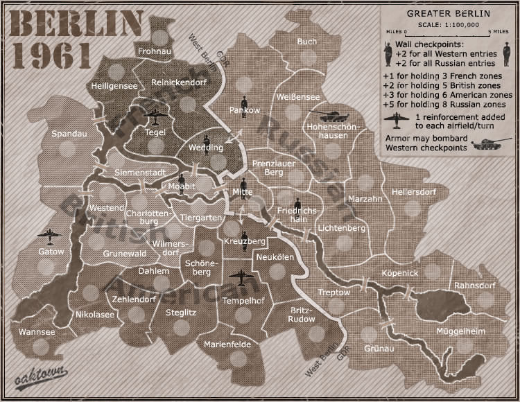
Shades of brown but that is semantics. Forgot about Berlin.

- natty dread
- Posts: 12876
- Joined: Fri Feb 08, 2008 8:58 pm
- Location: just plain fucked
Re: 1982 [24/12] Latest images Page 1/12
Sepia actually, but technically that counts as black & white - black & white photos were often coloured with sepia before colour photography became common...koontz1973 wrote:Shades of brown but that is semantics. Forgot about Berlin.
Anyway, I think you're on to something with that last version - a black & white radar screen could work nicely. Or maybe something like on Arms Race, a stylistic radar-like map.

- koontz1973
- Posts: 6960
- Joined: Thu Jan 01, 2009 10:57 am
Re: 1982 [24/12] Latest images Page 1/12
Been done in Arms Race as you said and DiM has just done it again with his alien map. Will make a quick mock up with what I have now to see what colour to add.natty_dread wrote:Or maybe something like on Arms Race, a stylistic radar-like map.
The flags would have to come out, but a different coloured glow around the ships would allow players to easily see the different sides.
Title back in colour.
Land colour will have to change to give a bigger difference between the bonus areas.
Lets see where this takes us for a few versions.

- koontz1973
- Posts: 6960
- Joined: Thu Jan 01, 2009 10:57 am
Re: 1982 [24/12] Latest images Page 1/12
Before I continue down this path, I need to ask a mod about a few extra pixels to explain the differing sides now as the flags have been removed.

- natty dread
- Posts: 12876
- Joined: Fri Feb 08, 2008 8:58 pm
- Location: just plain fucked
Re: 1982 [24/12] Latest images Page 1/12
If you continue with this style, you're going to have to redraw the land area, the current beveled style probably won't work with the b&w style...

- koontz1973
- Posts: 6960
- Joined: Thu Jan 01, 2009 10:57 am
Re: 1982 [24/12] Latest images Page 1/12
PMed a mod to see if I can get a few extra pixels for the bottom. With the flags gone, I will need the space to explain why the text has 2 different shades behind it. But it started as a little joke in my head but it is growing on me.
Lets see what happens if I get the extra height and where this leads us.

Re: 1982 [24/12] Latest images Page 1/12
Auch what a radical way you have taking this, I liked it much better as it was b4, it had a more obvious touch of your style, this one looks like its seen from terminators eyesight.
I agree with natty on redrawing the landscabe for the radar/terminator style.
- koontz1973
- Posts: 6960
- Joined: Thu Jan 01, 2009 10:57 am
Re: 1982 [24/12] Latest images Page 1/12
Never be afraid to try something new. If it does not work out, so what, you lose a few hours of work, but gain a lot of experience.Flapcake wrote:Auch what a radical way you have taking this, I liked it much better as it was b4, it had a more obvious touch of your style, this one looks like its seen from terminators eyesight.
I agree with natty on redrawing the landscabe for the radar/terminator style.
I love the terminators eyesight.

- natty dread
- Posts: 12876
- Joined: Fri Feb 08, 2008 8:58 pm
- Location: just plain fucked
Re: 1982 [24/12] Latest images Page 1/12
Are you going to fill the map with VIC-20 hex code as well? 

- koontz1973
- Posts: 6960
- Joined: Thu Jan 01, 2009 10:57 am
Re: 1982 [24/12] Latest images Page 1/12
Lets go not overboard just yet.natty_dread wrote:Are you going to fill the map with VIC-20 hex code as well?

- natty dread
- Posts: 12876
- Joined: Fri Feb 08, 2008 8:58 pm
- Location: just plain fucked
Re: 1982 [24/12] Latest images Page 1/12
Ok, one other thing... if you're going to redraw the map:
I notice you've been using the method in my tutorial for drawin the territory borders, ie. using the path tool and stroking the paths... Well, those tutorials are written as basic guides for people who are new to mapmaking/graphics, and that method in particular is just meant for you to use when you're new and not used to drawing on a computer.
I think you're ready for drawing the borders freehand. Even with a mouse, you can do better that way, when you're careful and work with a high zoom rate. Your borders will look more natural that way.
Also, try making the territory borders thinner. That way you can make the borders between bonus areas slightly thicker, and this will help differentiating the bonus areas.
I notice you've been using the method in my tutorial for drawin the territory borders, ie. using the path tool and stroking the paths... Well, those tutorials are written as basic guides for people who are new to mapmaking/graphics, and that method in particular is just meant for you to use when you're new and not used to drawing on a computer.
I think you're ready for drawing the borders freehand. Even with a mouse, you can do better that way, when you're careful and work with a high zoom rate. Your borders will look more natural that way.
Also, try making the territory borders thinner. That way you can make the borders between bonus areas slightly thicker, and this will help differentiating the bonus areas.

Re: 1982 [24/12] Latest images Page 1/12
I think if you're going B/W, then I think you can vary with different shades for the title and legend. I just have an issue with that orange title against the black back ground, with the green circle. Also, the green and black legend thing really clashes and takes away from the simple beauty of a B/W image.

Please don't invite me to any pickup games. I will decline the invite.
Re: 1982 [24/12] Latest images Page 1/12
well interesting development going on here
is this the new 2012 spirit
try directly with green ink instead of that glow effect behind the legend
maybe some metallic technical effect for the rules of engagement like some analogical command board
try with the green glow around the ship and landing point (not too heavy)
is this the new 2012 spirit
try directly with green ink instead of that glow effect behind the legend
maybe some metallic technical effect for the rules of engagement like some analogical command board
try with the green glow around the ship and landing point (not too heavy)
De gueules à la tour d'argent ouverte, crénelée de trois pièces, sommée d'un donjon ajouré, crénelé de deux pièces
Gules an open tower silver, crenellated three parts, topped by a apertured turret, crenellated two parts
Re: 1982 [24/12] Latest images Page 1/12
This is exactly what I'd suggest.pamoa wrote: try directly with green ink instead of that glow effect behind the legend
maybe some metallic technical effect for the rules of engagement like some analogical command board
try with the green glow around the ship and landing point (not too heavy)
Perhaps for a font you use http://www.dafont.com/neuropol-x-free.font
I'm bad at finding a good font; only good at commenting

Please don't invite me to any pickup games. I will decline the invite.