i always liked that idea and it's a big part of my inspiration for this map.MrBenn wrote:When I saw the words 'Pixel World', a small part of me hoped that this map (http://www.conquerclub.com/forum/viewto ... 42&t=24298) had been resurrected.
The idea has merit, whether you go for a square grid, a circular grid, a hexagonal grid or some other sort of tessellating grid
[Abandoned] - Pixel World
Moderator: Cartographers
Forum rules
Please read the Community Guidelines before posting.
Please read the Community Guidelines before posting.
- DiM
- Posts: 10415
- Joined: Wed Feb 14, 2007 6:20 pm
- Gender: Male
- Location: making maps for scooby snacks
Re: World 3.0 / Pixel World [09.Dec.11] - V1 - p1
“In the beginning God said, the four-dimensional divergence of an antisymmetric, second rank tensor equals zero, and there was light, and it was good. And on the seventh day he rested.”- Michio Kaku
- DiM
- Posts: 10415
- Joined: Wed Feb 14, 2007 6:20 pm
- Gender: Male
- Location: making maps for scooby snacks
Re: World 3.0 / Pixel World [09.Dec.11] - V1 - p1
i was thinking about reducing the size of the map and verticaly i can do it quite a lot if i turn the circles into ovals.
what do people think? this way i could reduce the large map from 1200*1000 to 1200*700
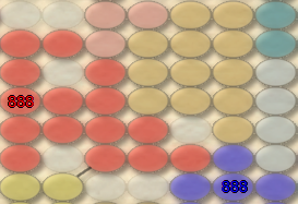
or
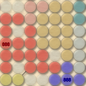
what do people think? this way i could reduce the large map from 1200*1000 to 1200*700

or

“In the beginning God said, the four-dimensional divergence of an antisymmetric, second rank tensor equals zero, and there was light, and it was good. And on the seventh day he rested.”- Michio Kaku
- thenobodies80
- Posts: 5400
- Joined: Wed Sep 05, 2007 4:30 am
- Gender: Male
- Location: Milan
Re: World 3.0 / Pixel World [09.Dec.11] - V1 - p1
i prefer ovals
- Industrial Helix
- Posts: 3462
- Joined: Mon Jul 14, 2008 6:49 pm
- Gender: Female
- Location: Ohio
Re: World 3.0 / Pixel World [09.Dec.11] - V1 - p1
So essentially its the world map, but it doesn't look like the world,tbh, it doesn't really appeal to me. Given the choice of playing a map versus some circles in a configuration that resembles the world, I'd choose to play the world map... however you could go the route of doing one of those human population, then I might be interested.


Sketchblog [Update 07/25/11]: http://indyhelixsketch.blogspot.com/
Living in Japan [Update 07/17/11]: http://mirrorcountryih.blogspot.com/
Russian Revolution map for ConquerClub [07/20/11]: http://www.conquerclub.com/forum/viewto ... 1&t=116575
Living in Japan [Update 07/17/11]: http://mirrorcountryih.blogspot.com/
Russian Revolution map for ConquerClub [07/20/11]: http://www.conquerclub.com/forum/viewto ... 1&t=116575
Re: World 3.0 / Pixel World [09.Dec.11] - V1 - p1
As IH mentioned, it doesn't look like the world. When I saw the title I thought "Oh cool, a supersized version of World 2.1!" Then when I saw it I was deeply disappointed. IMHO this is just another take of the old Classic theme. DiM, I know you appreciate honesty, I like every map you've made so far, - and this is not from my CA perspective - but I think you can come up with a better way to portray the world than this. I would like to see an updated world map with more countries, like for instance, Sudan is now split into two countries.
- DiM
- Posts: 10415
- Joined: Wed Feb 14, 2007 6:20 pm
- Gender: Male
- Location: making maps for scooby snacks
Re: World 3.0 / Pixel World [09.Dec.11] - V1 - p1
isaiah40 wrote:As IH mentioned, it doesn't look like the world. When I saw the title I thought "Oh cool, a supersized version of World 2.1!" Then when I saw it I was deeply disappointed. IMHO this is just another take of the old Classic theme. DiM, I know you appreciate honesty, I like every map you've made so far, - and this is not from my CA perspective - but I think you can come up with a better way to portray the world than this. I would like to see an updated world map with more countries, like for instance, Sudan is now split into two countries.
world 3.0 is a dream of mine from way back 2007. a world where each and every country appears as a single terit. from there i had several gameplay ideas ranging from economic powers to a battle for resources.
however i have tried countless times to do such a map and utterly failed because there are lots of tiny tiny countries. i tried skewed versions i tried zoom bubbles (or whatever they're called) and i could not find a solution that fully satisfies me so i abandoned that idea in favour of this one.
i don't know, i'll go ahead with it and see where it leads. if people don't like it then i'll bin it and that's that.
“In the beginning God said, the four-dimensional divergence of an antisymmetric, second rank tensor equals zero, and there was light, and it was good. And on the seventh day he rested.”- Michio Kaku
- natty dread
- Posts: 12877
- Joined: Fri Feb 08, 2008 8:58 pm
- Location: just plain fucked
Re: World 3.0 / Pixel World [09.Dec.11] - V1 - p1
No matter what they're called, I'm calling them zoom bubbles from now onDiM wrote:zoom bubbles (or whatever they're called)

Re: World 3.0 / Pixel World [09.Dec.11] - V1 - p1
DiM wrote:i'm currently working on something else but i'll get to adding impassables as soon as possible.natty_dread wrote:Oh yeah, that's pretty much my life goal.DiM wrote:maybe in the future you'll actually behave decently.
Are you telling me that you have no such aspirations?
(sorry. couldn't resist copy-pasting the quotes to make them more funny, the flame war was just too tempting)
Re: World 3.0 / Pixel World [09.Dec.11] - V1 - p1
maybe just take the outline of the map if that's possibleDiM wrote:brilliant idea. i will most certainly do it.thenobodies80 wrote: Maybe a semi-transparent layer under your circles that makes a little easier to see the "classic shape" of the continents?
edit// it's not going too well. as it turns out the style isn't fittingi'll keep trying though
Re: World 3.0 / Pixel World [09.Dec.11] - V1 - p1
that would have the same problem, naming them. DiM choose circles so he could name them in a grid, which is much harder with your layout. i beleive DiM doesn't want his map to be like Hive (and i prever it that way too, Hive is a nice map but quite confusing)natty_dread wrote:You know - just to clarify - I wasn't suggesting to change the circles to hexagons, rather to change the grid to a hexagonal layout, like this:
A layout like that would look more natural as a world map -the current image kind of reminds me of a Go board...
The columns for the coordinates would be a problem, yes, but I think it can be solved... Rows would still be even, maybe you could use some kind of markings for the columns... or something.
Anyway, it's your map, and if you don't like the idea that's fine, this is the last I'll mention of this.
Re: World 3.0 / Pixel World [09.Dec.11] - V1 - p1
to be honest i prever the ovals, especially with 888's they look more natural to me.DiM wrote:i was thinking about reducing the size of the map and verticaly i can do it quite a lot if i turn the circles into ovals.
what do people think? this way i could reduce the large map from 1200*1000 to 1200*700
or
(sorry for the quadriple post i always read and reply as i see the posts)
- DiM
- Posts: 10415
- Joined: Wed Feb 14, 2007 6:20 pm
- Gender: Male
- Location: making maps for scooby snacks
Re: World 3.0 / Pixel World [09.Dec.11] - V1 - p1
this map will be continued under the name of pixel world not world 3.0 as it does not follow the graphic style of world 2.1.
i have started creating a proper world 3.0 map that will have its own thread.
i have started creating a proper world 3.0 map that will have its own thread.
“In the beginning God said, the four-dimensional divergence of an antisymmetric, second rank tensor equals zero, and there was light, and it was good. And on the seventh day he rested.”- Michio Kaku
- natty dread
- Posts: 12877
- Joined: Fri Feb 08, 2008 8:58 pm
- Location: just plain fucked
Re: World 3.0 / Pixel World [09.Dec.11] - V1 - p1
Well they could be named like this:zimmah wrote:that would have the same problem, naming them.
Code: Select all
. 1 2 3 4
A *   *
B   *   *
C *   *
D   *   *

- DiM
- Posts: 10415
- Joined: Wed Feb 14, 2007 6:20 pm
- Gender: Male
- Location: making maps for scooby snacks
Re: Pixel World [09.Dec.11] - V1 - p1
V2:
reduced the size and made circles into ovals
reduced the size and made circles into ovals
“In the beginning God said, the four-dimensional divergence of an antisymmetric, second rank tensor equals zero, and there was light, and it was good. And on the seventh day he rested.”- Michio Kaku
- natty dread
- Posts: 12877
- Joined: Fri Feb 08, 2008 8:58 pm
- Location: just plain fucked
Re: Pixel World [13.Dec.11] - V2 - p1&3
You know, I just had a potentially awesome idea:
Make the territories like bricks. Make the map look like a brick wall, with each brick representing a country/territory, and rename it "brick world".
Make the territories like bricks. Make the map look like a brick wall, with each brick representing a country/territory, and rename it "brick world".

- AndyDufresne
- Posts: 24932
- Joined: Fri Mar 03, 2006 8:22 pm
- Location: A Banana Palm in Zihuatanejo
- Contact:
Re: Pixel World [13.Dec.11] - V2 - p1&3
The gameplay is obviously reminiscent to the Classic, but I'm not sure if I approached this map as just an image, I'd be able to tell it was the world from an initial get go. Africa is the only thing that stands out.
So it is disappoint that this didn't work out:
--Andy
So it is disappoint that this didn't work out:
DiM wrote:brilliant idea. i will most certainly do it.thenobodies80 wrote: Maybe a semi-transparent layer under your circles that makes a little easier to see the "classic shape" of the continents?
edit// it's not going too well. as it turns out the style isn't fittingi'll keep trying though
--Andy
-
ManBungalow
- Posts: 3431
- Joined: Sun Jan 13, 2008 7:02 am
- Location: On a giant rock orbiting a star somewhere
- lostatlimbo
- Posts: 1386
- Joined: Wed Mar 28, 2007 3:56 pm
- Location: Portland, OR
Re: Pixel World [13.Dec.11] - V2 - p1&3
As I was looking over World 3.0, I thought it would be interesting to do a map where every country was the same size - the connections remain, but countries themselves would just be represented by a square or circle.
Then I open this map and... well, its in a similar vein. Like some others, I'm not really feeling this one as is, but I wonder how it would work in that direction. Think Pixel World vs World 3.0 mash-up.
Could be interesting, could be a cluster. Something to think about.
At any rate, I look forward to more DiM v Dread fights.
- Victor Sullivan
- Posts: 6010
- Joined: Mon Feb 08, 2010 8:17 pm
- Gender: Male
- Location: Columbus, OH
- Contact:
Re: Pixel World [13.Dec.11] - V2 - p1&3
natty_dread wrote:You know, I just had a potentially awesome idea:
Make the territories like bricks. Make the map look like a brick wall, with each brick representing a country/territory, and rename it "brick world".
-Sully
Beckytheblondie: "Don't give us the dispatch, give us a mustache ride."
Scaling back on my CC involvement...
Scaling back on my CC involvement...
Re: Pixel World [13.Dec.11] - V2 - p1&3
Victor Sullivan wrote:natty_dread wrote:You know, I just had a potentially awesome idea:
Make the territories like bricks. Make the map look like a brick wall, with each brick representing a country/territory, and rename it "brick world".This would be sooo cool!
-Sully
could also be with lego/megablocks but that may be copyrighted
- firsal901
- Posts: 193
- Joined: Thu Jul 17, 2008 3:33 am
- Gender: Male
- Location: Laguna, Philippines (Google it)
Re: Pixel World [13.Dec.11] - V2 - p1&3
I like it. Nice idea, basic gameplay. excelent for newbies.

They hate you as much as you hate them
- DiM
- Posts: 10415
- Joined: Wed Feb 14, 2007 6:20 pm
- Gender: Male
- Location: making maps for scooby snacks
Re: Pixel World [13.Dec.11] - V2 - p1&3
please bin this for now.
i've got 6 other maps going on and frankly i don't have the required inspiration for this right now. i will get back to it at a later date.
i've got 6 other maps going on and frankly i don't have the required inspiration for this right now. i will get back to it at a later date.
“In the beginning God said, the four-dimensional divergence of an antisymmetric, second rank tensor equals zero, and there was light, and it was good. And on the seventh day he rested.”- Michio Kaku
- thenobodies80
- Posts: 5400
- Joined: Wed Sep 05, 2007 4:30 am
- Gender: Male
- Location: Milan
Re: Pixel World [13.Dec.11] - V2 - p1&3
[Moved]
I think you want this (and the other one) on vacation...
I think you want this (and the other one) on vacation...
-
nolefan5311
- Posts: 1768
- Joined: Mon Nov 22, 2010 11:51 am
- Gender: Male
- Location: Florida
Re: [Abandoned] - Pixel World
The six months of vacation for this map has expired and this map will now be labeled as [Abandoned]. If the original mapmaker wants to continue this map project that's fine but an update must provided. From this moment anyone else is free to take this project without the original mapmaker permission, but it has to be started from scratch.


