ManBungalow wrote:I approve of the diagonal orientation. The long, thin shape of the country (even with the islands adding some width to the map) translates better to a CC map better in the slanted position. Put a compass on there and job's a good one. Also, the current version is true to how the map already is. You could change it all, but I'm sure some people would just throw a fit.
Suddenly the issue once again, becomes unresolved
Just choose the orientation you like. Either way you are going to have people say "great work " and "Christ, that looks bad ".
The bad:
- some dotted lines, islands, labels etc. are simply too close to the image border, leave more margins for improved visibility.
- Same goes for continent list and minimap - also too close to each other.
- The border around the minimap is very ugly, should be changed into something more elegant, almost any other box border template example would work better graphically, same goes for the shadow below it - not really working...
- Label positioning should be corrected a little, for example, Portimao, letter p is over the border, Alentejo Sul - "Sul" and some others are not really readable enough, Mirando do Douro i saw existing only after looking at the map for 15 minutes...
- Dotted lines do not start and end properly or on proper places, for example, Acores Oriental - Lisboa - dot too close to land at Lisboa end, also all lines start from a imagined circle all of which are positioned very loosely so it is not really good looking nor clear enough in my opinion (add the IMHO to all thoughts here please). So i would reposition the lines, get them out of the imaginary circle scheme (drop the scheme itself), maybe add a little design to them (outline, color, shading, relief, make dots bigger, etc.)
Some ideas:
- You may try to put a little more relief to the land outside portugal
- maybe "raise" portugal a little (shadow/outline/bevel/something)
- maybe create a 50% transparent or in other way designed border around islands that are in one territory (it cant be circle but thats ok, just treat them like they are - custom shapes - not clear geometrical shapes like circle, square...)
- consider putting the continent names around the continents themselves, theres a lot of free space to do that and if designed well, could work
- maybe add something "Portugal" - flag, coat of arms, colors (red, green)... ?
The Good:
This is a very clean map, with obvious borders and gameplay, easy and fun to play as a classic "risk" game and the design should stay that way - so, no extensive reliefs, grunge stuff or major redesign is needed but the mapmaker is right in wanting to improve the graphics.
"Have you tried the map without army shadows? Sometimes a map is better without them."
oh wait, you have no army shadows. panda would be proud of you
“In the beginning God said, the four-dimensional divergence of an antisymmetric, second rank tensor equals zero, and there was light, and it was good. And on the seventh day he rested.”- Michio Kaku
gimil wrote:...
-More discussion on map orientation needed.
...
gimil, i'd like to see more of an north south RL orientation.
I've posted this before Gimil
...but the diagonal orientation really bothers me. It's just unnatural.
It would be like making a map of the USA with California on the SW corner ant NY on the NE corner of the map. Or, as I've said before (and I know you're Scottish and that wouldn't bother you especially) seeing an England map laying down, with London on the right side and Newcastle on the left side...
I think that maps of real places should be correctly or closely oriented to their actual orientation. Part of the fun on CC is learning about places I've never been and to find out that Portugal is not at a large angle has upset me. While the original and revamp look good it would be completely impossible to get a map of the USA or ENGLAND through the foundry at a 45* angle unless that was part of the gameplay twist.
I don't play it often, but I've always enjoyed this map and I like the new look!
The only thing I see left to improve is the territory fonts. I don't like the white outline. It makes the text look cut out in places (the F in Figueria, for example).
I think you can drop the outline and just make the font a wee bit thicker and have the same clarity.
thehippo8 wrote:Just to throw another idea into the orientation question - why not consider something with perspective and the curvature of the earth like Canada?
because portugal is a tiny little country compared to canada and the earth curvature would be almost undetectable at that scale.
“In the beginning God said, the four-dimensional divergence of an antisymmetric, second rank tensor equals zero, and there was light, and it was good. And on the seventh day he rested.”- Michio Kaku
thehippo8 wrote:Just to throw another idea into the orientation question - why not consider something with perspective and the curvature of the earth like Canada?
because portugal is a tiny little country compared to canada and the earth curvature would be almost undetectable at that scale.
Ah, silly me - of course - maybe it already is in perspective ... lol.
I like the idea, Portugal is good the way it is, but this is a nice, crisp, replacement.
A few of the territory names placements are bothering me, and I'm not sure the white outline works with the text. Alentro Sul (placement) Mirando do Douro (outline) Setabal (placement) These ones stand out most to me, anything else is very very minor along those lines. Could end up being a bit the font or the background or the color of the outline, etc. so tinkering with what works might cause an across the board change to the text.
Thanks for all the recent input guys. I have put alot of thought into the orientation issue and with such split opinion, my gut is telling me to maintain the map orientation. Since my aim to maintain as much similarity to the old map as possible (while freshening it up).
I think that maps of real places should be correctly or closely oriented to their actual orientation. Part of the fun on CC is learning about places I've never been and to find out that Portugal is not at a large angle has upset me. While the original and revamp look good it would be completely impossible to get a map of the USA or ENGLAND through the foundry at a 45* angle unless that was part of the gameplay twist.
CC maps should never be used as tools to learn geography. The primary concern of it make them work graphical and gameplay wise, many many or out geographic map are inaccurate in order to priorities gameplay/graphics.
n.n. posted a large list of feedback which I greatly appreciate. But I shall get back to that tomorrow. It is to large to fully digest after what I put myself through this (long) weekend . A few people have mentioned issues they have with territories names position/aesthetics. I shall give them a general overhaul and take it from there.
Been rather busy as of late. Now I have a little free time I will try and get an update for this done tomorrow. Just a friendly reminder to everyone that I haven't disappeared.
Made a few little changes just to get an update out. After the latest discussions I have alot to think about for a more major update.
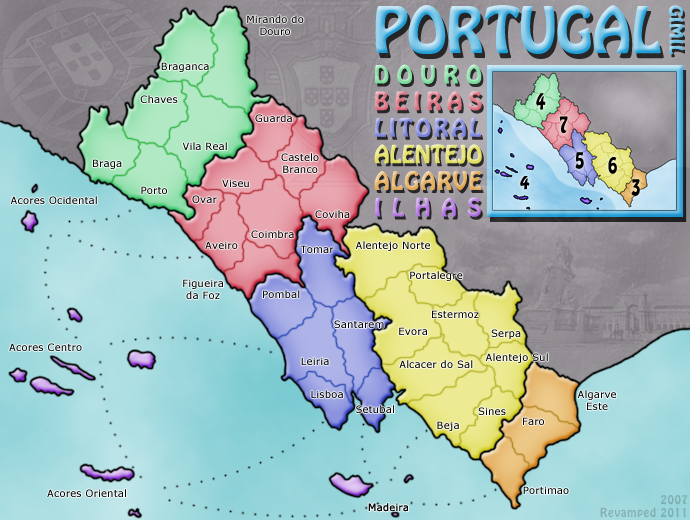
Click image to enlarge.
TODO/Areas for discussion:
-Add impassables.
-Add a neutral to one of the Algarve terrs (is this 100% a good idea?).
-Perhaps add a compass to aid in orientation.
-Custom shape around islands continent.
-New island attack routes.
-Rework territory names again. Make them strong with no outline. And fix positioning of all.
-Add 88 coordinates.
Changes:
-Added bevel to the continents, continent names and title.
-Lightened ILHAS to avoid colour blind issue between it and LITORAL.
-Added watermarks to dead land.
-Change the minimap border.
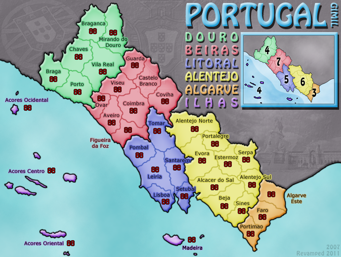
TODO/Areas for discussion:
-Add impassables.
-Perhaps add a compass to aid in orientation.
-Custom shape around islands continent.
-New island attack routes.
Changes:
-Tweek all territory names
-Added 88 to all terrs
Looking better and better! I like the idea of a compass. And make sure the minimap has that same bevel effect and whatnot as the mainland. Still not convinced that title font is a good choice...
Victor Sullivan wrote:Looking better and better! I like the idea of a compass. And make sure the minimap has that same bevel effect and whatnot as the mainland. Still not convinced that title font is a good choice...
-Sully
Thanks Sully,
I forgot to update the mini map so it is consistent with the main land, thank for pointing it out. I plan on adding a compass, just haven't decided how it should look.
What dont you like about the title text, I really like it and will be resistant to changing it unless there was a good reason.

 " and "Christ, that looks bad
  ".
".