I could help you if you were a GIMP user... sadly, I don't think you can open GIMP brushes with photoshop.Industrial Helix wrote:Yes it should have a title with a little bit of artwork... but I want to solve this train track mess first.
Speaking of which... i cannot for the life of me manage to draw train tracks with evenly spaced ties... masters of the railroad maps... please help me!
[Abandoned] - Russian Revolution
Moderator: Cartographers
Forum rules
Please read the Community Guidelines before posting.
Please read the Community Guidelines before posting.
-
natty dread

- Posts: 12876
- Joined: Fri Feb 08, 2008 8:58 pm
- Location: just plain fucked
Re: Russian Revolution: 3/26 - White Rails p. 12


Re: Russian Revolution: 3/26 - White Rails p. 12
Maybe they could install gimp, then draw a railroad track, then copy it onto there map.natty_dread wrote:I could help you if you were a GIMP user... sadly, I don't think you can open GIMP brushes with photoshop.Industrial Helix wrote:Yes it should have a title with a little bit of artwork... but I want to solve this train track mess first.
Speaking of which... i cannot for the life of me manage to draw train tracks with evenly spaced ties... masters of the railroad maps... please help me!

16:00:18 ‹Pixar› Valentines Day the one day in they year that the V and the D come together
-
Industrial Helix

- Posts: 3462
- Joined: Mon Jul 14, 2008 6:49 pm
- Gender: Female
- Location: Ohio
Re: Russian Revolution: 3/26 - White Rails p. 12
What brushes do you use? Perhaps I could find something similar. I would expect that there would be something similar.natty_dread wrote:I could help you if you were a GIMP user... sadly, I don't think you can open GIMP brushes with photoshop.Industrial Helix wrote:Yes it should have a title with a little bit of artwork... but I want to solve this train track mess first.
Speaking of which... i cannot for the life of me manage to draw train tracks with evenly spaced ties... masters of the railroad maps... please help me!
Sketchblog [Update 07/25/11]: http://indyhelixsketch.blogspot.com/
Living in Japan [Update 07/17/11]: http://mirrorcountryih.blogspot.com/
Russian Revolution map for ConquerClub [07/20/11]: http://www.conquerclub.com/forum/viewto ... 1&t=116575
Living in Japan [Update 07/17/11]: http://mirrorcountryih.blogspot.com/
Russian Revolution map for ConquerClub [07/20/11]: http://www.conquerclub.com/forum/viewto ... 1&t=116575

Re: Russian Revolution: 3/26 - White Rails p. 12
IH. See if you can use these rail brushes that i used on Rail Afrcia.Industrial Helix wrote:Yes it should have a title with a little bit of artwork... but I want to solve this train track mess first.
Speaking of which... i cannot for the life of me manage to draw train tracks with evenly spaced ties... masters of the railroad maps... please help me!
They're done in Ilustrator CS3, so you should be able to use them in PS.
Save as...
http://h1.ripway.com/cairnswk/Rail_Brushes.ai
If you can grab them and use them successfully, i'll put them into Tools.

* Pearl Harbour * Waterloo * Forbidden City * Jamaica * Pot Mosbi
-
natty dread
- Posts: 12876
- Joined: Fri Feb 08, 2008 8:58 pm
- Location: just plain fucked
Re: Russian Revolution: 3/26 - White Rails p. 12
I make my own brushes...Industrial Helix wrote:
What brushes do you use? Perhaps I could find something similar. I would expect that there would be something similar.
-
Industrial Helix
- Posts: 3462
- Joined: Mon Jul 14, 2008 6:49 pm
- Gender: Female
- Location: Ohio
Re: Russian Revolution: 3/26 - White Rails p. 12
Hmm... seems that I need an .abr filecairnswk wrote:IH. See if you can use these rail brushes that i used on Rail Afrcia.Industrial Helix wrote:Yes it should have a title with a little bit of artwork... but I want to solve this train track mess first.
Speaking of which... i cannot for the life of me manage to draw train tracks with evenly spaced ties... masters of the railroad maps... please help me!
They're done in Ilustrator CS3, so you should be able to use them in PS.
Save as...
http://h1.ripway.com/cairnswk/Rail_Brushes.ai
If you can grab them and use them successfully, i'll put them into Tools.
Sketchblog [Update 07/25/11]: http://indyhelixsketch.blogspot.com/
Living in Japan [Update 07/17/11]: http://mirrorcountryih.blogspot.com/
Russian Revolution map for ConquerClub [07/20/11]: http://www.conquerclub.com/forum/viewto ... 1&t=116575
Living in Japan [Update 07/17/11]: http://mirrorcountryih.blogspot.com/
Russian Revolution map for ConquerClub [07/20/11]: http://www.conquerclub.com/forum/viewto ... 1&t=116575
Re: Russian Revolution: 3/26 - White Rails p. 12
Industrial Helix wrote:....
Hmm... seems that I need an .abr file

* Pearl Harbour * Waterloo * Forbidden City * Jamaica * Pot Mosbi
-
Pope Joan
- Posts: 96
- Joined: Wed Mar 23, 2011 3:34 pm
- Gender: Female
- Location: Holy See (crusading until the end September)
Re: Russian Revolution: 3/26 - White Rails p. 12
Names corrections:
Oren does not exist
Stavropol not Stavrapol
Vologda not whatever is written there...
Oren does not exist
Stavropol not Stavrapol
Vologda not whatever is written there...
-
Industrial Helix
- Posts: 3462
- Joined: Mon Jul 14, 2008 6:49 pm
- Gender: Female
- Location: Ohio
Re: Russian Revolution: 3/26 - White Rails p. 12
Duly noted. Thanks!Pope Joan wrote:Names corrections:
Oren does not exist
Stavropol not Stavrapol
Vologda not whatever is written there...
Sketchblog [Update 07/25/11]: http://indyhelixsketch.blogspot.com/
Living in Japan [Update 07/17/11]: http://mirrorcountryih.blogspot.com/
Russian Revolution map for ConquerClub [07/20/11]: http://www.conquerclub.com/forum/viewto ... 1&t=116575
Living in Japan [Update 07/17/11]: http://mirrorcountryih.blogspot.com/
Russian Revolution map for ConquerClub [07/20/11]: http://www.conquerclub.com/forum/viewto ... 1&t=116575
-
Industrial Helix
- Posts: 3462
- Joined: Mon Jul 14, 2008 6:49 pm
- Gender: Female
- Location: Ohio
Re: Russian Revolution [09 May 2011] - White Rails p. 12
Alright... the names changes have been made. I tried something totally different for the rails and to be honest, I rather like it. It's simple and it stands out against the borders well enough. Plus, Moscow looks like the communist octopus it is.
- Click image to enlarge.

Sketchblog [Update 07/25/11]: http://indyhelixsketch.blogspot.com/
Living in Japan [Update 07/17/11]: http://mirrorcountryih.blogspot.com/
Russian Revolution map for ConquerClub [07/20/11]: http://www.conquerclub.com/forum/viewto ... 1&t=116575
Living in Japan [Update 07/17/11]: http://mirrorcountryih.blogspot.com/
Russian Revolution map for ConquerClub [07/20/11]: http://www.conquerclub.com/forum/viewto ... 1&t=116575
-
Victor Sullivan

- Posts: 6010
- Joined: Mon Feb 08, 2010 8:17 pm
- Gender: Male
- Location: Columbus, OH
- Contact:
Re: Russian Revolution [08 Jul 2011] - Moscoctopus
Title? 
-Sully
-Sully
Beckytheblondie: "Don't give us the dispatch, give us a mustache ride."
Scaling back on my CC involvement...
Scaling back on my CC involvement...
-
DiM

- Posts: 10415
- Joined: Wed Feb 14, 2007 6:20 pm
- Gender: Male
- Location: making maps for scooby snacks
Re: Russian Revolution [08 Jul 2011] - Moscoctopus
i like how this map looks like it's hand-drawn. the little lines in the water, the washed out colours and the grain on the flags, even the poorly spaced rail lines are very nice details that work together to create the hand-drawn feel.
however some elements spoil that feel.
1. the perfect lines in the legend. try and freehand them. it doesn't matter if they don't come out perfect. that's the whole point.
2. the areas with diagonal lines could also use a bit of freehand
3. the font
4. lack of a nice title.
i took a peek at your blog and i really liked your sketches. use that talent here to give the map your own personal touch. anybody can draw a straight line in photoshop but not many can draw by hand like you.
however some elements spoil that feel.
1. the perfect lines in the legend. try and freehand them. it doesn't matter if they don't come out perfect. that's the whole point.
2. the areas with diagonal lines could also use a bit of freehand
3. the font
4. lack of a nice title.
i took a peek at your blog and i really liked your sketches. use that talent here to give the map your own personal touch. anybody can draw a straight line in photoshop but not many can draw by hand like you.
“In the beginning God said, the four-dimensional divergence of an antisymmetric, second rank tensor equals zero, and there was light, and it was good. And on the seventh day he rested.”- Michio Kaku
-
natty dread
- Posts: 12876
- Joined: Fri Feb 08, 2008 8:58 pm
- Location: just plain fucked
Re: Russian Revolution [08 Jul 2011] - Moscoctopus
I don't know, I still think the railways conflict with the borders.
The borders should be stronger than the railways, not the other way around. The borders are what primarily help the player to visualize the map and the connections between the territories - the territory boundaries should be the strongest, clearest element of the map.
Here's what I suggest for the railways:
- make them a bit narrower and not as thick
- lower the opacity a bit
- cut them off where they overlap with borders, so that it looks sort of like the borders go over them - this will help bring the borders on the foreground, while still keeping the railway connections clear.
The borders should be stronger than the railways, not the other way around. The borders are what primarily help the player to visualize the map and the connections between the territories - the territory boundaries should be the strongest, clearest element of the map.
Here's what I suggest for the railways:
- make them a bit narrower and not as thick
- lower the opacity a bit
- cut them off where they overlap with borders, so that it looks sort of like the borders go over them - this will help bring the borders on the foreground, while still keeping the railway connections clear.
-
Industrial Helix
- Posts: 3462
- Joined: Mon Jul 14, 2008 6:49 pm
- Gender: Female
- Location: Ohio
Re: Russian Revolution [08 Jul 2011] - Moscoctopus
OK, thanks for the feedback guys.
@VS - Title.. yes, this will be soon. I think I'm going to draw it.
@ DiM - Thanks for the kind words and feedback (actually, this map was hand drawn for the most part. Mostly the colors and the paper, the rivers and seas as well. The borders, ect, looked too sloppy when scanned in so i redrew them in PS).
1) Freehand it.... hmmm... I'm real hesitant. I feel like the imaginary cartographer who drew the map would have had access to a ruler. If freehanding it doesn't look good to my eye, I think maybe something like layered papers a la 13 Colonies or First Nations of America would work quite nicely.
2) Do you mean the army symbols? Like the nearby ruler, I presumed the cartographer had a template for drawing these things. When I freehanded them originally, they were a total mess.
3) You don't like the font? The style I was going for was typewriter of the early 20th century. I rather like the font, so while your criticism is appreciated, I think I'm going to keep it.
4) Nice title... yes. This is coming. There's a little spot in the lower left I'm going to use.
@Natty - regrettably, I'm of totally different opinion with you on this one. I think the railroads should be bolder than the borders because they cross over them. The regions are irrelevant to the trains because they link cities, not territories. When i had them so narrow, I felt they just got muddied up with the borders too much. With them thick like this, they are clear that they are not borders and are something different. I might lower the opacity a bit though, just to get it to mesh with the rest of the map a bit better.
@VS - Title.. yes, this will be soon. I think I'm going to draw it.
@ DiM - Thanks for the kind words and feedback (actually, this map was hand drawn for the most part. Mostly the colors and the paper, the rivers and seas as well. The borders, ect, looked too sloppy when scanned in so i redrew them in PS).
1) Freehand it.... hmmm... I'm real hesitant. I feel like the imaginary cartographer who drew the map would have had access to a ruler. If freehanding it doesn't look good to my eye, I think maybe something like layered papers a la 13 Colonies or First Nations of America would work quite nicely.
2) Do you mean the army symbols? Like the nearby ruler, I presumed the cartographer had a template for drawing these things. When I freehanded them originally, they were a total mess.
3) You don't like the font? The style I was going for was typewriter of the early 20th century. I rather like the font, so while your criticism is appreciated, I think I'm going to keep it.
4) Nice title... yes. This is coming. There's a little spot in the lower left I'm going to use.
@Natty - regrettably, I'm of totally different opinion with you on this one. I think the railroads should be bolder than the borders because they cross over them. The regions are irrelevant to the trains because they link cities, not territories. When i had them so narrow, I felt they just got muddied up with the borders too much. With them thick like this, they are clear that they are not borders and are something different. I might lower the opacity a bit though, just to get it to mesh with the rest of the map a bit better.
Sketchblog [Update 07/25/11]: http://indyhelixsketch.blogspot.com/
Living in Japan [Update 07/17/11]: http://mirrorcountryih.blogspot.com/
Russian Revolution map for ConquerClub [07/20/11]: http://www.conquerclub.com/forum/viewto ... 1&t=116575
Living in Japan [Update 07/17/11]: http://mirrorcountryih.blogspot.com/
Russian Revolution map for ConquerClub [07/20/11]: http://www.conquerclub.com/forum/viewto ... 1&t=116575
-
DiM
- Posts: 10415
- Joined: Wed Feb 14, 2007 6:20 pm
- Gender: Male
- Location: making maps for scooby snacks
Re: Russian Revolution [08 Jul 2011] - Moscoctopus
1. fair enoughIndustrial Helix wrote:@ DiM - Thanks for the kind words and feedback (actually, this map was hand drawn for the most part. Mostly the colors and the paper, the rivers and seas as well. The borders, ect, looked too sloppy when scanned in so i redrew them in PS).
1) Freehand it.... hmmm... I'm real hesitant. I feel like the imaginary cartographer who drew the map would have had access to a ruler. If freehanding it doesn't look good to my eye, I think maybe something like layered papers a la 13 Colonies or First Nations of America would work quite nicely.
2) Do you mean the army symbols? Like the nearby ruler, I presumed the cartographer had a template for drawing these things. When I freehanded them originally, they were a total mess.
3) You don't like the font? The style I was going for was typewriter of the early 20th century. I rather like the font, so while your criticism is appreciated, I think I'm going to keep it.
4) Nice title... yes. This is coming. There's a little spot in the lower left I'm going to use.
2. i actually meant the diagonal lines inside the cities but since we established the map maker had acces to a ruler i guess they're ok even though they look too perfect to me. i mean even with a ruler you'd still not get them perfectly spaced and paralel.
3. i actually like the font and immediately recognized the typewriter. but i would actually feel more attracted if it were a handwriting font. like the map maker made notations on the map.
4. perfect.
“In the beginning God said, the four-dimensional divergence of an antisymmetric, second rank tensor equals zero, and there was light, and it was good. And on the seventh day he rested.”- Michio Kaku
-
Augustus Maximus
- Posts: 46
- Joined: Wed Apr 27, 2011 8:17 pm
- Gender: Male
Re: Russian Revolution [08 Jul 2011] - Moscoctopus
I like the look of this map. I have a book of maps from WW1, and this map is very similar in style to them.
-
Industrial Helix
- Posts: 3462
- Joined: Mon Jul 14, 2008 6:49 pm
- Gender: Female
- Location: Ohio
Re: Russian Revolution [08 Jul 2011] - Moscoctopus
It wouldn't happen to be the westpoint atlas of WWI would it? That was part of the inspiration for this one. I also looked at loads of contemporary maps to get an idea for the feel. I'm glad you like it so far!Augustus Maximus wrote:I like the look of this map. I have a book of maps from WW1, and this map is very similar in style to them.
Sketchblog [Update 07/25/11]: http://indyhelixsketch.blogspot.com/
Living in Japan [Update 07/17/11]: http://mirrorcountryih.blogspot.com/
Russian Revolution map for ConquerClub [07/20/11]: http://www.conquerclub.com/forum/viewto ... 1&t=116575
Living in Japan [Update 07/17/11]: http://mirrorcountryih.blogspot.com/
Russian Revolution map for ConquerClub [07/20/11]: http://www.conquerclub.com/forum/viewto ... 1&t=116575
-
theBastard

- Posts: 994
- Joined: Sat Jan 09, 2010 9:05 am
Re: Russian Revolution [08 Jul 2011] - Moscoctopus
are railways solved? did you Helix try railways as I have on Slovak Uprising map? that "symbol" is used on maps for railways...

Re: Russian Revolution [08 Jul 2011] - Moscoctopus
well if it wasn't you I would say those rails are a quick and cheap solution to avoid graphic work, if it wasn't you
as said before its too strong in respect to the borders
have you tried to use only a thin double line
so borders would be a thick black line and trains a thin double line
as said before its too strong in respect to the borders
have you tried to use only a thin double line
so borders would be a thick black line and trains a thin double line
De gueules à la tour d'argent ouverte, crénelée de trois pièces, sommée d'un donjon ajouré, crénelé de deux pièces
Gules an open tower silver, crenellated three parts, topped by a apertured turret, crenellated two parts
Gules an open tower silver, crenellated three parts, topped by a apertured turret, crenellated two parts
-
Augustus Maximus
- Posts: 46
- Joined: Wed Apr 27, 2011 8:17 pm
- Gender: Male
Re: Russian Revolution [08 Jul 2011] - Moscoctopus
No. The book I have was published in 1917 in Berlin. It shows the month to month changes on the Western Front from August 1914 to February 1917. The book was printed by a private company for sale to the public.Industrial Helix wrote:It wouldn't happen to be the westpoint atlas of WWI would it? That was part of the inspiration for this one. I also looked at loads of contemporary maps to get an idea for the feel. I'm glad you like it so far!Augustus Maximus wrote:I like the look of this map. I have a book of maps from WW1, and this map is very similar in style to them.
-
Industrial Helix
- Posts: 3462
- Joined: Mon Jul 14, 2008 6:49 pm
- Gender: Female
- Location: Ohio
Re: Russian Revolution [08 Jul 2011] - Moscoctopus
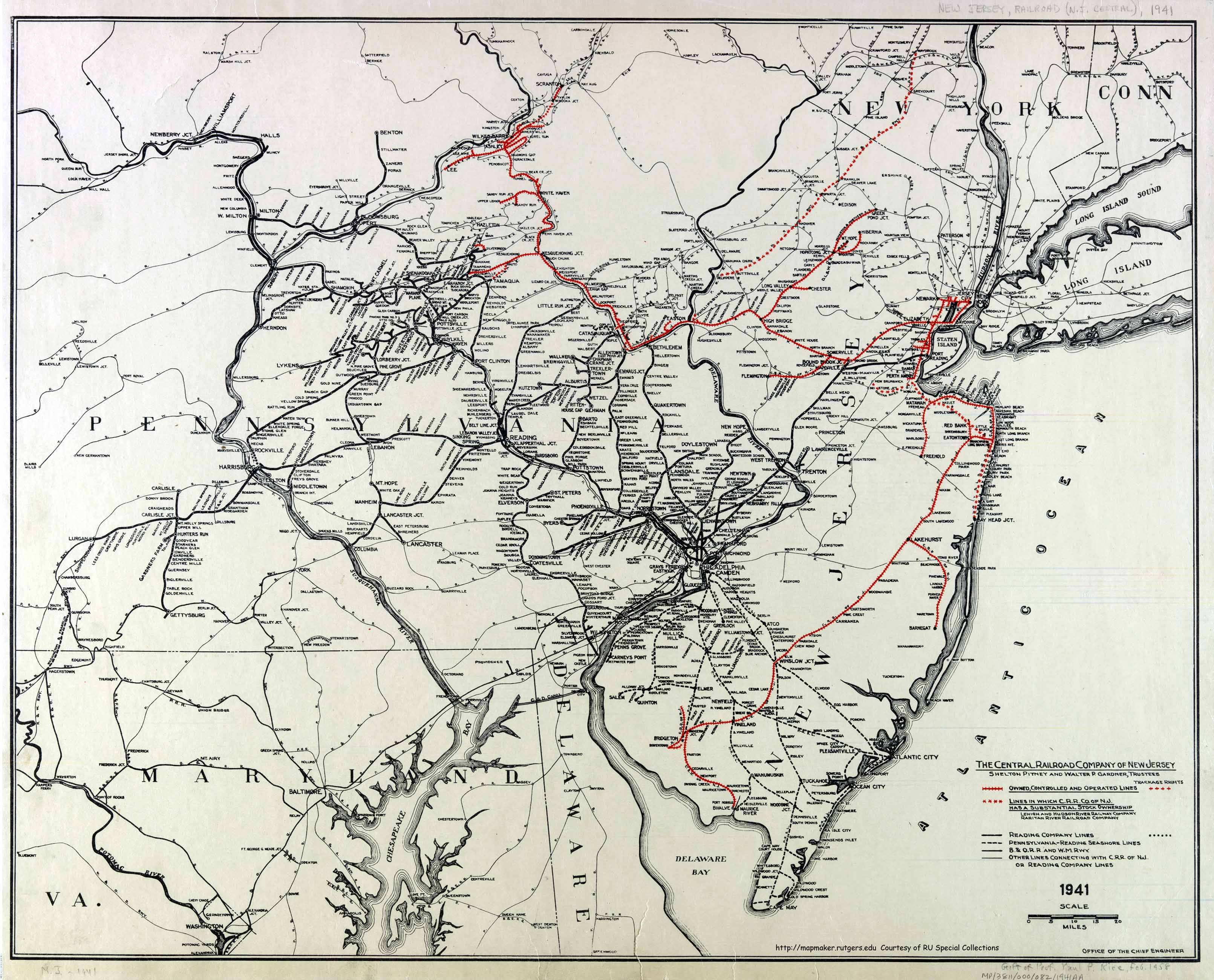
@pamoa - Well, i want to use a railroad symbol that is somewhat common to maps of the period. The military maps of the period I've seen use this style most often. This style was my first choice but I couldn't find a way to make it work, but when I was googling for solutions, I found this map:
The spiky rails are much thicker than the regular borders and that causes them to stand out from the rest of map. It seemed like a good solution that gave me what I wanted originally. I didn't want to do the skyview rails because I think they're quite uncommon to maps, same for the double line idea.
Update: I made the railroads much less inky and black. To me, they seem to blend in the map muchbetter yet still stand out enough to be distinct.
- Click image to enlarge.
- Click image to enlarge.

Sketchblog [Update 07/25/11]: http://indyhelixsketch.blogspot.com/
Living in Japan [Update 07/17/11]: http://mirrorcountryih.blogspot.com/
Russian Revolution map for ConquerClub [07/20/11]: http://www.conquerclub.com/forum/viewto ... 1&t=116575
Living in Japan [Update 07/17/11]: http://mirrorcountryih.blogspot.com/
Russian Revolution map for ConquerClub [07/20/11]: http://www.conquerclub.com/forum/viewto ... 1&t=116575
-
natty dread
- Posts: 12876
- Joined: Fri Feb 08, 2008 8:58 pm
- Location: just plain fucked
Re: Russian Revolution [11 Jul 2011] - Moscoctopus
I'm a bit concerned how this will look on the small map. Have you considered supersizing this a bit?
-
Industrial Helix
- Posts: 3462
- Joined: Mon Jul 14, 2008 6:49 pm
- Gender: Female
- Location: Ohio
Re: Russian Revolution [11 Jul 2011] - Moscoctopus
Not yet. Maybe I'll shrink it down tomorrow.
Sketchblog [Update 07/25/11]: http://indyhelixsketch.blogspot.com/
Living in Japan [Update 07/17/11]: http://mirrorcountryih.blogspot.com/
Russian Revolution map for ConquerClub [07/20/11]: http://www.conquerclub.com/forum/viewto ... 1&t=116575
Living in Japan [Update 07/17/11]: http://mirrorcountryih.blogspot.com/
Russian Revolution map for ConquerClub [07/20/11]: http://www.conquerclub.com/forum/viewto ... 1&t=116575
Re: Russian Revolution [11 Jul 2011] - Moscoctopus
much better like this would you mind trying with a bit of brown in it (sepia ink)
my other concern is about white armies on the map as reds and "green" are easy to find the white ones are invisible
maybe you should use the white you have in the Czech flag
my other concern is about white armies on the map as reds and "green" are easy to find the white ones are invisible
maybe you should use the white you have in the Czech flag
De gueules à la tour d'argent ouverte, crénelée de trois pièces, sommée d'un donjon ajouré, crénelé de deux pièces
Gules an open tower silver, crenellated three parts, topped by a apertured turret, crenellated two parts
Gules an open tower silver, crenellated three parts, topped by a apertured turret, crenellated two parts
-
gimil

- Posts: 8599
- Joined: Sat Mar 03, 2007 12:42 pm
- Gender: Male
- Location: United Kingdom (Scotland)
Re: Russian Revolution [11 Jul 2011] - Moscoctopus
Hi ndustrial Helix,
I love the pale grunge effect you are going with in this map. However I do think some or your free hand line drawing needs some improvement. particularly with borders. Some your boarders looks very good and natural, I an guessing these are ones you traced from a base image. Then you have those territory borders which you can tell are hand drawn, then don't flow the same. For example the pink high population areas have a good (I an guessing traced) outer boarder, but then you have the ones you must have free handed inside that region that stick out. I don't know if it is a big issue but I defiantly believe this is holding your image back from its full potential, which judging by what you have done so far, is well within your ability to fix.
I have many little issues I want to address about this map as well, but I think it is better to address those at a later date. Keep up the good work here, mate.
I love the pale grunge effect you are going with in this map. However I do think some or your free hand line drawing needs some improvement. particularly with borders. Some your boarders looks very good and natural, I an guessing these are ones you traced from a base image. Then you have those territory borders which you can tell are hand drawn, then don't flow the same. For example the pink high population areas have a good (I an guessing traced) outer boarder, but then you have the ones you must have free handed inside that region that stick out. I don't know if it is a big issue but I defiantly believe this is holding your image back from its full potential, which judging by what you have done so far, is well within your ability to fix.
I have many little issues I want to address about this map as well, but I think it is better to address those at a later date. Keep up the good work here, mate.
What do you know about map making, bitch?
Top Score:2403natty_dread wrote:I was wrong