ya true dat btw #1 for me, the others dont stand out well enoughCJ Lues wrote:Great maps guys!!!
btw. isn’t there a missing impassable (between Croydon and Bromley) in London 2?
World Cities Contest: We have a winner!
Moderator: Cartographers
Forum rules
Please read the community guidelines before posting.
Please read the community guidelines before posting.
-
qwertylpc

- Posts: 759
- Joined: Fri Jun 05, 2009 4:12 pm
- Location: In front of a computer somewhere out there in the universe
- Contact:
Re: World Cities Contest: Pick your favourite London Map!

-qwertylpc 

My active tournaments looking for players
Q's "Hey you went first!"
Q's 1v1 NBA Playoffs
Q's Feudal Overlord
Game 9151351
Most Consecutive Troops Defeated 0
Most Consecutive Troops Lost 14
My active tournaments looking for players
Q's "Hey you went first!"
Q's 1v1 NBA Playoffs
Q's Feudal Overlord
Game 9151351
Most Consecutive Troops Defeated 0
Most Consecutive Troops Lost 14
-
natty dread

- Posts: 12876
- Joined: Fri Feb 08, 2008 8:58 pm
- Location: just plain fucked
Re: World Cities Contest: Pick your favourite London Map!
Why were the large maps removed from the first post?

-
the.killing.44

- Posts: 4724
- Joined: Thu Oct 23, 2008 7:43 pm
- Gender: Male
- Location: now tell me what got two gums and knows how to spit rhymes
- Contact:
Re: World Cities Contest: Pick your favourite London Map!
Victor, there is nothing "new" about #1. I suppose [Mod edit] meant it to be an imitation of, or perhaps more appropriately a gross and obvious counterfeit of, Great Lakes? Even the layout of the elements on the canvas is plagiarised. No aspect of the map works well in conjunction with any other. Bland.
#3 is simply a mapmaker's first or second attempt at a map. Not to be slanderous, there isn't more to be said.
[mod edit] Go #2.
#3 is simply a mapmaker's first or second attempt at a map. Not to be slanderous, there isn't more to be said.
[mod edit] Go #2.
Last edited by thenobodies80 on Mon May 23, 2011 2:19 pm, edited 2 times in total.
Reason: remove/edited inappropriate text
Reason: remove/edited inappropriate text
-
yazoochick

- Posts: 172
- Joined: Sat Feb 03, 2007 1:48 pm
- Gender: Female
- Location: Imaginaerum

Re: World Cities Contest: Pick your favourite London Map!
the.killing.44 wrote:Victor, there is nothing "new" about #1. I suppose [mod edit] meant it to be an imitation of, or perhaps more appropriately a gross and obvious counterfeit of, Great Lakes? Even the layout of the elements on the canvas is plagiarised. No aspect of the map works well in conjunction with any other. Bland.
#3 is simply a mapmaker's first or second attempt at a map. Not to be slanderous, there isn't more to be said.
[mod edit] go #2.
Yeah, 2's got my vote also, although I think the green is overpowering, I still like the smoothness of it.
Last edited by thenobodies80 on Mon May 23, 2011 2:18 pm, edited 2 times in total.
Reason: remove/edited inappropriate text
Reason: remove/edited inappropriate text
-
Victor Sullivan

- Posts: 6010
- Joined: Mon Feb 08, 2010 8:17 pm
- Gender: Male
- Location: Columbus, OH
- Contact:
Re: World Cities Contest: Pick your favourite London Map!
the.killing.44 wrote:Victor, there is nothing "new" about #1. I suppose [mod edit] meant it to be an imitation of, or perhaps more appropriately a gross and obvious counterfeit of, Great Lakes? Even the layout of the elements on the canvas is plagiarised. No aspect of the map works well in conjunction with any other. Bland.
#3 is simply a mapmaker's first or second attempt at a map. Not to be slanderous, there isn't more to be said.
[mod edit] Go #2.
Oh, killing! And #2 don't remind you of England? And besides, despite the perspective, there's not much else that ties #1 with Great Lakes. I think it's a rather fresh style still.-Sully
Last edited by thenobodies80 on Mon May 23, 2011 2:18 pm, edited 2 times in total.
Reason: remove/edited inappropriate text
Reason: remove/edited inappropriate text
Beckytheblondie: "Don't give us the dispatch, give us a mustache ride."
Scaling back on my CC involvement...
Scaling back on my CC involvement...
-
natty dread
- Posts: 12876
- Joined: Fri Feb 08, 2008 8:58 pm
- Location: just plain fucked
Re: World Cities Contest: Pick your favourite London Map!
Oh please, killing... plagiarism? Counterfeit? Lol. Like Great Lakes is the only map in the world with a tilted perspective... 
There's no such thing as original ideas. Everything you can think of someone has already done in one form or another. All you can do is take an idea and make your own interpretation of it.
There's no such thing as original ideas. Everything you can think of someone has already done in one form or another. All you can do is take an idea and make your own interpretation of it.

Re: World Cities Contest: Pick your favourite London Map!
Space:
1 wastes way too much at the top.
2 wastes a bit at the bottom, it should be cut off like 1.
3 wastes space everywhere eventho it's the smallest.
Text:
1's white isn't very readable.
2's black is fine, THO THE ALL CAPS IS IRRITATING.
3's black in the southeast doesn't have enough contrast.
Continent colors:
1's is the best and will probably look fine with colored army numbers, tho it could do with more contrast.
2's is too many shades of green.
3's is too much blue and purple.
Overall:
1's waste of space at the top spoils it.
2 is my pick.
3's map and legend borders spoil it. The inset should be removed and the city's size exaggerated.
Errors?:
2 doesn't have an impassable between Croydon and Bromley.
All of that said, great work by those involved - I couldn't do anything as nice.
1 wastes way too much at the top.
2 wastes a bit at the bottom, it should be cut off like 1.
3 wastes space everywhere eventho it's the smallest.
Text:
1's white isn't very readable.
2's black is fine, THO THE ALL CAPS IS IRRITATING.
3's black in the southeast doesn't have enough contrast.
Continent colors:
1's is the best and will probably look fine with colored army numbers, tho it could do with more contrast.
2's is too many shades of green.
3's is too much blue and purple.
Overall:
1's waste of space at the top spoils it.
2 is my pick.
3's map and legend borders spoil it. The inset should be removed and the city's size exaggerated.
Errors?:
2 doesn't have an impassable between Croydon and Bromley.
All of that said, great work by those involved - I couldn't do anything as nice.

Re: World Cities Contest: Pick your favourite London Map!
If a map is going to waste space (and I am not sure I call a large title a waste of space), I much prefer it to be at the top of the map. That way, I can scroll it off and get down to the Action pane on the Game page. Large non-playable areas at the bottom of maps I find very annoying.
-
karelpietertje

- Posts: 801
- Joined: Mon Sep 03, 2007 1:43 pm
- Gender: Male
- Contact:
Re: World Cities Contest: Pick your favourite London Map!
Is it me or, in Entry 1, is the name of Southwark (south of the river, borders the city) simply missing?
(I read in the other options, don't know London that well)
(I read in the other options, don't know London that well
)
-
porkenbeans

- Posts: 2546
- Joined: Mon Sep 10, 2007 4:06 pm
Re: World Cities Contest: Pick your favourite London Map!
Now that you bring it up, that so called "tilted perspective" is all wrong. If it were done correctly, it would be distorted in a way that makes the image shorter, ...not taller.natty_dread wrote:Oh please, killing... plagiarism? Counterfeit? Lol. Like Great Lakes is the only map in the world with a tilted perspective...
There's no such thing as original ideas. Everything you can think of someone has already done in one form or another. All you can do is take an idea and make your own interpretation of it.
All in all, #1 is OK, but it just has too much that needs to be addressed before it is up to par.
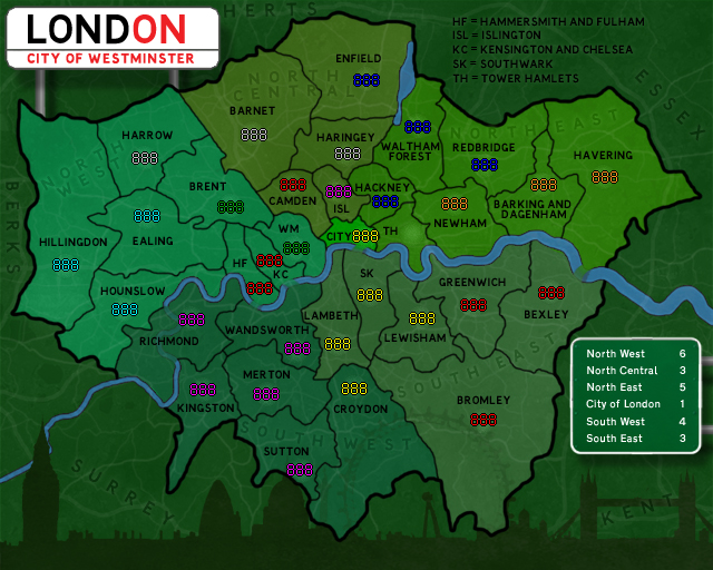
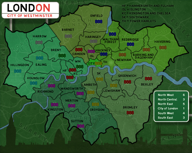
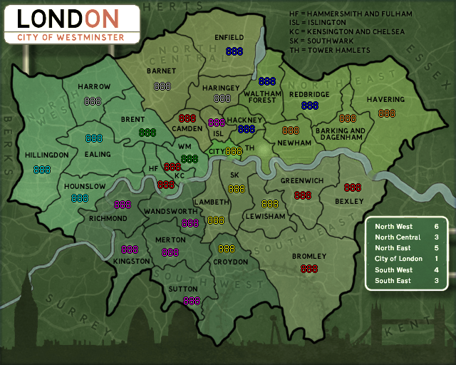
#2 is clearly the most professional looking entry. I think that the "all green" effect, is holding it back in the poll. I believe that this effect has advantages that are not seen until you see it with the numbers added. So, I took the liberty to show just what I mean. The only color that does not show up as well as the others are the green ones, so I have showed a couple of examples of minor color tweaks that might be in order.
without any color tweaking-
Spoiler
- Click image to enlarge.
Spoiler
- Click image to enlarge.
Spoiler
- Click image to enlarge.
Last edited by thenobodies80 on Sun May 22, 2011 6:25 am, edited 5 times in total.
Reason: Added spoilers to images. The images are not part of the competition.
Reason: Added spoilers to images. The images are not part of the competition.

-
natty dread
- Posts: 12876
- Joined: Fri Feb 08, 2008 8:58 pm
- Location: just plain fucked
Re: World Cities Contest: Pick your favourite London Map!
Things like that will be fixed in FF... it's not like the maps have to be put in play exactly as they are.karelpietertje wrote:Is it me or, in Entry 1, is the name of Southwark (south of the river, borders the city) simply missing?
(I read in the other options, don't know London that well
-
kevusher
- Posts: 13
- Joined: Tue Apr 07, 2009 7:21 am
- Gender: Male
- Location: Sailing the Seas of Cheese
Re: World Cities Contest: Pick your favourite London Map!
Just a minor point - I think the Lond'on' used in no. 2 may be copyrighted....


Re: World Cities Contest: Pick your favourite London Map!
I picked #1. All of them look very nice, but #2 and #3 remind me of existing maps with colour schemes where it is very difficult to distinguish between enemy armies. #2 especially, reminds me of the existing England map where it is almost impossible to tell the difference between the Green and Grey armies.
“Life is a shipwreck, but we must not forget to sing in the lifeboats.”
― Voltaire
― Voltaire

Re: World Cities Contest: Pick your favourite London Map!
2 for sure
Highest Rank: 26 Highest Score: 3480

-
the.killing.44
- Posts: 4724
- Joined: Thu Oct 23, 2008 7:43 pm
- Gender: Male
- Location: now tell me what got two gums and knows how to spit rhymes
- Contact:
Re: World Cities Contest: Pick your favourite London Map!
Victor Sullivan wrote:the.killing.44 wrote:Victor, there is nothing "new" about #1. I suppose [Mod edit] meant it to be an imitation of, or perhaps more appropriately a gross and obvious counterfeit of, Great Lakes? Even the layout of the elements on the canvas is plagiarised. No aspect of the map works well in conjunction with any other. Bland.
#3 is simply a mapmaker's first or second attempt at a map. Not to be slanderous, there isn't more to be said.
[mod edit] Go #2.
-Sully
Plagiarised was a literary hyperbole.natty_dread wrote:Oh please, killing... plagiarism? Counterfeit? Lol. Like Great Lakes is the only map in the world with a tilted perspective...
There's no such thing as original ideas. Everything you can think of someone has already done in one form or another. All you can do is take an idea and make your own interpretation of it.
Firstly, of course #2 reminds me of England [Mod Edit] … but it works well being of the related subjects. They complement one another.
There is most definitely such a thing as an original idea. However, I am not saying that Wids had the original idea to tilt an image to create the illusion of a different perspective. No, I am saying that he was the first to do it on this website, and that [the mapmaker] obviously tried to emulate his map in more ways than just the perspective. I must mention the botched nature of [the] attempt to create the same feel, but really [the maker] also put the legend in the same style and the impassables in a poorly designed clone. Lastly, the background patterned brown is exactly that of Wids'.
But honestly it's not just [the] attempt that makes [the] map[#1] far from [entry #2]. It's just ugly. The images of London are a nice try to add some mood to the map but it doesn't mesh well with the rest of the canvas. The title is atrocious and takes the eye away from everything else instantly. There is no theme. The colors are washed out and positively reek of [the maker] style in border, color, and pattern overlay, not to mention the overly-condensed and hard-to-read font. The transition from map to images is nonexistent and jarring. Hell, the map just lies there and the absence of any sort of transitionary feel is sorely lacking. Why is there a thick brick line as an impassable? 2/3 of the Union Jack just sitting there in the corner?
[The] map's elements simply lie there and do not interact with one another. I'm sorry and I didn't originally intend to be overly rude. [mod edit] I can think of no more than five other map subjects that have the possibility of greater flavor and taste than London; truthfully, it is pretty easy to create a nice theme upon which to base a London map, for there are multiple distinct possibilities and for God's sake it's fucking London. The epitome of culture and history. I am disappointed [that entry #1 is going] to win this contest.
Last edited by the.killing.44 on Mon May 23, 2011 7:48 pm, edited 3 times in total.
-
thenobodies80

- Posts: 5401
- Joined: Wed Sep 05, 2007 4:30 am
- Gender: Male
- Location: Milan
Re: World Cities Contest: Pick your favourite London Map!
My vote goes to Nr. 2
To me it's the most professional and clean submission, although it's certainly not perfect (the missing impassable and bad bridges, just to make 2 examples). But I love the skyline and let me say I also like the idea of a England sister map.
Some thoughts about the other submissions:
Nr. 1 I'm sorry to say this, but personally I think, more or less, what the.killing.44 wrote:
Nr. 3 is interesting, even if it needs some improvements for what concern graphical quality and colors. Like others said, a brown Thames doesn't look so good, and also that purple-blue colors are a sort of eyesore.
To me it's the most professional and clean submission, although it's certainly not perfect (the missing impassable and bad bridges, just to make 2 examples). But I love the skyline and let me say I also like the idea of a England sister map.
Some thoughts about the other submissions:
Nr. 1 I'm sorry to say this, but personally I think, more or less, what the.killing.44 wrote:
Saying it in few words: the map doesn't looks to me a London Mapthe.killing.44 wrote:The images of London are a nice try to add some mood to the map but it doesn't mesh well with the rest of the canvas. The title is atrocious and takes the eye away from everything else instantly. There is no theme. The colors are washed out and positively reek of [the maker] style in border, color, and pattern overlay, not to mention the overly-condensed and hard-to-read font. The transition from map to images is nonexistent and jarring. Hell, the map just lies there and the absence of any sort of transitionary feel is sorely lacking. Why is there a thick brick line as an impassable? 2/3 of the Union Jack just sitting there in the corner?
[The] maps elements simply lie there and do not interact with one another.
Nr. 3 is interesting, even if it needs some improvements for what concern graphical quality and colors. Like others said, a brown Thames doesn't look so good, and also that purple-blue colors are a sort of eyesore.
Last edited by thenobodies80 on Mon May 23, 2011 7:08 pm, edited 3 times in total.
Reason: remove/edited inappropriate text
Reason: remove/edited inappropriate text
-
natty dread
- Posts: 12876
- Joined: Fri Feb 08, 2008 8:58 pm
- Location: just plain fucked
Re: World Cities Contest: Pick your favourite London Map!
47% of people seem to disagree with you guys.
SUCK IT UP CUPCAKES.
SUCK IT UP CUPCAKES.
-
Victor Sullivan
- Posts: 6010
- Joined: Mon Feb 08, 2010 8:17 pm
- Gender: Male
- Location: Columbus, OH
- Contact:
Re: World Cities Contest: Pick your favourite London Map!
natty_dread wrote:47% of people seem to disagree with you guys.
SUCK IT UP CUPCAKES.
I am Victor Sullivan, and I approve this message.
-Sully
Beckytheblondie: "Don't give us the dispatch, give us a mustache ride."
Scaling back on my CC involvement...
Scaling back on my CC involvement...

Re: World Cities Contest: Pick your favourite London Map!
I voted for map #1 in first day cause it's better than two others. But still map #1 isn't a good map as alone ...
The big London title really needs to be changed (Be re fonted or re colored or effected or whatever) as is now it's disgusting in my idea ...
Names in small map can not be read (or can be but hard)! It's probably due a bad re size from large one to small one. They need to be fixed too ...
But anyway between these 3, my vote is still #1 for sure ...
The only thing I liked in #2 was the London city image bar under the image which #1 has a more cooler one on top of the image ...
The big London title really needs to be changed (Be re fonted or re colored or effected or whatever) as is now it's disgusting in my idea ...
Names in small map can not be read (or can be but hard)! It's probably due a bad re size from large one to small one. They need to be fixed too ...
But anyway between these 3, my vote is still #1 for sure ...
The only thing I liked in #2 was the London city image bar under the image which #1 has a more cooler one on top of the image ...
-
natty dread
- Posts: 12876
- Joined: Fri Feb 08, 2008 8:58 pm
- Location: just plain fucked
Re: World Cities Contest: Pick your favourite London Map!
[Mod Edit]
The whole idea of doing something "original" just for the sake of being the first to do it, for the sake of being original, is flawed. Firstly, it often does not succeed - even if you don't directly "plagiarize" another work, and you think you're being original, you'll soon find out that some Norwegian guy did the same thing as you back in 1965 and he did it one-handed.
But not just that. Things that are "original" for the sake of being "original" are often just that... pretentious, artsy crap that have no other redeeming qualities.
So, the best one can do, is not put "originality" as his first priority. Rather, one must take an idea that works, then put his own twist on it. Make a new interpretation of an old idea. Instead of doing your all to make something original, you should look to make something good.
[Mod Edit]
Oh, and the map elements are exactly where they should be. You're just making up crap.
[Mod Edit]
No, there is not. Everything has already been done. Or let's just say, truly "original ideas" these days are things that are made for the sake of being original and often lack any other distinctive quality.the.killing.44 wrote:There is most definitely such a thing as an original idea.
The whole idea of doing something "original" just for the sake of being the first to do it, for the sake of being original, is flawed. Firstly, it often does not succeed - even if you don't directly "plagiarize" another work, and you think you're being original, you'll soon find out that some Norwegian guy did the same thing as you back in 1965 and he did it one-handed.
But not just that. Things that are "original" for the sake of being "original" are often just that... pretentious, artsy crap that have no other redeeming qualities.
So, the best one can do, is not put "originality" as his first priority. Rather, one must take an idea that works, then put his own twist on it. Make a new interpretation of an old idea. Instead of doing your all to make something original, you should look to make something good.
Which means what exactly? Right. I'm happy to let "Wids" have the bragging rights of "being the first to make a tilted map on this website". Well done for him. Some chinese dude already made a tilted map and put it on a website back in 1956, and he had no hands... who gives a shit.the.killing.44 wrote:However, I am not saying that Wids had the original idea to tilt an image to create the illusion of a different perspective. No, I am saying that he was the first to do it on this website
[Mod Edit]
Ok, I read through your diatribe, and all I can say is, sour grapes. If the map is such a piece of crap, I wonder why it's leading the vote? I guess the people voting it are just stupid and don't know which map they should like.... right?the.killing.44 wrote:[The] maps elements simply lie there and do not interact with one another. I'm sorry and I didn't originally intend to be overly rude. [Mod Edit]
Oh, and the map elements are exactly where they should be. You're just making up crap.
[Mod Edit]
Last edited by thenobodies80 on Mon May 23, 2011 2:17 pm, edited 2 times in total.
Reason: remove/edited inappropriate text
Reason: remove/edited inappropriate text
Re: World Cities Contest: Pick your favourite London Map!
Okay everyone simmer down!! There will be no more of this bickering back and forth. If this continues, then, well us CA's will have to make a decision on whether to cancel this contest and everyone loses, or take some other measures. Let this be fair warning to everyone!
-
Victor Sullivan
- Posts: 6010
- Joined: Mon Feb 08, 2010 8:17 pm
- Gender: Male
- Location: Columbus, OH
- Contact:
Re: World Cities Contest: Pick your favourite London Map!
Well, this...this is nice... Honestly, I think it's worth saying that all of the entries have their positive attributes. If they didn't have any, then they wouldn't have gotten any votes! #1, I think the title is cool, and the slightly tilted perspective along with the color scheme and textures. #2 pairs nicely with the England map, and I think it has a nice overall crispness to it. I also think #2 did well with the background, making it intriguing but subtle. #3 has a nice artsy feel, with the border, and the flags are a nice touch.
Now, I think it goes without saying none of the entries are perfect, but I think it's important to highlight the positive attributes.
-Sully
Now, I think it goes without saying none of the entries are perfect, but I think it's important to highlight the positive attributes.
-Sully
Beckytheblondie: "Don't give us the dispatch, give us a mustache ride."
Scaling back on my CC involvement...
Scaling back on my CC involvement...
-
Dr Madvibe

- Posts: 14
- Joined: Sun May 30, 2010 6:29 pm
- Gender: Male
- Location: My Southsea island
Re: World Cities Contest: Pick your favourite London Map!
Here's my two penneth worth.
First of all respec is due (see how old I am) to porkenbeans for demonstrating te values of map 2.
However, I do concur with those who say it is too similar to the England map. Not a bad thing, but ... ben there, done that.
I don't lke map 3 much. It's main fault is that it is too small: and the colours ...
So map 1 it is. But why is there a wall between Croydon and Bomley? Having lived in South East London for a good many years, I do not ever recall being barred from such a transition. Knock it down please.
i would also like to see the wall between Enfield and Waltham Forest replaced by water. There is a river and lakes there in real life.
Typos:
Southwark is missing as people have said.
It's Merton not Menton
And Sutton not Sultun
As we say in my part of SE London 'nuff said!
First of all respec is due (see how old I am) to porkenbeans for demonstrating te values of map 2.
However, I do concur with those who say it is too similar to the England map. Not a bad thing, but ... ben there, done that.
I don't lke map 3 much. It's main fault is that it is too small: and the colours ...
So map 1 it is. But why is there a wall between Croydon and Bomley? Having lived in South East London for a good many years, I do not ever recall being barred from such a transition. Knock it down please.
i would also like to see the wall between Enfield and Waltham Forest replaced by water. There is a river and lakes there in real life.
Typos:
Southwark is missing as people have said.
It's Merton not Menton
And Sutton not Sultun
As we say in my part of SE London 'nuff said!
-
D00MandD3A7H

- Posts: 234
- Joined: Tue Mar 22, 2011 5:55 pm
- Gender: Male
- Location: Launched from : Florida | Destination : UAC Headquarters on Mars
