Conquer Club

Cuban Missile Crisis [Quenched]

Care to peruse completed maps? Take a stroll through the Atlas.

Moderator: Cartographers

Forum rules
Please read the Community Guidelines before posting.

Cuban Missile Crisis [Quenched]

Postby Ace Rimmer on Thu May 12, 2011 1:44 pm

ImageImageImageImageImage Image Image

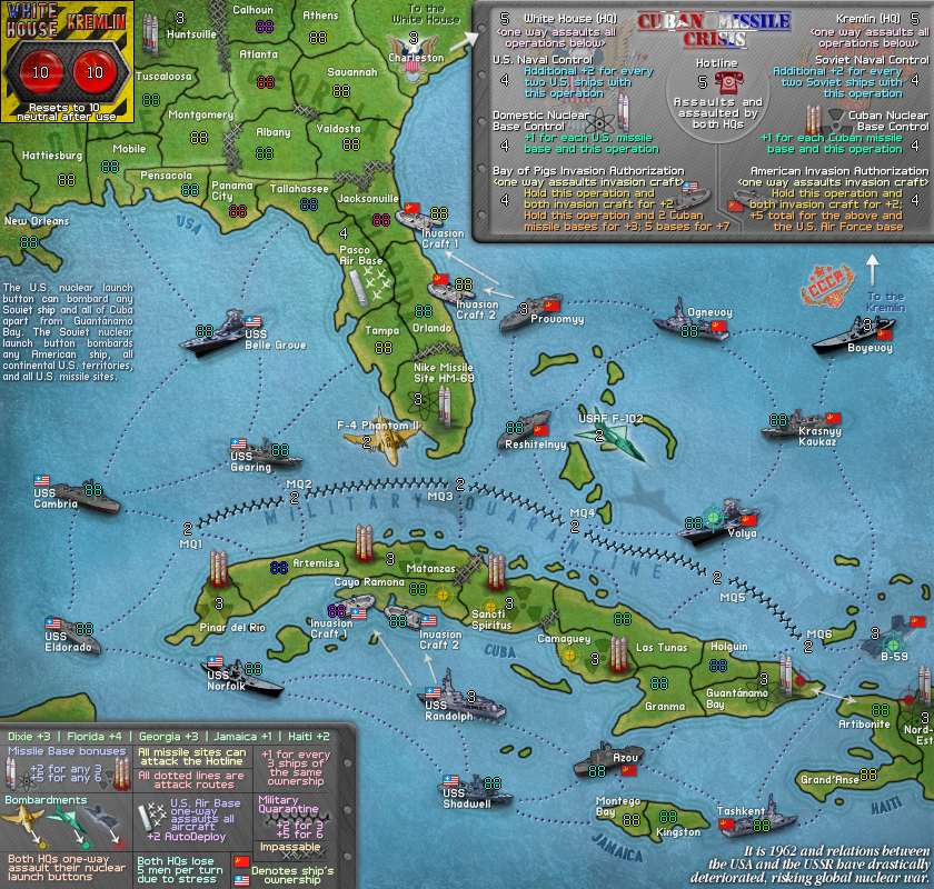
small with 88s:
Click image to enlarge.
image


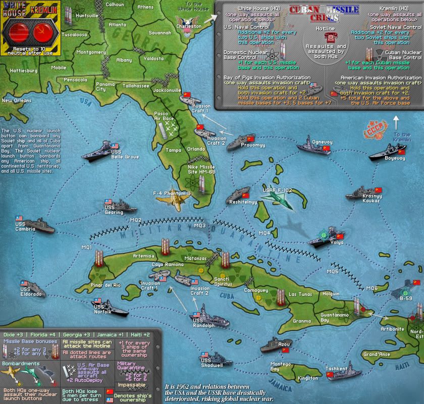
small no numbers:
Click image to enlarge.
image


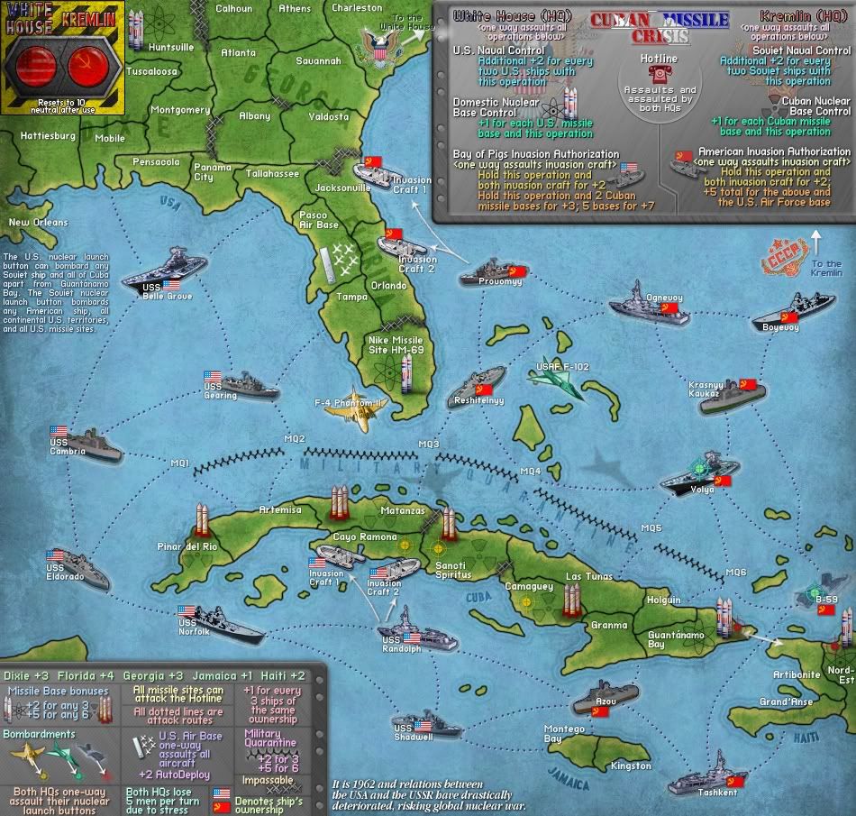
supersize no numbers:
Click image to enlarge.
image


Image

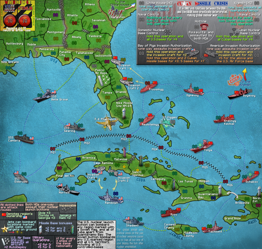
Map Name: Cuban Missile Crisis
Mapmaker(s): Ace Rimmer & t-o-m, XML by victor sullivan
Map Size: 75 territories, 31 start neutral (44 territories dropped) (MAGIC NUMBER)
Your aims/design style: A map of this time in the Cold War, when nuclear war was closer than ever before (and hopefully the closest that it ever will be).
Uniqueness: Some straightforward bonuses, most are not standard type. Some bonuses that give you extra depending on what you hold (the "operations" on the map). Some bombarding. (Hopeful) nuclear strike negative bonus
Relevant Experience: ex member of TeamCC, haven't left anything unfinished and don't plan on it. Attempting to give up my CC addiction but it's not working.

What else do you want to know?

outstanding issues/todo list:
1. Graphics stamp
2. Beta stamp
3. Quenched stamp

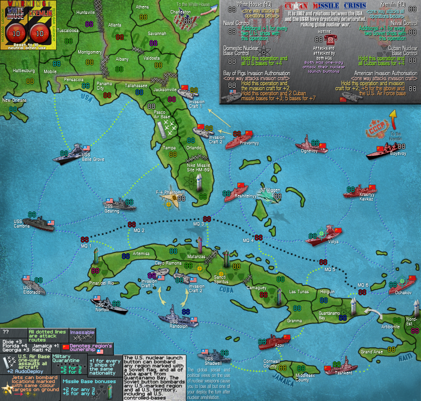
previous versions
V36: http://i603.photobucket.com/albums/tt115/amynjakefamily/CC/CubanMissileCrisis36.png
V34: http://i603.photobucket.com/albums/tt115/amynjakefamily/CC/CubanMissileCrisis34.png
V25: http://i603.photobucket.com/albums/tt115/amynjakefamily/CC/CubanMissileCrisis25.png
V22: http://i603.photobucket.com/albums/tt115/amynjakefamily/CC/CubanMissileCrisis22.png
V20: http://i603.photobucket.com/albums/tt115/amynjakefamily/CC/CubanMissileCrisis20.png
V18: http://i603.photobucket.com/albums/tt115/amynjakefamily/CC/CubanMissileCrisis18.png
V17: http://i603.photobucket.com/albums/tt115/amynjakefamily/CC/CubanMissileCrisis17.png
V16: http://i603.photobucket.com/albums/tt115/amynjakefamily/CC/CubanMissileCrisis16.png
V13: http://i603.photobucket.com/albums/tt115/amynjakefamily/CC/CubanMissileCrisis13.png
V12: http://i603.photobucket.com/albums/tt115/amynjakefamily/CC/CubanMissileCrisis12.png
V11: http://i603.photobucket.com/albums/tt115/amynjakefamily/CubanMissileCrisis11.png
Last edited by Ace Rimmer on Thu Oct 11, 2012 1:21 pm, edited 30 times in total.
User avatar
Lieutenant Ace Rimmer
 
Posts: 1911
Joined: Mon Dec 01, 2008 1:22 pm

Re: Cuban Missile Crisis (v11 page 1)

Postby grifftron on Thu May 12, 2011 2:08 pm

NICE JAKE! I likey
Image
User avatar
Major grifftron
SoC Training Adviser
 
Posts: 3280
Joined: Thu Jul 09, 2009 6:11 am

Re: Cuban Missile Crisis (v11 page 1)

Postby natty dread on Thu May 12, 2011 5:54 pm

Looks pretty damn good for your first draft! I'll be keeping an eye on this ;)
Image
User avatar
Sergeant 1st Class natty dread
 
Posts: 12877
Joined: Fri Feb 08, 2008 8:58 pm
Location: just plain fucked

Re: Cuban Missile Crisis (v11 page 1)

Postby Victor Sullivan on Thu May 12, 2011 5:59 pm

Damn, this map is almost as sexy as you! ;)

I'll comment further later, but as for #1 under your "to-do" list, the killer neutral (resetting neutral) resets at the beginning of the person's turn who took it, so a decay would do nothing and no one be able to hold it long enough to get a bonus (as the killer neutrals are taken into effect before the bonuses are given).

-Sully
User avatar
Corporal Victor Sullivan
 
Posts: 6010
Joined: Mon Feb 08, 2010 8:17 pm
Location: Columbus, OH

Re: Cuban Missile Crisis (v11 page 1)

Postby Rodion on Thu May 12, 2011 6:32 pm

Looking pretty good already. Good job!
User avatar
General Rodion
 
Posts: 1380
Joined: Sun Jun 13, 2010 5:33 pm
Location: São Paulo, Brazil

Re: Cuban Missile Crisis (v11 page 1)

Postby natty dread on Fri May 13, 2011 3:16 am

Ok... time for some criticism.

The legend in the lower left seems really small and cramped. Why the tiny font? It's hard to read for me and I have 20/20 eyesight, so I can imagine someone with worse eyesight could have trouble with it... Not to mention that you'll have to make the small version, and the legend will be way too small in it. Also, the legend is not very organized - it's usually not a good idea to "stack" your text like that . it's much easier for the eyes to have your text follow rows and columns, because our eyes are used to reading text that is organized like that.

Why do you have so many different dotted lines? It makes for confusion, players will assume that there's something different about the assault routes. I suggest picking one style and using it consistently - the blue dotted lines look the best to me, but that's more a personal preference.

Also, back to the subject of fonts... you have lots of other very small pixel fonts. There's no reason to make them so small. If you're straggled for space, the foundry now allows for supersize maps, but I think you can get everything to fit with a larger font, with a little bit of reorganization.

Your icons (ships, missiles etc) all look really good. Did you draw all of them yourself? I'm just asking to make sure, because you can't use any copyrighted material... if you drew them yourself, good, if you didn't, you need to make sure they're free to use.

Anyway, that's all for now. Looking forward to see your next update!
Image
User avatar
Sergeant 1st Class natty dread
 
Posts: 12877
Joined: Fri Feb 08, 2008 8:58 pm
Location: just plain fucked

Re: Cuban Missile Crisis (v11 page 1)

Postby Bruceswar on Fri May 13, 2011 4:41 am

Very nice start. Natty got pretty much all I was going to say. Good luck!
Highest Rank: 26 Highest Score: 3480
Image
User avatar
Corporal Bruceswar
 
Posts: 9713
Joined: Sun Dec 23, 2007 12:36 am
Location: Cow Pastures

Re: Cuban Missile Crisis (v11 page 1)

Postby Industrial Helix on Fri May 13, 2011 10:35 am

Wow... I'm loving the concept here.

The execution is pretty awesome given such an early stage in development. The text is a little small, which is irritating. In the gameplay workshop, find out about getting supersize map dimensions. I feel this is an awesome concept and very well thought out and deserves to be done right with legible text.
Sketchblog [Update 07/25/11]: http://indyhelixsketch.blogspot.com/
Living in Japan [Update 07/17/11]: http://mirrorcountryih.blogspot.com/
Russian Revolution map for ConquerClub [07/20/11]: viewtopic.php?f=241&t=116575
User avatar
Cook Industrial Helix
 
Posts: 3462
Joined: Mon Jul 14, 2008 6:49 pm
Location: Ohio

Re: Cuban Missile Crisis (v11 page 1)

Postby natty dread on Fri May 13, 2011 1:23 pm

Industrial Helix wrote: In the gameplay workshop, find out about getting supersize map dimensions.


Shouldn't that be done before GP?
Image
User avatar
Sergeant 1st Class natty dread
 
Posts: 12877
Joined: Fri Feb 08, 2008 8:58 pm
Location: just plain fucked

Re: Cuban Missile Crisis (v11 page 1)

Postby Ace Rimmer on Mon May 16, 2011 12:32 pm

V12 update:

Click image to enlarge.
image


responses to this point.

natty: The first legend was just throwing it together, not making it look great. This one should look better, but still not great until the entries for the legend are finalized.

There are only three different dotted lines: one style to show ship to ship connections, one to show ship to land connections, and one to show the connections between the Military Quarantine (to help that bonus stand out). The ship to ship connections have been made nicer.

Do you have issues with the font on the map itself, or just the legend?

All graphics were either hand-drawn, redrawn from copyrighted pictures, or are free for any use (commercial or noncommercial).

Sully: thanks. Any ideas from anyone on how to punish the player for using the nuclear launch?
User avatar
Lieutenant Ace Rimmer
 
Posts: 1911
Joined: Mon Dec 01, 2008 1:22 pm

Re: Cuban Missile Crisis (v12 page 1)

Postby natty dread on Mon May 16, 2011 1:16 pm

jakewilliams wrote:natty: The first legend was just throwing it together, not making it look great. This one should look better, but still not great until the entries for the legend are finalized.


Well, it's better, but I'd still like to see it organized better.

There are only three different dotted lines: one style to show ship to ship connections, one to show ship to land connections, and one to show the connections between the Military Quarantine (to help that bonus stand out). The ship to ship connections have been made nicer.


Well, thing is, the different dotted lines serve to make the map more confusing. You already have lots going on here, so any way you can use to simplify the layout of the map should be utilized... there's no need that I see to have different lines for land-sea and sea-sea connections, since they're all sea connections and function just the same.

As for the military quarantine... It might be better to figure out some kind of icon for those, rather than using the connections.

Do you have issues with the font on the map itself, or just the legend?


The territory font is a bit small, yes. I think you could increase all the territory name fonts by 2 points or so.
In the upper right legend, the texts next to the phone are a bit small. The "to the white house" text in Charleston is almost invisible.

All graphics were either hand-drawn, redrawn from copyrighted pictures, or are free for any use (commercial or noncommercial).


Good :)

Keep up the good work.
Image
User avatar
Sergeant 1st Class natty dread
 
Posts: 12877
Joined: Fri Feb 08, 2008 8:58 pm
Location: just plain fucked

Re: Cuban Missile Crisis (v12 page 1)

Postby AndyDufresne on Tue May 17, 2011 10:52 am

This a really cool looking map, Jakewilliams, nice work so far.

When things start together more, as Natty_dread pointed out (and as you responded), getting the legends to have the most crucial information, and in an organized fashion, will be critical (same with making uniform the lingo used on the map---there is a mix of assault/attack).

You might also want to further demarcate the difference between Domestic Nuclear Control Bases and Missile Bases.

Also, since you have assault routes that are dots, it'd make sense to change the Military Quarantine to something else---dashed perhaps. Or something from one of these or something similar:
Image

The thematic aesthetic of the map is pretty terrific. The ships probably need some work to make them fit with aesthetics more (the airplanes look different---in a good way, and go with the look).

Keep up the good work.


--Andy
User avatar
Corporal 1st Class AndyDufresne
 
Posts: 24935
Joined: Fri Mar 03, 2006 8:22 pm
Location: A Banana Palm in Zihuatanejo

Re: Cuban Missile Crisis (v12 page 1)

Postby isaiah40 on Tue May 17, 2011 12:29 pm

This is looking pretty good jake. I just have a small nit pick right now. You need to change the planes to resemble F4 Phantoms. The ones you have pictured are the F16's (Lawn Darts as we called them when I was in the Air Force). Something like this:
Image
Lieutenant isaiah40
 
Posts: 3990
Joined: Mon Aug 27, 2007 7:14 pm

Re: Cuban Missile Crisis (v13)

Postby Ace Rimmer on Thu May 19, 2011 7:54 am

Click image to enlarge.
image


List of changes:
All region fonts/sizes were changed;
Near all of the top legend text was changed to improve legibility;
Added a slight drop shadow to the green dotted lines to help definition;
Reorganised the bottom legend so it reads left-to-right easier;
Redesigned the Military Quarantine layout in the style of one of the styles Andy posted;
Redesigned the F-4 Phantom II;
Slight changes to the 37 Viggen to create more definition from it and the background (sea);
Moved the "Both HQs one-way attack their nuclear launch buttons" text from the top legend to the bottom legend to save space and help organise both areas;
Put the Hotline in a bubble which also helps divide between the White House operations and Kremlim operations;
Changed all 'attacks' to 'assaults';
Put the U.S. missiles on the legend and sort of rearranged that square of the legend;
Also made the 'Impassables' part of the legend more 'normal';

With the new design of the Military Quarantine, there are now only two different colours of dotted lines. It's good to have one which shows assault routes to land because it can save more confusion, for example in areas such as Jamaica (where ship-to-ship routes are close to land) you can easily see which ships do in fact connect to land and which don't.

Andy touched on how domestic nuclear bases and Soviet nuclear bases were too similar, but it's pretty straight forward. On Soviet bases, the missiles are coloured and have a radiation symbol in the background (as on the top legend), and on the domestic bases, the missiles are white and different in design, with the atomic symbol in the background. Do you think U.S. and Soviet flags should be added to the bases, like with the ships and landing craft?

We still need a punishment for using the nukes - it shouldn't be anything major. I would've liked the whole one deploy thing after use, but that can't be done unless the territory doesn't reset to neutral, and if it didn't reset then the person who used the nuke would have a 1 deploy until someone took it from them. That needs to be discussed...
User avatar
Lieutenant Ace Rimmer
 
Posts: 1911
Joined: Mon Dec 01, 2008 1:22 pm

Re: Cuban Missile Crisis (v13)

Postby Victor Sullivan on Thu May 19, 2011 4:21 pm

Sully's Breakdown:
  • Dixie to +2, Haiti to +1
    • Normally, I would be against a change like this, but I feel like these bonuses shouldn't be very hefty, since they aren't the focus of the map.
  • Military Bases - Try something like +1 for each missile base, -1 per US-Soviet pair. Adds some flair.
  • Hotline and HQs - I say drop the hotline and make the HQs killer neutrals. That way, no one can stack on the HQs while reaping the benefits of all techs in the chain. And, technically, I believe the hotline was installed after this debacle.
  • Naval Control - Try +1 for 1, makes the tech more worth it. Also, add "US" and "USSR" at the beginning of their respective tech names.
  • Nuclear Base Control - Maybe something like +2 per base, or +6 for all.
  • Nuclear Launch - I see two options here: make it an auto-decay 99999... and a -9999... deploy bonus or just make the killer neutrals high.

That's all for now!

-Sully
User avatar
Corporal Victor Sullivan
 
Posts: 6010
Joined: Mon Feb 08, 2010 8:17 pm
Location: Columbus, OH

Re: Cuban Missile Crisis (v13 page 1)

Postby isaiah40 on Thu May 19, 2011 9:45 pm

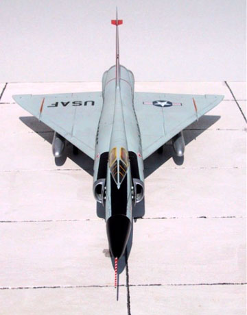
Okay another nit pick. The 37 Viggen seams to be a SAAB Viggen 37 with a manufacture start date of 1970, built for the Swedish Air Force. My suggestion is to use the USAF F-102 like this one. This will be more in the time frame of the Cuban Missile Crisis.
Image
Lieutenant isaiah40
 
Posts: 3990
Joined: Mon Aug 27, 2007 7:14 pm

Re: Cuban Missile Crisis (v13)

Postby Ace Rimmer on Fri May 20, 2011 10:06 am

Victor Sullivan wrote:Sully's Breakdown:
  • Dixie to +2, Haiti to +1
    • Normally, I would be against a change like this, but I feel like these bonuses shouldn't be very hefty, since they aren't the focus of the map.


I think that would make those bonuses too boring, and all the action would be over the ship/missile base bonuses. You don't want to de-value them too much.

Victor Sullivan wrote:
  • Military Bases - Try something like +1 for each missile base, -1 per US-Soviet pair. Adds some flair.


  • That would require making them neutral to start, as I strongly oppose bonuses that you're dropped on any map.

    Victor Sullivan wrote:
  • Hotline and HQs - I say drop the hotline and make the HQs killer neutrals. That way, no one can stack on the HQs while reaping the benefits of all techs in the chain. And, technically, I believe the hotline was installed after this debacle.


  • Technically true, but the invasion craft are not historically accurate either. We'll call it artistic liberty ;)

    Victor Sullivan wrote:
  • Naval Control - Try +1 for 1, makes the tech more worth it. Also, add "US" and "USSR" at the beginning of their respective tech names.


  • I think that would unbalance the naval control too much, it would be the only bonus to shoot for. Naming change agreed with.

    Victor Sullivan wrote:
  • Nuclear Base Control - Maybe something like +2 per base, or +6 for all.


  • I think that would be too overpowering again. What about +1 per missile site? Adding a fourth US missile site, so that would be +4 bonus if you held all the U.S. or Cuban bases. It may need to be more of a bonus for the US ones though as they're sperad out geographically.

    Victor Sullivan wrote:
  • Nuclear Launch - I see two options here: make it an auto-decay 99999... and a -9999... deploy bonus or just make the killer neutrals high.


  • Still thinking about this.

    posting this for now, to be updated later, working on another map revamp.
    User avatar
    Lieutenant Ace Rimmer
     
    Posts: 1911
    Joined: Mon Dec 01, 2008 1:22 pm

    Re: Cuban Missile Crisis (v13 page 1)

    Postby thenobodies80 on Sun May 22, 2011 8:05 am

    Jake!!! :D
    Wow, let me say this looks really good.
    Like VS said, having the two nuclear launch buttons coded as killer neutrals don't allow you to receive a negative bonus for using it. But I don't know if add a decay is a solution: afterall your idea is to punish someone only if he uses the nuclear launch to bombard, not for holding it. With a decay or a negative bonus, you won't lose the region so you'll receive the punishment in any case, you've used the launch or not (Having said that another player doesn't take it or that it isn't nuked cashing spoils).

    About the dotted lines, part of me agree with Natty, I don't know if have different dotted lines is necessary. I spent about 10 mins to understand why there are 2 different connections on the map. And honestly I understood it just because I've read your post:
    jakewilliams wrote:There are only three different dotted lines: one style to show ship to ship connections, one to show ship to land connections, and one to show the connections between the Military Quarantine (to help that bonus stand out). The ship to ship connections have been made nicer.

    I don't have problem if you want to use different connections to prevent confusion where you have few space but in this case, not having them explained somewhere on the map, they may be cause of confusion.

    A question, what's the purpose of the small number on the air base roof?

    The main concern is the launch button :-k
    For now, let me just change this thread to sticky and wait for your next update.
    Looking forward to it.

    Nobod....ehm... Joe ;)
    User avatar
    Sergeant 1st Class thenobodies80
     
    Posts: 5400
    Joined: Wed Sep 05, 2007 4:30 am
    Location: Milan

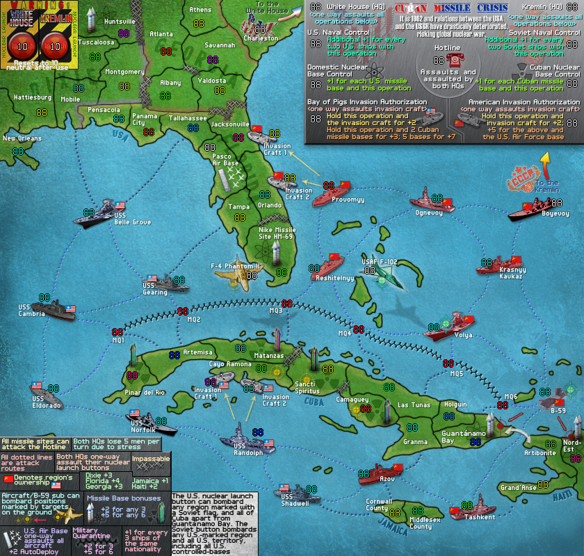
    Re: Cuban Missile Crisis (v16 page 2)

    Postby Ace Rimmer on Fri May 27, 2011 1:40 pm

    Hi Joe ;)

    V16:
    Click image to enlarge.
    image


    Changed the graphical border of Huntsville/Tuscaloosa/Mobile/Montgomery
    to include a nuclear base in Hunstville. Now there are four Soviet bases
    and four U.S. bases.

    Changed the bonus structure for the Nuclear Base control operations. It's
    now +1 for each U.S. or Soviet missile base + the operation.

    Added "Soviet" and "U.S." at the front of the Naval Control ops for clarity.

    Replaced the 37 Viggen with the USAF F-102 - both region name and graphics.

    Added another bombard point to Camaguey (Cuban missile base) for the F-4
    Phantom II... gives more use to the jets.

    Replaced 'Ochakov' (Soviet ship above Haiti) with the B-59 submarine which
    essentially mirrors the U.S. jets, however won't start neutral and can
    attack other ships, the Military Quarantine, and bombard the two U.S.
    nuclear bases.

    Changed the way the HQs (Kremlim/White House) can be attacked. Sully raised
    the point that someone could just block all operations through the HQs. Now
    the HQs lose 5 men per turn, and all missile sites can attack the Hotline.
    This gives all operations/HQs much more accessibility.

    Added a top line to the bottom legend to include more explanations.

    Made the green dotted lines a darker shade of blue.

    Changed the U.S. landing craft arrows to match the Soviet ones (consistency).

    Removed "Global social and political views on..." section.
    User avatar
    Lieutenant Ace Rimmer
     
    Posts: 1911
    Joined: Mon Dec 01, 2008 1:22 pm

    Re: Cuban Missile Crisis (v16 page 2)

    Postby koontz1973 on Sat May 28, 2011 9:23 am

    I really like this map and you seem to of put in and continue to put in a lot of work.

    Quick question though as for the life of me I cannot see the answer on the map, what is the reason for the marking (like a tank tread) between the red 88's MQ1 to MQ8?
    Image
    User avatar
    Lieutenant koontz1973
     
    Posts: 6960
    Joined: Thu Jan 01, 2009 10:57 am

    Re: Cuban Missile Crisis (v16 page 2)

    Postby Tisha on Sat May 28, 2011 12:05 pm

    koontz1973 wrote:I really like this map and you seem to of put in and continue to put in a lot of work.

    Quick question though as for the life of me I cannot see the answer on the map, what is the reason for the marking (like a tank tread) between the red 88's MQ1 to MQ8?


    the center bottom, of the lower legend.
    Military Quarantine
    User avatar
    Major Tisha
     
    Posts: 1065
    Joined: Sat Dec 23, 2006 12:41 am

    Re: Cuban Missile Crisis (v16 page 2)

    Postby thenobodies80 on Sat May 28, 2011 7:24 pm

    Time to move on!

    Image
    User avatar
    Sergeant 1st Class thenobodies80
     
    Posts: 5400
    Joined: Wed Sep 05, 2007 4:30 am
    Location: Milan

    Re: Cuban Missile Crisis (v16 page 2)

    Postby koontz1973 on Sun May 29, 2011 12:06 am

    Tisha wrote:
    koontz1973 wrote:I really like this map and you seem to of put in and continue to put in a lot of work.

    Quick question though as for the life of me I cannot see the answer on the map, what is the reason for the marking (like a tank tread) between the red 88's MQ1 to MQ8?


    the center bottom, of the lower legend.
    Military Quarantine

    That is why I could not find it. Very hard to see.


    Congrats on the draft stamp. =D> Lets hope this goes all the way.
    Image
    User avatar
    Lieutenant koontz1973
     
    Posts: 6960
    Joined: Thu Jan 01, 2009 10:57 am

    Re: Cuban Missile Crisis (v16 page 2)

    Postby Ace Rimmer on Tue May 31, 2011 7:40 am

    Tisha wrote:
    koontz1973 wrote:I really like this map and you seem to of put in and continue to put in a lot of work.

    Quick question though as for the life of me I cannot see the answer on the map, what is the reason for the marking (like a tank tread) between the red 88's MQ1 to MQ8?


    the center bottom, of the lower legend.
    Military Quarantine


    User avatar
    Lieutenant Ace Rimmer
     
    Posts: 1911
    Joined: Mon Dec 01, 2008 1:22 pm

    Re: Cuban Missile Crisis (v16 page 2)

    Postby Ace Rimmer on Tue May 31, 2011 1:54 pm

    Gameplay discussion:

    According to Widowmakers' spreadsheet, bonus values should be 3.67 for Dixie, 3.92 for Georgia, 7.5 for Florida, 1.5 for Jamaica, 3.25 for Haiti.

    According to MrBenn's calculator, at least one player will drop the missiles, US ships, and the USSR ships in a 2p/3p game. fairly likely someone will drop the MQ bonus as well.

    We may have to add some neutrals and starting positions to negate these.
    User avatar
    Lieutenant Ace Rimmer
     
    Posts: 1911
    Joined: Mon Dec 01, 2008 1:22 pm

    Next

    Return to The Atlas

    Who is online

    Users browsing this forum: No registered users