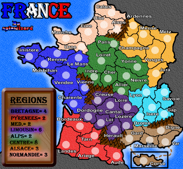
Texture of the sea. It reminds me of little bathroom tiles coloured blue and they're annoying to look at.
The brown table annoys me, it seems to plain. I dono what you can change it to.
The dead area texture. It looks like there's all these giant worms underneath the surface trying to get up to fresh air.
Or in other words, little squiggly lines.
Good luck
KraphtOne wrote:when you sign up a new account one of the check boxes should be "do you want to foe colton24 (it is highly recommended) "
Definitely clean up the borders, and make them clear (there are some parts where they seem to die out, Yonne, etc) and less pixely and more uniform (Orne).
I also can't stand the flesh tone color being used as continental color. Perhaps more of an orange color (but different the from yellow orange) would be more suitable? Or perhaps a dark red? But that wouldn't really fit with brightness of the map. But look into a different possibility.
I also think that the extra border around the Legend, seems sort of odd, and cramps the space a slightly. Maybe try it without that, and just the simple interior brown border. But maybe that would look bad just as that also!
lol, u read my mind when i first saw it i thought, "isnt there a i surrender button", although you could just make alliances with everyone like they did
i like the colors maybe switch purple and yellow but thats about it
my only suggestion is that you change the region box take out that thick border and then make it bigger and make the back round a lighter color cant really cant really see MED. or Normandie for that matter
and maybe you could mess around with it but maybe put a border in between the different countries
i also thin Alsace should be worth 4 maybe, maybe not don't really matter