Battle For Australia [Quenched]
Moderator: Cartographers
Forum rules
Please read the Community Guidelines before posting.
Please read the Community Guidelines before posting.
-
spinwizard
- Posts: 5016
- Joined: Sun Dec 10, 2006 9:52 am


Yes, thanks for that offering Gozar. I am currently investigating some options right now just when you wrote that.Gozar wrote:What if you put a line or dash from the name to the place?
I am even considering an entire re-working of colours and fonts to enable place names to stand out more.

* Pearl Harbour * Waterloo * Forbidden City * Jamaica * Pot Mosbi
31Mar V8 Comlpete Colour Rework
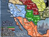
Complete colour rework...what do you think?

* Pearl Harbour * Waterloo * Forbidden City * Jamaica * Pot Mosbi
I really like it, but i just find it REALLY hard to follow. lots of lines everywhere. my first time playing this map, I would probably use up the hour for my turn, just trying to get strait different borders etc.
with that said, i really like it. i love maps that are somewhat complicated. i think the majority of my confusion w/ the names not being on the territories, but in the "water". probably will just take some getting used to.
with that said, i really like it. i love maps that are somewhat complicated. i think the majority of my confusion w/ the names not being on the territories, but in the "water". probably will just take some getting used to.
I hate truces, and I hate people that truce. If you can't win on your own, DON'T PLAY!
Yes Gemineye...i tool find it a bit confusing  and that will be a challange with the armies in the water, but unfortunately this 1942 campaign was not simple and like most wars there were various fronts. I think however, that those name to territory lines may have to go. Its just too much.
* Pearl Harbour * Waterloo * Forbidden City * Jamaica * Pot Mosbi

1Apr - V9 Update
Thanks Mibi...your feedback prompted an even better result...now I believe we have a map...yes?!mibi wrote:This is a diagram, not a map.

* Pearl Harbour * Waterloo * Forbidden City * Jamaica * Pot Mosbi


Font change
Thanks nagerous....Here is a font re-work...i kinda new it would have to happen....nagerous wrote:I can't read the green text on the left very well
Boberz...is this any better?

* Pearl Harbour * Waterloo * Forbidden City * Jamaica * Pot Mosbi
-
sam_levi_11

- Posts: 2872
- Joined: Mon Dec 11, 2006 2:48 pm
- Gender: Male
Thanks Sam_levi_11....complicated yes...and perhaps this is one continent that would be really hard to hold because it is split up....perhaps needs a higher bonus package....glad to hear however that you'd still play it.sam_levi_11 wrote:actually i love it but its complicated with the jn navy, but id play it cause its nice and hectic and i like hectic
Upon reflection, now that you have pointed this out, I have just come up with a solution that will join the entire japanese navy red together to make it easier to play this as one continent. Posting somehting shortly.
Last edited by cairnswk on Sun Apr 01, 2007 3:22 pm, edited 1 time in total.
* Pearl Harbour * Waterloo * Forbidden City * Jamaica * Pot Mosbi
-
sam_levi_11
- Posts: 2872
- Joined: Mon Dec 11, 2006 2:48 pm
- Gender: Male
Gozar, Thanks for that....that is an island off Nhullunby (pronounced nulunbi)...i agree with the black background but had to change it as it was too dark for a player....so i hope this dark green retains the "war feel"Gozar wrote:What is off the east coast of nullhunnby? Is that just an island?
Map is looking nice! The black background give the map a very dark, ominous, "war" feel. A much different feel from the Cairns map, which is much more light and "summery" as someone said.
Keep up the nice work!
Cheers,
Gozar
* Pearl Harbour * Waterloo * Forbidden City * Jamaica * Pot Mosbi
Japanese Navy joins
This is the result that joins the Japanese Navy together...what do you think?sam_levi_11 wrote:cool, glad to be of service

* Pearl Harbour * Waterloo * Forbidden City * Jamaica * Pot Mosbi