Conquer Club

Philadelphia [Quenched]

Care to peruse completed maps? Take a stroll through the Atlas.

Moderator: Cartographers

Forum rules
Please read the Community Guidelines before posting.

Re: Philadelphia - updated 2/2 pg 8

Postby MarshalNey on Sun Feb 06, 2011 6:12 pm

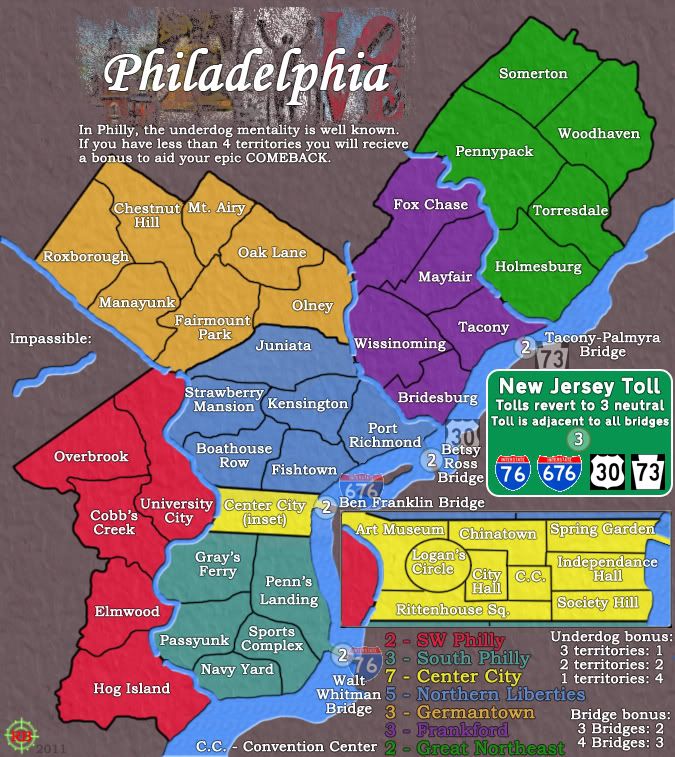
RedBaron0 wrote:I did think the font I was using for the neutral numbers was the right one, it's Tahoma, correct? I think I might have it bolded though... I can put those highway shields by the correct bridges.(I76: Walt Whitman; I676: Ben Franklin; US30:Betsy Ross; PA73: Tacony-Palmyra) Still that's more of a graphical thing.

There still might been some miscommunication to how the bridges/toll is meant to work. Each bridges location, marked with an army circle with a blue ring, assaults to the army circle on the green New Jersey Toll sign, as marked with an army circle with a red ring. This is the killer neutral. That spot in turn assaults ANY and all bridge locations.

On an update note, I've rearranged the title and inset as asked, it's feeling a bit cramped, but might work if I can get some more space. But it may just work exactly the way it was before better. Again more of a graphical debate, all gameplay aspects are the same. Any one else have any issues with gameplay?


Actually, if the bridge/toll attack isn't clear, that's a gameplay clarity issue which I'd prefer was taken care of before moving to graphics. Putting the Highway symbols next to the respective bridges seems preferable, I think.

For the explanation box with the Tolls, I think a couple of things could be changed:
(1) Change the name of the territory from "New Jersey Tolls" to the singular, "New Jersey Toll", or use a singular article, as in "the New Jersey Tolls". I'd recommend the former as it takes up less space. It's always made me a little uneasy that someone might think that there are more than one regions involved the way that it is currently worded.
(2) Put the army circle and number directly under the large title "(the) New Jersey Toll(s)" rather than next to text explaining what can attack it and what it can attack. That way the army circle won't get lost in the explanation, and the explanation will make more sense when the Toll(s) are seen as a separate region to conquer.
(3) Modify the legend to the current neutral value, i.e., "resets to 3 neutral" (not 4)

On a side note, could you just state that the New Jersey Toll is adjacent(connects) to all bridges rather than saying "Bridges assault NJ Toll" and "NJ Toll assaults all Bridges"?

Once the Toll legend is addressed, and barring any other concerns in the meantime, the map will have a well-earned stamp :)

-- Marshal Ney
User avatar
Captain MarshalNey
 
Posts: 781
Joined: Mon Sep 28, 2009 9:02 pm
Location: St. Louis, MO

Re: Philadelphia - updated 2/7 pg 9

Postby RedBaron0 on Mon Feb 07, 2011 2:58 am

Click image to enlarge.
image


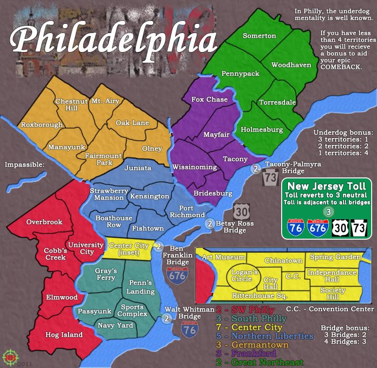
Done and done, MarshalNey.

You can probably see what I mean by how everything has gotten pretty cramped in the bottom corner with the switch of the title and the inset. I dunno going back to the top corner for the inset might be the way to go, or see what extra space I can get, I don't think I'd need that much over the standard limits for each version to keep this arrangement. Either way though.

EDIT: You know.... I just realized that I've got a fair amount of space under the normal space constraints. 8-[ ](*,) #-o
ImageImage
User avatar
Sergeant 1st Class RedBaron0
 
Posts: 2657
Joined: Sun Aug 19, 2007 12:59 pm
Location: Pennsylvania

Re: Philadelphia - updated 2/7 pg 9

Postby carlpgoodrich on Mon Feb 07, 2011 8:40 am

Ya, the inset and NJ toll is very crowded. You can also try just croping the map at the top and left a bit, and then give yourself some more space in the right and bottom. Also, "tolls revert" should be "toll reverts".
Lieutenant carlpgoodrich
 
Posts: 408
Joined: Tue Aug 04, 2009 2:12 pm

Re: Philadelphia - updated 2/7 pg 9

Postby MarshalNey on Mon Feb 07, 2011 12:40 pm

RedBaron0 wrote:Done and done, MarshalNey.

You can probably see what I mean by how everything has gotten pretty cramped in the bottom corner with the switch of the title and the inset. I dunno going back to the top corner for the inset might be the way to go, or see what extra space I can get, I don't think I'd need that much over the standard limits for each version to keep this arrangement. Either way though.

EDIT: You know.... I just realized that I've got a fair amount of space under the normal space constraints. 8-[ ](*,) #-o


The inset is crowded in there, and where it is distracts from the NJ Toll; right now the two compete for attention. Also carl is right, minor change from "New Jersey Tolls revert..." to "New Jersey Toll reverts..."

The main issues have all been addressed, however. Gameplay = stamp!

Image

Congratulations RedBaron0 for some Classic action with a unique twist. Go Philly :)

-- Marshal Ney
User avatar
Captain MarshalNey
 
Posts: 781
Joined: Mon Sep 28, 2009 9:02 pm
Location: St. Louis, MO

Re: Philadelphia - updated 2/7 pg 9

Postby isaiah40 on Mon Feb 07, 2011 4:50 pm

MarshalNey wrote:The main issues have all been addressed, however. Gameplay = stamp!

Image

Congratulations RedBaron0 for some Classic action with a unique twist. Go Philly :)

-- Marshal Ney


=D> =D> =D> Congrats RdeBaron0 =D> =D> =D>
Lieutenant isaiah40
 
Posts: 3990
Joined: Mon Aug 27, 2007 7:14 pm

Re: Philadelphia - updated 2/7 pg 9

Postby shakeycat on Mon Feb 07, 2011 6:28 pm

Congrats on the stamp!

Maybe you can grab some extra pixels by moving the overall map up and left a little? The green and red territories could be a little closer to the edge if need be.
Current Map Project: Tokyo
User avatar
Lieutenant shakeycat
 
Posts: 390
Joined: Sun Mar 11, 2007 5:13 am
Location: Vancouver

Re: Philadelphia - updated 2/7 pg 9

Postby RedBaron0 on Tue Feb 08, 2011 1:49 pm

I actually have a ton of room, I really thought I was closer to 800x800 but I've got many pixels to fiddle with in both directions within the normal standards.I'm getting some things uncluttered so we should look much better with the next update. :)
ImageImage
User avatar
Sergeant 1st Class RedBaron0
 
Posts: 2657
Joined: Sun Aug 19, 2007 12:59 pm
Location: Pennsylvania

Re: Philadelphia (GP)- updated 2/10 pg 9

Postby RedBaron0 on Thu Feb 10, 2011 3:45 am

Click image to enlarge.
image


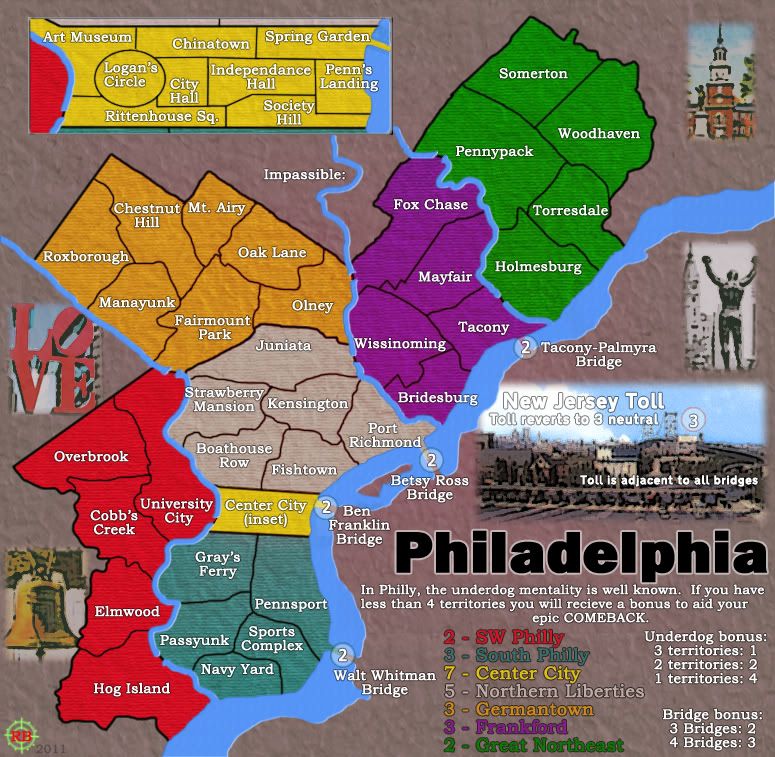
My space issues should be more clearly resolved, and within the standard space restrictions. I therefore shouldn't need any extra space for sure.

Anything and everything is open kids, fire away! I can change the sign for the "New Jersey Tolls" it may or may not fit as a road sign on this map, I'd say may putting a small state of New Jersey outline and still call it a Toll, or call it a "Down the Shore Vacation" and jump off from there.

The title block has a number of Philly icons resting in the background all recognizable (I hope!) even if they've been masked and splattered back onto the map. I really like the look of it. However it doesn't have to remain locked to the title itself. They can be broken up moved around, or limited to just 1 or 2 of the icons. The one in particular, the statue of Rocky on top of the Art Museum steps, is iconic, and probably one of the THE first things anyone thinks of when they hear "Philadelphia." It does carry with it a possible issue of copyright, since it is attached to a major motion picture franchise.... I in no way am mentioning the film in any part, this is a statue, a work of art given freely to the City of Philadelphia whose spirit it represents.

Of course there is the simple fixes and nitpicks to work though, colors, vischecks, army colors blending, etc, etc things that will have to be checked and rechecked.

Look it over, scrutinize and suggest, I'm all ears. :mrgreen:
ImageImage
User avatar
Sergeant 1st Class RedBaron0
 
Posts: 2657
Joined: Sun Aug 19, 2007 12:59 pm
Location: Pennsylvania

Re: Philadelphia (GP)- updated 2/10 pg 9

Postby natty dread on Thu Feb 10, 2011 6:19 am

Ok, here comes the suggestions!

IMO, the splatter effect on the title images doesn't work too well. It seems a bit too pixely. I suggest trying something a bit more smooth. If you remove the splatter effect, then feather the edges of the images with a sufficiently wide radius, and set it on low opacity... that could work, giving a similar effect, but less pixelated. Another thing that might work is applying a layer mask with a clouds effect... experiment with it, I'm sure you'll come up with something nice.

The title text itself could use some emboss or drop shadow, to pop it out of the picture a bit. The same with the New Jersey sign.

Speaking of pixelated, the interstate signs also suffer from this condition... do something to them?

I also suggest giving the whole map a very slight gradient overlay, to give it a more "natural" feel.

You could use some contrast between the water and the land area. Maybe make the water a bit darker? The rivers seem to blend in with the land somewhat, especially near the blue-ish bonus areas.

Also, as I've said before (a reminder is always good ;) ) you should make the shape of Center City match the inset.

Lastly, I'm not quite sure about the texture... it's nice, but seems a bit too uniform and artificial. The gradient overlay might help with it though.

Keep up the good work.
Image
User avatar
Sergeant 1st Class natty dread
 
Posts: 12877
Joined: Fri Feb 08, 2008 8:58 pm
Location: just plain fucked

Re: Philadelphia (GP)- updated 2/10 pg 9

Postby isaiah40 on Thu Feb 10, 2011 1:43 pm

I'd have to agree with natty on the icons being a little too much. If you reduced the noise on them (I gather that's what you did to them), and then reduced the opacity of them they might work.
Lieutenant isaiah40
 
Posts: 3990
Joined: Mon Aug 27, 2007 7:14 pm

Re: Philadelphia (GP)- updated 2/10 pg 9

Postby Victor Sullivan on Thu Feb 10, 2011 4:46 pm

IMO, you can just drop the road signs completely. They seem to add a hint of unnecessary confusion.

In some spots it looks like the river is on top of the territories, than cut out of the land.

And what's your reasoning behind the "Philadelphia" font? I mean, it looks okay, but I feel like there might be something better out there if the font isn't specific to something Philly-related.
User avatar
Corporal Victor Sullivan
 
Posts: 6010
Joined: Mon Feb 08, 2010 8:17 pm
Location: Columbus, OH

Re: Philadelphia (GP)- updated 2/10 pg 9

Postby RedBaron0 on Fri Feb 11, 2011 3:02 am

The only font I can find that falls under the name of "Philadelphia" is this one:

Image

This one is based of the Philadelphia magazine... so no to that atrocity. I can try something scrpitier, or blockier, or look for something on a patriotic kinda note?

I'll hammer out the other suggestions, and see what I come up with!
ImageImage
User avatar
Sergeant 1st Class RedBaron0
 
Posts: 2657
Joined: Sun Aug 19, 2007 12:59 pm
Location: Pennsylvania

Re: Philadelphia (GP)- updated 2/10 pg 9

Postby natty dread on Fri Feb 11, 2011 3:11 am

Image
User avatar
Sergeant 1st Class natty dread
 
Posts: 12877
Joined: Fri Feb 08, 2008 8:58 pm
Location: just plain fucked

Re: Philadelphia (GP)- updated 2/10 pg 9

Postby RedBaron0 on Fri Feb 11, 2011 12:29 pm

Eh.... that font looks like the font they used on 50's-60's era cars

I was starting to lean towards Franklin Gothic, it's quite similar to the font used for the title used for "Rocky"

Image
ImageImage
User avatar
Sergeant 1st Class RedBaron0
 
Posts: 2657
Joined: Sun Aug 19, 2007 12:59 pm
Location: Pennsylvania

Re: Philadelphia (GP)- updated 2/10 pg 9

Postby Z-Rambo on Fri Feb 11, 2011 3:57 pm

I have Two(2) more recommendations, everything else looks great.

1) Penn's Landing looks a little too big for what it really is, could you trim down the size a bit and add 1 more territory on the southeast side of it between Penn's Landing and the sports complex? It could be called Riverview, since it is what the industrial/commercial community is called and where the Walt Whitman Bridge connects to.


2) On the font note, why not use the Edwardian Script ITC? It has the Historic Colonial Philadelphia look.


Image
User avatar
Private 1st Class Z-Rambo
 
Posts: 181
Joined: Fri Jan 01, 2010 3:16 am
Location: Maryville, TN

Re: Philadelphia (GP)- updated 2/10 pg 9

Postby Victor Sullivan on Sat Feb 12, 2011 12:47 am

Edwardian's nice, but it's in the primary font set in Microsoft Word and is therefore abused on multiple occasions, so I'd have to disagree there.
User avatar
Corporal Victor Sullivan
 
Posts: 6010
Joined: Mon Feb 08, 2010 8:17 pm
Location: Columbus, OH

Re: Philadelphia (GP)- updated 2/10 pg 9

Postby RedBaron0 on Sat Feb 12, 2011 1:53 am

Z-Rambo wrote:I have Two(2) more recommendations, everything else looks great.

1) Penn's Landing looks a little too big for what it really is, could you trim down the size a bit and add 1 more territory on the southeast side of it between Penn's Landing and the sports complex? It could be called Riverview, since it is what the industrial/commercial community is called and where the Walt Whitman Bridge connects to.


2) On the font note, why not use the Edwardian Script ITC? It has the Historic Colonial Philadelphia look.


Image


While gameplay has been generally decided, I always welcome further debate there. However, the balance of north and south would be thrown off a little bit. I mean I realize that Penn's Landing is really just that bit along the riverfront and only really the bit between the 2 bridges, but it's a strategic territory. It becomes a border for the Walt Whitman AND against Center City. If you split it up you create a 4th border territory that can be attacked which likely would have to raise the value of South Philly to 4. (at least) Making it so much harder to hold bonuses in all of South Philadelphia, giving those with drops towards North and West Philly an advantage.

The font would be nice for a colonial type of map, true, and it's pretty close to what Industrial Helix used on 13 Colonies. I'm moving towards a more modern look, and I'm liking the way Franklin Gothic is looking.
ImageImage
User avatar
Sergeant 1st Class RedBaron0
 
Posts: 2657
Joined: Sun Aug 19, 2007 12:59 pm
Location: Pennsylvania

Re: Philadelphia (GP)- updated 2/10 pg 9

Postby Z-Rambo on Sun Feb 13, 2011 12:38 am

You may have a point there. Okay, how about this? Change Penn's Landing to Pennsport, change Independence Hall to Penn's Landing, and change C.C. to Independence Hall. This way no statistics are messed with, but the names are in their proper location, especially since Penn's Landing is a smaller territory north of Society Hill, Independence Hall is west of both Society Hill and Penn's Landing, and Pennsport is a big area south of Society Hill and north of the Sports Complex. Not much work jockeying the names to different location and gives a more accurate map. Thanks for hearing me out.
User avatar
Private 1st Class Z-Rambo
 
Posts: 181
Joined: Fri Jan 01, 2010 3:16 am
Location: Maryville, TN

Re: Philadelphia (GP)- updated 2/10 pg 9

Postby RedBaron0 on Sun Feb 13, 2011 3:28 am

Click image to enlarge.
image


Z-Rambo wrote:You may have a point there. Okay, how about this? Change Penn's Landing to Pennsport, change Independence Hall to Penn's Landing, and change C.C. to Independence Hall. This way no statistics are messed with, but the names are in their proper location, especially since Penn's Landing is a smaller territory north of Society Hill, Independence Hall is west of both Society Hill and Penn's Landing, and Pennsport is a big area south of Society Hill and north of the Sports Complex. Not much work jockeying the names to different location and gives a more accurate map. Thanks for hearing me out.


Glad I read this post before posting up an update, a quick tweak and those names have been flipped around. A slight gameplay change has the new location of "Penn's Landing" not connecting to Chinatown. The change just allows me to fit the text for "Independence Hall" in a reasonable space on the inset map instead of abbreviating it.

Changes:
-I've fiddled with just about everything suggested.
-I've once again reversed the location of the inset map. The space at the top of the map really does better accommodate it.
-The title block as I've had it is broken up to disperse the Philly icons across the map, at about 50% opacity and the edges feathered.
-Toll sign totally revamped, road sign completely dismantled and redone. free image found that actually has the Ben Franklin Bridge on it with a toll plaza visible. Text and army circle incorporated into this image with the edges feathered.
-Diamond pattern gradient overlay (red/green) applied to the background and basic land texture. The effect has lightened the background significantly.
-Color zones darkened as well as adding a secondary texture. (canvas) Layers set to overlay.
-Franklin Gothic text used for the title.
-Rivers should have a less carved look.
-Northern Liberties color completely changed to a grayish color instead of the light blue.
-Frankford and Pennypack creeks extended to flow under the inset instead of coming to an abrupt end.

Things I'm considering/thinking about:

The thing about the inset not matching up to the section on the main map.... I think the thing is on the map itself it is slightly tilted, where the inset is perfectly rectangular, and maybe the fact that the Schuylkill River isn't totally the same. I can easily alter the river's course to match between the two, but the natural tilt of the main map as opposed to the inset I feel is negligible, and not going to cause any confusion.
I'm going to need to check army number if this version primarily flies, I'll likely need army circles to make sure the numbers don't get lost in the territories. Plus vischeck will definitely need to be checked off on.
ImageImage
User avatar
Sergeant 1st Class RedBaron0
 
Posts: 2657
Joined: Sun Aug 19, 2007 12:59 pm
Location: Pennsylvania

Re: Philadelphia (GP)- updated 2/13 pg 10

Postby Bruceswar on Sun Feb 13, 2011 3:59 am

Those side graphics... they gotta go if you ask me. The map is coming along nicely. Those just stick out like a sore thumb if you ask me.
Highest Rank: 26 Highest Score: 3480
Image
User avatar
Corporal Bruceswar
 
Posts: 9713
Joined: Sun Dec 23, 2007 12:36 am
Location: Cow Pastures

Re: Philadelphia (GP)- updated 2/13 pg 10

Postby natty dread on Sun Feb 13, 2011 4:59 am

I think the philadelphia images worked better grouped in one location, rather than sprinkled over the map.

I like the texture on the playable area. I wish you'd do something similar to the neutral area though.

The colours look a bit too bright and saturated now. I would suggest desaturating them a bit. Especially the red and green areas.

About the inset: I think it'll be fine, if you line up the upper and lower edge on the main map (they're currently at a slight angle to each other), and add that slight nubble in the upper left corner that the inset has. Although, fixing the river curvature would certainly help too.
Image
User avatar
Sergeant 1st Class natty dread
 
Posts: 12877
Joined: Fri Feb 08, 2008 8:58 pm
Location: just plain fucked

Re: Philadelphia (GP)- updated 2/13 pg 10

Postby keiths31 on Sun Feb 13, 2011 7:44 am

This is nice RB. A standard, non gimmicky map.
User avatar
Corporal 1st Class keiths31
 
Posts: 2202
Joined: Fri Jan 26, 2007 6:41 pm
Location: Thunder Bay, Ontario

Re: Philadelphia (GP)- updated 2/13 pg 10

Postby Z-Rambo on Sun Feb 13, 2011 11:36 am

The images scattered could come back together and have as a background behind the bonuses. Also, I think the bridges need to have their own color, as they are their own bonus territory(black could work).
User avatar
Private 1st Class Z-Rambo
 
Posts: 181
Joined: Fri Jan 01, 2010 3:16 am
Location: Maryville, TN

Re: Philadelphia (GP)- updated 2/13 pg 10

Postby bernooch on Mon Feb 14, 2011 9:55 am

I like the map and the underdog concept. Too bad the map stops at the Delaware...I live in South Jersey :)
Cook bernooch
 
Posts: 609
Joined: Tue Feb 24, 2009 1:58 pm
Location: South Jersey

Re: Philadelphia (GP)- updated 2/13 pg 10

Postby Industrial Helix on Mon Feb 14, 2011 11:29 am

Definitely not feeling the posterized images.
Sketchblog [Update 07/25/11]: http://indyhelixsketch.blogspot.com/
Living in Japan [Update 07/17/11]: http://mirrorcountryih.blogspot.com/
Russian Revolution map for ConquerClub [07/20/11]: viewtopic.php?f=241&t=116575
User avatar
Cook Industrial Helix
 
Posts: 3462
Joined: Mon Jul 14, 2008 6:49 pm
Location: Ohio

PreviousNext

Return to The Atlas

Who is online

Users browsing this forum: No registered users