South Africa 1885
Moderator: Cartographers
Forum rules
Please read the Community Guidelines before posting.
Please read the Community Guidelines before posting.
-
army of nobunaga

- Posts: 1989
- Joined: Sat Oct 13, 2007 10:06 pm
- Gender: Male
- Location: www.facebook.com/armyofnobu and Houston.
- Contact:
Re: S Africa 1885 - Another update p. 21 9/28
yep, but like I said.. this is just 2 cents and i love the map how it is atm too
Maps Maps Maps!
Take part in this survey and possibly win an upgrade -->
https://docs.google.com/spreadsheet/emb ... OHRFZnc6MQ
Take part in this survey and possibly win an upgrade -->
https://docs.google.com/spreadsheet/emb ... OHRFZnc6MQ
-
porkenbeans

- Posts: 2546
- Joined: Mon Sep 10, 2007 4:06 pm
Re: S Africa 1885 - Another update p. 21 9/28
I understand that IH. My point goes to the "feel" of the warped text on the mini-map verses the other text on the map. I know they are both computer generated, but the warped text looks so much more in line with the rest of the map. It "feels" hand drawn.Industrial Helix wrote:... the rest of the map IS hand drawn. I did it... with my hands! Ironically, the text is not hand drawn and is via the computer.porkenbeans wrote:The warped text on the mini-map looks good. It gives the feel of being hand drawn. It is a shame that the rest of the map is not like that.
Army... I kind of dig the ocean and its blueness. It really works with the rest of the colors on the map, I think. Are you suggesting it should be more like that brownish paper color?
For example, take the old map that you used for the inspiration for this map, I really like the warped text that juts out over the water. It "says" old, antique, and promotes that "hand drawn" feeling.

-
Industrial Helix

- Posts: 3462
- Joined: Mon Jul 14, 2008 6:49 pm
- Gender: Female
- Location: Ohio
Re: S Africa 1885 - Another update p. 21 9/28
Ah ah... i see what you mean Army and I think I can tweak it to make it work.
Pork, well I think i understand what you mean. It's kind of funny actually, because I think the original map looks newer than the map that I've done. I tried making the territory names have the same effect, but it wasn't working out the way I tried it. Maybe I'll give it a shot again. The trouble is with places like Swaziland, the names fits best when its perfectly straight.
Pork, well I think i understand what you mean. It's kind of funny actually, because I think the original map looks newer than the map that I've done. I tried making the territory names have the same effect, but it wasn't working out the way I tried it. Maybe I'll give it a shot again. The trouble is with places like Swaziland, the names fits best when its perfectly straight.
Sketchblog [Update 07/25/11]: http://indyhelixsketch.blogspot.com/
Living in Japan [Update 07/17/11]: http://mirrorcountryih.blogspot.com/
Russian Revolution map for ConquerClub [07/20/11]: http://www.conquerclub.com/forum/viewto ... 1&t=116575
Living in Japan [Update 07/17/11]: http://mirrorcountryih.blogspot.com/
Russian Revolution map for ConquerClub [07/20/11]: http://www.conquerclub.com/forum/viewto ... 1&t=116575

Re: S Africa 1885 - Another update p. 21 9/28
The title on the small map is off the right side of the map.
I see what Vic and Sully are talking about with the older browning edges of the map. I dunno if it is possible since there are a few things right up to the edge of the map and might make things unclear with this addition. It's worth a try but I get the feeling that function will likely trump form in this case.
I see what Vic and Sully are talking about with the older browning edges of the map. I dunno if it is possible since there are a few things right up to the edge of the map and might make things unclear with this addition. It's worth a try but I get the feeling that function will likely trump form in this case.

-
porkenbeans
- Posts: 2546
- Joined: Mon Sep 10, 2007 4:06 pm
Re: S Africa 1885 - Another update p. 21 9/28
Swaziland would still work well with a slight arch.Industrial Helix wrote:Ah ah... i see what you mean Army and I think I can tweak it to make it work.
Pork, well I think i understand what you mean. It's kind of funny actually, because I think the original map looks newer than the map that I've done. I tried making the territory names have the same effect, but it wasn't working out the way I tried it. Maybe I'll give it a shot again. The trouble is with places like Swaziland, the names fits best when its perfectly straight.

Re: S Africa 1885 - Another update p. 21 9/28
The browning of old paper is not typically uniform, so it could be limited in those areas where they might affect important features at the edge of the map, and yet still look realistic.RedBaron0 wrote:The title on the small map is off the right side of the map.
I see what Vic and Sully are talking about with the older browning edges of the map. I dunno if it is possible since there are a few things right up to the edge of the map and might make things unclear with this addition. It's worth a try but I get the feeling that function will likely trump form in this case.
-
Industrial Helix
- Posts: 3462
- Joined: Mon Jul 14, 2008 6:49 pm
- Gender: Female
- Location: Ohio
Re: S Africa 1885 - Another update p. 21 9/28
OK, the browning of the paper didn't work out too well... I'm open to other suggestions on that.
I fixed the Cape names to read as they are.
I also adjusted some stuff I forgot about since I did it a while ago.
I fixed the Cape names to read as they are.
I also adjusted some stuff I forgot about since I did it a while ago.
- Click image to enlarge.

- Click image to enlarge.

Sketchblog [Update 07/25/11]: http://indyhelixsketch.blogspot.com/
Living in Japan [Update 07/17/11]: http://mirrorcountryih.blogspot.com/
Russian Revolution map for ConquerClub [07/20/11]: http://www.conquerclub.com/forum/viewto ... 1&t=116575
Living in Japan [Update 07/17/11]: http://mirrorcountryih.blogspot.com/
Russian Revolution map for ConquerClub [07/20/11]: http://www.conquerclub.com/forum/viewto ... 1&t=116575
-
The Bison King
- Posts: 1957
- Joined: Thu Aug 27, 2009 5:06 pm
- Location: the Mid-Westeros
Re: S Africa 1885 - Another update p. 23 10/5
Still looks good to me. I'm not concerned with the paper browning, I think that looks fine as is.

-
army of nobunaga
- Posts: 1989
- Joined: Sat Oct 13, 2007 10:06 pm
- Gender: Male
- Location: www.facebook.com/armyofnobu and Houston.
- Contact:
Re: S Africa 1885 - Another update p. 23 10/5
looks fine to me too.. I think I liked the earlier versions where you didnt brown the top though.
still looks better than 80% of the maps I regularly play, so thats pretty damn good imo
still looks better than 80% of the maps I regularly play, so thats pretty damn good imo
Maps Maps Maps!
Take part in this survey and possibly win an upgrade -->
https://docs.google.com/spreadsheet/emb ... OHRFZnc6MQ
Take part in this survey and possibly win an upgrade -->
https://docs.google.com/spreadsheet/emb ... OHRFZnc6MQ
-
Victor Sullivan

- Posts: 6010
- Joined: Mon Feb 08, 2010 8:17 pm
- Gender: Male
- Location: Columbus, OH
- Contact:
Re: S Africa 1885 - Another update p. 23 10/5
I agree, I think you're too critical, IHThe Bison King wrote:Still looks good to me. I'm not concerned with the paper browning, I think that looks fine as is.

Beckytheblondie: "Don't give us the dispatch, give us a mustache ride."
Scaling back on my CC involvement...
Scaling back on my CC involvement...
-
porkenbeans
- Posts: 2546
- Joined: Mon Sep 10, 2007 4:06 pm
Re: S Africa 1885 - Another update p. 23 10/5
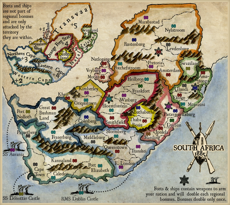
Maybe look at throwing a small border on it, to help balance it all out. Something very small and simple like this.
- Click image to enlarge.
-
army of nobunaga
- Posts: 1989
- Joined: Sat Oct 13, 2007 10:06 pm
- Gender: Male
- Location: www.facebook.com/armyofnobu and Houston.
- Contact:
Re: S Africa 1885 - Another update p. 23 10/5
if the border had the same texture then you would be in business.
Maps Maps Maps!
Take part in this survey and possibly win an upgrade -->
https://docs.google.com/spreadsheet/emb ... OHRFZnc6MQ
Take part in this survey and possibly win an upgrade -->
https://docs.google.com/spreadsheet/emb ... OHRFZnc6MQ
Re: S Africa 1885 - Another update p. 23 10/5
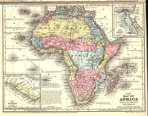
Yes, borderless printing strikes me as too modern.
-
porkenbeans
- Posts: 2546
- Joined: Mon Sep 10, 2007 4:06 pm
Re: S Africa 1885 - Another update p. 23 10/5
Yes, it would need to have the same texture. I just whipped up a quick example of what it might look like. I reduced the image to 98%, then put a vanilla colored layer (from the shield color), underneath. Then put on an inside shadow to dirty up the edge a bit. Also, put a dup. of that "vanilla" layer over the top and used a radial gradient set at lin. burn at 30%. And set the overall opacity of that layer very low. All just to tone down the white a little bit more. I am diggin that off white color, it really helps to sell it as antique.army of nobunaga wrote:if the border had the same texture then you would be in business.
-
Industrial Helix
- Posts: 3462
- Joined: Mon Jul 14, 2008 6:49 pm
- Gender: Female
- Location: Ohio
Re: S Africa 1885 - Another update p. 23 10/5
Alright guys... I threw int he lat and long. lines but I have my reservations. You can also see how I distorted the shape of South Africa to make the map fit reasonably well by the basis of the lines. Then I added in a second border. I like the second border but the lines just seem very distracting. Maybe lower the opacity or gray out the border some. Thoughts?
- Click image to enlarge.

Sketchblog [Update 07/25/11]: http://indyhelixsketch.blogspot.com/
Living in Japan [Update 07/17/11]: http://mirrorcountryih.blogspot.com/
Russian Revolution map for ConquerClub [07/20/11]: http://www.conquerclub.com/forum/viewto ... 1&t=116575
Living in Japan [Update 07/17/11]: http://mirrorcountryih.blogspot.com/
Russian Revolution map for ConquerClub [07/20/11]: http://www.conquerclub.com/forum/viewto ... 1&t=116575
-
AndyDufresne

- Posts: 24919
- Joined: Fri Mar 03, 2006 8:22 pm
- Location: A Banana Palm in Zihuatanejo
- Contact:
Re: S Africa 1885 - Another update p. 23 10/8
Look backing to older drafts---like on page 11, I noticed the text in the lower right corner was: "Forts and ships contain weapons which double all bonuses." And then there was the switch to the current description: "Forts & ships contain weapons to arm your nation and will double each regional bonuses." Is the "bonuses" left over from the original textual construction? Reading "and will double each regional bonuses" is clunky.
Other than that, I'm liking the latest version above. I don't think I'd do much to change it.
--Andy
Other than that, I'm liking the latest version above. I don't think I'd do much to change it.
--Andy
-
The Bison King
- Posts: 1957
- Joined: Thu Aug 27, 2009 5:06 pm
- Location: the Mid-Westeros
Re: S Africa 1885 - Another update p. 23 10/8
The Lines are a little distracting. I'd try lowering the opacity a little bit. If that doesn't work just ditch them. I like the border though.
-
natty dread

- Posts: 12876
- Joined: Fri Feb 08, 2008 8:58 pm
- Location: just plain fucked

-
Industrial Helix
- Posts: 3462
- Joined: Mon Jul 14, 2008 6:49 pm
- Gender: Female
- Location: Ohio
Re: S Africa 1885 - Another update p. 23 10/8
@Andy, ah yeah... I'll fix that.
@everyone else. I'll give it a shot, thanks for the quick feedback
@everyone else. I'll give it a shot, thanks for the quick feedback
Sketchblog [Update 07/25/11]: http://indyhelixsketch.blogspot.com/
Living in Japan [Update 07/17/11]: http://mirrorcountryih.blogspot.com/
Russian Revolution map for ConquerClub [07/20/11]: http://www.conquerclub.com/forum/viewto ... 1&t=116575
Living in Japan [Update 07/17/11]: http://mirrorcountryih.blogspot.com/
Russian Revolution map for ConquerClub [07/20/11]: http://www.conquerclub.com/forum/viewto ... 1&t=116575
-
AndyDufresne
- Posts: 24919
- Joined: Fri Mar 03, 2006 8:22 pm
- Location: A Banana Palm in Zihuatanejo
- Contact:
Re: S Africa 1885 - Another update p. 23 10/8
Keep up the work. This map has come a long way, and I really am digging the style it has worked itself into.
--Andy
--Andy
-
porkenbeans
- Posts: 2546
- Joined: Mon Sep 10, 2007 4:06 pm
Re: S Africa 1885 - Another update p. 23 10/8
The border looks wonderful. Try to lighten it up to/or around the level of the vanilla shield. There is no telling which will look better until you see them. I have a feeling that the light color will look the best.
Either way, the map is really starting to look like something.
Either way, the map is really starting to look like something.
-
Industrial Helix
- Posts: 3462
- Joined: Mon Jul 14, 2008 6:49 pm
- Gender: Female
- Location: Ohio
Re: S Africa 1885 - Another update p. 23 10/8
- Click image to enlarge.

- Click image to enlarge.

Sketchblog [Update 07/25/11]: http://indyhelixsketch.blogspot.com/
Living in Japan [Update 07/17/11]: http://mirrorcountryih.blogspot.com/
Russian Revolution map for ConquerClub [07/20/11]: http://www.conquerclub.com/forum/viewto ... 1&t=116575
Living in Japan [Update 07/17/11]: http://mirrorcountryih.blogspot.com/
Russian Revolution map for ConquerClub [07/20/11]: http://www.conquerclub.com/forum/viewto ... 1&t=116575
-
The Bison King
- Posts: 1957
- Joined: Thu Aug 27, 2009 5:06 pm
- Location: the Mid-Westeros
Re: S Africa 1885 - Another update p. 23 10/8
I feel like I would like the lines more if they were parallel. As it is they don't really seem to be uniform. It just looks wrong to me.
-
Industrial Helix
- Posts: 3462
- Joined: Mon Jul 14, 2008 6:49 pm
- Gender: Female
- Location: Ohio
Re: S Africa 1885 - Another update p. 23 10/8
Well... these would be accurate lat and long lines that reflect the curvature of the earth and the perspective that SA is being looked at... they also show that the map is tilted a bit to fit everything. I'm open to making them straight, but I don't really think its going to bring anything more to the table.
Sketchblog [Update 07/25/11]: http://indyhelixsketch.blogspot.com/
Living in Japan [Update 07/17/11]: http://mirrorcountryih.blogspot.com/
Russian Revolution map for ConquerClub [07/20/11]: http://www.conquerclub.com/forum/viewto ... 1&t=116575
Living in Japan [Update 07/17/11]: http://mirrorcountryih.blogspot.com/
Russian Revolution map for ConquerClub [07/20/11]: http://www.conquerclub.com/forum/viewto ... 1&t=116575