Conquer Club

CCU [Quenched]

Care to peruse completed maps? Take a stroll through the Atlas.

Moderator: Cartographers

Forum rules
Please read the Community Guidelines before posting.

CCU [Quenched]

Postby Jota on Thu Jun 08, 2006 10:01 pm

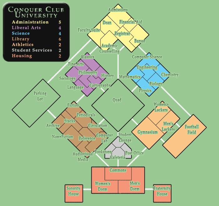
Well, the Apocalypse map is just about done, and I'm sure all of you know what that means. It's time to pick up your class schedules and meet your new roommates, because you just became a freshman at Conquer Club University!

Image

For a change, I'm going to try to keep this one visually and mechanically simple, unlike my last two maps. CCU has forty-four countries in seven continents, including two countries not in any continent (with a nod to Alexander's Empire, which did that first). I'm also experimenting a bit with the continent bonuses here; we'll see how that works out.
User avatar
Sergeant 1st Class Jota
 
Posts: 634
Joined: Wed Mar 29, 2006 7:38 pm

Postby AndyDufresne on Thu Jun 08, 2006 10:25 pm

Well lets see...


---Jota you are one of the reasons I love the Foundry job. You have always strived for uniquess both in game play and location in all your maps. I must say, Thanks for everything.

===================

Anyways, enough ego boosting, lets get to the map.

---Could this map be the first of the 'building' maps? We'll have to see.

---First off one thing I see trouble with is the green background. The choice limits contintental colors. I might look into keeping the 'brown/orange/red orange' continents now so near each other. Use the colors to break them up. Also keeps people from confusing them in the legend.

---What are you considering for this green background? Curious George wants to know. Perhaps even look into making the Quad and the Parking lot shades of gray, or something slightly different from the green background.

---I'm not so sold on the green text you've got going. Maybe stick to simple black. For the font though I like the choice.

---And what are your ideas for the 'texture' for the contients? Perhaps something similar to USApocalypse image use. Images in the background of their respective area. Tennis rackets and footballs for the Athletics, etc.

---One thing you have started to experiment with, is the shape and design of the buildings. I think there should be even more building uniqueness, stray away from the repeated single square and rectangle. Maybe a L shape. Go look at Tetris. ;)

---Also what are your ideas for the connecting lines?

---I like the names of the countries. I even notice the nod to map making in the Liberal Arts continent

---As for the legend, I think there could be a lot of fun experimentation here. Maybe an open book? Maybe a stack of books and papers for the background, or a backpack. You know college things. They could also be used in the 'blank' spaces of the map.

===============================

Hm, Hopefully I'll have time to think on it more later! Interesting idea, I wondered what you had in mind when you mentioned you had a working idea for your next map. Don't burn yourself out!


--Andy
User avatar
Corporal 1st Class AndyDufresne
 
Posts: 24935
Joined: Fri Mar 03, 2006 8:22 pm
Location: A Banana Palm in Zihuatanejo

Postby Marvaddin on Fri Jun 09, 2006 12:18 am

Hmmmm, really zero appeal to me. It only reminds me the ???dome map, with those boxes. Could you instead imagine a starship map?
Image
User avatar
Major Marvaddin
 
Posts: 2545
Joined: Thu Feb 09, 2006 5:06 pm
Location: Belo Horizonte, Brazil

Postby AndyDufresne on Fri Jun 09, 2006 12:21 am

---Perhaps if you did something 'Clue-esque' and add some furniture...or maybe just look at the clue board for ideas.


--Andy
User avatar
Corporal 1st Class AndyDufresne
 
Posts: 24935
Joined: Fri Mar 03, 2006 8:22 pm
Location: A Banana Palm in Zihuatanejo

Postby rocksolid on Fri Jun 09, 2006 12:55 am

I like a departure from the backgrounds and textures of the USApocalypse map - not that they don't have appeal for some people, they just look kind of messed-up and decrepit and chaotic, which works for that map.

I also like the readability of this map relative to your other ones. This is like the Jota-for-dummies map.

As for decor, I think Andy missed your stated intention of simplicity...but if you are throwing more stuff on there, I want little cartoon people, kind of like a Where's Waldo map filled with stereotypical university characters wandering around the place. That's what I'm putting my personal order in for. :wink:
User avatar
Lieutenant rocksolid
 
Posts: 625
Joined: Sat Mar 18, 2006 10:00 pm
Location: Mowwwnt Reeeal

Postby Jota on Fri Jun 09, 2006 1:10 am

AndyDufresne wrote:What are you considering for this green background?


If you mean in terms of decorations, I was thinking of maybe placing a few stylized iconic trees and bushes around, and maybe a couple other landscape-ish decorations as appropriate. If you mean "why green?", it just seemed like a natural "outdoors" color, and appropriate for the Quad. But perhaps an off-white would be more suitaby neutral.

And what are your ideas for the 'texture' for the contients? Perhaps something similar to USApocalypse image use.


Actually, I was planning to leave the countries themselves a more or less solid color, to keep a clean, simple visual feel. Something not unlike an actual campus map/directory. I already did the background image thing in the last map, and I wouldn't want to start repeating myself.

I was going to look around to see how hard it would be to add some architectural flourishes to the outsides of the buildings, if I could, but that might exceed my skills.

I think there should be even more building uniqueness, stray away from the repeated single square and rectangle. Maybe a L shape.


I've got an L! The Administration building. But I'll see what I can do.

Also what are your ideas for the connecting lines?


Probably a white cobbled texture, to look like sidewalks.

Marvaddin wrote:Hmmmm, really zero appeal to me. It only reminds me the ???dome map, with those boxes.


Ah well. Can't win 'em all. Maybe it'll grow on you as it develops...
User avatar
Sergeant 1st Class Jota
 
Posts: 634
Joined: Wed Mar 29, 2006 7:38 pm

Postby Mr. K on Fri Jun 09, 2006 1:39 am

Hmm, well done. I like it, its a neat idea.

One little suggestion, for the title it might be neat and might give more of that "university feel" if you used some sort of famous University crest.

What comes right to mind for some reason is Cambridge.
http://upload.wikimedia.org/wikipedia/e ... -_flat.png
I think it might be neat if you used that image for the title, and removed all the stuff out of that middle bar and replaced it with "Conquer Club Universtiy."

Just a thought.
User avatar
Lieutenant Mr. K
 
Posts: 291
Joined: Thu Mar 16, 2006 9:14 pm

Postby Pilate on Fri Jun 09, 2006 1:54 am

This map looks awesome
highest ranking 1 highest points 3200

Canada Cup Tournament Qualifers
http://www.conquerclub.com/forum/viewtopic.php?t=3166
User avatar
Colonel Pilate
 
Posts: 382
Joined: Thu May 18, 2006 10:21 pm
Location: Toronto, Canada

Postby gavin_sidhu on Fri Jun 09, 2006 2:44 am

I think the writing is not college like. The map isnt actually very collage like. I remember seeing that kind of font in the simpsons spookerama. Maybe you should go for times new roman or a chalkboard style text. Conquer Club is going to end up with lots of weird maps. This map is OK but following the marvel that was the apocolypse map, this is a let down.
User avatar
Lieutenant gavin_sidhu
 
Posts: 1428
Joined: Mon May 22, 2006 6:16 am
Location: Brisbane, Australia

Postby Jota on Fri Jun 09, 2006 8:08 am

Here's a version with different coloring and some more interesting variety in building shapes:

Image

Re-doing the shapes of buildings and rooms is pretty-labor intensive, so if any more of that needs to be done (e.g. if the continents and borders and such need reworking), it'd be good to get that out of the way early.

This version has a couple different styles of highlighting for the country names so you can compare them. It needs some highlighting, because plain dark text gets hard to read when it crosses the walls, and plain light text would be hard to read against the off-white background.
User avatar
Sergeant 1st Class Jota
 
Posts: 634
Joined: Wed Mar 29, 2006 7:38 pm

Postby AndyDufresne on Fri Jun 09, 2006 11:36 am

---For the names then, instead of using the same color highlight, perhaps a tone darker for the highlight doesn't blend off into the background of the contintental area.

---Maybe this would be adding too much clutter, but to give it more of a blue print feel, how about the 'swinging' doors you see on 'em? Maybe windows also. Nothing too elaborate obviously, but something else so it feels less like boxes and more like rooms.

--Andy
Last edited by AndyDufresne on Fri Jun 09, 2006 11:43 am, edited 1 time in total.
User avatar
Corporal 1st Class AndyDufresne
 
Posts: 24935
Joined: Fri Mar 03, 2006 8:22 pm
Location: A Banana Palm in Zihuatanejo

Postby Ronaldinho on Fri Jun 09, 2006 11:39 am

looks good m8 but looks a little dull maybe spice it up a bit :)
User avatar
Sergeant Ronaldinho
 
Posts: 3069
Joined: Sat May 27, 2006 5:35 pm
Location: Dorset, England.

Postby Jota on Fri Jun 09, 2006 12:06 pm

Yeah, blueprint-style doors and windows were definitely one of the things I was thinking about. Probably just on the outside walls of the buildings, though, since putting them between rooms would raise questions of whether rooms without doors bordered each other (and putting doors between every pair of adjacent rooms would be... messy). If someone knows a good resource for blueprint-style images (doors, windows, facades, stairs, trees, shrubs, cornices, cornish game hens, etc.), feel free to toss out a URL.
User avatar
Sergeant 1st Class Jota
 
Posts: 634
Joined: Wed Mar 29, 2006 7:38 pm

Postby AndyDufresne on Fri Jun 09, 2006 12:33 pm

Well...

---I've been spending some time trying to find some resources for you, Jota. Not as easy as I thought it would be. But so far for outside features this site seems to have a few (if not images ideas then).


---Also are you looking for this to be more of a 'student directory' rather than a blueprint per se? If you go the blueprint route, maybe using a few tool images (Right Angle rulers, compass, etc) for decorative use. If you go the directory route, I'm not so sure...have to look into that.

I'll keep my eye out for any other sites...


--Andy
User avatar
Corporal 1st Class AndyDufresne
 
Posts: 24935
Joined: Fri Mar 03, 2006 8:22 pm
Location: A Banana Palm in Zihuatanejo

Postby reverend_kyle on Fri Jun 09, 2006 3:39 pm

No appeal here.
User avatar
Sergeant reverend_kyle
 
Posts: 9250
Joined: Tue Mar 21, 2006 4:08 pm
Location: 1000 post club

Postby Marvaddin on Fri Jun 09, 2006 5:39 pm

Agreed. Who would like to fight for a parking lot in a college? Nothing new, only another picture with boxes and names with very little appeal. New shapes of buildings? Bah!

How about a mix between chess and conquer club? :wink:
Image
User avatar
Major Marvaddin
 
Posts: 2545
Joined: Thu Feb 09, 2006 5:06 pm
Location: Belo Horizonte, Brazil

Postby Mr. K on Fri Jun 09, 2006 5:48 pm

Marvaddin wrote:Agreed. Who would like to fight for a parking lot in a college? Nothing new, only another picture with boxes and names with very little appeal. New shapes of buildings? Bah!

How about a mix between chess and conquer club? :wink:

Have a little imagination! You're country is overthrown by a totalitarian evil empire. You and some freedom fighters vow to take it back. You start by retaking the university - its got loads of intellectuals within as well as a wealth of useful information and technology, as well as powerful tools (and knowledge) that could be helpful to the resistance!

From there its classic strategy, and suddenly fighting to control that parking lot becomes a little more important!
User avatar
Lieutenant Mr. K
 
Posts: 291
Joined: Thu Mar 16, 2006 9:14 pm

Postby Jota on Sat Jun 10, 2006 1:50 am

Hey, thanks Andy. Those should come in quite handy. I'm going for more of a directory look overall, but I think a few blueprint-like elements will help it look less bland.

And Marv, of course you don't care about taking the parking lot: that's why it's not worth any points. But wouldn't you like to storm the Women's Locker Room? ;)
User avatar
Sergeant 1st Class Jota
 
Posts: 634
Joined: Wed Mar 29, 2006 7:38 pm

Postby fluffybunnykins on Sat Jun 10, 2006 4:56 am

argh, you beat me to it!
I've been working on a plan of my old school & was going to call it Class War!
Never mind...
When I'm next at my work computer I'll post it up for ideas, if you like.
Phil
Superman wears 'Fluffybunnykins' pyjamas
User avatar
Corporal 1st Class fluffybunnykins
 
Posts: 385
Joined: Tue May 02, 2006 6:43 am
Location: Liverpool, UK

Postby Jota on Sat Jun 10, 2006 5:30 am

Whoops. If only you'd been faster, then I could be working on my next map now, instead ;)
User avatar
Sergeant 1st Class Jota
 
Posts: 634
Joined: Wed Mar 29, 2006 7:38 pm

Postby zip_disk on Sat Jun 10, 2006 5:55 am

On a strategic note, I don't think its so good an idea to have the three smallest continents directly connected like that. Specifically the Housing continent is the problem. In games with lots of players, if a player gets lucky they can seize Housing and then creep outwards to the other 2 with little risk while everyone else is struggling to obtain a continent (especially in No Card games). Taking Student Services doubles the bonus and only risks another entrance. Swapping the Parking Lot and SS might work.


As a random and probably useless side idea: What if you make the Quad and the Parking Lot have a mini-continent bonuses of -1 each but a combined continent bonus of 4 (or even 5 to make people truely consider breaking it) for a net continent worth of 2 (or 3). Anyone who tries to transition either will have to try to take both or risk the tiny penalty. Anyone who tries to break the continent however accepts the negative bonus for themselves. If you move stuff just make sure that the 2 sections don't touch directly but stay like it is now. Makes for a questionable situation.

You could even turn Housing's Commons into a third "public" sub-country. Making it questionable whether the positive of holding the strategic chokepoint is worth the negative army bonus. Give the Women's and Men's Dorms 1-way attack routes out to the Library and the Athletics respectively to reinforce that idea. With this sub-continent rule in place the closeness of the small continents might not be a concern.

I'll stop now before I ramble on too much about this side idea that is extremely unlikely to get used. :roll:
Captain zip_disk
 
Posts: 216
Joined: Thu Mar 23, 2006 9:33 pm

Postby Marvaddin on Sat Jun 10, 2006 8:26 am

Jota wrote:But wouldn't you like to storm the Women's Locker Room? ;)

Not an empty one as it is now... Will you add some nude girls images? :lol:

It has still no appeal to me, but maybe you can increase it with more buildings... This doesnt even looks like a college... ONE building to "Science"? See my college map here in Brazil:
http://www.ufmg.br/conheca/mapas/pampulha2004.html
Image
User avatar
Major Marvaddin
 
Posts: 2545
Joined: Thu Feb 09, 2006 5:06 pm
Location: Belo Horizonte, Brazil

Postby Banana Stomper on Sat Jun 10, 2006 9:12 am

I had actually for a while been considering making a pennstate map. But then i realized that while i'm at school and basically anywhere in my hometown...or at work...it seems like a good idea because no matter where i am at least 75% of the people i run into go to, or went to pennstate. (the other 25% wish they did). So basically, anything pennstate rocks to them...but i doubt that obsession will translate accross continents...so i decided against it. but if you want jota, this could make an interesting map...its a pretty big campus so it'd have to be thinned out. But i immagined it would be divided into the 5 residence halls areas, north, south, east, west, and pollock. Those could be divided into the different buildings. The sports area with beaver stadium, bryce jordan center etc. off to the right. And if you wanted to get into areas like, engineering, liberal arts, natural sciences, that can be done as well. Its a sweet campus, a lot of fun to live on, more fun to conquer?

Jota, if you don't think it would really work well for your idea here, i hope you don't mind if i just do a little stab at finding interest in it here.


http://www.campusmaps.psu.edu/print/pdf ... ut2005.pdf
User avatar
Corporal 1st Class Banana Stomper
 
Posts: 422
Joined: Thu Mar 16, 2006 4:39 pm
Location: Richmond, Virginia

Postby gavin_sidhu on Sat Jun 10, 2006 9:55 am

I think the sorority house and the fraternity house should be squares. People dont build buildings in those shapes. I like your change to the shape of the Library though.
User avatar
Lieutenant gavin_sidhu
 
Posts: 1428
Joined: Mon May 22, 2006 6:16 am
Location: Brisbane, Australia

Postby Jota on Sun Jun 11, 2006 7:45 am

zip raised some really good points. A whole bunch of fiddly manipulation later, here's my response to them:

Image

I haven't started in on the decorations yet: any changes I make to the layout will likely require undoing any decorating work I've done. Thus, I'd really like to get the layout more or less down before I move on to the next stage.
User avatar
Sergeant 1st Class Jota
 
Posts: 634
Joined: Wed Mar 29, 2006 7:38 pm

Next

Return to The Atlas

Who is online

Users browsing this forum: No registered users