- Click image to enlarge.

Moderator: Cartographers


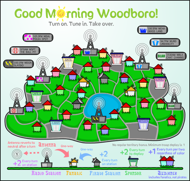
I agree... and I'm sorry Natty, I know this is something you feel strongly about, and you know a lot more than me about it, but I really like Evil's version from page 14 (before all this text tweaking started) the best. I know the text is plain, and that that style wouldn't work for the majority of maps, but this map is supposed to be simple and cartoonish, that's one of the things that made me really like it in the first place. The fonts you made look very pretty in and of themselves, but I just don't think they fit with the rest of the map. I also do not understand what was wrong with the original text in the first place... "If it ain't broke, don't fix it." If it was illegible then I agree that's a problem, but I don't think it was.It looks kind of strange to me since the letters have a shadow and nothing else does.
I suppose the shadows do seem a little out of place. I also agree that the version at the top of page 14 was legible. I only made suggestions in the hope that it would help those who were having trouble reading that one. But once again, as I have learned so many times in the real world, "better" is the enemy of "good enough".carlpgoodrich wrote:I agree... and I'm sorry Natty, I know this is something you feel strongly about, and you know a lot more than me about it, but I really like Evil's version from page 14 (before all this text tweaking started) the best. I know the text is plain, and that that style wouldn't work for the majority of maps, but this map is supposed to be simple and cartoonish, that's one of the things that made me really like it in the first place. The fonts you made look very pretty in and of themselves, but I just don't think they fit with the rest of the map. I also do not understand what was wrong with the original text in the first place... "If it ain't broke, don't fix it." If it was illegible then I agree that's a problem, but I don't think it was.It looks kind of strange to me since the letters have a shadow and nothing else does.
...Which is pretty much what I was looking for. Can I get the names on a transparent PNG by themselves?carlpgoodrich wrote:Ooooh, I actually do like that oneIt kinda looks like someone mowed the names into the lawn.


My way is better, because it adapts itself to whatever background colour. Like if we decide to change the tone of the grass later, we won't have to adjust the text again.MrBenn wrote:Looks like you could do something similar with some sort of outer glow using a slightly darker green than the green of the grass (select the colour of the green using the eyedropper, and change it to another closish one that's just darker).


This one looks pretty good - much better than the random ones I posted. I think my only concern about the current one is that I think it's a bit wibbly. It's fine as it is, of course (so I won't push for a change), I was just trying to articulate my thoughts and suggest an alternative.natty_dread wrote:No offense MrB, but I couldn't see any of those fonts really fitting the style of the map...
A solid, thick hand-written-ish font would be best I think... perhaps just a little less squiggly than the current one?
http://www.dafont.com/yikes.font?psize= ... e+Lazy+Dog.