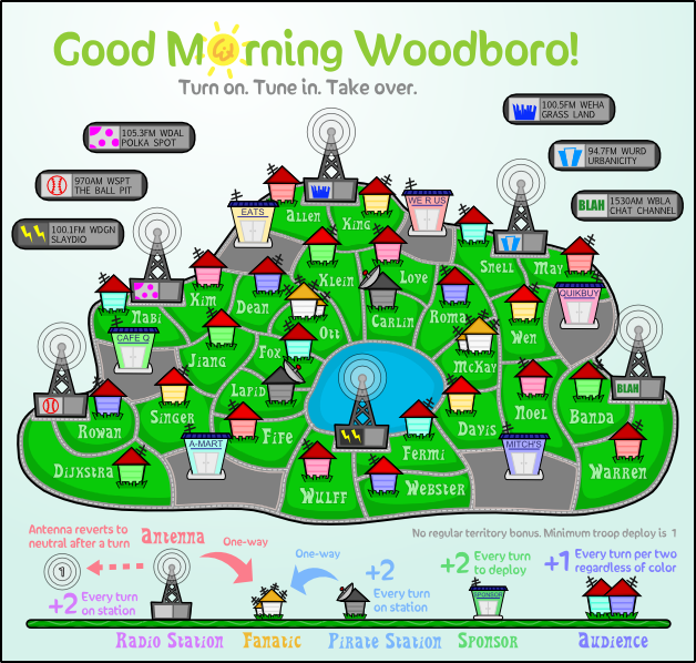
- Click image to enlarge.
Good Morning Woodboro (V7.X) -- Home for the Holidays
Moderator: Cartographers
Forum rules
Please read the Community Guidelines before posting.
Please read the Community Guidelines before posting.
-
Evil DIMwit

- Posts: 1616
- Joined: Thu Mar 22, 2007 1:47 pm
- Gender: Male
- Location: Philadelphia, NJ
Re: Good Morning Woodboro (V7.4) -- Smooth defeats Grunge
I tried the outline. Tell me if this looks better:


-
natty dread

- Posts: 12876
- Joined: Fri Feb 08, 2008 8:58 pm
- Location: just plain fucked

Re: Good Morning Woodboro (V7.4) -- Smooth defeats Grunge
Dijkstra - looks a bit like it's spelt Dijxstra
C.
C.

Highest score : 2297
-
carlpgoodrich
- Posts: 408
- Joined: Tue Aug 04, 2009 2:12 pm
Re: Good Morning Woodboro (V7.4) -- Smooth defeats Grunge
I agree. I actually think a lot of the text is a bit hard to read. Personally, I liked it better without the black outline... but I'm good either way.yeti_c wrote:Dijkstra - looks a bit like it's spelt Dijxstra

Re: Good Morning Woodboro (V7.4) -- Smooth defeats Grunge
I also think that the outline has not helped the text. Try simply increasing the contrast, which I suspect means that you will have to make the text lighter, as the green background is a good colour now.carlpgoodrich wrote:I agree. I actually think a lot of the text is a bit hard to read. Personally, I liked it better without the black outline... but I'm good either way.yeti_c wrote:Dijkstra - looks a bit like it's spelt Dijxstra
-
Evil DIMwit
- Posts: 1616
- Joined: Thu Mar 22, 2007 1:47 pm
- Gender: Male
- Location: Philadelphia, NJ
Re: Good Morning Woodboro (V7.4) -- Smooth defeats Grunge
Even more contrast than the previous version (here)?ender516 wrote:I also think that the outline has not helped the text. Try simply increasing the contrast, which I suspect means that you will have to make the text lighter, as the green background is a good colour now.carlpgoodrich wrote:I agree. I actually think a lot of the text is a bit hard to read. Personally, I liked it better without the black outline... but I'm good either way.yeti_c wrote:Dijkstra - looks a bit like it's spelt Dijxstra
Re: Good Morning Woodboro (V7.4) -- Smooth defeats Grunge
Well that version was better than the one with the black outline. What about that one you just referenced with a white outline on the text? Would that sharpen the edges of the text?Evil DIMwit wrote:Even more contrast than the previous version (here)?ender516 wrote:I also think that the outline has not helped the text. Try simply increasing the contrast, which I suspect means that you will have to make the text lighter, as the green background is a good colour now.carlpgoodrich wrote:I agree. I actually think a lot of the text is a bit hard to read. Personally, I liked it better without the black outline... but I'm good either way.yeti_c wrote:Dijkstra - looks a bit like it's spelt Dijxstra
-
Evil DIMwit
- Posts: 1616
- Joined: Thu Mar 22, 2007 1:47 pm
- Gender: Male
- Location: Philadelphia, NJ
Re: Good Morning Woodboro (V7.4) -- Smooth defeats Grunge
- Click image to enlarge.

Re: Good Morning Woodboro (V7.4) -- Smooth defeats Grunge
You're right, it has made no difference at all, apart from "Klein" and "Love" being sized up to match the other text.
Re: Good Morning Woodboro (V7.4) -- Smooth defeats Grunge
There is definitely something that's awkward with the colour of the text in the grass.
C.
C.
Highest score : 2297
-
Evil DIMwit
- Posts: 1616
- Joined: Thu Mar 22, 2007 1:47 pm
- Gender: Male
- Location: Philadelphia, NJ
Re: Good Morning Woodboro (V7.4) -- Smooth defeats Grunge
In which version? Light outline, dark outline, or no outline?yeti_c wrote:There is definitely something that's awkward with the colour of the text in the grass.
C.
Re: Good Morning Woodboro (V7.4) -- Smooth defeats Grunge
I'm afraid to say - all of them...
C.
C.
Highest score : 2297
-
carlpgoodrich
- Posts: 408
- Joined: Tue Aug 04, 2009 2:12 pm
Re: Good Morning Woodboro (V7.4) -- Smooth defeats Grunge
I like the most recent one a lot. Looks fine to me.yeti_c wrote:I'm afraid to say - all of them...
C.
-
Evil DIMwit
- Posts: 1616
- Joined: Thu Mar 22, 2007 1:47 pm
- Gender: Male
- Location: Philadelphia, NJ
Re: Good Morning Woodboro (V7.4) -- Smooth defeats Grunge
Well, I don't quite know how to fix this problem I'm not seeing, so do you have a recommendation?yeti_c wrote:I'm afraid to say - all of them...
C.
-
natty dread
- Posts: 12876
- Joined: Fri Feb 08, 2008 8:58 pm
- Location: just plain fucked
-
Evil DIMwit
- Posts: 1616
- Joined: Thu Mar 22, 2007 1:47 pm
- Gender: Male
- Location: Philadelphia, NJ
Re: Good Morning Woodboro (V7.4) -- Font lines
Isn't 1px width a little big considering the lines are less than 2px wide?natty_dread wrote:Try a bevel with 1px width and put it on overlay...
-
natty dread
- Posts: 12876
- Joined: Fri Feb 08, 2008 8:58 pm
- Location: just plain fucked
Re: Good Morning Woodboro (V7.4) -- Font lines
I mean on the text. And I don't think it's too thick, just adjust the opacity if necessary.
I'm not sure what software you're using nowdays... but I do it this way: I use magic wand to select all the transparent area of a text layer, then invert the selection so all the text is selected. Then I create another layer and set it on overlay. Then I apply a bevel with 1px width, then adjust the opacity of the bevel layer until it looks good. If the bevel is not visible enough with full opacity then I duplicate it and adjust one of them until it is good.
I'm not sure what software you're using nowdays... but I do it this way: I use magic wand to select all the transparent area of a text layer, then invert the selection so all the text is selected. Then I create another layer and set it on overlay. Then I apply a bevel with 1px width, then adjust the opacity of the bevel layer until it looks good. If the bevel is not visible enough with full opacity then I duplicate it and adjust one of them until it is good.

-
Evil DIMwit
- Posts: 1616
- Joined: Thu Mar 22, 2007 1:47 pm
- Gender: Male
- Location: Philadelphia, NJ
Re: Good Morning Woodboro (V7.4) -- Font lines
Well, I'm doing it in Inkscape, which is a vector graphics program, so most of that can't really apply.
-
natty dread
- Posts: 12876
- Joined: Fri Feb 08, 2008 8:58 pm
- Location: just plain fucked
Re: Good Morning Woodboro (V7.4) -- Font lines
Hmm... 
Then I'm not sure what to suggest. Perhaps exporting the text layer to another graphics software, editing it there, then importing it back in? That's the best I can think of, unless you can achieve what I suggested in inkscape somehow.
Then I'm not sure what to suggest. Perhaps exporting the text layer to another graphics software, editing it there, then importing it back in? That's the best I can think of, unless you can achieve what I suggested in inkscape somehow.
-
Evil DIMwit
- Posts: 1616
- Joined: Thu Mar 22, 2007 1:47 pm
- Gender: Male
- Location: Philadelphia, NJ
Re: Good Morning Woodboro (V7.4) -- Font lines
I can't seem to get the bevel pulgin working in Paint.NET and there isn't a good way to do bevel at this scale in Inkscape. I played around and this is the closest I got:
- Click image to enlarge.

-
natty dread
- Posts: 12876
- Joined: Fri Feb 08, 2008 8:58 pm
- Location: just plain fucked
Re: Good Morning Woodboro (V7.4) -- Font lines
Were you using the "bevel selection" plugin? Because the normal bevel doesn't work for it, it only bevels rectangular areas, you need to use the "bevel selection" to do shaped bevels.
-
Evil DIMwit
- Posts: 1616
- Joined: Thu Mar 22, 2007 1:47 pm
- Gender: Male
- Location: Philadelphia, NJ
Re: Good Morning Woodboro (V7.4) -- Font lines
No, I literally couldn't get the plugin to work. I put the dll in the 'Effects' directory but the effect didn't show up when I restarted Paint.Net.natty_dread wrote:Were you using the "bevel selection" plugin? Because the normal bevel doesn't work for it, it only bevels rectangular areas, you need to use the "bevel selection" to do shaped bevels.
-
natty dread
- Posts: 12876
- Joined: Fri Feb 08, 2008 8:58 pm
- Location: just plain fucked
Re: Good Morning Woodboro (V7.4) -- Font lines
Hmm. Do you have the latest version of paint.net and latest version of the plugin?
Try re-downloading the plugin.
Here's a link to the plugin-pack which contains the bevel plugin http://forums.getpaint.net/index.php?ap ... ch_id=3490
Try re-downloading the plugin.
Here's a link to the plugin-pack which contains the bevel plugin http://forums.getpaint.net/index.php?ap ... ch_id=3490
-
Evil DIMwit
- Posts: 1616
- Joined: Thu Mar 22, 2007 1:47 pm
- Gender: Male
- Location: Philadelphia, NJ
Re: Good Morning Woodboro (V7.4) -- Font lines
Well, I got the plugin to work, and I applied the bevel effect to the text, but I don't like how it looked at all. I think I'll stick to vector effects.
-
natty dread
- Posts: 12876
- Joined: Fri Feb 08, 2008 8:58 pm
- Location: just plain fucked
Re: Good Morning Woodboro (V7.4) -- Font lines
Well, applying bevels is a form of art... it's very easy to make it look cheap and crappy. The key to using bevels is subtlety. There's many things that can be done with them if one uses imagination... but, I'm not going to expand on that here.
Perhaps we need to think of something else for the text...
(btw, if you wish, you can give me the text layer and the image without the text as transparent png:s, I could try to tweak them a bit... see if I can manage to create something useful.)
Perhaps we need to think of something else for the text...
(btw, if you wish, you can give me the text layer and the image without the text as transparent png:s, I could try to tweak them a bit... see if I can manage to create something useful.)