Lunar War [GP, G, X] files on p.1
Moderator: Cartographers
Re: Lunar War <v5> p1, 5
I've been watching this map with unease. I want a moon map, but man I hate dots and connector lines. Fortunately, I think it has the potential to work on a map based on craters...
My first crit is that the Sinus seem unnecessary. You've got Mare already.
You've got 6 landing sites per country... cut each in half and add countries. part of the fun of a what if future mission is all the possibilities. The Indian Chandrayaan-I lunar mission found the first evidence of water on the moon just before the US mission confirmed this years big discovery. In fact, the Indian Space Agency is more capable of lunar landing and operations, at this point, than China or Japan.
The European Union could use some representation as well as it is capable of all forms of space exploration as the US, short of landing on the moon. They also spend the most on space exploration besides the US.
Brazil is also a very capable space nation as they run all sorts of rockets, have astronauts and operate satellites. Perhaps the most capable outside of the great powers.
Now if you want to delve deep into science fiction... the South African gov't this year signed a bill which marks their entrance into space exploration. Canada, S. Korea, Indonesia, Israel and Ukraine are all running strong space agencies which include operating rockets and satellites and having astronauts. So the choice is yours but I would love to see more countries involved in this map.
I say you should run with just one style of connection, either the dotted lines or the arrows. Using two is unnecessary and confusing.
The outline of the moon is pixelated.
Throw some stars into that black background.
Can you make the craters look like craters rather than purple circles? I didn't realize they were craters looking at the map until I resigned myself to looking at the lengthy legend. I think it should be obvious what a territory is when you look at it. The mares look great though, very distinctive but the blue line ruins it for me....
Have you guys considered running with a different color scheme? Or at least desaturating them some so that theyre not so bright and neon?
What about the two craters in the south west?
Anyway, good luck.
Sketchblog [Update 07/25/11]: http://indyhelixsketch.blogspot.com/
Living in Japan [Update 07/17/11]: http://mirrorcountryih.blogspot.com/
Russian Revolution map for ConquerClub [07/20/11]: viewtopic.php?f=241&t=116575
Living in Japan [Update 07/17/11]: http://mirrorcountryih.blogspot.com/
Russian Revolution map for ConquerClub [07/20/11]: viewtopic.php?f=241&t=116575
-

 Industrial Helix
- Posts: 3462
- Joined: Mon Jul 14, 2008 6:49 pm
- Location: Ohio


Re: Lunar War <v5> p1, 5
Wow, that's a lot of good criticism and I appreciate it. I'll let Isaiah answer to the gameplay issues, and concentrate on the graphical questions.
IMO it would be odd to group them along with the seas, when they are called bays.
The arrows are used because the dotted lines would not be visible enough in the connections between the seas. And using the arrows in all connections would clutter the map and look really ugly.
This will be fixed, I was going to do it last update but forgot.
I will as soon as I find a good public domain starfield image.
I will try to improve the craters. Which blue lines do you mean? The territory borders? I'm not sure what to do with them. There needs to be some way to indicate the borders of the seas. I'll try to redraw them as well, but they also need to be easily visible.
I think the map needs some colour. The background, the moon, is already so grey and dull, that adding some bright colours brings some contrast and makes the map look less boring.
There's lots of balancing of visual style vs. clarity of gameplay in this map. I'll try my best though.
My first crit is that the Sinus seem unnecessary. You've got Mare already.
IMO it would be odd to group them along with the seas, when they are called bays.
I say you should run with just one style of connection, either the dotted lines or the arrows. Using two is unnecessary and confusing.
The arrows are used because the dotted lines would not be visible enough in the connections between the seas. And using the arrows in all connections would clutter the map and look really ugly.
The outline of the moon is pixelated.
This will be fixed, I was going to do it last update but forgot.
Throw some stars into that black background.
I will as soon as I find a good public domain starfield image.
Can you make the craters look like craters rather than purple circles? I didn't realize they were craters looking at the map until I resigned myself to looking at the lengthy legend. I think it should be obvious what a territory is when you look at it. The mares look great though, very distinctive but the blue line ruins it for me....
I will try to improve the craters. Which blue lines do you mean? The territory borders? I'm not sure what to do with them. There needs to be some way to indicate the borders of the seas. I'll try to redraw them as well, but they also need to be easily visible.
Have you guys considered running with a different color scheme? Or at least desaturating them some so that theyre not so bright and neon?
I think the map needs some colour. The background, the moon, is already so grey and dull, that adding some bright colours brings some contrast and makes the map look less boring.
There's lots of balancing of visual style vs. clarity of gameplay in this map. I'll try my best though.

-

 natty dread
- Posts: 12877
- Joined: Fri Feb 08, 2008 8:58 pm
- Location: just plain fucked


Re: Lunar War <v5> p1, 5
Industrial Helix wrote:I've been watching this map with unease. I want a moon map, but man I hate dots and connector lines. Fortunately, I think it has the potential to work on a map based on craters...
My first crit is that the Sinus seem unnecessary. You've got Mare already.
You've got 6 landing sites per country... cut each in half and add countries. part of the fun of a what if future mission is all the possibilities. The Indian Chandrayaan-I lunar mission found the first evidence of water on the moon just before the US mission confirmed this years big discovery. In fact, the Indian Space Agency is more capable of lunar landing and operations, at this point, than China or Japan.
The European Union could use some representation as well as it is capable of all forms of space exploration as the US, short of landing on the moon. They also spend the most on space exploration besides the US.
Brazil is also a very capable space nation as they run all sorts of rockets, have astronauts and operate satellites. Perhaps the most capable outside of the great powers.
Now if you want to delve deep into science fiction... the South African gov't this year signed a bill which marks their entrance into space exploration. Canada, S. Korea, Indonesia, Israel and Ukraine are all running strong space agencies which include operating rockets and satellites and having astronauts. So the choice is yours but I would love to see more countries involved in this map.
I say you should run with just one style of connection, either the dotted lines or the arrows. Using two is unnecessary and confusing.
The outline of the moon is pixelated.
Throw some stars into that black background.
Can you make the craters look like craters rather than purple circles? I didn't realize they were craters looking at the map until I resigned myself to looking at the lengthy legend. I think it should be obvious what a territory is when you look at it. The mares look great though, very distinctive but the blue line ruins it for me....
Have you guys considered running with a different color scheme? Or at least desaturating them some so that theyre not so bright and neon?
What about the two craters in the south west?
Anyway, good luck.
Great suggestions IH!!
I have let natty know that we can open up all the areas where the arrows are to show they are connected.
AS for the countries, I have thought about using more countries, but figured that it would clutter up the map too much. At the same time, splitting the rockets and landing sites in half could be done. I have suggested to natty to put up a poll asking that question, whether or not people want more countries! If the majority want that, then by all means we will get it done, as long as we have room in the legend. Natty and I will see if we can jugle things around in the legend to see if it can be done. It may be we will have to just say something like "+x for each counties landing sites".
We'll get it worked out!!
-
 isaiah40
- Posts: 3990
- Joined: Mon Aug 27, 2007 7:14 pm


Re: Lunar War <v5> p1, 5 *POLL*
[ Moved ] to the drafting room.
-

 thenobodies80
- Posts: 5400
- Joined: Wed Sep 05, 2007 4:30 am
- Location: Milan


Re: Lunar War <v5> p1, 5 *POLL*
The blue lines I'm talking about are those surrounding the Mares. Like Natty said, you're working with a very dull and monotone map and some color should liven things up. But I warn you to exercise caution. Neon color is going to make it look too gaudy as it breaks from the established tone of the map, which is towards the darker side. By all means, do color, but try and desaturate it or give it some wear and tear so that it fits in, yet livens up, the rest of the map.
Sketchblog [Update 07/25/11]: http://indyhelixsketch.blogspot.com/
Living in Japan [Update 07/17/11]: http://mirrorcountryih.blogspot.com/
Russian Revolution map for ConquerClub [07/20/11]: viewtopic.php?f=241&t=116575
Living in Japan [Update 07/17/11]: http://mirrorcountryih.blogspot.com/
Russian Revolution map for ConquerClub [07/20/11]: viewtopic.php?f=241&t=116575
-

 Industrial Helix
- Posts: 3462
- Joined: Mon Jul 14, 2008 6:49 pm
- Location: Ohio


Re: Lunar War <v5> p1, 5 *POLL*
Lol, that latin will be funny when it is in the xml.
player x attacks from sinus whatever to mare whatever.
My internal latin student: AHHHHH those aren't the right case!
player x attacks from sinus whatever to mare whatever.
My internal latin student: AHHHHH those aren't the right case!
~ CaptainWalrus
-
 captainwalrus
- Posts: 1018
- Joined: Sun Nov 11, 2007 3:19 pm
- Location: Finnmark


Re: Lunar War <v5> p1, 5 *POLL*
captainwalrus wrote:Lol, that latin will be funny when it is in the xml.
player x attacks from sinus whatever to mare whatever.
My internal latin student: AHHHHH those aren't the right case!
That's very unfortunate, but do you have a solution in mind?

-

 natty dread
- Posts: 12877
- Joined: Fri Feb 08, 2008 8:58 pm
- Location: just plain fucked


Re: Lunar War <v5> p1, 5 *POLL*
captainwalrus wrote:Lol, that latin will be funny when it is in the xml.
player x attacks from sinus whatever to mare whatever.
My internal latin student: AHHHHH those aren't the right case!
As a student of both Latin and English, I can decidedly say, once the word's been imported, case no longer applies.
-

 Evil DIMwit
- Posts: 1616
- Joined: Thu Mar 22, 2007 1:47 pm
- Location: Philadelphia, NJ


Re: Lunar War <v5> p1, 5 *POLL*
Evil DIMwit wrote:captainwalrus wrote:Lol, that latin will be funny when it is in the xml.
player x attacks from sinus whatever to mare whatever.
My internal latin student: AHHHHH those aren't the right case!
As a student of both Latin and English, I can decidedly say, once the word's been imported, case no longer applies.
Yeah, on Imperium Romanum i there is the same thing, It isn't really a problem, it is just funny to me.
~ CaptainWalrus
-

 captainwalrus
- Posts: 1018
- Joined: Sun Nov 11, 2007 3:19 pm
- Location: Finnmark


Re: Lunar War <v5> p1, 5 *POLL*
I voted for 8 countries, not for any geopolitical reason but rather it fits better with CC. 
-
 MeanestBossEver
- Posts: 111
- Joined: Thu May 29, 2008 11:00 pm
- Location: Behind You...Right Now


Re: Lunar War <v5> p1, 5 *POLL*
I'd be much more willing to go with 6 countries than 8. US and Russia as they are, the rest can be divided to 2. US because I want to preserve the Apollo sites as US landing sites for accuracy, and Russia because US needs a balancing counterpart. 

-

 natty dread
- Posts: 12877
- Joined: Fri Feb 08, 2008 8:58 pm
- Location: just plain fucked


Re: Lunar War <v5> p1, 5 *POLL*
natty_dread wrote:I'd be much more willing to go with 6 countries than 8. US and Russia as they are, the rest can be divided to 2. US because I want to preserve the Apollo sites as US landing sites for accuracy, and Russia because US needs a balancing counterpart.
I can deal with that!! So what other countries do people want?? If we have 4 other countries, the I would suggest an autodeploy of +4 for each of the other countries rockets to balance the gameplay. US and Russia would get +2 for each rocket so each of the other countries should get a +4 for their rockets. Ideas? Suggestions?
-
 isaiah40
- Posts: 3990
- Joined: Mon Aug 27, 2007 7:14 pm


Re: Lunar War <v5> p1, 5 *POLL*
The other four countries/organizations with moon-bound space programs are India, China, Japan, and the European Union. So, go with those.
-

 Evil DIMwit
- Posts: 1616
- Joined: Thu Mar 22, 2007 1:47 pm
- Location: Philadelphia, NJ


Re: Lunar War <v5> p1, 5 *POLL*
isaiah40 wrote:natty_dread wrote:I'd be much more willing to go with 6 countries than 8. US and Russia as they are, the rest can be divided to 2. US because I want to preserve the Apollo sites as US landing sites for accuracy, and Russia because US needs a balancing counterpart.
I can deal with that!! So what other countries do people want?? If we have 4 other countries, the I would suggest an autodeploy of +4 for each of the other countries rockets to balance the gameplay. US and Russia would get +2 for each rocket so each of the other countries should get a +4 for their rockets. Ideas? Suggestions?
I'd say just leave the autodeploys as they are. Each player will still start with the same amount of rockets, just that two countries have an extra rocket doesn't affect that.
The only thing that may need changing are the landing point bonuses. Holding 3 landing points currently gives +2, while holding all 6 gives +5. Thus US and Russia would have the advantage of getting a +5 bonus from 6 landing points, while all other countries only have 3 landing points each, so you can only get a +4 bonus from 2 countries...
I'm not sure how to fix this, it seems like a pickle. If we increase the bonus of the other countries, then US and Russia are at a disadvantage - and they shouldn't certainly be.
Maybe just leave it as it is, it's not such a big issue after all... just 1 extra army.

-

 natty dread
- Posts: 12877
- Joined: Fri Feb 08, 2008 8:58 pm
- Location: just plain fucked


Re: Lunar War <v5> p1, 5 *POLL*
I may be repeating myself here, but I would organize the starting positions and bonuses into 8 groups: US Government, US Commercial or Private, Russian Government, Russian Commercial or Private, India, China, Japan, and the European Union. These seem to me to be the only groups likely to have any significant presence on the Moon in the near future. (As proud as I am of the Canadian Space Agency and its work, I don't think we launch much ourselves. We certainly don't launch our own crewed missions. Our astronauts get a lift with the Americans or Russians.)
-

 ender516
- Posts: 4455
- Joined: Wed Dec 17, 2008 6:07 pm
- Location: Waterloo, Ontario


Re: Lunar War <v5> p1, 5 *POLL*
I'm OK with the 4 starting positions (readed as countries, not as # of rockets). In the future you can make another version for 8 players (just like Feudal Wars that expanded from 6 to 8 players on the new Feudal Epic version) using another moon, Titan (Saturn) or Europe (Jupiter) for example.
Now, I'm not sure about all the connection lines. Please tell me if I'm not missing any attacking route centering myself on N. Oceanus Procellarum:
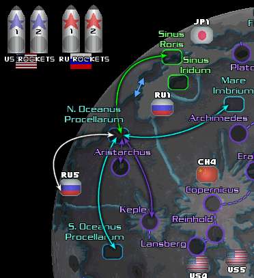
It's not very clear if Crater Aristarchus is inside or if it has the same attacking routes as the oceanus since both troop containers appear on the map next to each other as equals.
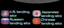
Another thingy, you can save some pixels as showed:
 ->
->
I think it's repetitive to mention "Landing site" with each flag.
Now, I'm not sure about all the connection lines. Please tell me if I'm not missing any attacking route centering myself on N. Oceanus Procellarum:

It's not very clear if Crater Aristarchus is inside or if it has the same attacking routes as the oceanus since both troop containers appear on the map next to each other as equals.
Another thingy, you can save some pixels as showed:
 ->
->
I think it's repetitive to mention "Landing site" with each flag.
-

 fumandomuerte
- Posts: 620
- Joined: Sat Dec 29, 2007 1:27 am
- Location: The Cinderella of the Pacific


Re: Lunar War <v5> p1, 5 *POLL*
I'm OK with the 4 starting positions (readed as countries, not as # of rockets). In the future you can make another version for 8 players
This map has 8 starting positions. Each player gets 1 rocket.
fumandomuerte wrote:I think it's repetitive to mention "Landing site" with each flag.
good point
fumandomuerte wrote:Please tell me if I'm not missing any attacking route centering myself on N. Oceanus Procellarum:
You're not missing any attacking route centering myself on N. Oceanus Procellarum

-

 natty dread
- Posts: 12877
- Joined: Fri Feb 08, 2008 8:58 pm
- Location: just plain fucked


Re: Lunar War <v5> p1, 5 *POLL*
OK and here is a small update. New countries added, smoothed the edge of the moon. New sea borders.

-

 natty dread
- Posts: 12877
- Joined: Fri Feb 08, 2008 8:58 pm
- Location: just plain fucked


Re: Lunar War <v6> p1, 7 *POLL*
Looking good. I love those rockets!! Can you widen the connection between N Oceanus and Mare Roris? It would be much clearer to see that they do indeed connect. Also swap IN3 with CH3, this way each country has one landing point in the opposite hemisphere!
Also move the Landing Sites in the legend to the right along with the Crater, Mare, Sinus icons and change out those rockets to your new ones.
I'm still going pver the game play since we switched over to adding in more countries. The tough part is the bonuses for the landing sites since the four single rockets will only have 3 landing sites. Anyone have any suggestions for that, I'm all ears!!
-
 isaiah40
- Posts: 3990
- Joined: Mon Aug 27, 2007 7:14 pm


Re: Lunar War <v6> p1, 7 *POLL*
Your "both rockets" bonus is misleading - as 4 countries only have 1 rocket?
So this gives a bonus to the USA/USSR - how do you plan to counter that?
What happens in a 4 player game when 1 player gets a pair - and the others don't?
I've not examined the rest of the GP - but I like the Graphics and the general idea...
C.
So this gives a bonus to the USA/USSR - how do you plan to counter that?
What happens in a 4 player game when 1 player gets a pair - and the others don't?
I've not examined the rest of the GP - but I like the Graphics and the general idea...
C.

Highest score : 2297
-

 yeti_c
- Posts: 9624
- Joined: Thu Jan 04, 2007 9:02 am


Re: Lunar War <v6> p1, 7 *POLL*
yeti_c wrote:Your "both rockets" bonus is misleading - as 4 countries only have 1 rocket?
So this gives a bonus to the USA/USSR - how do you plan to counter that?
What happens in a 4 player game when 1 player gets a pair - and the others don't?
I've not examined the rest of the GP - but I like the Graphics and the general idea...
C.
Another quick look and you're right! We can remove that bonus, but I'm scratching my head trying to figure out how to have the landing site bonuses work. Maybe a +4 for 3 landing sites, and it doesn't matter if they are of the same country?
Any suggestions? I'm all ears! er I mean all eyes!!
-
 isaiah40
- Posts: 3990
- Joined: Mon Aug 27, 2007 7:14 pm


Re: Lunar War <v6> p1, 7 *POLL*
natty_dread wrote:[If craters are inside a sea or on the shore of one, they are connected to that sea territory. Otherwise they are connected by connecting lines.
Why don't you paste this description of the craters on the map?
Oh, and I think the UE has a more important space program than Russia at the moment. So, can you give 2 rockets to the UE and 1 to Russia?
-

 fumandomuerte
- Posts: 620
- Joined: Sat Dec 29, 2007 1:27 am
- Location: The Cinderella of the Pacific


Re: Lunar War <v6> p1, 7 *POLL*
Can you widen the connection between N Oceanus and Mare Roris? It would be much clearer to see that they do indeed connect. Also swap IN3 with CH3, this way each country has one landing point in the opposite hemisphere!
Also move the Landing Sites in the legend to the right along with the Crater, Mare, Sinus icons and change out those rockets to your new ones.
Will do.
fumandomuerte wrote:Why don't you paste this description of the craters on the map?
Why not.
Oh, and I think the UE has a more important space program than Russia at the moment. So, can you give 2 rockets to the UE and 1 to Russia?
Russia has historical significance. And USA needs a counterpart. US-Russia fits great, US-EU not so well.

-

 natty dread
- Posts: 12877
- Joined: Fri Feb 08, 2008 8:58 pm
- Location: just plain fucked


Re: Lunar War <v6> p1, 7 *POLL*
You know - I look at the map and I can't see what borders what... There are craters with connections - then seas and flags that have no connections... Is that because you have only drawn on a few of the connections?
I fear that when all of the connections are on the map - then it will become very busy...
My other query - is how do you attack the rockets? The wording of the legend seems to point out that they attack the landing sites but not vice versa...
C.
I fear that when all of the connections are on the map - then it will become very busy...
My other query - is how do you attack the rockets? The wording of the legend seems to point out that they attack the landing sites but not vice versa...
C.

Highest score : 2297
-

 yeti_c
- Posts: 9624
- Joined: Thu Jan 04, 2007 9:02 am


Who is online
Users browsing this forum: No registered users

